المقدمة
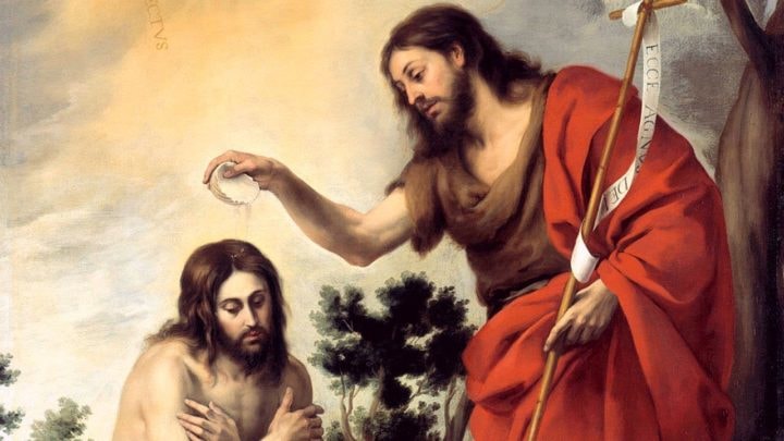
تعارض بياض ردائه الناصع مع المياه الموحلة عندما قام المُعَمِّد بلحيته البيضاء ومعه أعوانه المحتشدون أمامه بغمر رأس المُعَمَّد في مياه النهر. بدا ذلك كأحد مشاهد الكتاب المقدس عند نهر الأردن، وربما كان هذا الشخص هو يوحنا المعمدان وهو يُعمِّد يسوع، بينما تتنزل الروح القدس عليه في شكل حمامة، ليدوي الصوت من السماء مُعلنًا: “هذا هو ابني الحبيب، الذي به سُررت”.
إلا أنه لم يكن يسوع الذي يُعَمَّد، ولا كان ذلك يوحنا الذي يُعمده، فها أنا ألقي نظرة على إحدى الصور التي يبلغ عمرها حوالي 2002 عام لنهر يُدعى نهر “يردنا” -باللهجة الآرامية التي يتحدث بها المُعَمِّدون- والذي يعني “الأردن”. ولكنه ليس نفس النهر الجاري عبر دولتي الأردن وفلسطين بطبيعته الجغرافية، بل يقع هذا النهر في العراق، ومن المرجح أن يكون نهر الفرات. ولكنه قد يكون نهرًا آخر في نيو جيرسي، بالولايات المتحدة الأمريكية، أو نهر نيبيان الذي يجري عبر إحدى الحدائق العامة في سيدني بأستراليا. يمكن أن يكون أي نهر جارٍ ونظيف هو اليردنا -نهر الأردن- إذا استُخدم لهذا الغرض. حتى إن هذه لم تكن المعمودية الحدث الأبرز في حياة أي مسيحي، والتي تُقر دخوله أو دخولها الكنيسة. بينما تُقام تلك الطقوس كل أسبوع، ويقيمها هؤلاء الأشخاص الذين لا يدينون بأيٍّ من الديانة المسيحية، أو اليهودية، أو الإسلامية، إنهم المندائيون.
كان هؤلاء الأشخاص المحبون للسلام هم القائمون على حفظ تقاليد إحدى الأقليات الدينية القديمة، وإحدى ضحايا العنف الطائفي والتطهير العرقي الذين هربوا إلى سوريا وإلى الغرب، وقد تجد بعضهم في بعض الأماكن غير المُتَوَقَّعة مثل سيدني، أو نيو جيرسي، أو مانشستر. أو قد تجدهم ضمن ضحايا التدخل الغربي في العراق، وضحايا أنشطة داعش الأخيرة. ورغم حرصهم على الاندماج مع ثقافاتهم المحلية وسعادتهم باعتبارهم مسيحيين، فإن ديانتهم تتميز بارتداء كهنتهم (المعروفين باسم الترميذا) أردية بيضاء في أثناء إقامتهم طقوس المعمودية المثيرة بالنهر. وقد يدَّعون أنهم آخر الغنوصيين؛ فهم الطائفة الوحيدة الباقية من الطوائف التي لها علاقة بالمسيحية القديمة والتي دَرَّسَت الغنوصية،
فمعرفتهم المباشرة بالرب خلقت إنجيلهم الخاص وأساطيرهم، وقد اضطهدتهم الكنيسة ووصفتهم بالملحدين خلال القرنين الثاني والثالث. وتحتل طقوس المعمودية الأسبوعية التي يؤديها المندائيون بالنهر مركز حياتهم الدينية، ويدَّعون أن أهم رسلهم هو يوحنا المعمدان (يحيى بالمندائية)، رغم أنه لم يكن مؤسس ديانتهم. ولذلك أطلق عليهم أول الغربيين الذين صادفوهم اسم “مسيحو القديس يوحنا” -وهي تسمية غير دقيقة.
وهل يمكن أن يكون كل ذلك صحيحًا؟ هل يمكن حقًا لديانة وثنية من الشرق الأوسط أن تمتد بجذورها لتصل إلى الغنوصية و يوحنا المعمدان؟ وهل حقًا الغنوصية -وهو مصطلح يضم مجموعة من الطوائف الدينية المُلحدة، يعرفهم العلماء بالسيثيين، والفالانتيين، وما غير ذلك- التي انقرضت في العصور القديمة وتعرضت للتهميش والاضطهاد من قِبل الكنيسة كانت طائفة الكاثاريين التي ظهرت في العصور الوسطى، والمعروف عنها أنها المجموعة الأخيرة من أتباع المسيحية الغنوصية الثنائية، قد أبيدت خلال سلسلة من المذابح المتعطشة للدماء التي عُرفت بالحملة الصليبية الألبيجنسية؟ فكيف يمكن أن تنتمي طائفة صغيرة تعيش في العراق وإيران إلى طوائف الغنوصيين الملحدين، الذين انتشروا في مصر، وسوريا، وإيطاليا، وفرنسا؟
وهل يمكنهم حقًا إرساء حقهم التاريخي في المطالبة بـ يوحنا المعمدان نبيًا لهم وجميع المسيحيين يدركون أن دور يوحنا اقتصر على كونه المُبَشر بالثورة المسيحية، وهي رسالة أدَّاها بمجرد أن عَمَّد السيد المسيح؟ بل إن يوحنا نفسه قُطِع رأسه من قِبَل هيردوس أنتيباس قبل أن يُصلَب السيد المسيح، فهل حقًا انتهت حكايته عند هذا الحد؟ وهل نحن الآن في عوالم التاريخ البديل؟ نعم، إلى حدٍ ما؛ حيث ينطوي معظم التاريخ البديل على عمل إعادة بحث جذرية في أصول المسيحية، ومدى صحة تناقلها على مر العصور، ومدى رجاحة التقاليد السرية. فقد ساد في الغرب إبان فترة ما بعد المسيحية شعور قوي بأن التيار الرئيس للمسيحية يفتقد بعض العناصر التي كان ينبغي أن تكون به منذ البداية، وأن ثَمَّة شيء ما أُغفل ذكره في القصة. ومن ثَمَّ انتشرت البحوث البديلة والكتب الشائعة عن المؤنث الإلهي في المسيحية؛ والعلاقة بين السيد المسيح ومريم المجدلية، وأهمية الرسل بخلاف بيتر وبول؛ وأهمية الأصول المسيحية المهزومة أو غير المتجانسة مثل الغنوصية، والكاثارية، وفرسان الهيكل. حيث تجاهلت مبادئ الأصول المسيحية المفقودة
الأتباع المنبوذين، واتسمت بالسرية الدائمة بشكل استثنائي، لتتكون نظرية المؤامرة الخاصة بسلالة المسيح التي انتشرت في العالم الناطق باللغة الإنجليزية من خلال العملين الروائيين، “الدم المقدس، الكأس المقدسة”، و”شفرة دافنشي”.
رغم ما يشوب معظم هذه النظريات الرائعة من مشكلات، فإنها تُعد انتصارًا للحرفية؛ حيث ترتبط فرضيات تلك الكتب بوقائع مادية وجوهرية، وانحصر معظم التركيز على السلالة، والأبناء، والزواج، والمجتمعات السرية، والكنوز المفقودة؛ للتحقق من صحة الآثار، والأبنية الغامضة، والمخطوطات المفقودة. بينما الأجزاء المغمورة من التيار الرئيس للمسيحية أو المطمورة وفقًا للتشبيهات الغنوصية هي مضمونه الداخلي -عنصر التجربة الروحية الخالصة أو الغنوصية- أما الانتشار السري الحقيقي فكان من نصيب المعلومات الغنوصية، وليس النسب الوراثي الذي ينتهي في بعض المجتمعات السرية المُخادعة. فأي غاية تُرجى من اكتشاف الوريث الشرعي السري للسيد المسيح إذا اتضح أنه رجل فرنسي يميني بائس، ومُتشكك؟
رسمت في إحدى المرات قصة قصيرة تهدف إلى المحاكاة الساخرة للانبهار بالمجتمعات السرية والتاريخ البديل، يكتشف بطل الرواية بها مجتمعًا مُتغلغلاً في العالم كله ويُغطي جميع القارات، ويعول أتباع هذا المجتمع أهمية كبرى على النسب الذي حظوا به في أحد طقوس الإعداد، التي يقتصر تنظيمها على القريبين من قمة التسلسل القيادي الهرمي الديني، ويمكنهم تعقب مسار البداية من جيل إلى جيل، وعبر العقود والقرون المتعاقبة، وعبر كل فرد وصولاً إلى سلفه، ويعود تاريخهم مرة أخرى إلى حيث بدأ ليلتقي في نطاق بعض الأماكن المقدسة، بل مدينة واحدة على وجه التحديد. ومع تعاقب القرون، يظل النسب صامدًا، طوال طريق عودته إلى القرن الثاني، ومن يدري! فلربما عاد إلى القرن الأول. تُعد تلك القصة أصل نظريات المؤامرة، ورمز المنظمة القوية التي تسيطر على الحضارة كلها من وراء الستار. ولكن تكمن المفاجأة في أنها لم تكن طائفة غامضة ما، ولا زُمرة سرية، بل الكنيسة الكاثوليكية الرومانية. (يوجد بالطبع العديد من المؤامرات التي تدور حول الكنيسة الكاثوليكية ومكتبة الفاتيكان، التي تضم -حسب زعمنا- نسخًا من كل إنجيل مفقود، ونسخًا من توقيع السيد المسيح بخط يده، ويضم كل منهم أسرارًا من شأنها القضاء على الديانة المسيحية إلى الأبد إذا أتاحت الكنيسة معرفتها.
ولكن بالرغم من جميع أخطائها، فإن الرؤى البديلة للدين المسيحي أصابت في إدراكها أن الهيئات الكنسية الرسمية المُكلفة ذاتيًا لم تدعِ المطالبة بالانفراد بالمعرفة والسلطة، وأنها قامت باضطهاد أناس يتمتعون بصدق روحاني أعظم، وقضت عليهم على مدار عدة مراحل من التاريخ، وفي أثناء تقصيهم حقيقةَ القصص الرسمية عن أصل الدين المسيحي وبداية تطور الكنيسة، ومن خلال إدراكهم لوجود سبل أخرى ترتبط بالماضي أكثر من التاريخ الأكاديمي ألقت الرؤى البديلة الضوء عليه.
وتُعد قصة المندائيين تاريخًا بديلًا وحقيقيًا؛ فقد مثلوا بديلًا عن المعتقدات الإمبراطورية الضخمة بالدينَين المسيحي والإسلامي، على الرغم من -كما سنرى في الفصل الأول- أنهم لم يكونوا الوحيدين في ذلك الأمر؛ فقد قدموا قصة بديلة لقصة انتصار الكنيسة، التي قضت على الطائفة الغنوصية البغيضة والملحدة، وطرحوا تاريخًا بديلًا لتاريخ الغنوصيين القدماء المأساوي؛ فالمندائيون هم الغنوصيون الذين لم يندثروا. وفي ما مضى كانت تساورني بعض الشكوك بشأن الديانة المندائية، وأكدت دراسة أكاديمية حديثة أنها ليست فئة أكاديمية مترابطة، ولا هم الأشخاص الوحيدون الذين يُمكن أن يُطلَق عليهم غنوصيون؛ حيث توجد طائفة واحدة تُعرف أيضًا بالسيثيين. إلا أني ذُهلت في أثناء بحثي لهذا الكتاب وكتابته من أفكار المندائيين الغنوصيين، فبمرور الوقت، وعندما كنت أرتب المادة العلمية والمعلومات عنهم مرة أخرى اكتشفت -وربما بشكل لا إرادي- كيف أن النظرة الشاملة إلى الغنوصية والمواضيع الرئيسة، وحتى التفاصيل الدقيقة بشأنهم تقع في المندائية بشكل مستمر.
فقد دفعونا إلى التساؤل حول رؤية الدين المسيحي لـ يوحنا المعمدان كمُبشر بمجيء السيد المسيح فقط، وتدفعنا قصة استمرار بقاء المندائيين الاستثنائية إلى التساؤل حول وجهة نظر المسيح التي تلقيناها منه؛ فمن الوارد أن يحدث نقل بديل خلال فترة 2.000 عام. إلا إنني لن أُتخم الكتاب بالتخمينات الجنونية؛ حيث إن الموضوعات المطروحة في الجزء الأكبر منه هي الموضوعات نفسها التي طرحها الدارسون. وجاءت استنتاجاتي مشابهة لاستنتاجاتهم إلى حد بعيد، وأحذو هنا حذو كل من يكتب عن الموضوعات التاريخية، وأدين بالفضل للمتخصصين في التاريخ والأكاديميين الذين عهدت إليهم بأعمال الترجمة والترتيب والتحليل.
بعض الأكاديميين الذين شاركوا في الدراسات المندائية كانوا أصدقاءً حقيقيين للمندائيين، وعرضوا تقديم الدعم المادي إليهم.
وقاموا مؤخرًا بمساعدة اللاجئين الذين تأثروا بالأزمات التي حدثت في العراق وسوريا، ويجتمع كل من التاريخ البديل بالدراسة الأكاديمية الدقيقة في قصة المندائيين؛ فالمندائيون هم التاريخ الحي البديل للغنوصية.
لا يدور موضوع هذا الكتاب حول التجربة الحية للمندائيين المعاصرين، ولكنه يدور حول تاريخهم الاستثنائي والإمكانات المدهشة لمواجهاتهم مع فرسان الهيكل ومندائية حرَّان وتأثيرهم فيهم، وأصولهم بصفتهم أتباع يوحنا المعمدان. ومع ذلك، فقد حاولت خلال كتابتي لهذا الكتاب ألَّا يغيب عن ذهني أن المندائيين طائفة عرقية حقيقية، وعلى قيد الحياة وليسوا مجرد سلالة قديمة مندثرة.
وقد لا تكون أسطورة المندائيين بنفس أهمية ممارسة طقوسهم، إلا أن القصص تمثل الأساس الميتافيزيقي للديانة؛ فهي ليست أساطير أدبية وخرافية، ولكنها جزء من حقيقة الإيمان المندائي. وقد ذكرت الباحثة جوريون باكلي كيف أن مأمون الدليمي -وهو مندائي عراقي المنشأ ولكنه يعيش في نيويورك ويعمل مهندسًا- يدعو الشخصية المقدسة (هيبل زيوا)، و(عابل) ليمنحه القوة عندما يحتاج إليها. وفي إحدى المرات ناشد كل من هيبل زيوا وماندا الحي الذي يرمز (للمُخلص المندائي) ليساعداه على النجاح في تحريك سيارته على الدرب المغطى بالثلوج3.
على الرغم من أنهم أشخاص أحياء ودينهم حي، فإن بقاءهم كذلك ليس مؤكدًا؛ حيث تزداد الصعوبات التي يجابهونها في سبيل المحافظة على شرائع دينهم وأحكامه التي بموجبها تنتقل العلوم السرية للكهنة ولطبقة الأشخاص المتعلمين. ولكن المندائية على مر العصور جابهت الأزمة تلو الأزمة بصلابة وتحملتها جميعًا.
فعلى أحد الجوانب تعم الفوضى والعنف بالشرق الأوسط، وعلى الجانب الآخر، يعانون من صعوبة التجانس مع الجانب الغربي، ومن ثّمَّ فالمندائيون مُعرضون لخطر الاندثار الحقيقي، سواء كطائفة عرقية أو دينية.
ولذلك، يبدأ هذا الكتاب بالمعاناة الحالية للمندائيين، ويعتمد منهجي على الرجوع بالزمن، والعودة مجددًا عبر العصور وكشف خفايا تاريخهم. وسوف أنتقل ذهابًا وإيابًا بين أحداث الماضي والحاضر، تسهيلاً لسرد الأحداث، ولكن منهج البحث أساسًا يسير عكس مسار التاريخ.
فالحياة التي تُرى بشكل معكوس تنظر دائمًا إلى المهد وإلى الرحم، وعلى الرغم من أهميتهم في تحقيق الجزء الأفضل من وجودهم الذي اقتصر على بعض المناطق المحدودة بالعراق وإيران، ظهر المندائيون مرتبطين بأكثر المظاهر بغضًا في التاريخ، مثل اليسوعيين البرتغاليين، و(ربما) فرسان الهيكل، ومدينة حَرَّان التي استمرت الديانة الوثنية بها على مدى قرون عديدة بعد مجيء محمد، والدين الإسلامي نفسه، والعودة مباشرةً إلى فلسطين في القرن الأول وما يتجاوز ذلك. وقد حافظ المندائيون على ديانتهم وانتمائهم العرقي، وثقافتهم على مر العصور. إلا أن الكثير من تاريخهم يستند إلى الحدس؛ فالأدب المندائي يصور قصة مُحددة المعالم، إذا رُويت بروية، ويوضح التاريخ النقدي أن بعض جوانب القصة المندائية غير واردة الحدوث، بينما بعض الجوانب الأخرى مثل هبوط المخلوق الملائكي هيبل زاوا إلى يهودا في القرن الأول، لا تتماشى مع النطاق التاريخي؛ فعادة لا يوجد أي أثر للمندائيين على مر العقود والقرون، أو على الأقل ليس بأي وسيلة في متناول الغربيين، ولكنهم صاروا لاحقًا محل الاهتمام، خلال غمر مياه النهر لأرديتهم البيضاء، بجوار أكواخ العبادة الخاصة بهم (الماندا)، وقيامهم بطقوس التعميد في المياه الجارية لنهر الأردن الأبدي4.
الفصل الأول
ديانة غريبة:
أقلية دينية تحيا بالشرق الأوسط
عندما نفكر في الشرق الأوسط، وتحديدًا في القرن الحادي والعشرين، فأول ما يتبادر إلى أذهاننا هو الإسلام، ومن المحتمل أن أول ما يمر بخاطر الغربيين المعتدلين هو دولتا إيران والعراق؛ فاسم إيران يستدعي صور آية الله الخميني، ورجال الدين بلحاهم الطويلة، والجهاد والفتوى، أما العراق فتستحضر صور صدام حسين والفوضى التي أعقبت تغيير النظام الغربي.
بعيدًا عن إيران والعراق، ظل الشرق الأوسط موطنًا للتطورات الأخيرة مثل المؤامرات المخيفة لداعش/ تنظيم الدولة الإسلامية، ونظام الأسد في سوريا، والقصف التركي لكردستان، وأهوال لا حصر لها في إسرائيل وفلسطين. والقاسم المشترك بين كل ذلك هو الإسلام؛ فالغرب هو المجتمع الديموقراطي، والاستهلاكي، والمسيحي أو العلماني ما بعد المسيحي المعروف. أما الشرق الأوسط فهو الإسلام، والإسلام هو الجانب الآخر.
إلا أن ذلك يخلو من الصحة؛ فقد كان الإسلام بالفعل هو القوة المهيمنة في الشرق الأوسط، ولايزال كذلك. ولكن بعيدًا عن العديد من الأقليات المسيحية المنتشرة بالمنطقة، واليهود الذين كانت لهم مجتمعاتهم الخاصة في العديد من دول الشرق الأوسط، ولكنهم الآن محتشدون بشكل أساسي في إسرائيل، فالشرق الأوسط يُمثل موطن العديد من الأقليات الدينية.
وقد يُشكل الأمر صدمة للبعض منا الذين يدركون أن الغرب متسامح، ولكن الإسلام كان تاريخيًا أكثر مراعاةً للديانات الأخرى عما كانت عليه المسيحية يومًا1.
ويوصي القرآن على وجه التحديد بالتسامح مع ثلاث طوائف دينية خارج نطاق الإسلام -أربعة في حالة ذكر الزرادشتية من ضمنها- وهي: المسيحيون، واليهود، والصابئة الغامضون، وقد سمحت هذه الفئة الأخيرة لعدد من طوائف الأقليات الدينية بالبقاء، بالرغم من عدم تطورها على مر العصور بالشرق الأوسط، فكان اعتناق الإسلام ملائمًا لهذه الطائفة. وقد ظن غير المسلمين أنه من الأفضل لهم اعتناق الإسلام؛ حيث كانت تُفرض ضرائب خاصة على غير المسلمين في بعض الأوقات في العديد من الدول، ولكن على عكس المسيحية في عصر ما قبل الحداثة، فقد أقر الإسلام وجود بعض الأديان الصحيحة الأخرى؛ فهي تمثل التراث الذي تتذكره الجماعات الإسلامية الحديثة جيدًا.
ويمثل المندائيون إحدى هذه الطوائف المعروفة بالصابئة، الحالة المدعوة بـ “أهل الكتاب”، وسوف نلقي الضوء على الصابئة مرة أخرى لاحقًا بالكتاب، ونبحث ما إذا كان ذلك يدل على أن المندائيين قد يكونون هم المعنيين بالصابئة في القرآن.
ولم يكن المندائيون هم الأقلية الدينية الوحيدة -المجموعة الوثنية- بالشرق الأوسط، ولكي ندرك قصة المندائيين علينا أن نُبدي إعجابنا بالقدرة المدهشة لتلك الديانات على البقاء؛ فلم يدعِ أيُهم امتداد أصوله إلى زمن المسيح، مثلما فعل المندائيون، ولا ادعى أحد أنهم آخر الغنوصيين الأحياء، ولكن لكل منهم قصة آسرة؛ فهذه الأقليات التي يمكن الخلط بينها وبين المندائيين لم تكن معروفة بالشكل الكافي في الغرب حتى وقت قريب، وحتى الآن تأتي معظم معلومات الناس عنهم من العنف الذي يتعرضون له ومن أزمات اللاجئين.
اليزيدية:
ربما تكون اليزيدية هي أكثر هذه الطوائف شهرةً وانتشارًا؛ فقد أسفرت الأنشطة التي قامت بها جماعة داعش في عام 2014 تجاه اليزيديين -وتُعرف باليزيدية أو الإيزيدية- عن تلقيهم اهتمامًا دوليًا واسع النطاق لأول مرة على مدى وجودهم الطويل. كما جذبت معاناة المندائيين بعض الاهتمام العابر في الصحف على وجه التحديد، فقد خبا أثر تهجيرهم كلاجئين ومعاناتهم من انتهاك حقوقهم الإنسانية،
في ظل الفوضى والعنف المسيطرَين في أعقاب حرب العراق الثانية.
وينتشر اليزيديون بتعدادهم الذي قد يصل إلى بضع مئات من الألوف في العديد من الدول مثل: سوريا، وجورجيا، وكردستان أرمينيا، وشمال غرب إيران، وشمال العراق، حيث يوجد الضريح الأكثر قدسية في مدينة اليزيديين في لالش. ويوجد بالغرب حاليًا بعض أفرادهم وعائلاتهم. وعلى الرغم من أنه يمكن اعتبار اليزيدية أحد الأعراق الإثنية، فإنهم طائفة متدينة. وينحدر العديد من اليزيديين من العرق الكردي (رغم إنكار بعضهم ذلك)، ويتحدث معظمهم باللغة الكرمانجية، وهي لغة الأكراد، ولديهم بعض المُحرمات الغريبة مثل: عدم أكل الخس أو السمك وألاَّ يرتدوا ثيابًا زرقاء، وقد سرى تحريم اللون الأزرق على المندائيين في الماضي أيضًا، ولم يُفسر سبب ذلك بشكل مقنع.
وربما يكمن أشهر المحرمات في عدم قدرتهم على الخروج من دائرة مرسومة حولهم، وقد أوحى ذلك للشاعر برتولت بريشت بعنوان مسرحيته “دائرة الطباشير القوقازية”، وبأقوال جورج غوردجييف من ألكسندروبول في أرمينيا في حساب 1888:
“في منتصف دائرة مرسومة على الأرض يتموضع أحد الأولاد الصغار، ينتحب ويقوم بحركات غريبة، ويقف الباقون على مسافة معينة منه ويضحكون منه. شعرت بالحيرة وسألتهم عن ماهية ذلك:ِ
علمت أن الولد في منتصف الدائرة كان يزيديًا [كذا]، وقد رُسِمت هذه الدائرة حوله، وأنه لا يستطيع الخروج منها ما لم تُمحَ. كان الطفل يحاول حقًا بكل قوته الخروج من هذه الدائرة السحرية، ولكنه كافح دون جدوى، فركضت إليه ومحوت سريعًا جزءًا من الدائرة، وعلى الفور خرج منها مُسرعًا، وهرب بأقصى سرعة ممكنة.
أذهلني ذلك بشدة لدرجة أني وقفت مصعوقًا في المكان مدةً طويلة كما لو كنت مسحورًا، حتى استعدت قدرتي المعتادة على التفكير. على الرغم من أني علمت بعض الشيء عن هذه العادات اليزيدية، فإني لم أعرها يومًا اهتمامي؛ ولكن أجبرتني هذه الحادثة المذهلة التي وقعت أمام ناظريّ على التفكير بشكلٍ جاد.
بعد مرور عدة سنوات على مرور الواقعة التي ذكرتها سابقًا، قمت بتجربة للتحقق من هذه الظاهرة واكتشفت أنه -في حقيقة الأمر- إذا رُسمت دائرة حول أحد اليزيديين، فلن يستطيع اختراقها والهروب منها بمفرده. ولكن يمكنه الحركة بحرية داخل نطاق تلك الدائرة، وكلما كبرت الدائرة، زاد نطاق حركته داخلها، رغم استحالة خروجه منها؛ حيث تكبله قوى غريبة تفوق قدرته الطبيعية بكثير وتُبقيه داخلها، حتى أنا، رغم قوتي الظاهرة، لم أستطع أن أجذب امرأة ضعيفة خارج هذه الدائرة؛ واحتاج الأمر إلى رجل آخر بقوتي نفسها لمساعدتي.
أما في حالة سحب أحد اليزيديين خارج الدائرة بالقوة، يُصاب على الفور بحالة تُدعى الإغماء التخشبي، ويظل كذلك حتى اللحظة التي يعود فيها إلى داخل الدائرة، وفي حالة عدم رجوعه إلى الدائرة يعود إلى حالته الطبيعية -كما تأكدنا- بعد مرور وقت يتراوح بين ثلاث عشرة إلى إحدى وعشرين ساعة2.
أما أماكنهم المُقدسة فعبارة عن كهوف، وأضرحة بأسقف مخروطية، وتلعب العناصر الأربعة دورًا بارزًا في علومهم الكونية -وخاصة النار- التي تُمثلها النيران الموقدة في أضرحتهم. ويُعد الطاووس مَلِك الملاك ذو شكل الطاووس، هو شعار الديانة اليزيدية، ويعرف أيضًا باسم إبليس أو عزازيل، وهي الأسماء التي يطلقها الإسلام على الشيطان، ومن ثم كان ذلك سبب إطلاق اسم عبدة الشيطان على اليزيديين، ولكنهم ليسوا عبدة للشيطان فعلاً؛ حتى إن ذِكر لفظة الشيطان مُحرمُ تمامًا، وسماعها مُهين لمقدساتهم، لدرجة أنهم كانوا يضطرون إلى قتل كل من ينطق هذا الاسم3، حتى عصرنا الحالي، نظريًاعلى الأقل. وقد طُرد الملك طاووس -مثل لوسيفر- من الجنة، ولكنه افتدى نفسه بندمه على خطاياه لدرجة أنه ظل يبكي لمدة 7000 عام، ليملأ بدموعه سبع جِرار، وهي التي استُخدمت لاحقًا لإخماد نيران الجحيم، ولهذا صار الطاووس ملك ذلك الكيان الذي يعبده الإيزيديون.
وُلد الشيخ الصوفي عدي بن مسافر حوالي عام 1075، ويُعزى إليه فضل إصلاح اليزيدية، ورغم أنه لم يكن مؤسسها، فإنه قد يعود فضل إنشائها إلى شخص غامض يُدعى السلطان إيزيد أو يزيد الذي عرف بأكثر من شخصية، من الرب بذاته وحتى الخليفة يزيد، وهو حاكم سُني سابق، حرص اليزيديون من الشيعة الذين استقروا في المنطقة على تجنبه. كل هذه التفسيرات سيتبعها مجموعة من المبررات التي يسوقونها بعد ذلك.
يبدو أن عددًا قليلًا فقط من العلماء الغربيين لديه معلومات مؤكدة بشأن اليزيدية، فيبدو أن النصوص المقدسة التي يُزعم أنها لليزيديين والتي ترجمها الأكراد ونشروها في أوائل القرن العشرين، كانت مزيفة ومُلفقة لإشباع فضول الغربيين. فعلى الرغم من أنها قد توضح المعتقدات اليزيدية، فإنها ليست وثائق حقيقية من الكتب المقدسة الخاصة باليزيدية، وكذلك يبدو أن اليزيديين غالبًا مثل المندائيين، يخبرون الغرباء بما يودون سماعه.
وتشترك الديانة اليزيدية مع المندائية وباقي الأقليات الدينية التي عاشت في الشرق الأوسط بوجود الكهنوت الذي يقتصر على فئة قليلة سرية تُمثل الدائرة الداخلية، وعامة الناس غير المُطلعين على أسرار إيمانهم الحقيقية.
ويعيد تغلغل الشيخ عدي بن مسافر في تاريخ اليزيدية إلى الأذهان ما حدث من تغلغل يوحنا المعمدان في المندائية، فمثلما منح يوحنا سياقًا مسيحيًا للمندائية، منح الشيخ لليزيدية أصلاً مسلمًا، وقد يكون الرابط حقيقيًا وتاريخيًا، رغم أن اليزيديين حافظوا أيضًا على المُعتقدات والطقوس السائدة قبل الإسلام مع السمات الكردية، وبلاد ما بين النهرين، والزرادشتية. وقد تمتد هذه المظاهر لتشمل العصور التي سبقت ارتباطهم بالصوفية بآلاف السنين.
ولا يُصنف اليزيديون عادةً كغنوصيين، ولكن بعد الأديان التي انبثقت من العالم اليهودي -الهلنستي- رغم وجود الرب المتعالي الغني عن الذكر، نجد أن التشابه بين الطاووس ملك والصوفية المختلطة وشخصية فداء المُفَدى يوحي ببعض التقارب مع الغنوصية. ويمكن أن نجد في خلاص الشيطان وتحوله إلى شخصية المخلص أحد الأمثلة المعكوسة للتأويل المألوف في الغنوصية.
وبالرغم من أن اليزيديين والمندائيين يعيشون عادةً في مناطق مختلفة بالعراق، فإن العداء بينهم لا يخفى على أحد؛ ففي أحد الصدامات غير العادية بين الأديان أخبر أحد المندائيين الباحثة الإنجليزية ليدي دراوور -التي كانت صديقة للمندائيين- بأن الملك طاووس هو من كتب التوراة اليهودية4. ومن المؤكد أن هذا الكلام هو أحد التأويلات لفكرة أن الشيطان هو كاتب التوراة، ومع ترجمة الشيطان إلى المصطلحات اليزيدية، رغم عدم صحة ذلك.
العلويون:
من المؤكد أن العلويين هم أبرز الأقليات في المنطقة، ويشتركون مع المندائيين واليزيديين في قلب
تعاليمهم للمعرفة الكاملة وحصرها داخل حلقة محدودة، حيث لا يطلع العامة على التعاليم السرية. كما تميزوا بامتلاكهم سلطة سياسية حقيقية -وهو ما صار بكل أسف محط شك الآن- بواسطة الرئيس السوري بشار الأسد العلوي.
والعلويون مُسلمو الأصل وإن كانوا فرعًا مُحددًا ينبثق من الدين الرئيس، فهم من مسلمي الشيعة، ذلك الفرع المتشعب من الإسلام الذي ينتمي إليه حوالي خُمس سكان العالم. إلا أن موقفهم من مسلمي الشيعة ملتوٍ؛ حيث يدين الإسلام الشيعي بوجوده إلى الشقاق الذي حدث في الإسلام بعد مقتل علي ابن عم محمد الذي كان الخليفة الرابع وأول أئمة الشيعة، لذا فالشيعة هم الفرع الإسلامي لأتباع علي. ويُقر معظم الشيعة تحديدًا بأئمة الشيعة ال12، ولذلك أطلق عليهم اسم (الاثنا عشرية)، وتُقر أقلية من الشيعة بالأئمة الست الأوائل فقط، ثم تتبع بعدها نسلاً بديلاً من الأئمة، وتُعرف هذه الطائفة الشيعية بالسبعية أو الإسماعيلية؛ لإيمانهم بأن جعفر الصادق كان الإمام السابع (بدلاً من موسى الكاظم كما تُقر الاثنا عشرية).
ويؤمن العلويون بتناسخ الأرواح، مثلما يفعل الدروز واليزيديون، في حين لا يؤمن المندائيون به5. ويشبه العلويون المسيحيين في إيمانهم بأحد أنواع الثالوث، ولكن ثالوثهم به ثلاث شخصيات مقدسة تجسدوا في الآونة الأخيرة مثل علي، ومحمد، وسلمان الفارسي، كما أنهم يقيمون أحد أشكال المناولة مستخدمين النبيذ، ويلعب رصد الكواكب دورًا أثريًا في المعتقدات العلوية. ولاتزال كتبهم المقدسة محاطة بأكبر قدر من السرية ولم تصلها أيدي الغربيين بعد، ولكن يُقال إنها تضم قائمة من الرجال المقدسيين، ولا تقتصر تلك القائمة على محمد وخلفائه، إلى جانب الأنبياء الإبراهيميين السابقين الذين كرمهم الإسلام مثل (يسوع، وموسى، إلى آخره)، ولكنها تمتد لتشمل بعض الشخصيات اليونانية الوثنية مثل أفلاطون والإسكندر الأكبر.
وقد حاول الأسد أن يطمس هذه الاختلافات بالإسلام السائد وأن يبقي العناصر السرية للديانة العلوية طي الكتمان، مضطهدًا بعض رعاياه، ولولا الجهود التي بذلها العلويون على مر العصور في المطالبة بعضويتهم وانتمائهم إلى المجتمع الإسلامي الأوسع نطاقًا، لكانوا في نفس مكانة الأقليات الدينية الأخرى بالشرق الأوسط. وقد دعم العلويون الأسد في الحرب الأهلية الدائرة بسوريا التي نتج عنها مصرع حوالي ثلث شباب العلويين.
وقد أسفرت الإجراءات التي قام بها الأسد عن وجود بعض التعاطف من الغرب تجاه العلويين، والذي لم يظهر بشكل واضح في أثناء تغطية أخبار أزمة اللاجئين السوريين.
الدروز:
قد يلتبس الأمر أحيانًا ويُخلط بين الدروز والعلويين، فالدروز أيضًا يؤمنون بتناسخ الأرواح وقد يدعون أيضًا أنهم نموذج مُبتدع من الإسلام، ويعيش الدروز في مجتمعات واسعة النطاق في سوريا (أكثر من نصف تعدادها السكاني) ولبنان (حوالي ربع السكان). كما يستوطنون فلسطين والأردن، وبعض جاليات الشتات في العالم الجديد. ويتحدث الدروز باللغة العربية، كما يفعل معظم المندائيين المعاصرين، بغض النظر عن الموجودين في إيران الذين يتحدثون باللغة الفارسية المعاصرة. وقد نعجز أحيانًا -في العالم الناطق بالإنجليزية- عن إدراك جوانب الهوية المتداخلة والمتقاربة والمتباينة في الوطن العربي؛ حيث يمكن للدين إلى جانب اللغة والمكان أن يوفر قواسم مشتركة مع الآخرين الذي يعيشون معهم في الدولة نفسها أو يميز بينهم، والذي قد تقوم السياسات المتغيرة بتعزيزه أو بتقليصه.
يتحدث الدروز الذين يعيشون في إسرائيل باللغة العربية -لغة القرآن- مثلما تفعل جموع الجماهير في باقي دول الشرق الأوسط، ولكنهم يؤدون الخدمة العسكرية في جيش الدفاع الإسرائيلي خلافًا لرفاقهم الفلسطينيين المسلمين الذين يتحدثون بالعربية. ويستطيع المندائيون بالعراق أن يتحدثوا لغة الأغلبية العربية التي لا يفهمها المندائيون الإيرانيون الذين يعيشون في دولة تخوض حربًا منظمة ضدهم، فيعدون أنفسهم مواطنين عراقيين، ولكنهم يشتركون مع المندائيين الإيرانيين في خلفيتهم الدينية والعرقية.
وبالمثل يُعرف الدروز أنفسهم كطائفة مسلمة، رغم أن ديانتهم بها خصائص توفيقية بين الأديان مثل العلويين؛ فهم يعطون الأولوية لجيثرو عن موسى، وهو كاهن من أهل مدين وحمو موسى، والذي يظهر بشكل رئيس في سفر الخروج 18، ويعده كاشفًا إلهيًا ونبيًا وأحد أسلافهم. وقد تأثرت السمات المميزة للدرزيين كونيًا بنظرية فيثاغورث وبالفلسفة الأفلاطونية المُحدثة، جنبًا إلى جنب مع تفسير متساهل لتعاليم الإسلام، وخاصةً تلك التعاليم التي تتساهل مع العامة، ويتميز جبل الدروز اللبناني بطبق محلي شهير عبارة عن خنزير صغير مطهو في النبيذ، والذي يُعد
لعنة في نظر أي مسلم مُتدين. وظلت المنطقة أمدًا طويلًا جزءًا من العالم الهلنسي حتى بداية الفتح العربي الإسلامي لسوريا، ومن هنا جاء إرث الفلسفة اليونانية.
ويتبع الدروز النموذج الحالي المألوف للعامة الذي يتضح بانتمائهم إلى إحدى المجموعات العرقية أو المجتمع المحلي أكثر من معتقداتهم أو حتى ممارساتهم، وأهم ما يجب أن يلتزم به الدروز هو الزواج في إطار المجتمع الدرزي. ويعاني المندائيون أيضًا من ضغط كبير للزواج من مندائيين فقط، وقد يعد من يتزوج من خارج مجتمعهم مُرتدًا، ويستعين العديد من شباب المندائيين في أستراليا وكندا بالإنترنت لمساعدتهم على الزواج من داخل مجتمعهم المتدين.
أما عن رجال الدين الدرزيين فعلى اطلاع على الكثير من المعارف الدينية أكثر من عامة الدرزيين كما توجد تعاليم سرية خفية، وتتسم الطبقة الكهنوتية بها بالانضباط والعفة، ويلتزمون بالتشريعات الإسلامية في الطعام (ممنوع أكل لحم الخنزير المطهو في النبيذ) ويتنسكون. وعُرف عن الدروز في العصور السابقة أنهم محاربون شرسون، وقد قاتلوا بجانب المسلمين في أثناء الحملات الصليبية.
ويُعد الدروز أقلية كبيرة العدد، حيث يبلغ تعدادهم 1.500.000، وعندما سألت الدبلوماسي البريطاني السابق جيرارد راسل -مؤلف كتاب ورثة الممالك المنسية– عن أي من الأقليات الدينية العديدة التي صادفها أثارت إعجابه الشديد، وكانت إجابته:
يعيش الدروز في مجتمع سليم، فإذا ذهبت إلى منطقة الدروز ستجدها موطنًا لمئات الآلاف من الناس الذين يعيشون حاليًا في منطقة منعزلة واستثنائية، وتقريبًا غادر المسيحيون الذين عاشوا هنا سابقًا.
وعندما تنظر إلى مجتمع الدروز تجده لا يزال متماسكًا، ولكنك ستجد أيضًا الكهنة كما كانوا دائمًا، يحملون على عاتقهم مسؤولية ديانتهم كاملة. وأعتقد أن البقاء ليس بالأمر الهين عندما تكون المجتمعات مشتتة، وعندما يترك الشيخ محل سكنه على الطريق، ويعيش على بعد 100 ميل في لوس أنجيليس6.
الزرادشتيون:
على الرغم من غموض المنشأ الأصلي لطائفة الزرادشتيين مثلهم في ذلك مثل باقي الطوائف السابقة، فإنهم يتفوقون عليهم في توثيقهم الأفضل لتاريخهم؛ فطائفتهم الآن أقلية دينية بعد أن كانت الزرادشتية سابقًا الديانة الرسمية للدولة في بلاد فارس، أو إيران لعدة قرون عندما قام زارادشت عام 1000 قبل الميلاد تقريبًا بإصلاح الديانة الأصلية للإيرانيين التي كانت عتيقة للغاية. ولا يمكن التيقن بشأن التفاصيل التاريخية لحياة زرادشت، ولكن جاءت تقديرات الباحثين لتواريخ الإصلاحات الدينية التي قام بها، تراوحت ما بين عامي 1200، و500 قبل الميلاد، فهو شخصية شبه أسطورية. وتلا ذلك الإصلاح وجود دين منظم للدولة يؤمن بإله واحد هو الأسمى، وبوجود ثنائية الخير والشر، وهناك أكثر من مبدأ في الغنوصية التي آمنت بالروح والجسد أو النور والظلام.
وقد عادت الزرادشتية للظهور في القرن الثالث بعد الميلاد، والتقت بالديانة المانوية الناشئة، وألحقت بها الهزيمة في أثناء تنافسهما على المكانة الرسمية لدين الدولة الساسانية الفارسية في القرن الثالث بعد الميلاد. وكما سنتبين لاحقًا، فقد قُتل النبي مانو بسبب النفوذ السياسي للزرادشتيين المجوس على الملك الفارسي. كان المندائيون في العراق في تلك الفترة من العصر الساساني، فهل تأثرت المندائية بثنائية الخير والشر الزرادشتية؟ هل كان للديانة المانوية تأثير تكويني في المندائية، أم العكس؟ ما هي الثنائية تحديدًا، وهل تتفق مع مبدأ التوحيد؟
التوحيد:
يمكن أن توصف كل الديانات التي شرحناها سابقًا بأنها توحيدية، رغم التباين الكبير في فهم معنى هذا المصطلح، والديانة المندائية بدورها توحيدية، ويُعد ذلك أمرًا بالغ الحيوية؛ لأنه قد يكون مسألة حياة أو موت في الشرق الأوسط. وتخلو العقيدة المندائية من عناصر تعدد الآلهة، ولكن يوجد بها العديد من الكائنات الروهانية، شأنها في ذلك شأن العقيدة اليهودية والمسيحية والإسلامية، فكل منها به مجموعة من الملائكة، ورؤساء الملائكة، وشياطين، وجن، وما غير ذلك7. وقد تُصَنَّف العقيدة المندائية على أنها ثنائية، كما سنتبين لاحقًا -ولكن يمكن اعتبار النظام الثنائي أحد أنواع التوحيد، حتى الزرادشتية نفسها تُصنف كأحد نماذج ثنائية التوحيد.
ابتعدت اهتماماتي الخاصة كثيرًا عن الديانة التوحيدية التي أجدها مبالغًا فيها إلى حد كبير، فلن يستطيع التوحيد خداع آلهته، ولا تستطيع آلهة/ إله التوحيد خداع أحد، فواجهت عقيدة التوحيد التي يعتنقها معظم المسيحيين واليهود والمسلمين صعوبات بالغة مع بعض القضايا مثل وجود الشر؛ فعندما يكون خالق العالم مطابقًا للرب المتعالي فقد لوث الرب المتعالي يديه -إذا جاز القول- بصور المعاناة والكوارث وفظائع الوجود المادي. ولا يسمح التوحيد بشرعية واحدة لجميع القوى النفسية التي تُمثل النفس البشرية: الحب الجسدي، والحب الرومانسي، والمتعة، والفضول، والتسامح، والاضطهاد، وبعض الصفات الأخرى التي تندرج تحت مسمى الخطايا والنوازع الشيطانية بقبضة إله واحد. وعندما يُملي الرب -مصدر جميع المخلوقات- القوانين والكتاب المقدس، ويُزود الهيئات بالسلطة، فكن واثقًا من حدوث بعض الصعاب مستقبلًا.
ولكن تكمن قوة التوحيد في مفهومه عن الهدف الوحيد المناسب من أجل البشرية، ويُقر تنوعَ النفس البشرية واحتياجاتها، وتنوع الطبيعة في الآلهة. ومع ذلك فغياب بعض التعالي أو مبدأ توحيد التعدد الخالص يمكن أن يُمثل البشرية بأسوأ خصائصها: عدم التكامل، والجدال، وضيق الأفق، الذين تحددهم الرغبة والصراع، ويصبح التوحيد في أسوأ صوره المكافئ الديني للدولة الشمولية.
ولذلك تتركز اهتماماتي الخاصة على نماذج أكثر ابتداعًا للدين والجوانب الروحانية، وتعكس محتويات هذا الكتاب تركيزي، ولكن أود أن أؤكد على أن المندائيين لديهم كل الحق في الاعتراف بها كأحد نماذج التوحيد؛ فقد يكون الأمر بالنسبة إليهم مسألة حياة أو موت.
الأديان الإبراهيمية:
جرت العادة على الإشارة إلى اليهودية، والمسيحية، والإسلام بأنهم أديان توحيدية، بالإضافة إلى كونهم أديانًا إبراهيمية أيضًا؛ حيث يمكن النظر إلى موسى على أنه مؤسس القانون اليهودي، بل ومؤسس الديانة اليهودية، كما أنه نبي مُبجل في الإسلام. ورغم أن شخصية موسى معروفة في الديانات الثلاثة، فإنه شخصية يهودية أساسية، والمسؤول عن سفر الخروج؛ ومع ذلك يبلغ إبراهيم أبعد من ذلك، ويمكن اعتباره مُتلقي العهد الأول مع الرب، وكان لإبراهيم ابنان، إسماعيل الذي ولدته هاجر جارية
زوجته سارة، وإسحاق الذي أنجبته سارة في شيخوختها. يعود نسب اليهود إلى إسحاق، بينما يعود نسب العرب إلى إسماعيل، لذلك يُعد محمد كذلك سليل إسماعيل لكونه عربيًا، وروحيًا يُمكن اعتبار كل مسلم -سواء أكان عربيًا أم لا- سليلَ إسماعيل، وقد دُفن كل من هاجر وإسماعيل على نحو تقليدي في الكعبة بمكة. وقد يكون انحدار العرب من نسل إسماعيل صحيحًا تمامًا مثل انحدار اليهود من نسل إسحاق -لا أكثر من ذلك ولا أقل.
صارت المسيحية ديانة منفصلة عن اليهودية بإنكارها لأحد العناصر العرقية، بكونها متاحة للذكور والإناث، واليهود وغير اليهود، والأحرار أو العبيد. وقد ذكر بولس الأمر مجازيًا في رسالة بولس الرسول إلى أهل غلاطية 4: 24-31 موضحًا أنه رغم أن إسحاق ابن إبراهيم من زوجته سارة الذي أراد إبراهيم أن يُقدمه قربانًا إلى الرب إلى أن نجا في آخر لحظة -وهو جد اليهود- فإنه يمثل المسيحيين مجازيًا، ومن ثَمَّ يمثل العهد الجديد من الرب لغير اليهود، بينما إسماعيل الذي ولدته جارية أجنبية، وليس حرًا، يمثل الدولة الحالية لليهود والبيت المُقدس. ورغم أن القليل من المسيحيين يهتمون بأمر النسب المجازي لإسماعيل، فهو يُعد أحد العوامل؛ لأن إبراهيم يمثل الالتزام بالتوحيد. ولذلك تدعي الأديان الإبراهيمية الثلاثة8 نوعًا من النسب إلى أبناء إبراهيم، بينما يُنظر إلى إبراهيم نفسه على أنه القاسم المُشترك بينهم.
ويمكن القول جدلاً إن المندائية تُعد أحد الأديان الإبراهيمية، ولكن إبراهيم ليس شخصية شائعة في الأساطير المندائية؛ لاعتباره قائدًا لليهود الذين يناصبونهم العداء، ولكنه ذُكر مرة واحدة على الأقل في إحدى الحكايات الشعبية التي قُصَّت على ليدي دراوور؛ كان بهرام في هذه القصة مندائيًا من عائلة كهنوتية مهمة اكتشفت قرحة على قلفته ما يستوجب ختانه9. ربما يمكننا النظر إلى الفئة الأوسع نطاقًا من الدين الآدمي، أي الأديان التي كرمت شخصية آدم (رغم إخفاق حواء)، وآدم هو أول البشر في المندائية، وكذلك في الإسلام، واليهودية، والمسيحية، واليزيدية، وباقي الأديان.
وهو نمط ملحوظ في الديانات القديمة بالشرق الأوسط، حيث يُنسب إليهم الفضل في وجود المؤسسين التاريخيين في بدايات العصور الوسطى، ورغم ذلك توجد بها بعض العناصر الشاذة؛ إذا كانوا طوائف إسلامية ابتداعية محضة، حتى مع المقارنة بطوائف الشيعة شديدة التنوع.
فالدروز متأثرون بالنظرية الفيثاغورثية وفلسفة أفلاطون المجددة، ويؤمن العلويون بتناسخ الأرواح، وببعض المظاهر المسيحية، وعناصر عبادة الكواكب. وتشترك بعض مظاهر الديانة اليزيدية مع ديانة بلاد فارس القديمة (إيران)، فضلاً عن تأسيسهم طريق أحد الصوفيين في الألفية الثانية بعد الميلاد، فقد يعود أصل اليزيديين إلى آلاف السنين. وتمارس العديد من هذه الطوائف الدينية طقوسًا بعيدة كل البعد عن المصادر المسلمة، ولكنها عوضًا عن ذلك قد تُمثل الهيمنة المتواصلة للممارسات الوثنية القديمة.
بينما يختلف الأمر بالنسبة إلى المندائيين؛ فهي لم تُؤسس على يد أحد المسلمين، ولم تُجدد أيضًا بيد أحدهم لتبرير استمرار وجودهم، ولكنهم يؤمنون بـ يوحنا المعمدان كآخر أنبيائهم. ووفقًا لوجهات النظر السائدة، فقد كان يهوديًا يعيش في القرن الأول، وبَشَّر بالمسيحية وبنبي ذُكر في القرآن، ولكن يمكن أن تكون عناصر المندائية تسبق حتى يوحنا المعمدان.
الثنائية؛ القوتان المسيطرتان على الكون:
تفترض الديانة الثنائية أو تُقر وجودَ قوتين متعارضتين في الكون؛ حيث يمثل كل من النور والظلام، والخير والشر، والروح والجسد الانقسامات الوجودية المشتركة، وغالبًا ما تصطف هذه العناصر بعضُها مع بعض، بحيث يتسنى للروح أن تأتي من عالم النور، وهو ما يعد خيرًا، في حين يمكن أن يتكون الجسد من المادة من عالم الظلام ويصبح شرًا، وقد يتباين تركيز الثنائية وآثارها بشكل كبير، مثلما قد يتباين الهيكل الأسطوري الذي يدعمها.
ويبدو أن الطبيعة العشوائية والمشتتة للأساطير المندائية تعني أننا قد نجد معظم نماذج الثنائية داخل قصصها، بداية من التوحيد الخالص إلى الثنائية المطلقة التي تفترض وجود كل من النور والظلام منذ بداية الخلق.
ورغم ذلك ففي كل مجموعة متنوعة من الثنائيات، يمكن اعتبار إحدى القوى مكافئًا للرب، وتعتقد الديانات الثنائية أنها دائمًا في جانب الرب -مثل النور والروح والخير- ولا أحد يختار إلى أي جانب يقف، رغم أنه يمكن رؤية أعداء الدين في جانب قوى الشر، مثلما قد يكون المرتدون. وتكمن فكرة قوى الخير والشر في وجودهم في حالة حرب بعضهم مع بعض، أو يتنافسون على التأثير في الإنسانية، قد لا يبدو هذا غريبًا.
ماذا عن الرب والشيطان في الدين المسيحي؟ يوجد بالفعل عنصر ثنائي في الاتجاه السائد بالدين المسيحي، ولكن لا يمكن تصنيف أي من المسيحية أو الإسلام أو اليهودية على أنها أديان ثنائية؛ ربما يتعلق السبب بمقدار القوى لدى الرب أو الشيطان، فبالرغم من اعتبار الشيطان مؤثرًا في تطور العالم وخطرًا كبيرًا يُهدد البشرية، فإن هذا التأثير قليل نسبيًا، مثلما كان دوره الأساسي قبل سقوطه وفقًا للاتجاه السائد بالمسيحية؛ فالأرض ليست من صنع الشيطان، ولا البشر مخلوقاته. أما إذا كان الشيطان اغتصب سلطة الرب، أو أن الرب تضاءل أمام الشيطان، أو أن الشيطان موجود منذ وجود الرب ذاته10، فكل ذلك أمور غير واردة على الإطلاق. أما الديانات الثنائية -وهي الفئة التي تضم كلًّا من الزرادشتية، والمانوية، ومعظم طوائف الغنوصية، والكاثارية، والبوجوميل، والمندائية- بها قوتان متعارضتان، وتعمل كل من النفس البشرية والدنيا كساحات للصراع الدائر بينهما.
إذا كان العالم يخضع لقوتين، فمن الطبيعي أن تتبادر إلى الذهن عدة أسئلة مثل: هل هاتان القوتان متعادلتان؟ هل كان الحال دومًا هكذا، أم كانت إحدى القوتين اليدَ العليا؟ إلى أيهما يُنسب الفضل في وجود العالم؟ أي القوتين خلقت الإنسان؟ هل الدنيا مكان جيد؟ وهكذا.
ربما كان السؤال الأساسي هو: هل ظلت تلك القوتان قائمتين منذ الأزل؟ حيث يوجد العديد من الاحتمالات المنطقية -مثل قد تكون القوتان أبناءً لقوة واحدة سابقة، ويمكن أن تكون طبيعة الكون أصلها الفوضى التي نتجت عنها قوى الخير، أو ربما كانت توجد في مرحلة سابقة عدة قوى أو آلهة، ولكن بقي اثنان منهما فقط- ولكن يظل أهم اختلاف بينهما هو هل ظلت تلك القوتان معًا منذ الأزل، أم كانت قوى الشر تطورًا لاحقًا؟ إذا كانت القوى موجودة منذ الأزل، تدعى الثنائية عندئذٍ ثنائية مُطلقة. أما إذا كان هناك إله واحد أساسي، أو قوة واحدة، ثم سقطت قوة الشيطان بعدها، أو انفصلت بعيدًا، أو اغتصب جزءًا من الكون، أو نتيجة لتصرفات أحد الملائكة، يُطلق على الثنائية عندئذٍ ثنائية معتدلة أو ثنائية ملكية.
وَفقَ العديد من الطوائف الغنوصية، ينشأ العالم المادي عندما تغادر صوفيا (الحكمة) البليروما (الملأ الأعلى) وتُنجب ديميورج (خالق العالم المادي).
لذلك صار حال البشر يتلخص في الروح سجينة للمادة، ويُعد الديميريج إله المادة، بينما الإله الحق هو إله الروح، ورغم أن المادة ليست حقيقية الجوهر فإنها تتعارض مع الروح. ويظل الوضع كذلك فترةً مؤقتة حتى ينتهي الأمر بتحرير كل الروح المحتجزة داخل الجسد كاملةً، ويعود البليروما (الملأ الأعلى) إلى أصله التام.
وعندما صادف العديدون الأسطورة الغنوصية المذكورة بإحدى نسخها المتعددة، ردوا بأنهم شعروا بأنها قاتمة، أو متشائمة، وفقَ معناها الشائع في المنح الدراسية على مر الزمن، فهي تنكر وجود العالم، أو ضد الكون، ولكن من الغريب أن ما بدا نظرة سلبية للعالم لا يؤثر سلبًا في المشاركين. اعتقد الكاثاريون الذين عاشوا في بلانغيدوك في العصور الوسطى، أن العالم صنيعة الشيطان نتيجة سقوطه من النعيم الروحي الخالص إلى عالم المادة. ويمتنع الكامل -صفوة الكاثارية- عن الخمر، واللحم، والاتصال الجنسي، كما فعل المندائيون سابقًا. إلا أنهم كانوا محبوبين من عامة الناس في المنطقة، بشهادة الجميع، حتى عموم الكاثوليكيين، ونتيجة لذلك فقد تكبد الناس خسائر فادحة من جراء محاولتهم حمايتهم من محاكم التفتيش.
وبالمثل لم تؤسس غنوصية المندائيين مجتمعًا يمقت العالم المادي، حتى إنهم سمحوا بقدر معقول من المساكن التي أقاموها على مر الزمن للمتطلبات العملية للحياة في العالم، وعُرِف عن المندائيين أنهم أناس دمثون يحظون بعلاقات أسرية ناجحة، ويستمتعون بأساليب الحياة التقليدية.
تطرقت إحدى الأساطير الغنوصية إلى التساؤل بشأن دور الطبيعة، فإذا أخبرنا أحدهم بأن العالم المادي سجن وأن الهدف الرئيس للحياة البشرية هو تحرير الروح من هذا السجن، فقد تكون أولى إجاباتنا هي التساؤل عن الطبيعة، أليست الطبيعة جميلة وسخية؟ هل الطبيعة غير طبيعية؟ وربما نعارض فكرة أن الطبيعة قاسية ولا ترحم، أو أن مدح الطبيعة هو بالأساس استجابة رومانسية حضارية، ولكن يشوبها شيء ما. ربما كانت الغنوصية هي الإجابة عن الناس الذين يعيشون بالمدن11.
ورغم ذلك، فقد صُعقت السيدة دراوور دهشةً من حب المندائيين للطبيعة،
(رغم أن بعض التعليقات التالية قد تُبرز قدرًا معينًا من الاستشراق):
إنهم يُكنون حبًا خالصًا للطبيعة… فرغم أن العربي يُقدر الجمال في المرأة أو الخيل، فإنه لا يرى في منظر الطبيعة سوى مظاهر راحته الشخصية، وليس جمالها الحقيقي: فالشجرة تمنحه الظل، والمياه الجارية التي قد يشرب منها، والحديقة التي قد يحتفي فيها بأصدقائه. ولكن الدراويش في حكايات المندائيين ينظرون إلى الطبيعة نظرة روهانية؛ فهم يبتهجون في الطبيعة كأنها جزء من البشرية. فالطيور تُصلي للحي العظيم، والشمس والنجوم تنشد الصلوات له في تناغم يصل إلى أسماع الطاهر. وتتغلغل هذه الروهانية في أنشطة الحياة اليومية؛ فإذا أعطيت أحد المندائيين بعض الزهور، ينحني فوقها مدندنًا (من واقع تجربتي) بكلمات جميلة “عطر الحياة، بهجة الرب، ماندا الحياة!”…
فتلك الروهانيات المبهجة لا تعرف عار الزهد المسيحي وقذارته، وحرمانه الذاتي؛ فكل ما يرسله روح الحياة هو هبة صالحة، يستخدمها وهو يُمجده…
ولا يوجد موت، فالأحياء والموتى يلتقون باستمرار على مائدة وجبة الطقوس12.
وقد تكون ثنائية المندائيين ثنائية مطلقة؛ فكل من النور والظلام موجود في مملكته الخاصة منذ البداية، ولكنهما اختلطا الآن. أما عن كيف صار الكون إلى ما هو عليه، وكيف سينتهي، وما هي العملية الجارية التي تُشارك فيها البشرية؟ فقد حان دور الأساطير المندائية لتوضح لنا هذه التساؤلات.
الفصل الثاني
الأسطورة المندائية
تنمو الأساطير بأساليب متنوعة وتلبي العديد من الاحتياجات، وأول ما يمكن ملاحظته هو وجود العديد من الروايات للأسطورة المندائية الأساسية، مع العديد من الاختلافات والمتناقضات.
وقد أشارت ليدي دراوور إلى ذلك عند المندائي:
تُعد عناصر دينه الثابتة والمُقدسة هي الطقوس القديمة، والمعمودية، وشتى أشكال الوجبة المقدسة، ولا يبالي بوجود عدة روايات لقصص الخلق، ولا بتناقض بعضها مع بعض، ولا بخلطه لآلهته المبتدعة لأرواح النور والظلام، وما يهمه حقًا هو عدم كسر أي قاعدة تخص طقوس الطهارة، والالتزام بدقة بكل الإيماءات والحركات المنصوص عليها1.
حتى الكتاب المقدس الجيد يبدو متناقضًا ومتعارضًا مع ذاته، في حين أن الكتاب المقدس الناجح يسمح بالتفسيرات المتعارضة وبالتعديلات، بل ويطالب بها… بداية من التوراة، إلى العهد الجديد، إلى القرآن، إلى كتاب مورمون، إلى كتاب القانون الذي ألفه أليستر كراولي، يمكن استخدام الكتب المقدسة لإنصاف أي شكل من أشكال البنية المجتمعية وأي نوع من السياسات. والكتب المقدسة وحدها لا معنى لها، ولكنها في حاجة إلى مفسرين وباحثين، وأنبياء جدد، وشعراء، وفنانين، ومحامين لتطبيق معناها على الوقت المعاصر.
وللتعامل مع هذه الروايات بأسلوب منهجي ينبغي تلخيص رواية الأسطورة التي وردت بكل مصدر، ثم نوضح أي العناصر كان أسبق في الفترة الزمنية، وما العناصر التي تلتها، ونُفسر كيف تغيرت الأسطورة، وكيف اجتمعت الشخصيات، وتباينت مجالات التركيز. وتتجاوز هذه الخطوات نطاق الكتاب كثيرًا؛ لذلك أوردنا أدناه أسطورة مُرَكَبة، مع الإشارة إلى بعض الاختلافات الكبيرة، وستظهر عناصر الأسطورة ثانية مرة بعد مرة إذا اطلعنا على تاريخ المندائيين، وسيتضح تشابه بنية الأسطورة ووجهة نظرها مع أسطورة الغنوصية الواردة بالفصل الأول.
العالم والحياة:
يشمل كون المندائية أربعة عوالم: عالم النور، وعالم الظلام، وعالمنا؛ أي العالم المادي الذي يُطلق عليه اسم تيبيل، وعالم الهيئات المثالية، مصباني كوشتا. عالم النور موجود منذ البداية، على الرغم من انبثاق طبقات أخرى منه مع تطور العملية الكونية، ومن أهميته اليومية في الديانة المندائية. أما عالم الظلام فيحظى بقليل من الأهمية حتى يتواصل مع المخلوقات من عالم النور، وينتج عن ذلك التواصل وجود العالم المادي. أما عالم الأطياف/ الهيئات المثالية (مصباتي كوشتا) فهو جنة الشعب في درجة الدنيا: وهي تمثل النظير الروحي للعالم المادي تيبيل.
على الرغم من أن البنية الرباعية لهذه العوالم غير منهجية على الإطلاق، فإنها واضحة في معظم قصص المندائية، ويمكنها التوفيق بين المناهج المختلفة للكون الديني، من أول التوحيد إلى الفيض، وأشكال عديدة للثنائية، كما تسمح بوجود الأرواح، والشياطين، وآلهة الكواكب، والنظائر السماوية، والشخصيات المقدسة الكاشفة، وكل ما لا يمت للشرك الفعلي بصلة. (كما توجد عوالم أخرى وأساليب أخرى لتقسيم الأكوان، بما في ذلك مجموعة من أماكن التطهير مع الرابطات الكوكبية، بالإضافة إلى الحيوات الأربع الواردة أدناه) التي يمكن اعتبار كل منها عالمًا مستقلًّا بذاته، إذا أراد الشخص ذلك.
أما عن الكتاب الأول من مجموعة الكتب المقدسة فيعرف باسم جنزا ربا (الكنز العظيم)، (ويُفضل أن نطل على أحد أجزاء جنزا رابا العظيم، اسم الجنزا فقط، ويشمل هذا العالم وجود مقطوعة موسيقية تمتد إلى الحي العظيم، ومنهجها توحيدي. وتعد الحي العظيم، أو الحي الأول كلي القدرة والمعرفة، والمحبة. ورغم أنه مصدر كل شيء، فإن الحي العظيم يمكن اعتباره…
حياة ثانوية لمانا العظيم الموجود من أول الخلق. “عندما كانت الثمرة مازالت كامنة داخل ثمرتها، والأثير مازال داخل الأثير، كان مانا العظيم المجيد هناك”2. وفي بعض الأحيان يُنظر إلى الحي العظيم على أنه المكافئ لمانا العظيم. وفي أحيان أخرى يُنظر إلى الحي العظيم ككيان له وجود مستقل بالطريقة نفسها التي يُنظر بها إلى مانا العظيم، داخل الفاكهة العظيمة، تجسد الحي العظيم في هيئة مانا العظيم، الذي ظهر للعيان وطلب من نفسه3.
ومن هذا الالتماس ظهر أتبرا (كائن سماوي نوراني، الجمع أوثري) أطلق عليه الحي الثاني، أما اليردنا -نهر الأردن- فكان موجودًا أيضًا منذ الأزل، وهو نهر من النور يتدفق من دون نهاية، ويحرص كل مندائي على صلته بعالم النور من خلال التعميد المنتظم.
ونتناول هنا وفقَ المصطلحات الأسطورية مشكلة كيفية تحقيق التعددية من أصل الوحدة؛ وهى العلاقة بين المظاهر الكثيرة للكون الذي نحيا فيه والمصدر الواحد الذي نشأ منه كل شيء.
عندما يكون هناك شيء واحد، وحدة واحدة (قبل أن يدخل عالم الظلام في الأحداث) فكل شيء تام ومثالي ولكنه ثابت، ولا شيء يحدث إذا لم تتعدد الكيانات، ولن توجد قصة. وإذا لم توجد القصة، فلن يوجد البشر الذين يمثلون الجانب الحيوي للعالم في كل أسطورة، والذين من خلالهم وبهم تدور أحداث المسرحية الكونية.
وينبغي أن تنطوي آلية التحول من كيان واحد إلى كيانين على انقسام الكائن الأوحد إراديًا (ها أنا أضع جانبًا الآن عالم الظلام الموجود مُسبقًا”. في بعض روايات الغنوصية، ينطوي هذا المشهد على الواحد المُختار وهو يتطلع إلى نفسه، كما لو كان من خلال المرآة، وينتج عن ذلك وجود شخص آخر يُشاهد -وهو ما يعني وجود كائنين بعد أن كان واحدًا. وفي قصة الحياة العظمى للمندائية، يطلب الواحد نفسه – ونتيجة لذلك ظهرت كل الكائنات الأخرى في عالم النور، وتُعرف هذه العملية بنظرية الفيض. ولا يُخلق الكائن الثاني أو يكون له وجود مستقل عن الرب، حيث ينبثق منه، وتظهر الكائنات الأخرى من الكائن الثاني وهكذا. وللمفارقة، فالحي الأعظم لا يفقد أيًا من ذاته خلال هذه العملية، ولكن الآن يوجد الحي الثاني أيضًا.
ويُعد يوشامين، أو الحي الثاني4، عالمًا آخرَ في نطاقه، حيث تظهر كيانات “لا حد لها ولا حصر”5. وتكافئ كائنات النور هذه الملائكة، وتُعرف أيضًا باسم مالكي (الملوك ومالكا ملك). وتجري بأنحاء هذا العالم نسخة أخرى من اليردنا، ويقيم الحي الثاني حيث يعيش الأوثري. ولذلك يُمثل الحي الثاني النسخة المثالية لقصة وجود المندائية مع حياة الأبتري بجوار اليردنا، مثلما يقيم المندائيون معموديتهم في أكواخ عبادتهم بجوار النهر. ولكن شرع هؤلاء الأبتري في التآمر بمجرد أن ألقوا نظرة باتجاه أرض الظلام وبحر سوف6 العظيم (البحر الأحمر)، فيسمح لهم الحي الثاني بأن يُعِدوا عالمًا آخر لهم، ولكن الحي العظيم أو الحي الأول غير راضٍ عن هذا القرار، فيخلق مندا الحي، “معرفة الحياة” الذي يحمل أسماءً وصفات عديدة. ويُتوج مندا الحي ملكًا على جميع الأبتري، وكان خاليًا من العيوب، ثم كلفه الحي الأعظم بمهمة إنقاذ الأبتري من انجذابهم إلى عالم الظلام، فكان على مندا الحي أن يهبط إلى عالم الظلام (الذي وُصف بأنه يوجد أسفل عالم النور) قبل أن يفعل باقي الأبتري ذلك.
ارتبط الحي الثالث (أباثور) بتطور الروح بعد الموت، عند مرورها الإجباري بالمطهر، ومن ثم ينبثق منه الحي الرابع (الخالق للرب) وفي بعض الأحيان يوصف الحي الثالث بأنه أبو الحي الرابع بتاهيل.
دخول العالم المادي في القصة:
أمر الحيُّ الثالث (أباثور) الحيَّ الرابع (بتاهيل) بأن يخلق العالم المادي، المعروف بتبيل، ومن ثَمَّ فبتاهيل هو ديميورج (خالق العالم المادي)، ولكنه يخلقه تنفيذًا لتوجيهات من أعلى في المستوى، وليس رغبة منه في التمرد ضد السلطة الإلهية. إلا أن الخطة باءت بالفشل، مثلما حدث في خلق العالم المادي في الغنوصية. ويُعد كل من الحي الثاني والثالث والرابع ديميورجات إلى حد ما، حيث إن كل منهم كان له دوره الخاص في خلق عالمنا، ومن ثَمَّ فكل منهم وُجه إليه اللوم في الجنزا بسبب دوره في هذا الخلق الفاشل.
يواصل الحي العظيم (سيد النور) مشاركته غير المباشرة في ظهور الكون وتطوير العالم؛
فهو لا يستطيع التصرف مباشرةً ولا إلغاء خلق العالم، ولكنه يستطيع الحد من تأثير الظلام، ولذلك أرسل مندا الحي للسيطرة على حاكم الظلام والحد من تصرفاته. كما خلق بتاهيل آدم -بطلب من الحي العظيم أيضًا- من مادة الظلام، ولكن آدم لم يُمنح الحياة حتى ساعده مندا الحي في استحضار روحه، (أداكاس) وهو نموذج مُصَغَّر من آدم ناسيا (آدم الخفي).
ولذلك كانت نظرة المندائية إلى الديميورج، (خالق العالم المادي)، ألطف من نظرة الغنوصيين لهم، ومن المؤكد أنها أكثر تشتتًا؛ بسبب اللوم المتبادل بين كل من يوشامين، وأباثور، وبتاهيل، وباقي الأبتري. ويُعرف الديميورج في الغنوصية التقليدية بإله الدين اليهودي، أو إله العهد القديم، وهو الإله الغيور من التكوين. في حين لم يُعامل بتاهيل بمثل الطريقة 7، رغم أننا نجد في شكل يهوه شيئًا أقرب ما يكون إلى خلق توراتي سيء في تقليد مُشابه، ولكن منفصل إلى حد ما عن الأسطورة الكونية. ويهوه كلمة عبرية ترد مترجمة في العهد القديم بمعنى “الرب”. وفي مجموعة القصص والمحادثات المندائية المرتبطة بـ يوحنا المعمدان المعروفة باسم (كتاب يوحنا أو كتاب الملوك)، في حين أن يهوه هو إله اليهود الذي يتحالف مع روها (روح الشر المؤنثة)، بينما تذكر روايات أخرى أن يهوه كان يومًا ما عطوفًا ومُقدسًا عند المندائيين، ومن المستحيل ربط كل هذه الخيوط معًا للخروج بمعنى منطقي. ويبدو أن هذه القصص المندائية هي أساطير فعلية، فهي تعبر عن حياة المجتمع من خلال قصة غير واقعية.
الأوثري في عالم النور:
من الصعب معرفة كيفية تصنيف الأوثري؛ فبالرغم من أنهم كيانات من عالم النور-فالحي الثاني والثالث والرابع من الأثرا- فإنهم مجال يعيش فيه القليل من الأثرا. ويعد هذا أحد جوانب هذه الأسطورة رغم غرابتها بالنسبة إلينا. كما يمكن وصفهم بأنهم آلهة، ويوصف البعض منهم بأنهم أقانيم، مع تجسيد بعض المفاهيم مثل الحياة، أو النور، أو الصورة، كل منها في هيئة مُقدسة. وقد أدى اتجاه المندائيين نحو إنشاء هيئات مقدسة لتجسيد العناصر اليومية في صورة أشجار نخيل،
وفاكهة، وكروم، وملابس، وحتى نصف رجل ونصف كتاب. ولن تجد مندائيًّا معاصرًا يستطيع أن يصف أيًّا من هذه الصور، عدا الحي العظيم كأحد الآلهة. ولكنك قد تجد ملاك أحدهم يمثل إلهًا لشخص آخر؛ وإله أحد الأديان هو شيطان عقيدة أخرى.
كما تُعد الكيانات التي تتدخل للإنقاذ التي يشملها تاريخ المندائيين وتحمل أسماء بعض شخصيات الكتاب المقدس -مثل هيبل، وشيتل، وأنوش- جميعها من الأوثري، وبحلول القرن العشرين، واكبت الأوثري الزمن المعاصر وظهرت المركبات المحمولة مثل السفن التي تعمل بالطاقة الكهربية، في كلمات أحد رواة القصص المندائية.
الظلام:
من الصعب تحديد ما إذا كان الظلام وُجد مع النور في الوقت نفسه، أو حتى سبق النور في الوجود في الأساطير المندائية التي بها العديد من التناقضات التي يصعب التوفيق بينها؛ فدائمًا ما كانت الأساطير المندائية تبدأ بتكوين عالم النور، ومعه عالم الظلام الذي يدخل في الأحداث لاحقًا، وتوضح الأسطورة أن مالكا تشوكا (سيد الظلام) وُلد ذاتيًا، وظهر من المياه المُظلمة، وهي التي يمكن تفسيرها بأنها مياه ملوثة. يذكرنا ملك الظلام الذي يحمل رأس أسد بدميورج الغنوصية (يلدابوث) بقدرته على خلق الشياطين والمخلوقات الشريرة الأخرى. وبالرغم من رسم مواصفات العالم السفلي في العديد من المصادر، فإنها مشتقة من أحد أجزاء العراق الجغرافية؛ مثل الأرض التي تحمل النفط، والمياه المُلوثة تحت سطح الأرض المظلم “كان النفط والقار الأسود هما عصارة أشجار العالم السفلي”9.
تسقط الروح الشريرة روها في هذا الظلام، وتلد تنينًا أو وحشًا يُدعى (أور). وفي نطاق الظلام تظهر الوحوش وتولد ملائكة الشر، وتتزاوج روها مع نسلها أور، وتشعر الكواكب السبع، والأبراج الاثنا عشر بالتأثيرات الفلكية المؤذية. ويعني اسم روها (الروح) وهي الكيان الوسيط الذي سقط من النور والنعيم.
كيف يمكن رؤية هذه الروح -في صورة روها- بهذا الشكل السلبي؟ وفقَ فلسفة فالانتينوس الغنوصي يتكون الإنسان من ثلاثة أجزاء هي: الجسد، والنفس، والروح، ويتكون الجسد بالطبع من العالم المادي،
والنفس هي الوسيط، بينما الروح هي الجزء الذي يأتي من الكمال التام. وفقَ الغنوصية الفالنينية قد تضطر النفس إلى الانحدار إلى مستوى الجسد الذي يرتبط بالاحتياجات المادية الأساسية، أو تسمو لتقترن بالروح في طقوس “غرفة العرس”.
أما في المندائية تتعارض قيم النفس والروح، والنفس في المندائية تعني نشيمتا، وتعني أسمى جزء في الإنسان. وتتشابه روها مع روخا اليهودية (من حيث المعنى الذي يُقصد به النفس الحي أو الروح)، وربما كان اختيار “الروح” هو انعكاس معنى النموذجية الغنوصية؛ حيث إن الروح القدس هو أحد عناصر الثالوث في المسيحية، حيث يُعد مكان روها في الظلام تعقيبًا على المسيحية، أو على أحد أجزائها، وبعيدًا عن أن روها تُجسد الظلام، فهي تجسد أيضًا النفس الساقطة. واختلفت الأسطورة حول ارتفاع روها جزئيًا من الظلام على يد هيبيل10، ويبدو أن دورها ينحصر في تجسيدها للنفس الساقطة التي يمكن إعادتها عن طريق رسول يأتي إليها من عالم النور، حتى وإن لم تستطع الصعود مرة أخرى إلى هناك بنفسها، فهي تشبه صوفيا (رمز الحكمة في الغنوصية القديمة)، التي هبطت من الملأ الأعلى، وأنجبت ديميورجًا وعلقت تقريبًا في العالم المادي.
وكان لروها وجود حيوي في عالم المندائيين؛ حيث لعبت دورًا شريرًا في الأحداث الدرامية المتواصلة بالعالم المستمرة، بما فيها قصة يوحنا المعمدان، ويسوع المسيح، وتدمير أورشليم (القدس)، وهجرة المندائيين. وتتميز روها بارتدائها اللون الأزرق، ما يُفسر تحريم ارتداء المندائيين للون الأزرق (رغم أنه ليس سبب تحريم اللون عند اليزيديين). ويقام كوخ من البوص مُغطى بقماش أزرق في ساحة منزل الكنزبرا، يُدعى مندي لرسم الكهنة، (الكنزبرا هو مقام الكاهن، مثل الأسقف). ويبدو استخدام اللون الأزرق رغم ارتباطه بروها أمرًا غريبًا في هذا السياق؛ أخبر أحد المندائيين دراوور بشأن ذلك الأمر:
(رفض أحد المرشحين للكهنوت أن يضع العباءة الزرقاء فوق الكوخ قائلاً: “لماذا نضع رداء روها فوق الجميع؟” وعندما نزل إلى النهر لتطهير بعض التمر ليأكله، دفعه شيء ما وأسقطه أرضًا.
فحملوه وأعادوه، وقبل أن يموت أخبرهم بأن روها هي من ضربته، نعم؛ فقد مات رغم أنه لم يشكُ من أي شيء قبلها”).
يوجد العديد من الكائنات الشيطانية، أو المظلمة، أو الشريرة الأخرى في المعتقدات المندائية، مثل كرون، (تل اللحم العظيم الذي لا يملك عظامًا)12. كما كانت روها هي المسؤولة عن إنجاب الكواكب.
الكشف، والتعويض، والإصلاح:
كانت مهمة مندا الحي هي الهبوط إلى عالم الظلام في مهمة استطلاعية، وقد رأى المياه السوداء، و”المرأة هيواث” (روها) التي تتحدث، وكان حديثها “سفسطائيًا”، وبوابات الظلام، وتنانين بجميع الأشكال والأحجام، وعربات أبناء الظلام، ومتمردي الشر بأسلحتهم التي سوف يستخدمونها ضد موقع النور، وكان الحي العظيم قد زَوَّد مندا الحي بالأسلحة وبزي طقسي، ورموز المعمودية المندائية: الرداء، والعصا.
آدم وحواء:
كان آدم كسيا (آدم الخفي) هو (آدم السري)، وفق ما ذكرته ليدي دراوور، هو نظير آدم بجريا (آدم الأرضي) في عالم النور، وهو آدم المادي، أو الجسدي. وقد اعتُقد أن آدم كسيا كان محبوسًا داخل آدم بجريا- وهو مثال آخر لتطبيق الغنوصيين فكرةَ أفلاطون التي تعتقد أن الجسد هو سجن الروح. ويُعد خلق الإنسان تتويجًا لعملية الخلق بأسرها- أو الإحداث، أو الانبثاق- التي بدأت بالحي الثاني، أو يوشامين.
ولم يقع آدم في الخطيئة أو يسقط، ولا ينبغي إلقاء اللوم على حواء كذلك، ويُدرك الغنوصيون أن الخطأ وقع بسبب قوَى أكبر؛ فقد وقع الإخفاق الكوني الكبير أو السقوط قبل أن توجد البشرية.
وتهتم المندائية بابني آدم (قابيل وشيث) أكثر من آدم نفسه؛ اللذَين اتضح أنهما هيبييل وشيتيل، ويُعدان من الأوثري الذين يستجيبون مباشرةً للحي الأول. وبرزت أهمية آدم عندما رفض أن يموت حينما جاء أجله، وأخذ شيتيل/ سيث مكانه ليموت أولًا.
إلا أن كلًّا من هيبيل وشيتيل وأنوش لعبوا أدوارًا بارزة في القصة الأسطورية للمندائيين؛ لاحظ أن الاسمين الأوَّلَين
ينتهيان بالحرفين (ي، ل) اللذَين يُنطقان (إل)، ما يجعل لهما دلالة مقدسة في بعض العادات الساميَّة. ويرتبط اسم هيبيل عادة بمندا الحي كإحدى الشخصيات الكاشفة التي ساعدت الحي الأول وقدمت يد العون إلى البشرية كلها.
صعود الروح:
بعد الموت تقطع الروح رحلة طويلة عبر العديد من الدوائر المرتبطة بالكواكب وروحا، حيث توجد أماكن المطهر التي قد تُحتجز الروح بها، وتنتشر فكرة ارتقاء الروح في الوثائق الغنوصية القديمة، وفي المدرسة الأفلاطونية المُحدثة، والتصوف اليهودي، والتقاليد الغامضة. ويحدث ارتقاء الروح بعد الموت، ولكن يمكن الشعور بصورتها الأولية في أثناء الحياة. ويُعد ارتقاء الروح أيضًا من المظاهر المألوفة للغنوصية التقليدية، وإذا نجحت الروح في تجاوز هذه العقبات، ستمر بالمرحلة الأخيرة وهي وزنها على ميزان أباثور، ما يذكرنا بالتقاليد المصرية. ولكن وفق تقاليد المندائية ينبغي الإثبات لأباثور أن الروح تزن الوزن الصحيح، بدلاً من كونها أخف من وزن الريشة كما هو الحال في التقاليد المصرية القديمة.
وتختلف الأرواح في ما بينها من حيث قدرتها على الارتقاء أو بالدوائر/ الكواكب التي ستمر عبرها، ويؤمن المندائيون أن الروح تُبعث إلى داخل الجنين خلال خمسة أشهر13. ولكن ماذا عن أرواح الأطفال غير المُعَمَّدين؟ وفق المندائية يذهب الأطفال غير المُعمدين إلى مملكة بتاهيل (الحي الرابع) والهيئة الدميورجية، بدلاً من الذهاب إلى عالم النور، وهو مكان يشبه الجنة الأرضية، وليس مثل المطهر، حيث توجد به أشجار تتدلى منها فاكهة تشبه حلمات الثدي، وتمتلئ باللبن ليرضع منها الأطفال14. وتحمل ليليث مسؤولية الأطفال في أثناء ولادتهم، وهي شيطانة يُطلق عليها أيضًا (زهاريل)، ومن المُرجح أن يكون اسمها مُستوحًى من فينوس/ عشتار، ولذلك تنجو من المعتقدات الوثنية، ويُعتقد أنها تزوجت من الشخصية المقدسة هيبيا زيوا (عابل).
يبدو أن المندائية اعتقدت أن ارتقاء الروح يقتصر على شعبها فقط.
الكشف والخروج:
تقول الأسطورة المندائية إن أول البشر في أول حقبة كان آدم وحواء (تشير بعض التقاليد المندائية إل أن كل حقبة تبدأ بزوج واحد من ذكر وأنثى، وهما اللذَين سبق لهما النجاة من حقبة سابقة، وسنوضح تلك
الاختلافات بالتفصيل في الجزء المتعلق بعلم التنجيم في المندائية). في نهاية هذا العالم وهذا الزمن سيكون هناك قضاء رهيب، حيث يُسمح بدخول كل واحد إما إلى مملكة النور، أو يُلقى في النار، أو في بحر سوف -بحر البوص في سفر الخروج، والمعروف حاليًا بالبحر الأحمر.
وتحتل حكاية سفر الخروج أهمية كبيرة عند المندائيين، ولكن تُعد نسختهم من الحكاية مصدرًا للجدل؛ حيث يثور التساؤل حول ما إذا كانت الحكاية خضعت لتأويل معكوس، وهو ما يتفق مع الطريقة الغنوصية في التعامل مع قصص التوراة، فبالنسبة إلى المندائيين كان موسى والمهاجرون الاسرائيليون أناسًا أشرارًا، وموسى وفرعون كانا أخوين ولكن اختلفا في ما بينهما، وكان اليهود يعانون في مصر فخرجوا منها بقيادة ربهم وروها. أما التحريف فجاء كالتالي: يُحيي المندائيون كل عام ذكرى المصريين الذين ماتوا عندما انطبق عليهم البحر.
الأسطورة الحية:
قد تكون الأفكار التي تدور حول آدم بجريا وآدم كسيا وهيبيل -الذي تحول إلى عابل ولكن مع وجود روحي قبل حتى أن تُخلق الأرض- صادمةً للعديد من القراء لغرابتها؛ فهي أفكار أسطورية، ولم يعد أحدنا يفكر في المصطلحات الأسطورية أو يرى العالم بهذه الطريقة، والاتجاه السائد للغرب العلماني هو أن القصص محض خيال والتاريخ هو الحقيقة. ويغلب الظن أن حياة يسوع المسيح في المسيحية السائدة هي جزء من أسطورة، رغم أن المسيحيين المحافظين يؤمنون بأن بشارة جبريل للعذراء بالمسيح القادم (لوقا1: 26-38) صادقة بمعناها الحرفي، ويعدون أن الأمر حدث ليس بصورة مجازية، ولا في عالم الأحلام الأسطوري، بل بالطريقة التي حدثت بها في الحياة الواقعية؛ واقعية مثل شراء الخبز يوميًا من أحد المخابز. ولكن يمكن استخدام مظاهر حياة يسوع كأمثلة عن الحياة التي يعيشها المسيحي، ليس على الجانب العقلي أو العاطفي فقط، ولكن من جانبها الواقعي والروهاني. ولذلك فالمسيحي الذي يتعرض للاضطهاد أو يُعاني، يستحضر آلام المسيح إلى حدٍ ما. أما المسيحي الذي يرتاب أو ينكر، فيستحضر تصرفات توماس أو بيتر، وهكذا. ولذلك، يتعلق أحد جوانب الأسطورة بنمط المعيشة، الذي يتكرر على مدار الأسطورة وحياة الأفراد.
وتستخدم الأسطورة أسلوب القصة ليدركها العالم. يعتقد كارل غوستاف يونغ أن خلق الأساطير أو إنشاءها كان عملية عفوية إلى حد كبير،
فيوجد بها نماذج من العقل الباطن، وتتجلى من خلال الأنشطة الدينية والإبداعية، والاضطراب العقلي وهكذا، وبالرغم من وجود مكان في نظامه يتسع لجميع التجارب والظواهر الروحية، فإنها تبدو كنتيجة لأفكار عقله الباطن. وهذه الأساطير لم تكن مكتوبة من دون حياة على الورق؛ فقد عاشت ليدي دراوور بين المندائيين الذين قصوا عليها هذه الأساطير شفويًا، مع المزج بين كل من الحكايات الروحية وعناصر القصة الخرافية.
ورغم تشعب القصة التي رويت لي، فإنها في واقع الأمر نسختها المبسطة والانسيابية التي دمجت عناصر الروايات المتباينة لها. وعلى مر العصور ظل المندائيون يروون أساطيرهم ويعيدونها مرة بعد مرة، ما أدى إلى وجود روايات متباينة، وقد سجلت ليدي دراوور العديد من أمثلة رواية القصص في القرن العشرين، التي استمر ظهور الروايات الجديدة عن الأساطير بها، والمختلفة عن الروايات المكتوبة. وهذه عملية شائعة في جميع الثقافات؛ فقصة حياة يسوع المسيح موجودة في نُسخ مُعترف بها من الكنيسة فقط في أربعة أناجيل مُعتمدة، ولكن يستمر المسيحيون على مر العصور في ابتكار قصص جديدة عن يسوع، ويعيدون رواية القصص المذكورة في الإنجيل بأساليب مختلفة. وتواصل أساطير القرون الوسطى إضافة مصالحها الذاتية؛ فلم تكتفِ بارتباط شخصيات ماري المجدلية ويوسف الرامي بجنوب فرنسا وإنجلترا، بل كان للصليب الحقيقي الذي صُلب عليه يسوع قصة للرواية، مع مواصلة الربط بين قصص الكتاب المقدس بأثر رجعي.
وحتى الآن تتفق الرواية التي يسردها أي طفل عن قصة يسوع مع قصة الإنجيل وتُبسطها، ومع ذلك فقد وردت حياة يسوع أساسًا في أناجيل العهد الجديد الأربعة، أيًا كانت التناقضات التي قد توجد، وهو ما يختلف عن حالة المندائية؛ فرغم أن بعض الكتب المقدسة الخاصة بالمندائيين تُعد رسمية -مثل كتاب جنزا ربا وكتاب (دروس يحيى أو يوحنا)- فإنه لا توجد نسخة مؤكدة، كما ذكر ناثانيل ديوتسش، “أكثر ما يميز المندائية هو إنتاج ذلك المجتمع الصغير الذي يعيش في مكان واحد تقريبًا، لذلك العدد الهائل من الروايات المتباينة، لدرجة أنك إذا استطعت أن تجمعها سويًا، ستجد جميع أطياف التقاليد الثنائية، لقد صاغ هذا المجتمع الوحيد كل هذا على مر الزمن”15.
وتشيع هذه السلاسة بين معظم الطوائف الغنوصية، وقد تساءلت عما إذا كانت الغنوصية القديمة مثل الغنوصية الشيثية، والغنوصية
الفلانتينية، أو حركات العصور الوسطى -مثل حركة بوجوميل وحركة الكاثار- لم تستمر فترةً كافية لإنتاج أسطورة ثابتة أو قصة مُؤكدة. ولكن ذلك لا ينطبق على المندائيين؛ فقد استمرت ديانتهم ما يقرب من 2000 عام وربما أكثر من ذلك، ولكن لن يقل عمرها عن 1700 عام، حتى مع أكثر التقديرات البحثية الحديثة اعتدالاً. ويبدو أن طبيعة منهج الغنوصية إزاء العالم كان يشوبها شيء ما يتعارض مع نقش نصوصهم المقدسة على الأحجار؛ فالكتابة كانت مُقدسة -والحروف الأبجدية كذلك- وكانت حكرًا على المندائيين، رغم التشابه الشديد بينها والأبجدية الآرامية، وكانت الأساطير أيضًا مُقدسة، ولكنها لم تكن في حاجة إلى الحفاظ على شكلها المُحدد.
في حين أن الطقوس المندائية مُحددة بدقة، وتُمارس بحرص، ومن المرجح أنها محور المندائية -مثل الشمس التي تدور حولها الكواكب مجسِّدةً أسطورة أخرى لتدور حولها.
السماح بالأسطورة، وممارسة الطقوس:
تسمح الطقوس المندائية للمشاركين بالقيام بدورهم في الدراما الكونية من خلال الأسطورة، وتُعد كل تلك الممارسات والمحظورات مسألة حياة أو موت؛ حيث يعيد التعميد الأسبوعي الاتصال بعالم النور، لذا قد يلزم الأمر طقوس تعميد إضافية ومتكررة.
ترتبط معظم الممارسات المندائية بالجسد، ورغم أن الجسد لا محل له في الحياة بعد الموت، فإنه وعاء الروح، لذا يحتاج إلى إيلائه عناية كبيرة، ومعاملته بالشكل اللائق لتهذيبه، كما أشار الباحثون:
“يُعد تلوث الجسد العارض عن طريق مداخله واتصاله بالعالم الخارجي، هو موضوع الرعاية الطقسية، فكل ما يوجد داخل الجسد يلوثه، سواء أكان فضلات، أم نطفًا، أم حتى أجنة. ويعامل المندائيون أجسادهم كم لو كانت مدينة تحت الحصار، وكل مداخلها ومخارجها تخضع لحراسة وسائل الطهارة الطقسية، ومن ثَمَّ فاستمرار مراقبة طهارة الجسد هو أهم ما يشغل المندائيين المتدينين”1
أما عن أبرز المظاهر الواضحة للطقوس المندائية فهي النهر، وكوخ العبادة الذي يُدعى مندي، والرداء الأبيض المعروف باسم رستة، والزي الكهنوتي، وأدوات الكهنوت، ويتميز الرستة
بلونه الأبيض المألوف في صور المندائيين، وكان يندر أن تجد لون الرستة في زمن ليدي دراوور أبيضَ نقيًّا بسبب أوحال النهر17.
ومن السهل إدراك الصلة المباشرة بين أدوات الطقوس والملابس وعالم النور، وعصا الكاهن مصنوعة من شجر الزيتون أو الصفاف، في حين أن الرستة مصنوعة من القطن الأبيض، ولكن ترمز الرستة إلى رداء النور، والعصا إلى عصا الماء الحي، ويصنع الكاهن إكليلين من شجر الآس، يضع أحدهما على رأسه، والثاني يتوج به العصا 18.
وينبغي الاستعداد للموت بصورة صحيحة؛ نظرًا لأهميته الجوهرية في تقدم الروح، وخاصة أن من يموت من المندائيين يلزم أن يكون مرتديًا ملابس مريحة، ولكنه رداء خاص.
بعض كتب المندائيين مصنوعة من مادة الرصاص، ومنقوش عليه بالإبر، وكانت باكلي قد رأت أحدها في العراق -كان ثقيلاً للغاية، وادعى مالكه أن يوحنا المعمدان بنفسه هو مؤلفه- ولم تُعرف الكتب المصنوعة من الرصاص في أي حضارة أخرى سوى حضارة المندائيين؛ فقد كان لهذا المعدن قيمة عملية؛ حيث يمكن غمس اللفائف والمخطوطات المصنوعة من الرصاص في الماء دون القلق بشأن إتلافها.
التعميد:
تُقام مراسم التعميد في أيام الأحد من كل أسبوع، مع درفش، وهو عبارة عن سارية علم تشبه صليبًا مغروسًا في الأرض، ومن يُشاهد كيف يقيم المندائيون طقوس التعميد المدعوة بـ (مصبتا) كل أسبوع، يخلط بينهم والطقوس المسيحية. تبدأ المعمودية بمراسمها الكاملة من المندي، المحاط بسياج من البوص، وتتدفق المياه إلى المغطس من خلال قناة، لتخرج مرة أخرى عائدة إلى النهر من خلال قناة أخرى، وبذلك تحقق شرط المياه الحية الجارية. في العصر الحديث، يمكن تغطية المغطس والمنطقة المحيطة به بالقرميد، كما يمكن معالجة المياه، ويمكن فصل المراسم إلى التعميد الفعلي، ووجبة الطقوس التي تليه، ويغمر الشخص المُعمَّد نفسه أو نفسها ثلاث مرات، ثم يغمره الترميذا ثلاث مرات، ثم يتناول أو تتناول خبز البيتا المُعد خصوصًا لذلك وبعض الماء، ويُمسح على جبهته ووجهه بزيت السمسم. وفي أثناء المراسم يقوم المشاركون بطقس آخر في أثناء الطقوس، وهو المصافحة باليد ويُدعى الكوشتا التي قد تستمر لساعات. وينبغي أن يشرب الكاهن من ماء النهر عند غمره بها، كما توجد جميع أنواع القيود على الطهارة،
والتي يؤدي خرق أي منها إلى إبطال المعمودية، وتتطلب إعادة التعميد بحزم أكبر وطهارة طقسية، ويكون الكاهن طاهرًا في أثناء مراسم المعمودية، كما تزداد القيود المفروضة عليه. عندما قابل بيتر أوين جونز، الكاهن الأنجليكي المندائيين في أستراليا وحاول مصافحة يد الكاهن (الترميذا) تراجع الأخير مُعلِّلًا بأن ذلك مستحيل؛ لأنه كان في حالة طهارة. ويُعد التعميد هو محور الممارسة المندائية، ومجتمعها، وجميع التناقضات بها يمكن أن تحدث في أي سياق مختلف، بعيدًا عن المصبتا الأسبوعية.
مطالب الكهنوت:
يُستبعد كل من المختون، والضعيف جنسيًا، والمتحول من خدمة الكهنوت، ويُعد تكريس أو قبول الكاهن، أو الكانز برا بشكل خاص مهمة مُعقدة وحافلة بالقيود والطقوس الإصلاحية؛ فعلى سبيل المثال ينبغي أن يكسب الكاهن المبتدئ قوت يومه، وأن يعيش مستقلاً عن عائلته، وأن يظل مدة من الزمن في كوخ للطائفة مقام خصوصًا لتكريسه. أما أكثر ما يُعرض طهارته للتلوث أو التدنيس فهو الاحتلام الليلي، أو الأحلام الرطبة، وإذا صادف حدوث ذلك في أثناء أسبوع التكريس الحاسم، تُقام العديد من طقوس التعميد. أما إذا حدث ذلك خلال الثلاثة أيام الأوائل، تقام مجموعة من طقوس التعميد البالغة 365 في نهاية الأسبوع10. كما يوجد العديد من طقوس المعمودية الواجبة إذا حدث ذلك في باقي الأيام، بداية من تعميد ثلاثي يقوم به ثلاثة كهنة وحتى 60 تعميدًا، أما إذا حدثت الأحلام الرطبة خلال الليلة الأخيرة، فلابد من تأجيل التكريس عامًا كاملًا، وتكون مجموعة المواصفات في حالة الكنزبرا أكثر تعقيدًا وإرهاقًا.21
وبعد مرحلة التكريس الأولى، ينبغي أن يضطلع الكاهن بالبقاء 60 يومًا من الطهارة التي ينبغي غمره خلالها ثلاث مرات باليوم، وألَّا يأكل اللحم، وأن يصنع قوت يومه (خبزه)، ويتجنب الذهاب إلى الأسواق أو الحمامات أو المراحيض العامة، وأن يظل مرتديًا ملابسه الداخلية، وأن يلاحظ بدقة الشروط التي قد تتطلب تمشيط شعره وفقًا لها، أو قد يزيل غطاء رأسه. وكما هو الحال مع معتقدات أي أقلية بالشرق الأوسط، يقع عبء مراقبة الطقوس ومنحة المعرفة السرية على عاتق الكهنوت.
الموت في عالم النور:
تهيم الروح بعد الموت ثلاثةَ أيام22 قبل صعودها من خلال عوالم الكواكب وأماكن المطهر23. والمسيكتا هي قداس الموتى -وهي وجبة تستمر ثماني ساعات، ولا يُفضل البكاء عند الموت، ولا عادة تقطيع الشعر القديمة؛ لأن هذه الدموع ستتحول إلى نهر لابد من أن تعبره روح الميت قبل ارتقائها، والشعر الممزق سيتشابك حول قدمي الروح الصاعدة، ويعوق تقدمها24. قابلت دروور سابقًا رجلًا عجوزًا فقد أخاه في أحد الأيام الخمسة المقدسة الخاصة باحتفال بانجا العام الجديد، وهو وقت تستطيع الروح الارتقاء خلاله بسهولة، كان شعره الأبيض يتطاير بفعل الرياح، ويشع وجهه نورًا من النشوة، “لقد تُوُفِّي أخي اليوم، رائع، رائع! ومنعت النساء عن البكاء!25“
كانت طقوس المندائيين هي ما تحدد هويتهم بشكل مرئي: كانت الصور تُذكرنا بالكهنة بأرديتهم البيضاء، وهم يخوضون في المياه العكرة أو وهم يغمرون مندائيين آخرين، فكانت أساطيرهم تحدد هويتهم الفعلية وماهية العالم بالنسبة إليهم، ولكن تظل ثَمَّة وثيقة واحدة في كتبهم المقدسة تثير اهتمامنا على نحو خاص وهي (ديوان حران كويثا).
الفصل الثالث
نشأة المندائية
في التاريخ
بمجرد أن ظهر المندائيون في التاريخ الغربي كانوا بالفعل يمرون بأزمة، ويظل هذا حالهم المستمر، ولكن من المتوقع -بعد كل شيء- أن يعيشوا منفيين في انتظار عودتهم إلى عالم النور، ومعظم الاهتمام الخارجي بشعب الأقلية ناتج عن وصفهم متفردين، أو بسبب بعض الكوارث التي ألمت بهم، وينطبق هذا على الأوروبيين الذين صادفوهم وكتبوا عنهم خلال القرون القليلة السابقة. ودُهِش معظمهم عندما اكتشفوا الأشخاص الذين ادعوا انحدارهم من نسل يوحنا المعمدان، وقد أتاحت لنا الاتصالات المتفرقة بين الغربيين والمندائيين خلال الزمن أن نراهم من الخارج، حتى وإن كانت هذه الرؤية مُشوشة، ولكن حملت أول كلمة من لغتهم التي تُعد الوسيط لإتاحة جميع معارفهم، بالإضافة إلى طقوسهم، وجميع أساطيرهم، وتاريخهم الكامل.
اللغة المندائية:
تُعد المندائية إحدى اللهجات الآرامية، وتقنيًا هي لهجة شرقية، أو جنوبية، وتشترك مع اللغة الآرامية البابلية لليهود في العديد من الخصائص، وبالإضافة إلى الآرامية العبرية، تنتمي اللغة المندائية إلى الفرع الشمالي الغربي لمجموعة اللغات السامية. وتُغطي اللغات السامية مساحة واسعة من الشرق الأوسط أو ما يجاوره، وتُضاف اللغة العربية إلى اللغتين الآرامية والعبرية، وهي أشهر اللغات السامية المعروفة، ولغة القرآن
التي يتحدث بها مئات الملايين من الناس اليوم، بمن فيهم العديد من المندائيين المعاصرين.
فعند ذكر اللغة الآرامية، أول ما يتبادر إلى أذهان الناس هو لغة يسوع المسيح، ومن المؤكد أنه كان يتحدث اللغة الآرامية بالفعل (رغم احتمالات حديثه باللغتين العبرية واليونانية)، ولكن يسوع كان يتحدث الآرامية؛ لأنها كانت لُغة الغُزاة. فالآرامية كانت لغة الإمبراطورية البابلية، وقد ظلت اللغة الشائعة في الشرق الأدنى على مدى عدة قرون، وقد سادت اللغة الآرامية زمنًا طويلًا، حتى أنها تطورت إلى لهجات متعددة في نطاق العديد من المناطق. وكانت الآرامية الجليلية، والسامرية، والمسيحية من اللهجات الغربية، في حين شملت اللهجات الشرقية كلًّا من السريانية التي شاع استخدامها كلغة أدبية في الدين المسيحي بدءًا من القرن الثاني، والآرامية اليهودية البابلية، والمندائية1. وقد يجهل العديد من غير اليهود أن التلمود الذي يضم التقاليد الشفوية والقانونية التي حددت اليهود الربانية في فترة بعد الهيكل، كُتب أغلبه باللغة الآرامية، وتتشابه اللهجة الآرامية للتلمود الفلسطيني مع لهجة الجليل، في حين تُشبه اللهجة الآرامية للتلمود البابلي اللهجة المندائية كثيرًا2.
قد يتساءل القارئ هنا عن الفارق بين اللغة واللهجة، فلا يوجد اختلاف محدد وواضح للتمييز بينهما، وقد يصف البعض اللغة بأنها لهجة فرضت نفسها بقوة السلاح، ويمكن القول إن اللهجة وليدة اللغة، وما يميز أي لغة عن غيرها هو صعوبة الفهم المتبادل بينهما، ولذلك يمكن وصف كل من الفرنسية، والإسبانية، والإيطالية لهجات من اللغة اللاتينية التي تُعد اللغة الأم -ولكن صعوبة الفهم المتبادل بين كل منهم تؤهلهم لأن يكونوا لغات مختلفة3. ولهذا قد نجد أنفسنا ندرس السريانية كلغة منفصلة بالتزامن مع كونها إحدى اللهجات الآرامية، وبالمثل تُدرس المندائية كإحدى اللهجات الآرامية، بالإضافة إلى أنها لغة المندائيين. وعلى الرغم من ذلك فإن اللهجتين الآرامية المندائية والآرامية اليهودية البابلية بينهما تشابه كبير للغاية، وتنحدران من المنطقة نفسها4. اعترض بعض الباحثين على هجرة المندائية من فلسطين؛ نظرًا إلى أن المندائية هي إحدى اللهجات الآرامية الشرقية، وبالمثل يمكن القول إن اليهود البابليين المتحدثين باللغة الآرامية لم يكن منشأهم فلسطين، في حين أننا نعلم أنهم كانوا منفيين من فلسطين في أثناء الأسر البابلي.
وتوضح العديد من الخصائص اللغوية أن اللغة المندائية التقليدية المكتوب بها الوثائق ذات مصادر بالغة القِدَم، بينما كانت هناك لغة منطوقة أيضًا، تُدعى راتنا التي يمكن تمييزها عن اللغة الأدبية المكتوبة -وفي خمسينيات القرن العشرين، اكتُشِفَ أن تلك اللغة ما تزال حية ومُستخدَمَة في إيران. وفي تسعينيات القرن العشرين، تولد انطباع لدى باكلي بأن الراتنا (اللغة المندائية المنطوقة) ظلت شائعة الحديث بين مندائيي إيران، في حين كانت نادرة بين مندائيي العراق، وكانت العديد من مظاهر الحضارة محفوظة في اللغة. ولئن كانت ترجمة الكتب المقدسة المندائية إلى اللغتين الإنجليزية والعربية أمرًا جديرًا بالإعجاب؛ لأن هذه الجهود كفيلة بالمساعدة في الحفاظ على الارتباط بين تلك الكتب المقدسة والشعب المندائي بفضل جهود المندائيين المتفانين ومعهم حفنة قليلة من الباحثين5. ويقال إن المؤلفات المندائية مليئة بأساليب الجناس والتورية، ما يجعل الترجمة مع الحفاظ على المعاني الغامضة والدقيقة أمرًا في غاية الصعوبة؛ فمثلاً يُعد معنى كلمة (فودش) هو (المقدس) وهو معنى ثابتً في اليهودية والمسيحية والمندائية، نظرًا إلى الأصل السامي للكلمة. ولكن المندائيين يستخدمون أصل الكلمة نفسها؛ مثل (فودشا- روها، أي “الروح المقدسة”)، ولكن بدلالة معاكسة تمامًا. لذا يُشار إلى روها رمزيًا باسم (الروح القدس)، رغم أن روها هي الشر، وربما تؤدي الترجمة الحرفية إلى الإيحاء بفكرة خاطئة تمامًا، ولكن يظل السؤال كيف تكون الترجمة الصحيحة؟ أي كاهن مندائي سيدرك أن المعنى المندائي المقصود من المصطلح هو عكس معناه الظاهري6.
من كاتب إلى كاتب:
تزخر الكتب المقدسة بالروايات الأسطورية للتاريخ المندائي، وكانت تلك النصوص تُنسَخ بخط اليد، حتى أنها لم تُطبع طبعات أكاديمية أو تُترجم لمجتمع المندائيين المغتربين إلّا مؤخرًا. وتحكي المخطوطات ما هو أبعد من قصص نصوصها؛ حيث توضح أصل الكُتاب الذين نسخوا المخطوطات من جيل إلى جيل، ومصدر هذا الكم من المعلومات هو خاتمة (حاشية) المخطوطة أكثر من المصادر التاريخية والمذكرات. ويُعد وجود خاتمة في آخر المخطوطة إحدى الخصائص الشائعة لأي مخطوطة، وتتضمن الخاتمة بأبسط صورها عنوان الوثيقة، ولكن عادةً يضع الكاتب اسمه ويسجل تعليقًا، ولم تقتصر خواتيم المخطوطات المندائية على اسم الكاتب الذي نسخ هذه المخطوطة بالتحديد،
ولكن من الجائز أن تشمل أيضًا التاريخ الكامل تقريبًا للكتاب الذين نسخوا هذا الفرع من المخطوطة، ومن المحتمل أن يكون ذلك بمنزلة منجم ذهب من المعلومات لأي باحث؛ لأنه سيتمكن من الاضطلاع بالمجهود الشاق المطلوب منه لتسجيل الأدلة والمقارنة بينها.
الليدي دراوور:
هي الليدي إيثل دراوور (E.S. Drower 1879-1972)، وهي سيدة إنجليزية غير عادية، وتُعد أهم الباحثين الغربيين الذين درسوا المندائية؛ كانت روائية، وتنشر رواياتها تحت اسمها الأوسط (E.S.Stevens)، كما عملت لصالح وكالة كورتيس براون الأدبية. كان العديد من كتبها عبارة عن سلسلة من الروايات الرومانسية النسائية في الشرق الأوسط نشرتها شركة (بالب رومانتيك فيكشن) بإدارة ميلز، وبون. كما كتبت كتابي رحلات عن الشرق الأوسط، وعاشت في العراق في الفترة ما بين عامي (1921-1947)، حيث عُين زوجها في بغداد كمُستشار للحكومة خلال عشرينيات وثلاثينيات القرن العشرين في أثناء الانتداب البريطاني على العراق، وقد ظلت تزور المندائيين بشكل متقطع على مدى أربعة عقود، وعملت على معرفة المندائيين في الثمانينيات من عمرها.
فضلاً عن كونها باحثة ميدانية، كانت أيضًا من هواة جمع المخطوطات، حتى أنها كانت مُكلفة بإصدار نسخ جديدة من المخطوطات، لتوصي بمجموعة دراوور إلى مكتبة بودلي بأكسفورد التي تعد أكبر مجموعة من المخطوطات المندائية في الغرب.
ويذكرها المندائيون بكل اعتزاز ويعدها بعضهم مواطنة مندائية شرفية، كما كتبت عن اليزيديين كتاب (الملاك الطاووس) الذين درستهم وعاشرتهم فترةً أقل8. وكل ما قامت به من اهتمام وتفانٍ لمساعدة المندائيين وقبولهم لها بينهم لا يضاهيه سوى ما قامت به جوريون جاكوبسين باكلي، التي تنحدر من نورواي، والتي كانت أستاذة فخرية لعلم الأديان في جامعة بودوين، برونزويك، ولاية مين. ونشرت باكلي عن المندائيين بصورة مستفيضة، وتناول كتابان من كتبها ( المندائيون: الوثائق القديمة، والشعب المعاصر، الانبثاق العظيم للأرواح) العديد من مظاهر الاهتمام بالمندائية. وكانت باكلي تعيش مع المندائيين وتسافر معهم، ورحب بها العديد من العائلات المندائية، كما حاولت أن تمارس طقوس الديانة المندائية، أو على الأقل تتلاءم مع متطلبات الطهارة الخاصة بالمشاركة في طقوس المندائيين. وعلاوة على ذلك،
كان لها دور بارز في مساعدة اللاجئين المندائيين على الهجرة إلى الولايات المتحدة الأمريكية عقب حرب العراق.
تجدر الإشارة إلى وجود تأثير بالغ لباحثين آخرين في الغرب، مثل كيرت رودولف، ورودلف ماكوتش، وباحثين معاصرين، مثل جيمس ماكجريس وغيره الذين يعملون على مشروع قاموس اللغة المندائية. ولكن تظل إنجازات كل من ليدي دراوور وجوريون باكلي هي الأبرز في هذ المجال، ويرى العديد من الناس أن الأوساط الأكاديمية كان منهجها قاصرًا، ولكن في حقيقة الأمر، إننا كنا بالكاد سنعرف أي شيء عن المندائيين، لولا جهود أولئك الأكاديميين الغربيين. ويمكن أن يصب حفظ الوثائق والعمل على اللغة المندائية في صالح الثقافة المندائية، ويساعد المندائيين المعاصرين، وخاصة المغتربين منهم في الحفاظ على عاداتهم الخاصة.
كان نيكولاس سيوفي باحثًا سابقًا له دور مهم في مجال التاريخ، وكان مسيحيًا يحمل الجنسية السورية، وتلقى تعليمه بأوروبا، وعمل لاحقًا في السلك الدبلوماسي الفرنسي بمنصب نائب القنصل في مدينة الموصل عام 1875. واستقى سيوفي معظم معلوماته من أحد المندائيين المرتدين يُدعى آدم، والذي كان بصدد أن يصبح كاهنًا، ولكنه ارتد عن ديانته وصار كاثوليكيًا. وتبرز تلك الحالات آراء المندائيين بشأن يسوع -كأحد المرتدين عن المندائية والذي تخلخل إيمانه بها ليؤسس الدين المسيحي- وعملوا من جانبهم على نشر القصص التحذيرية لإثناء المندائيين عن اعتناقهم المسيحية، فامتد استنكارهم لأفعال يسوع ليشمل أي مُرتد. كما وضحت الصعوبات التي تعترضهم لحمل المندائيين على الحديث بصراحة عن دينهم. فبينما استطاع سيوفي حمل أحد المرتدين على الحديث إليه، فإنه لم يُصادف أي نجاح مع المندائيين الراهنين.
وقبل ذلك، ترجم الباحث والمغامر السويدي ماثياس نوربرج الوثائق المندائية إلى الحروف السريانية، ومنها إلى اللغة اللاتينية، وامتدت أنشطته لتشمل العقود الأخيرة من القرن التاسع عشر، وبداية القرن العشرين، وكانت نظرياته عن اللغة المندائية شديدة المراوغة دائمًا، حتى أن ترجماته لم تنقل سوى القليل من معنى النسخ الأصلية.
اعتقد نوربرج أن أحد فروع المندائيين ظل بالقرب من فلسطين، في حين هاجر الباقون إلى بلاد الرافدين، وأشار إلى أن هذه المجموعة هي التي عُرفت باسم الطائفة النزارية، كما أنتج [جيرمانو كونتي من حلب بسوريا (Germano Conti of Aleppo)]، نائب بطريرك القسطنطينية، سردًا تاريخيًا مهمًا رغم عدم دقته عن الطائفة النزارية.
ومن المؤكد وجود بعض القواسم المشتركة بين المندائيين والنزاريين، فكل منهما يستخدم نبات الآس (الريحان) في الطقوس، ويمارس المُصافحات المتكررة، ويستخدم منقوع الزبيب والتين المجفف (أو البلح في حالة المندائيين) بدلًا من استخدام النبيذ الحلو في الطقوس9.
الهلاك والصحوة في القرن العشرين:
ظلت الثقافة المندائية وديانتها باقية حتى العصر الحديث بشق الأنفس؛ ففي عام 1831، تفشت الكوليرا في مساحات شاسعة تُعرف الآن بالعراق وإيران، وقضت على السكان المندائيين، ومات جميع الكهنة، ولم ينجُ سوى 1.500 مندائيٍّ فقط وفق التقدير الوحيد لتلك الفترة. مع العلم أن التقديرات السكانية المعاصرة تفيد بأن تعدادهم الحالي يتراوح بين 70.000 إلى 100.000 نسمة، رغم أن بعض المصادر تدعي أن تعدادهم لا يتجاوز 30.000 مندائيٍّ.
كانت رتبة كل من يحيى بهرام وابن عمه رام زهرين الذي كان صهره أيضًا الدينية هي إشكندا -وهي رتبة دينية لم تصل إلى مرتبة القساوسة، بل أقرب إلى المتدربين الذين يتلقون مقدارًا معينًا من التعليم الديني، وهي مكانة دينية تشبه مكانة الشماس في الكنائس المسيحية. ولكن نجا العديد من الإيالوبيا (Ialupia)، بمن فيهم كبار السن، والإيالوبيا (Ialupia) هم طبقة العامة الملمين بالقراءة والكتابة الذين حققوا مراتب عالية في تعلم التقاليد المندائية. اجتمع يحيى وابن عمه بكبار المندائيين ليجمعوا أكبر قدر ممكن من التراث الشفهي الباقي، ولدراسة الوثائق والطقوس المقدسة، وحصلوا على موافقة الشيخ العربي المسلم الذي كان يحكم المنطقة بإنشاء مندا لهم، وقام يحيى ورام بترسيم كل منهما الآخر ككاهن في حضور الكبار، وبهذا استطاعوا مواصلة تراثهم القديم بطريقة غير تقليدية إلى حدٍ ما. فكان الاختيار يتعلق بتطويع القواعد قليلًا، وإلا سيشهدون نهاية ديانتهم، ومن دون يحيى كانت المندائية ستصير دينًا منقرضًا يعرف عنه البعض أشياء قليلة، وديانة ضائعة من الماضي مثل الديانة المانوية، بدلًا من كونها دين مُهدد بالفعل ولكنه باقٍ11.
لماذا نجا يحيى ورام فقط، بينما هلك الكهنوت بأكمله؟ وتكمن إجابة هذا السؤال في طقس التعميد؛ فالكوليرا من الأمراض التي تنتقل بالمياه، ويقضي جميع الكهنة المندائيين وقتًا طويلًا في الأنهار، بل ويشربون مياه النهر نفسه كجزء من طقوس التعميد، ويمكن أن يمثل النهر روحيًا وأسطوريًا نهر الأردن المقدس والخاص بسيد النور،
ولكنه في الواقع الفيزيائي لهيبل العظيم. كان نهرا دجلة والفرات هما الطريقان الرئيسان لمرض الكوليرا، التي انتشرت من خلالهما في أرجاء بلاد الرافدين12، بينما كان يحيى ورام وباقي الأفراد من خارج الكهنوت غير معرضين للإصابة بمرض الكوليرا بدرجة الكهنة نفسها، ووفق كلمات يحيى نفسه التي خطها في خاتمة إحدى المخطوطات التي نسخها:
“والآن يا إخواننا الذين ستخلفوننا، اعلموا أنه في العام ويوم الجمعة [كما ورد على لسانه]، العام 1247 هجرية13، حل الوباء العظيم، ولم ينج أي كنزبرا، ولا أي كاهن، وغادر العديد من الناس أجسادهم، وعندما صار العام أهدأ، وعمت السكينة، برزنا (نحن) المتعلمين في يوم بارواناي (Parwanaiia) وصلينا (صلواتنا)، وأنشأنا كوخًا للعبادة، وبعد التكريس وقرنا المتعلمين ووضعنا الإكليل على رأس أحد المتعلمين في كوخ العبادة، وصلى الصلوات مدةَ ستين يومًا، واحتفل بمصبتا معلميه، وكرس كل منهما الآخر (كاهنًا)14.
سجل يحيى -في الكلمات النهائية للمخطوطة التي نسخها- العديد من الحكايات عن الصعوبات الجمة التي واجهت المندائيون ونجاتهم المباركة كديانة، ربما ندين بالفضل للباحثين من أمثال ليدي دراوور وجوريون باكلي في معرفة هذه المصادر الاستثنائية، ولكن يعود الفضل الأكبر إلى مندائي واحد مر بظروف قُصوى، وحافظ على كل من هذه القصص التاريخية، وعلى ديانته من الزوال15.
ولم تأتِ المصائب فرادى، حيث تحول العديد من المندائيين إلى الإسلام، واختلف الكهنوت الجديد مع عامة المندائيين بعد مرور ثلاثة أو أربعة أعوام على الوباء، واضطر يحيى وآخرون إلى ترك ديارهم16. حمل يحيى معه كل حاجياته تقريبًا، ولكن هاجمه بعض اللصوص العرب، وانتهى به الأمر بخسارة كل ما يملك تقريبًا. وبحلول عام 1873 انضمت أسرة يحيى إليه، ولكن ابنته ماتت ولم يستطع يحيى أن يجمع أربعة مندائيين لحمل النعش، وهو ما كان مطلوبًا لعمل جنازة لائقة (فمن المهم جدًا بالنسبة إلى المندائيين وجود ملاحظة جيدة للجنازة حتى يسافر المتوفى بشكل ملائم إلى عالم النور).
قضى يحيى وقتًا طويلاً في السفر؛ هربًا من المشاكل، ولكي يعلم المندائيين الناجين، ويبذل قصارى جهده للحفاظ على الديانة، وعمل بشكل أساسي في جنوب بلاد بابل، بينما عمل رام في خوزستان، وهي بعد خطوط الحدود الجغرافية داخل إيران بالعصر الحديث. وبعد مرور عام كامل،
يستقر يحيى في مارجاب، وهناك أمر الشيخ البدوي المحلي جميع المندائيين أن يُختنوا: لم يقتصر الأمر على الرجال والأولاد فقط، بل شمل النساء والفتيات أيضًا، والمندائيون غير مختونين؛ لأنه وفق عاداتهم أي تشويه يحدث لهم يحول بينهم وعادات مجتمعهم المندائي. ورغم التحريم الديني للتشويه، استعاد مجتمع المندائية الأكبر السكان الذين تعرضوا للإساءة في مارجاب وسمح بتعميدهم، ولكن يحيى نفسه كان حظه جيدًا، فلم يعانِ من آلام الختان.
وبدأ يحيى في الاعتقاد بأنه يشهد آخر عصور المندائيين المليئة بصور المعاناة القاسية التي تسبق نهاية العالم، وشعر بأنه مُضطهد من قبل السبع، والاثنا عشر، والخمس، وجميع التأثيرات الخبيثة لعلم التنجيم التي تؤثر في السبعة كواكب الأصلية، وعلى الأبراج، والخمسة كواكب، التي كانت بعيدة عن الشمس والقمر، وكانت تُحسب أحيانًا كمجموعة منفصلة مع مصادرهم وطاقتهم.
ونسخ يحيى برهام مخطوطته الأخيرة عام 1867، ووفق الأدلة الباقية وُلد يحيى حوالي عام 1800، ولا يبدو عام وفاته مسجلًا، ولكنه عاش حياة مديدة بالنسبة إلى العواقب التي واجهها، ومن دونه كانت المندائية غالبًا ستندثر، ولم يكن سيعرفها أحد اليوم، خاصة أن معظمهم يفتقر إلى البنية الأساسية لدينهم، وكانوا على الأرجح سيخضعون لضغط التحول إلى الإسلام.
كان رودلف ماكوتش أحد العلماء البارزين في القرن العشرين في دراسة المندائية، وشهد “الطقوس الحقيقية للـمصبتا التي اندثرت عام 1832 مع الكوليرا، واضطر عامة الناس بعدها إلى تسلم القيادة”17. ومن المؤكد أن الأمر يحمل بعض الصحة: غالبًا فُقدت بعض الجوانب الخفية من الديانة، حيث صنف العلماء فصلًا كاملًا من المؤلفات المندائية كوثائق سرية توضح الأهمية الأعمق للطقوس المندائية، على الرغم من اقتصار معرفة بعض الأساليب الروحية والتراث الشفوي على الكهنوت فقط، أو بالأحرى على أعلى درجاته التي هلكت بسبب الكوليرا.
اليسوعيون والهند:
وقبل رواية يحيى وصل الغرب إلى بعض المعرفة الواسعة نوعًا ما عن أنشطة المندائيين على مر الزمن،
وذلك منذ أول لقاء حدث بين المندائيين والغربيين خلال العصر الأوروبي العظيم للاستكشافات الذي بدأ في القرن الخامس عشر، عندما كان البرتغاليون في الصدارة.
على الرغم من أن الشرق الأوسط كان لا يزال خارج نطاق المستعمرات الأوروبية التي شملته بعدها، فلم يتوقع المندائيون أن يشاركوا أوائل المشروعات الإمبراطورية، عندما وصل القائد البرتغالي فاسكو دي جاما إلى شواطئ الهند وكلكتا في عام 1497 بعد رحلته الرائدة حول ما كان يُدعى وقتها برأس العواصف (الذي أصبح يُدعى رأس الرجاء الصالح).
توقع الأوروبيون أن يجدوا العديد من المسيحيين الضالين الذين حافظوا -منعزلين- على عاداتهم القديمة في أماكن نائية من العالم، وفي منتصف تسعينيات القرن الثالث عشر، عندما كان ماركو بولو في الهند بعد عودته من الصين عبر سيلان رأى في (ميلابور) وهي إحدى مقاطعات مدراس حاليًا، ضريح القديس توماس، واكتشف هناك المسيحيين التابعين للقديس توماس الذين حافظوا على الكنيسة هناك، وكانت الكنيسة مزارًا دينيًا لكل من المسيحيين والمسلمين. كما لاحظ بولو أن المسيحيين يأخذون التراب الأحمر من المكان الذي قُتل فيه الرسول (القديس) ويمنحونه أيَّ شخص مريض أو يعاني من الحمى، ليُشفى المريض “بقوة الله والقديس توماس”. (تفيد التقارير استمرار استخدام التراب الأحمر الموجود في ضريح القديس بالكاتدرائية بهدف العلاج حتى أواخر القرن التاسع عشر18).
وبحلول عام 1498 كان البرتغاليون في غوا، ومالابار، وبعض المناطق الأخرى، وبدأوا في تشييد القلاع والمراكز التجارية بامتداد ساحل مالابار، وسيطروا عام 1515 على التجارة البحرية بين الهند والخليج الفارسي (الخليج العربي)، وأسسوا مجموعة من القواعد بين مضيق هرمز والساحل الغربي للهند، وفي عام 1542 بدأ اليسوعيون في الوصول إلى غوا.
وأدى اكتشاف مسيحيي القديس توماس في الهند إلى اعتقاد اليسوعيين عام (1555( أن المندائيين كانوا مسيحيين بسبب ارتباطهم بـ يوحنا المعمدان، وكان المندائيون سعداء بتسميتهم (مسيحيو القديس يوحنا) رغم أنهم ليسوا كذلك. وظلت الإسهامات التاريخية الغريبة باقية على مر العصور ففي عام 1555 طالب المندائيون في غوا أن يكونوا على اتصال مع البطريرك السوري، وفي عام 1595 أطلق أحد اليسوعيين الإيطاليين على المندائيين اسم الصابي -وهو النسخة المعدلة من لقب الصابئة، الاسم الذي يطلقه المسلمون على المندائيين.
وفي عام 1615، ادعى أحد المندائيين أن الذين انفصلوا عن البطريرك البابلي مسيحيون 19، ولكن سيظل لقبهم كمسيحيي القديس يوحنا باقيًا20. وتذكر الليدي دراوور: “في أثناء الاحتلال البريطاني وبدايات عهدي بالمندائية، بينما يسير المرء بين أسواق الفضة الصغيرة في شارع النهر ببغداد، فكان يرى أحيانًا لافتة تُعلن أن صاحبها أحد “مسيحيي القديس يوحنا”21. وربما أشارت المراجع الغربية السابقة إلى المندائيين في بلاد الرافدين، ففي عام 1290، ذكر ريكولدو دي مونتيسروس (وهو أحد التوسكانيين الدومينيكان الذي عُرف أيضًا باسم ريكولدو بينيال) المندائيين قائلًا:
“شعب شديد الغرابة ومتفرد في طقوسه، ويعيش في الصحراء القريبة من بغداد، ويُدعون بالصابئة؛ جاءني العديد مهم يرجونني لزيارتهم بإصرار، وهم أناس بسطاء جدًا، ويدعون امتلاكهم قانونَ الرب السري الذي يحفظونه في كتب جميلة. وكانت كتاباتهم إلى حد ما، بمنزلة حلقة الوصل بين اللغتين السريانية والعربية. ويشمئزون من النبي إبراهيم بسبب الختان، بينما يُقدسون يوحنا المعمدان ويضعونه في المقام الأول، ويعيشون قريبًا من بعض الأنهار التي تمر بالصحراء، ويغتسلون ليلًا ونهارًا حتى يرضى عنهم الرب….22
كما يوجد قليل من المراجع الأخرى عن هذه الطائفة القديمة، رغم أن هذه الرواية ستحيد بنا عن طريق المصادر الأوروبية ومواجهاتها، وينبغي دراسة الاتصال الأول والرئيس بين أوروبا الغربية في العصور الوسطى والشرق الأوسط؛ فعلى أحد الجانبين، نجد أن الحملات الصليبية هي التي تقود المملكة الغربية المسيحية في العصور الوسطى، وعلى الجانب الآخر، نجد المسلمين المسيطرين على شواطئ البحر المتوسط. فهل توجد أي إمكانية للقاء المندائيين في ذلك الوقت؟ وهل يحتمل أن يكون المندائيين قد قابلوا فرسان الهيكل؟
الفصل الرابع
فرسان الهيكل هؤلاء
ينتشرون في كل مكان
يظل فرسان الهيكل، أو الجنود الفقراء للمسيح ولمعبد سليمان أحد أقوى التنظيمات في عالم القرون الوسطى، وأسسه هيوجز دي بانز ومعه ثمانية فرسان مرتبطون به، كنظام عسكري ديني عام 1119 تقريبًا. في أعقاب الحملة الصليبية الأولى كان هيوجز ورفاقه قد حددوا هدفهم الأساسي من التنظيم، وهو حماية الحجاج وهم في طريقهم إلى الأرض المقدسة، فبعد أن استولت الحملة الصليبية الأولى على القدس عام 1099، صارت جزءًا من المملكة المسيحية الناشئة حديثًا في ما وراء البحار. ووافق الملك بولدوين الثاني، ملك القدس على السماح لفرسان الهيكل أو المعبد بتأسيس مقر رئيس لهم على جبل الهيكل. كان فرسان الهيكل لا يتزوجون، وأقسموا على الطاعة والفقر؛ حيث إنهم كانوا محاربين ورهبانًا، وكانوا جنودًا صامدين، وبارعين في التكتيك الحربي. كما أقرت الكنيسة وجودَهم، وشجعهم برنارد من كليرفو، وسرعان ما صار له نفوذ طاغٍ على العالم المسيحي الغربي؛ فلم يكن الفرسان يدينون بالولاء لأي أحد ما عدا البابا، وحازوا أملاكًا شاسعة في كافة أنحاء أوروبا الغربية، كما أسسوا نظامًا مصرفيًا ساعدهم على تكديس ثروات هائلة.
أدت نهاية الحملات الصليبية، وخسارة القدس، والأرض المقدسة إلى تراجع نفوذهم، وفي يوم الجمعة الموافق الثالث عشر من أكتوبر عام 1307، أمر الملك فيليب الرابع بإلقاء القبض على القائد الأعلى لفرسان الهيكل (جاك دو مولاي) وبعض قادة الفرسان، ووجهت إليهم العديد من التهم من بينها الهرطقة التي ثبت أنها حقيقية بعد اعتراف الذين خضعوا للتحقيق معهم،
وصدر قرار بحل التنظيم، واعتُقل الفرسان المتبقون، وصدر القرار بمصادرة ممتلكاتهم، وإعدام قادتم حرقًا على المنصة. وبعد اكتشاف وثيقة شينون عام 2001، تبين أن البابا كليمنت الخامس أقر براءَتَهم من تهم الهرطقة، وجاء الرد الرسمي للكنيسة الرومانية الكاثوليكية في الوقت الحالي ليُقر بأن محاكمة فرسان الهيكل كانت غير عادلة.
ولا نعلم إن كانت تلك القصة الدرامية الملتوية عن فرسان الهيكل قد باركتهم أم لعنتهم، ولكن تظل عباءتهم البيضاء المزينة بالصليب الأحمر الكبير التي ارتدوها فوق درع مزرد، معروفة جيدًا حتى اليوم كما كانت دومًا. وعندما كنت صغيرًا، كان لدي مجسم بلاستيكيٌّ بارتفاع إنش لأحد فرسان الهيكل الصليبيين، وتوجد الآن بعض ألعاب الفيديو، مثل سلسلة (أساسنز كريد) أو عقيدة المغتالين التي تحظى بشعبية هائلة، وتخلد صورة فرسان الهيكل. ولكن يكمن سرهم الأساسي في حقيقة ادعاء العديد من الباحثين الذين يبتعدون عادةً عن التاريخ الأكاديمي السائد أو التاريخ المهني السائد، وجودَ ألغاز غامضة تتعلق بفرسان الهيكل ومعتقداتهم وممارساتهم.
لماذا فرسان الهيكل؟
لماذا ينبغي أن يكون لفرسان الهيكل أي دور في تاريخ المندائيين؟ فكما جاء على لسان (كاسوبون) (إحدى شخصيات رواية بندول فوكو التي كتبها أومبيرتو إكو) في محاكاة ساخرة لتنظير المؤامرات: “فرسان الهيكل لهم علاقة بكل شيء”1، ومن المُلاحظ أن اقتباس إكو صار يرد في كل كتاب يتحدث عن فرسان الهيكل تقريبًا، ليصبح لرواية بندول فوكو الآن علاقة بكل شيء. وإذا بحثت في دليل أي عمل أكاديمي يتحدث عن المندائية، فلن تجد أي أثر لفرسان الهيكل؛ فقد سبقت الفترة التي شهدت وجودًا فعالاً لفرسان الهيكل في الشرق الأوسط التي قد تصل إلى عام 1300 معرفة الغرب بوجود المندائيين ولقاءَهم بعدة قرون. وبينما كان الجزء الأكبر من فرسان الهيكل يتشبث بوجوده على سواحل البحر المتوسط السورية وفي المدينة المقدسة، كان المندائيون يعيشون على بعد مئات الأميال، تنطوي على اجتياز إما مجموعة من التضاريس الجبلية الوعرة -وهي تمثل عائقًا جوهريًّا في حد ذاتها- أو اجتياز الصحراء القاسية التي تبدو من دون نهاية، ويبدو أن محاولة إيجاد أي صلة تربط بين المندائيين وفرسان الهيكل لا طائل من ورائها مثل احتمال القيام بأي من تلك الرحلات الشاقة.
ولكن تبين وجود بعض الاتصالات الغريبة بين الفريقين، كما طرح باحثو البدائل بعض النظريات غير التقليدية،
ولكن تظل جميعها نظريات موحية أكثر منها حاسمة، وقد يتضح في النهاية أنه من غير المرجح إثباتهم، ولكنها تظل نظريات جديرة بالدراسة.
الربط المقدس:
يرتدي جميع فرسان الهيكل حبلًا رقيقًا من الكتان فوق ملابسهم2، ونذروا ألا يخلعوا هذا الحبل أبدًا، ويبدو أن معنى هذا التقليد اختلف عبر الأجيال، فهو يرتبط أولًا بالقيود المفروضة على العُري، ويرتبط بنذور العفة، وحين يرتدي الفارس هذا الشريط الكتاني فهو يعبر رمزيًا عن ارتداء الملابس، وينبغي تذكيره بنذره للعفة (السبب مُبرر وفق ذلك).
وفي نهاية المطاف، صار معنى الأمر كله منسيًا، وأصبحت الخيوط نوعًا من بقايا يعتقدون في ارتباطها بالأماكن المقدسة، وترتبط غالبًا بحياة يسوع؛ فعلى سبيل المثال يُضغط الكتان على عمود النصب التذكاري في الناصرة، وهو المكان الذي تلقت فيه مريم البشارة من الملاك جبريل. وفي أثناء محاكمة فرسان الهيكل، ادعى بعض الشهود أن تلك الخيوط الكتانية لها علاقة بوثن فرسان الهيكل الملتحي والغامض. هل تبدو هذه الممارسة المزعومة تتطابق في مبادئها مع ممارسة تقديس الكتان باتصاله مع المواقع المقدسة للمسيحية؟ فيبدو أن أبرز اختلاف بينهما هو أنه يبدو على أحدهما أنه مقبول، بينما الآخر عكس ذلك.
حيث كان فرسان الهيكل مهووسين بالآثار، وهي تجارة العصور الوسطى التي تبدو الآن سخيفة لأولئك ذوي الميول العقلانية، أو البروتستانتية؛ وبالفعل فمن يستطيع رؤية ذلك العدد من القِلف التي تنتمي إلى يسوع والمحفوظة داخل صناديق أثرية بأنحاء العالم المسيحي، دون أن يحاول السخرية من الأمر، إلا إذا كان شخصًا يفتقر إلى روح الدعابة بالفعل، ولكن تلك الآثار كانت على درجة من السخف والتفاهة تماثل قدسيتها.
وبالطبع رغم فساد تجارة آثار العصور الوسطى، وارتشائها، وطمعها، وخيانتها فقد انتشر استحسان وتقدير الآثار التي كانوا يسيطرون عليها، وحتى يومنا هذا، يعد المحافظون ملامسة الآثار أمرًا مقدسًا، وأي شخص لديه تعويذة جالبة للحظ أو تميمة للحماية، يمكنه إدراك تلك المعتقدات.
فجوهر التفاني للآثار هو إحدى صور الممارسات السحرية، فالفرق الوحيد بين عظام أحد القديسين المحفوظة في الكنيسة، ووضع تميمة وثنية للحماية من لعنة ما، أن الأولى توافق عليها الكنيسة، بينما الأخرى تحظرها الكنيسة نفسها.
كان إيان ويلسون هو من وجد الصلة بين كفن تورينو وفرسان الهيكل، وذكر ذلك في كتابه الشهير، كفن تورينو الذي نُشر أول مرة عام 1978.
ورغم عدم وجود أي دليل مباشر يؤكد امتلاك فرسان الهيكل للثوب الكتاني الذي يُدعى بكفن تورين، فإن هناك الكثير منها يشير إلى ذلك، على غرار أفضل قصة تحرٍّ تاريخية، وكما هو الحال مع أفضل الألغاز، تكون الحقائق دومًا مشوقة ولكنها غير حاسمة. أما الخلاف حول ما إذا كان فرسان الهيكل كانوا يمتلكون قطعًا أثرية غامضة وعناصر سحرية أم لا، كان غير حقيقي؛ لأنهم امتلكوها بالفعل. ولكن السؤال الأبرز هو هل كانت تلك القطع والعناصر تحظى بموافقة الكنيسة عليها أم لا.
وقد ثبت اهتمام فرسان الهيكل الشديد بجمع القطع الأثرية، ولكن هل يسري ذلك على الإشارة التاريخية سابقًا إلى كفن تورين الذي عُرض أول مرة عام 1357، بواسطة أرملة أحد الفرسان الفرنسيين بمنطقة ترويس، والمعروفة بأنها مركز نشاط فرسان الهيكل؟ أشار اسم الفارس (جوفري دو تشارني)، الذي عرضت أرملته الكفن إلى علاقة فرسان الهيكل بالأمر. حيث كان هناك شخص آخر يُدعى جوفري دو تشارني ضمن الفرسان الذين أعدموا حرقًا على المنصة مع جاك دو مولاي، آخر قادة فرسان الهيكل عام 1314. ما حدا بالبعض افتراض أن جوفري الثاني هو ابن أخ الأول، ولكن سرعان ما دُحِض هذا الاحتمال؛ لأنه يعني أن جوفري دو تشارني الثاني هو من ورث الكفن.
نُهبت قطعة أثرية من “الكتان الذي كان ملفوفًا به جسد سيدنا يسوع المسيح بعد موته وقبل القيامة” من القسطنطينية في أثناء الحملة الصليبية الرابعة عام 1204، ولا يوجد ما يؤكد أن هذا الكفن هو نفسه كفن تورين؛ بسبب وجود العديد من الأكفان المفترض أنها ليسوع المسيح كقطع أثرية في أثناء حقبة العصور الوسطى. ولكن ظهرت بين الوثائق التفصيلية لاعترافات فرسان الهيكل شهادة أرناؤوط ساباتير التي ذكر فيها أنه اقتيد إلى غرفة سرية يقتصر دخولها على فرسان الهيكل فقط، وشاهد هناك قطعة قماش طويلة من الكتان كان مطبوعًا عليها هيئة رجل، وصدرت إليه تعليمات بتقبيل قدم الصورة ثلاث مرات. ربما كانت تلك إحدى القطع الأثرية ضمن المجموعة الضخمة التي نشرها فرسان الهيكل بأنحاء أوروبا، أو ربما يكون كفن تورين بالفعل.
كفن مندائي:
وربما يتساءل القارئ مرة أخرى عن علاقة كل ما سبق بالمندائية؛ فقد رأى البعض أن كفن تورين هو كفن دفن مندائي. اقترحت الراحلة نورما ويللر التي كانت مُحاضِرة فنية بجامعة برايتون، أن الكفن كان أكفانًا مندائية، ولكنها لم تتفق مع الفكرة التي تشير إلى أنه ببساطة كان كفن دفن وجد طريقه ببساطة إلى سوق القطع الأثرية، إما عبر الخطأ في تحديد الهوية، أو من خلال التضليل المُتعمد، ولكن نورما ويللر اعتقدت أنه كان كفنًا مندائيًا وكفن يسوع في الوقت ذاته؛ لأن يسوع كان مندائيًا،
وكان دليلها في ذلك هو العلاقة بين أن يسوع كان ناصريًا وأن المندائيين أيضًا كانوا ناصريين، وسوف نطلع لاحقًا على الشبكة المعقدة من الناصري، والناصرة، والنصورائي. وأوضحت ويللر أن الكفن حقيقي، وأن يسوع كان مندائيًا.
ويعد هذا الرأي موضع جدل بالطبع، وحتى المندائيون لن يقبلوا هذا الرأي؛ فهم يؤمنون بالفعل بأن يسوع كان منهم ولكنه أصبح مرتدًا، وكان أحد الادعاءات التي وجهوها إليه أنه لم يلتزم بنظامهم الصارم الخاص بالطقوس والطهارة. فإذا كان يسوع مندائيًا مرتدًا بالفعل -ولا ينكرون أنه مؤسس المسيحية- فلماذا بحق السماء سيُدفن وفق الأسلوب التقليدي واللازم للمندائيين؟ ولكن دعونا نضع هذا التساؤل جانبًا لنتساءل لماذا اعتقدت ويللر أن الكفن يماثل أكفان الدفن المندائية؟ فالكفن كانت به علامات تشير إلى أنه تاج وعرش، فاعتقدت ويللر أن ذلك هو إكليل نبات الآس كليلا، التي يرتديها المندائيون:
“استُخدِم نبات الآس (الريحان) في جميع مراسم الولادة، والزواج، والموت، واستشهادًا بما قالته هيلين فرانكلي، مديرة نيوت كدوميم، (محمية طبيعية للمناظر المقدسة) في إسرائيل حيث قالت: “وفق التقاليد اليهودية التي يعود تاريخها إلى فترة الميشناه تقريبًا (210 سنة)، فنبات الآس (الريحان) يرمز إلى الخلود والنجاح؛ نظرًا إلى قدرته على الصمود فترات ممتدة من الجفاف، ويظل أخضراللون وعطر الرائحة طوال العام. وكانت العرائس يعقدن فروع الريحان تحت سقيفة الزفاف، وفي المقابل توضع الفروع على كفن المتَوفَّى قبل الدفن”.
وينمو نبات الآس (الريحان) في البرية بمستعمرة يهودا والمناطق المجاورة لها، ويستخدم النبات في الطقوس المندائية بالعديد من الطرق المختلفة، وأهم الطقوس التي تستخدم هذا النبات هو طقس كليلا (وضع الإكليل)، أي وضع إكليل الريحان على رأس المندائي، وغصن الريحان الذي يُفتَل حول قمة راية الدربشا التي تخفق عند عقد طقوس التعميد، ويتسم الريحان بوجوده بتنوع كبير في العادات الشرق أوسطية، وساد الاعتقاد بأنه نبات مقدس عند أفروديت بسبب “زي أوراق الشجر”3.
هل يمكن أن يوجد رابط بين الريحان وحران؟ كانت حران مركز صناعة النحاس قديمًا، وكان النحاس معدنًا مُقدسًا عند أفروديت/ فينوس/ عشتار التي كما سنعرف لاحقًا أنها أحد آلهة الكواكب المقدسة في حران. كما حفظ الريحان مكانته في التقاليد اليهودية، وخاصة في أثناء عيد سكوت، أو عيد المظلة؛ حيث القداس الذي جاءت منه الإشارة إلى سفر اللاويين 23:40 ويصف تلويح الفصائل الأربعة وهي: الصفصاف، وأفرع النخيل، والريحان، وثمار الليمون. وفق التلمود الذي نتج عن الأكاديميات البابلية اليهودية، يقول الحاخام يوحنان: “من يتعلم التوراة ولا يُعلمها، فهو مثل الريحان في البرية”5. كما ألقت نورما ويللر محاضرات حول دراسات الألوان في جامعة برايتون للفنون التطبيقية، وطبقت على أحد نماذج كثافة اللون في صور الكفن التي باللونين الأبيض والأسود:
“من خصائص هذا المقياس الذي لا يستخدم أي تعديلات، ولكنه يوضح أطياف الضوء المؤثر عند استخدامه بشكل منهجي مع الارتباط بالصورة أحادية اللون والخاصة بتكثيف درجات اللون لجعل الوجه يظهر حاضرًا وحيًا”….
وظهر ما يبدو مثل إكليل من أوراق الشجر حول الجبين وتحديدًا على الجانب الأيسر من الجبهة، ومع فرصة التركيز على الظروف المحيطة، وقد قمت بذلك بالفعل؛ لأن هدفي هو عمل بحث مفصل عن الناصريين وعاداتهم، واكتشفت بعض الحقائق المدهشة عن عاداتهم في الدفن، وخاصة تلك المتعلقة بالتسلسل الهرمي في مجتمعهم وتفاصيل طقوسهم التي كانت مقدسة للغاية، وأقرب ما يكون إلى الأسرار.
ويُعرف القادة الأرفع منزلة بمجموعة محددة من الثياب: (i) البادان، باداما الكاهن، وهي قطعة مربعة من القماش توضع على الوجه،
استعادة ذكريات منديلون/ فيرونيكا؛ (ii) ويوضع الكفن نفسه فوق الجسم كاملًا (iii) وأخيرًا، وحتى الآن لم يسبق تسجيل هذه الطقوس التي تحظى بأهمية كبيرة لدراستنا، يُوضع إكليل الريحان فوق حاجب المتّوفَّى حتى يسقط على الجانب الأيسر من حاجبه6″.
كما أجرت ويللر العديد من التجارب في محاولة لصنع كفن يشبه الصورة باستخدام وسائل التصوير الفوتوغرافي:
” ولكني أدين بالفضل لويليام هنري فوكس- تالبوت (1800-1877)، وهو أحد مؤسسي التصوير الفوتوغرافي، ألهمني بالمنهج الذي سأعمل عليه، حيث كانت تجاربه تهتم بكساء الورق بنترات الفضة وبعض المواد الأخرى اللازمة لاستخراج الصورة، ولفت نظري إلى العمل على الكفن”.
عند وضع أفرع الريحان على الورق المكسو بمحلول التصوير المخفف وتركها في ضوء الشمس، لتظهر صورًا باهتة وتقريبًا مطابقة لتلك الصور المطبوعة على الكفن، وما حدث هو أن لون الخلفية الأزرق الداكن بالورقة صار أكثر إشراقًا، ليترك علامات الورقة واضحة للعيان.
والآن صُنفت صورة الكفن بأنها لم تتكون بسبب العملية التصويرية، ولكن في ضوء وجود جسم ثلاثي الأبعاد لطبع شكله على القماش الكتاني7.
تحمست ويللر لفكرة اختبار هذه المساحة من الكفن على حبوب لقاح نبات الريحان، ولكن لسوء الحظ كان الهامش المتاح من الكفن لاختبار حبوب اللقاح ضئيلاً للغاية. “للأسف سيظل كل ذلك من دون إثبات إلا إذا أمكن قياس علامات الحاجب على جانبي الكفن، ويمكن اختبار وجود آثار حبوب لقاح نبات الريحان بها8. وكانت النقطة الحاسمة أنها اعتقدت أن:
“يرتبط تعليق خيط بخاتم حديدي بإكليل الريحان الذي يوضع على أحد جوانب الرأس (يسارًا في الحالات الإيجابية مثل الزواج، ويمينًا في حالة الكفن)، ويرتبط هذا الخاتم عادة بأجساد المتوفين كرمز الطائفة، ولحماية الروح في رحلتها إلى ما وراء العالم، فتحمل رمز الأسد، والنحلة، والعقرب، والأفعى إلى النهائية مع اعتبار ذيله المعروف ويُدعى سكوندلا”.
يلبس قساوسة المندائيين خاتمين يُدعيان سكوندلا وشوم، (سكوندلا) مصنوع من الحديد ومع رموز الأسد، والعقرب، والنحلة، أو اليعسوب، وحية تبتلع ذيلها (أو بالأحرى الفم يواجه الذيل)،
أما الخاتم الثاني (الشوم) فهو خاتم ذهبي منقوش عليه اسم الروح العظيم الذي ينضم النور إليه. ويقول البعض إن الأسد هو كرام، والعقرب هو هاغ، وتشبه هذه الرموز تلك الموجودة في الديانة الميثرائية ولكن دون وجود الكلب و الثور الذي يُعد وجوده جوهريًا في الميثرائية، وأي إشارة إلى ذلك على صورة الكفن، ستكون وفق ما يراه الرائي. كما يوجد العديد من الاكتشافات المُحددة وغير المبررة لكثير من الأشياء ذات الطبيعة المعدنية لجزيئات الحديد، وعلى الكفن الذي يوصف بأنه “نقي بصفة استثنائية” في كتاب سابق لإيان ويلسون، ووفق تأكيدات ويللر خاتم السكوندلا الحديدي كان موجودًا. واتسمت تعليقات كل من بيكنت والأمير على نظرية ويللر بالحدة أكثر من الموضوعية (انظر صفحة 64)9.
وربما تكون تلك المعلومات مثيرة للفضول كما ينبغي أن تكون، وملتوية مثل فرضية يسوع المندائي الذي حفُظِ َكفنه، وانتقل من جيل إلى جيل عبر العصور، إلا أنني لا أشعر بأي اقتناع، ولا أصدق أيًّا من هذا. وتوافقت الآراء على الإقرار بغموض الكفن الذي لا يوجد أي دليل يؤكد أنه أقدم من عهد العصور الوسطى، ولا يوجد أي دليل أيضًا يؤكد أنه كان في حوزة فرسان الهيكل، وحيث إنه من المستحيل أن يكون مُنتَجًا مصدره الشرق الأوسط في القرن الأول. ولا يوجد أي دليل يؤكد أنه يحاكي أكفان الدفن المندائية، ولم يسبق حفظ الأكفان المندائية كقطع أثرية، وربما بدا الأمر كأنه نزاع بين الأطراف، ولكن بالنسبة إليَّ يبدو كأن المندائيين حافظوا على كفن يسوع الذي استعان فرسان الهيكل بخيوط رفيعة منه، وربما أرفع من الحبل الرقيق الذي اعتادوا على ارتدائه.
قائد فرسان الهيكل:
حتى إذا لم توجد أي صلة بين فرسان الهيكل والمندائيين، فلا شك في أن كلتا المجموعتين تشتركان في تقديس شخصية معينة؛ مثل يوحنا المعمدان، ولكن يظل من بين كل تلك المصادفات المثيرة للفضول، حيث كرس تورين كاثيدرال نفسه لـ يوحنا المعمدان.
وكان بعض الحجاج الذين يحجون إلى الأرض المقدسة متعلقين بطقس المعمودية في نهر الأردن، ليعيشوا معمودية يوحنا المعمدان بدلًا من معمودية يسوع، كما ارتبطت هذه الطقوس بعلاج الحجاج من الأمراض ببركة يسوع، ليصبح الطقس النهائي هو المعمودية في نهر الأردن، مع الاستشفاء ببركة يسوع، فاستعاد المرضى يسوع ونهر الأردن معًا10.
كان اهتمام فرسان الهيكل بـ يوحنا المعمدان أمرًا غريبًا ولا تفسير له، بل إنه حظي بالقليل من الاهتمام؛ طالما لا توجد هرطقة في الموضوع، فلا يوجد ما يمنع الالتزام تجاه يوحنا ، والإرشاد إليه في الكنائس، فهو قديس في الكنيسة، وبعد كل شيء يظل يوحنا المعمدان شخصية أساسية وفريدة في الكتاب المقدس.
وكانت الجماجم المقدسة جزءًا من معين القطع الأثرية في العصور الوسطى، فمع الجماجم التي يزعم أنها للعديد من القديسين لعرضها في مزارات عبر أنحاء العالم المسيحي، يستطيع كل من فرسان الهيكل والمندائيين تقدير ما إذا كانت الجمجمة الموجودة في دمشق تنتمي إلى يوحنا المعمدان بالفعل أم لا؟ حيث ظل هذا المكان قبلة للحجاج المندائيين حتى وقتنا الحاضر. ولكن كما يبدو لنا فلا توجد في المندائية أي عادات أو طقوس تتضمن قطع رأس يوحنا المعمدان، فوفق المندائية عندما مات يوحنا عادت رأسه مباشرة إلى جسده، وبدلًا من إلقائها إلى الكلاب خارج قلعة هيرود، كما يمكننا أن نفترض أنها ستكون النتيجة في حالة إعدام المعمدان، ويعتقد المندائيون أن يوحنا حظي بجنازة كاملة حضرها زوجته وأبناؤه. ومن جانب آخر فقد رأينا قدرة المندائية على احتوائها مختلف الأساليب والروايات لرواية الأحداث دون القلق بشأن التناقضات، واستطاع المندائيون تقدير المزار المُخصص لنبيهم رغم الاختلاف حول طريقة موته في كتابهم المقدس.
فإذا كان فرسان الهيكل تواصلوا مع المندائيين فأين حدث ذلك؟ كانت دمشق إحدى محطات توقف المندائيين خلال هجرتهم، بينما حاولت الحملات الصليبية الاستيلاء على دمشق في أثناء الحملة الصليبية الثانية في عام 1148، ولكنها لم تنجح في مسعاها، وبعد حوالي قرن كامل، اتبع فرسان الهيكل سياسة دعم دمشق ضد عدوهما المشترك في مصر. وفي عام 1244 دعم نبلاء ما وراء البحار قائد دمشق المسلم ضد القوات القادمة من القاهرة، ولكن تحول الأمر إلى كارثة ألمت بفرسان الهيكل وبالسكان المسيحيين -واحدة من أفدح الخسائر التي ألمت بالحملات الصليبية جميعها11. وتوضح تلك المواجهات أنه إذا كان قُدر للمندائيين وفرسان الهيكل أن يلتقيا، فمن المرجح أن يكون ذلك في دمشق أو المناطق المجاورة لها، أما عن حصول فرسان الهيكل على المعرفة السرية من المندائيين، فتبدوا الإشارات غامضة، ومن المؤكد أن المندائيين لديهم معارف سرية.
كما أنهم كانوا مترددين بشأن التعامل بود مع الغرباء للحصول على الكثير من المعلومات عن دينهم، إلا أننا ندرك من خلال لقاءاتهم المُوَثقة مع الغربيين أنهم كانوا حريصين على ترك انطباع جيد لدى المسيحيين، الذين يستطيعون حمايتهم في أثناء فترات الاضطهاد التي يتعرضون لها من يد الإسلام الباطشة، وبوسعنا أن نضع الاحتمالات مرة أخرى.
طقس المصافحة باليد:
إذا افترضنا أن المجموعتين التقيتا، وكان لذلك اللقاء تأثيره في الممارسات الطقسية أو الدينية لأي منهما، فما الشكل الذي سيتخذه هذا اللقاء؟ نعتقد أن أهمية مكانة يوحنا المعمدان ستكون أحد السبل إلى ذلك. أما عن الكفن، فيمكن أن يكون هو السبيل الآخر، إذا تحلينا بالكرم الكافي واعتبرناه كذلك.
تبين أن طقس المصافحة باليد هو أمر شائع بين كل من المندائية والماسونية، ولكن من أو ما الذي يوفر الأرضية المشتركة بين المنظمتين البعيدتين جغرافيًا؟ من غير فرسان الهيكل يستطيع ذلك؟ حيث ادعت الماسونية علاقتها بفرسان الهيكل، التي يمكن تفسير تلك العلاقة حرفيًا أو أسطوريًا تبعًا لأهواء الفرد.
وينبغي التصريح بأن المصافحة هي شكل شائع جدًا من التحية؛ أتذكر مشاهدتي مباراةَ كأس روسيا عام 1991 على التلفاز بلندن، وكان معي صديق صربيٌّ، وشاهدنا سويًا الرئيس بوريس يلتسين وهو يترجل من الدبابة التي كان يقف بها مصافحًا أحد أفراد الحشود حوله، في صورة معبرة. أوضح صديقي لي أن هذه المصافحة هي طقس سلافي مُحدد، ويبدو أنه لم يكن مدركًا أن المصافحة باليد كانت ضمن الثقافة الإنجليزية كذلك، وما أقصده هنا أن ممارسات الإنسان الشائعة لا يعني بالضرورة أنها مرتبطة تاريخيًا.
إلا أن المصافحات تحديدًا ترتبط بالطقوس، وتوجد لها العديد من الصور؛ فالكوشتا المندائية ترتبط بشكل وثيق بالأسطورة، وعلى سبيل المثال يتلقى مندا الحي الكوشتا من الحي العظيم، وتعمل الأوثري على مد الكوشتا إلى شخص آخر، فهي ترمز إلى الإخلاص، والصدق، والمشاركة. يقول أحد الباحثين: “تُعد هذه الكوستا [حسب ما قال] مطابقة للمصافحة الأولى في الماسونية، كما أنها تُذَكِّرنا بالاستقبال الذي نشاهده في الفنون الجنائزية اليونانية والرومانية،
وهو الفن المرتبط بأسرار اليوسيس، والتسجيلات المحفوظة بخصوص طقوس الميثراثية12. ولكن يبدو أنها غير ملائمة للحديث عن أن المندائية كان لها تأثير بارز في فرسان الهيكل الذين أثروا بدورهم في الماسونية، ونقلت مباشرةً سر المصافحة على مر العصور. وجاءت أقدم شهادة عن المصافحة اليونانية القديمة على شاهد جنازة منذ القرن الخامس قبل الميلاد، وبه جنديان يبدو أنهما يتصافحان. وتوضح بعض الأمثلة المعاصرة صورًا لزوجين يتصافحان، وتُعد صورة الجنديين أكثر إثارة للاهتمام؛ لأن أتباع الديانة الميثراثية الغامضة التي كانت شائعة بين جنود الإمبراطورية الرومانية كانوا يمارسون طقس المصافحة باليد، وكانوا يُعرفون بـ “أولئك الذين وحدتهم المصافحة”13.
واستندت الديانة الميثراثية إلى تقديس ميثرا -إله الشمس في إيران قبل عهد عبادة زرادشت- واستمر هذا العنصر النابع من الديانة الفارسية في أثناء العرب قبل الإسلام والإمبراطورية الساسانية التي نشأ المندائيون في ظلها منذ القرن الثالث، وبيَّن جيرارد راسل أن المصافحة اليزيدية نشأت من أو كانت متصلة بالمصافحة الميثرية.
واعتقد أيضًا أن اليزيديين أورثوا طقس المصافحة للغرب، وبفضلهم انتشرت الإسهامات الثقافية وأصبحت ملحوظة: “على عكس المندائيين الذين عاشوا في عزلة نسبية بأهوار العراق، تعرض اليزيديون للعديد من الديانات المختلفة والثقافات، وتأثروا بها خلال الألفَي عام المنصرمَين”.
ويعتقد راسل أن الممارسات الدينية المندائيين كانت أكثر تأثرًا بالبابليين عن اليهود، وربما تأثر استنتاجه بما رآه، ولكن المندائيين لم يستقروا طوال الوقت بأهوار العراق؛ حيث عاشوا أيضًا في خوزستان بإيران، وبغداد، والبصرة، ولازالوا يعيشون هناك. ويمكننا ملاحظة أن تقاليدهم المتعلقة بالهجرة تضعهم في أماكن متنوعة، وكانوا صائغي فضة وذهب مَهرةً -وهي مهن ارتبطت بالمسافرين والتجار عبر العصور، ولا يوجد أي دليل مؤكد على أن اليزيديين نقلوا طقوس المصافحة إلى الغرب، فلربما كان المندائيون المُرشحون على القدر نفسه من الكفاءة.
ارتبطت العديد من الأقليات الدينية القديمة بالشرق الأوسط بفرسان الهيكل، وربما يعود سبب ذلك إلى افتراض أن فرسان الهيكل ربما يكونون ملحدين، وهو ما يزيد احتمال معارضتهم من قِبل أي جهة، وأيضًا لأنهم كانوا في الشرق الأوسط،
فمن المؤكد أنهم تدنسوا بسبب أي مجموعة أخرى من المنطقة (حيث إن هرطقتهم لم تكن إسلامية، مع التوقعات باحتمال أن يشبهوا محمدًا بالمعبود بافوميت).
نظرية هرطقة جوانيت:
طرح كل من لاين بيكيت وكليف برينس نظرية مدهشة -وهما باحثان ماهران طرحا شبكة من العلاقات بين فرسان الهيكل، والكاثارية، وباقي المجموعات الغامضة الأخرى التي بلغت درجة كنيسة هرطقة سرية تتمركز حول هيكل ماري المجدلية- تضم يوحنا المعمدان بصفته المسيح، فقد امتد تأثير المندائيين إلى تلك المنظمة الساحرة والأكثر من ذلك افتراضية.
وربطت الشبكة بين المندائيين وفرسان الهيكل بالعديد من الطرق التي تبين أنها طرق مضللة وزائفة ومُلفقة. كانت مادة الدراسة في حد ذاتها مُذهلة، حتى وإن اقتصرت على الارتباط المزعوم بين فرسان الهيكل والمندائيين، بالرغم من وجود حل أفضل أو أقرب ما يكون إلى ذلك؛ فإذا سمحنا لأنفسنا -للحظة واحدة فقط- بأن نتوقف عن التفكير في عدم الإيمان فما الصورة التي ستصلنا عن المندائيين؟ سنجدهم أناسًا مسالمين أثَّروا في أعظم المحاربين الرهبان بالعالم المسيحي، وأصحاب ديانة يُنظر إلى العالم المادي بها وإلى الجسد كسجن، ورغم ذلك يبجل الرأس المقطوع لـ يوحنا المعمدان. الديانة التي يُصبح فيها يسوع مرتدًا، ولكن رغم ذلك يكرمونه بطقوس دفن كاملة ويحفظون كفنًا ذا خصائص خارقة، أناس لا يوجد أثر لأوروبا في حضارتهم قبل القرن العشرين، ورغم ذلك يظل الرأي السائد الذي يدعي أنهم يتجاوزون أي كنيسة سرية أخرى تبجل يوحنا المعمدان.
يوجد العديد من الأسرار الغامضة التي ستتعلق بها الأسئلة الأخرى التي تتعلق بالمندائية، ولكن يستطيع فرسان الهيكل أن يقودونا إلى الطريق الصحيح الذي يقود إلى السر التالي، في السابع من مايو عام 1104وقعت معركة مهمة في وادي نهر البلخ، في منطقة تُدعى الآن جنوب شرق الأناضول، وفي أثناء المعركة سقط كونت إذيسا بلدوين الأول في الأسر بواسطة جنود الدولة السلوجقية، وأُطلق سراح بلدوين بعد دفع فدية، ثم ابتسم له الحظ وأصبح ملك القدس، الذي بموجب منصبه منح فرسان الهيكل الحق في ترقية أنفسهم على جبل الهيكل.
كانت هذه المواجهة هي معركة حران، وهي مدينة عرفت على مدى قرون بأنها معقل الصابئة، وهي تسمية بموجبها حصل المندائيون على بعض التسامح في ظل حكم الإسلام، ودُمرت مدينة حران بعد ذلك في منتصف القرن التالي لهذه المعركة عندما غزاها المغول، واتجه بعض اللاجئين من حران للاستقرار في دمشق. ربما كانت الأحداث أكثر ترتيبًا واتساقًا، ثم نكتشف أن التاريخ أحيانًا يسمح لنفسه بأن يتلون بالخطوط العريضة.
الفصل الخامس
حران، مدينة الصابئة
المُحكمة
إذا قُدر لأي مدينة أن تكون موطنًا للخفايا الرومانسية، فستكون مدينة حران، التي ظلت على مدى قرون مُنعزلة ومُهدمة، ولا يسكنها سوى قليل من القرويين البدو، الذين انتقلوا في السنوات الأخيرة إلى قرية بالجوار، ومعظم البقايا لا تزيد على كونها منازل عادية، ولكن حتى هذه المنازل يفوح منها عبق الغموض؛ بيوت للنحل، مصنوعة من الصلصال للعزل الكامل من أشعة الشمس، ومكونة على شكل مجموعات من الأقماع وأشكال بيضاوية. كانت حران مدينة قديمة، وأحد المراكز الحضارية المزدهرة حتى في زمن بطاركة الكتاب المقدس، وكان إبراهيم هناك عندما كان لا يزال يُدعى أبرام، قبل أن يهاجر شمالًا من مدينة أور منشأ الكلدانيين، وجنوب نهر الفرات بالقرب من الخليج، وعاش هناك مع والده تارح، وزوجته ساراي، وابن أخيه لوط، حتى مات والده وتلقى الأمر الإلهي بالذهاب إلى كنعان، حيث سيجعل له الرب أمة عظيمة من نسله (التكوين 12:12). وتحفظ بيوت النحل بالداخل في درجة حرارة لطيفة بدلًا من الحرارة اللافحة بالخارج، ويُعتقد أن التصميم يعود إلى القرن الثالث أو الرابع قبل الميلاد، ولذلك إذا كان إبراهيم وُجد بالفعل، فكان سيرى حران مختلفة؛ فحران التاريخية دمرها المغول عام 1270.
وارتبطت حران بشكل خاص بتقديس إله القمر (سين)، واستولى عليها الآشوريون في القرن الثامن قبل الميلاد، وكانت حران موطن آخر بلاط ملكي للملوك الآشوريين، وفي القرن السابع قبل الميلاد أقام بها آشوربانيبال بعد أن خسر نينوى.
ثم وقعت تحت سيطرة البابليين، وكان نبونيد آخر الملوك البابليين، وكان مؤيدًا لعبادة إله القمر سين، فتُصور له الألواح الحجرية المنحنية، أنه يعشق الإله سين، وكانت هذه الأحجار التي استخدمها صلاح الدين -صلاح الدين الذي استولى على القدس لصالح الإسلام- عندما أراد بناء مسجد في مدينة حران. كانت الألواح مستقرة على الأرض ووجهها إلى أعلى؛ حتى يسير فوقها المصلون وهم في طريقهم إلى المسجد، وحتى يطؤوا بأقدامهم الصور الوثنية1. فمن جهة كانت وجهة نظر صلاح الدين هي التأكيد على سيطرة الإسلام، ومن جهة أخرى سمحت لعبادة إله القمر بالاستمرار خلال عصور من السرية، فحياة الوثن القديم بالمدينة كانت محفوظة أسفل الواجهة الزائفة لعقيدة التوحيد الجديدة. وتُعد نجاة الحرانيين كشعب وثني حتى عهد العصور الوسطى أمرًا فريدًا، يماثل ما حدث مع المندائيين حاليًا.
الصابئة المراوغون:
يعتمد ارتباط المندائيين مع مدينة حران بشكل أساسي على هويتهم كصابئة، (أهل الكتاب)، فمصطلح الصابئة يعني في جوهره قدرة المندائيين في الإبقاء على الإسلام، وقد ذُكر المندائيون ثلاث مرات في القرآن: (إِنَّ الَّذِينَ آمَنُوا وَالَّذِينَ هَادُوا وَالنَّصَارَى وَالصَّابِئِينَ مَنْ آمَنَ بِاللَّهِ وَالْيَوْمِ الآخِرِ وَعَمِلَ صَالِحًا فَلَهُمْ أَجْرُهُمْ عِنْدَ رَبِّهِمْ وَلا خَوْفٌ عَلَيْهِمْ وَلا هُمْ يَحْزَنُونَ)، سورة البقرة – الآية 62.
وفي الإشارة الثانية إلى باقي تلك الأديان يُطلق عليهم اسم (أهل الكتاب)، الذين ينبغي أن ننظر إليهم: (إِنَّ الَّذِينَ آمَنُوا وَالَّذِينَ هَادُوا وَالصَّابِئُونَ وَالنَّصَارَى مَنْ آمَنَ بِاللَّهِ وَالْيَوْمِ الآخِرِ وَعَمِلَ صَالِحًا فَلا خَوْفٌ عَلَيْهِمْ وَلا هُمْ يَحْزَنُونَ)، سورة المائدة – الآية 69.
أما في الإشارة الثالثة للصابئة، يُضاف المجوس إلى القائمة، ولكن يُضاف المشركون أيضًا: (إِنَّ اللَّهَ يَفْصِلُ بَيْنَهُمْ يَوْمَ الْقِيَامَةِ إِنَّ اللَّهَ عَلَى كُلِّ شَيْءٍ شَهِيدٌ)، سورة الحج – الآية 172 وهوية الصابئة الأصليين3 الذين ذكرهم محمد (أو الله، أو المَلَك جبريل)، غير معروفة، أو على الأقل غير مُؤكدة. يعتقد بعض العلماء أن الأشخاص المعنيين هم الذين يعيشون في جنوب الجزيرة العربية، وإلا فهم أولئك الذين عاشوا في مملكة سبأ، الذين عُرِفوا بلقاء ملكتهم مع سليمان، الذي ذكر في الإنجيل الذي ظل يقدس النجوم حتى ظهور الإسلام، ولكن ملكة سبأ ورد ذكرها باختصار في موضع آخر بالقرآن. ونظرًا إلى تكرار ذكر الصابئة في كل من اليهودية والمسيحية،
فيبدو أن ثمة اعتقاد بوجود ما يربط بينهما كدين توحيدي، أو كديانات إبراهيمية.
تناقضات الصابئة:
يُعرفَ المندائيون حاليًا في العالم العربي باسم الصُبأ (المعمدانيون)، وجاء أصل الكلمة صبأ من اللغة الآرامية التي تعد عاملًا مشتركًا بين اللغتَين المندائية والسيريانية، وتعني الغمر أو الغمس، أو ما إلى ذلك، وتستخدم اللغات السامية عادةً أصل الكلمة الذي يتكون من ثلاثة أحرف ساكنة أو أربعة. ولتنويع نطق الأصل، يُضاف إليه حروف متحركة متباينة لتنتج في النهاية الكلمة المقصودة التي تكون مرتبطة باللغة المندائية. ولكن قد يكون الصابئة الأصليون معمدانيين بدورهم، والمعروفون لمحمد (أو الله، أو جبريل)، أي يمكن أن يكون المندائيون هم الصابئة الذين أشار إليهم القرآن.
أُعِدَّت دراسة عن المؤلفين الإسلاميين الأوائل الذين كتبوا عن موضوع الصابئة، ونتج عنها خليط من الهرطقة غير الواضحة4، ومن بين الأشياء المتناقضة المكتوبة عن الصابئة، أن ديانتهم تقع في منطقة وسطى بين اليهودية والمجوسية، وأنهم يصلون خمس مرات يوميًا، مثلما يفعل المسلمون، وأنهم قطاع من المسيحيين، وأنهم ديانة منفصلة. وفق أحد المؤلفين الذي ذكر أنهم يقدسون نوحًا كأحد الأنبياء، ومن ناحية أخرى، فهم يُقدسون الملائكة أو يعبدون الشمس؛ بينما قال كاتب آخر إنهم لا يؤمنون بأي عقيدة ولا كتاب مقدس ولا نبي، ولكن إذا كان هذا حالهم، فمن الصعب تصنيفهم كأهل الكتاب من الأساس. بالرغم من ذلك فبعض مما ذكر يتوافق مع المندائيين؛ فنوح شخصية مذكورة بالفعل في قصصهم، كما أن الشمس لها دور إيجابي عادةً في عقيدتهم، ويستخدمون المصطلح (ملاك) الذي يُنطق في المندائية مثل العربية وله المعنى نفسه، ولكنه يشير إلى أرواح الخير والشر باسم ملاك. كما يستخدمونه للدلالة على الأوثري والقدوس الأعلى؛ نظرًا إلى الطبيعة العربية البدوية، فيوجد المندائيون عادة في جنوب العراق، وليس من المستبعد أبدًا أن يكونوا هم المقصودين بصابئة القرآن.
كانت حران سابقًا جزءًا من الإمبراطورية البيزنطية، قبل أن تصبح أحد أجزاء العالم الإسلامي، وفي عام 217، قُتِل الإمبراطور الروماني كاركاللا في حران5، وتُعد إديسا من أقرب جيرانها ما يؤهلها لتصبح مركزًا حيويًا للأنشطة للمسيحيين السوريين، وللمصادفة أطلق بابا الكنيسة على حران أيضًا اسم (هيلونوبوليس)، أو مدينة الوثنيين6.
زار أحد المسيحيين ويُدعى إجريا مدينة حران في القرن الرابع أو الخامس، بعد دخول المسيحية لها بقرن كامل، وتذمر قائلاً: “المدينة نفسها، بعيدًا عن بعض رجال الكهنوت، والرهبان الضعفاء، الذين يظلون خارج أسوار البلاد، ولم أجد مسيحيًّا؛ كلهم وثنيون7“. زار جوليان كاركاللا الإمبراطور الروماني المرتد مدينة حران بعد أن استعادت بلاده الوثنية كدينها الرسمي، كان سعيدًا جدًّا بالزيارة وبزيارة إله القمر سين، وانتهت الزيارة باغتياله، فيبدو أن أهل حران شهدوا مثل هذه الأحداث من قبل بسبب تمسكهم بدينهم الوثني ومعابدهم.
ومع استيلاء العرب على سوريا وبلاد الرافدين، في القرن السابع (633-643) أصبحت حران جزءًا من الإمبراطورية العربية الاسلامية. وفي عام 744 نقل الخليفة الأموي مروان الثاني مقر الخلافة من بغداد إلى حران، ومن الغريب أنه حتى بعد أن صارت حران المركز السياسي للعالم الإسلامي، فإن الوثنية القديمة كانت مستمرة بها. وبدأت الفتن الحقيقية في الظهور في القرن التاسع عندما بدأ الكتاب المسلمون في وصف الحرانيين بالصابئة، وتعود بداية هذا الخلاف إلى حادثة معينة صاحَبَتها أحداث عنف مثل ما هو معتاد بين عامة البشر، وعلى إثر ذلك زار الخليفة العباسي المأمون مدينة حران، وهدد السكان الوثنيين بالقتل إذا لم يتحولوا إلى الإسلام، أو أي دين آخر من المذكورين في القرآن.
كان المأمون مستاءً منذ البداية بسبب نمط ملبسهم، الذي كان يشمل أثوابًا قصيرة وجدائل شعر طويلة، فتوجه إليهم سائلاً:
من أنتم من الذمّة؟
فقالوا: نحن الحرانية
فقال أنصارى أنتم؟
قالوا: لا
قال: فيهود أنتم؟
قالوا: لا، قال: فمجوس أنتم؟
قالوا: لا، قال لهم: ألكم كتاب أم نبى؟ فتلعثموا فى القول، فقال لهم: فأنتم إذن الزنادقة عبدة الأوثان، فقالوا: نحن نؤدّى الجزية، فقال لهم: إنما تؤخذ الجزية ممن خالف الإسلام من أهل الأديان الذين ذكرهم الله. وفق ما حدث غير بعضهم من عاداتهم ونمط ملبسهم وشعرهم، واعتنق البعض الآخر المسيحية، في حين قبل البعض الآخر الإسلام.
ولكن ظل عدد قليل منهم لا يرغبون في التخلي عن عقيدتهم وعن عاداتهم، وبعد مشاورات بينهم، أعلنوا أنهم كانوا صابئة8.
ولكي يصبحوا مؤهلين للقب الصابئة، ووصفهم بأنهم (أهل الكتاب)، كان على هؤلاء الحرانيين أن يُظهروا أن لديهم أمرين أساسيين: كتاب مقدس، وإيمان بعقيدة التوحيد.
فأظهروا الهرموتيكا أو متون هرمز، وهو مجموعة من الكتابات موجهة إلى المعلم هرمز، ترزيمجيستوس، هرمز المعظم ثلاث مرات، وهو كتاب نشأ مع نهاية الحضارة المصرية القديمة، وشمل خليطًا من التوفيق بين الوثنية والفلسفة الأفلاطونية والممارسات الروهانية، وهو أحد الكتب التي تميزت بها مدينة الإسكندرية، وكان أصل الكتاب ومحتواه يتحدثان عن متون هرمز وبعض التداخل مع الغنوصية، وعادةً ما يُصنف على أنه والغنوصية القديمة أبناء عمومة.
هرمز المعظم ثلاثًا:
تمتلئ المجموعة الرئيسة من النصوص الهرمسية بالإشارات إلى الألوهية المفردة، مثل الإله، الأحد، أصل كل شيء، وحتى الباب الثاني من الكتاب وردت به عبارة مفادها أن “تعدد الآلهة هو أمر عبثي ويخلو من المنطق”9. وتتكون المجموعة من العديد من الكتب مع بعض وجهات النظر المتباينة بعض الشيء، وهو ما يُعد أمرًا مثاليًا بالنسبة إلى كتاب مقدس؛ فالكتب مثل الإنجيل والقرآن تشمل بعض التناقضات الجوهرية التي تتطلب البحث والتداول. كما يحتل موضوع التناقض الذاتي جزءًا أساسيًا من أي كتاب مقدس، فمن دونه يصبح الدين عاجزًا عن أن يضطلع بمواجهة الحجج والتفسيرات، ولذلك كانت متون هرمس هي المرشح المناسب لادعاء الحرانيين أنهم الصابئة المدعوون من (أهل الكتاب).
وبمجرد الوقوع على كتابهم المقدس، صار أمر إيجاد نبي أكثر سهولة؛ فوفق تقاليد المسلمين يُعرف هرمز عندهم بأنه إدريس الذي ذُكر في القرآن (سورة مريم، آية:56،57)، ووصف بأنه كان (صديقًا نبيًا)10. ولم يربط القرآن أبدًا بين إدريس وهرمز، ولكن كان يُفهم عادةً أنه إنوك (أخنوخ)، ولذا استطاعوا الاستفادة من تحديد هوية هرمز بأنه إدريس وهو نفسه أخنوخ، مع التأكيد على أن هرمز ليس شخصية وثنية، رغم أن أصل التسمية يعود إلى هرمز اليوناني وتحوت المصري.
استمرت عبادة إله القمر سين ألفَ عام، إلى جانب آلهة الكواكب المتعددة، وكانت الكواكب بالطبع هي
مصدر علم التنجيم، وكانت مهمة أيضًا في التقاليد المندائية، ولكن كانت أهميتها سلبية؛ حيث كان المندائيون يستخدمون أسماء بلاد الرافدين، ويمثلون استمرارًا للتقاليد البابلية. ولكن الكواكب كانت مرتبطة بالقدر لدرجة التقيد به، وهي فكرة غنوصية جدًا، فكلمة (هيرمانين) أصلها يوناني تعني القدر، وهي القوة التي تتحكم في الناس وتقيدهم في هذا العالم، ولذلك يودون الفرار منها. أحيانًا يقتصر استخدام علم التنجيم في الغنوصية على تعزيز التأثير السلبي للقدر، ولايزال بإمكاننا رؤية ذلك عمليًا؛ فالاعتماد الكلي على التنجيم يمكن أن يؤدي إلى أن يظل الفرد أسير الخوف من التأثيرات الخبيثة للدوائر الكونية ونتائجها، ولذلك يعتمد علم التنجيم على الإحساس بعدم الأمان أكثر منه علم يمكن إدراكه. ورغم ذلك فقد مارس المندائيون التنجيم بشكل عام، رغم أن الديانة الرسمية لا تُقره، (راجع الفصل الثامن، عند نهر بابل)، وحتى الآن لايزال اليزيديون والعلويون يستخدمون عناصر التنجيم نفسها، التي تشير إلى استمرار تأثير تقاليد الحرانيين حتى اليوم.
الحرانيون والمندائيون:
ظل الحرانيون محور أي مناقشة يتداولها المسلمون عن الصابئة، وصار مصطلح الصابئة مرادفًا للوثنية، وانتشر ذلك الأمر في أنحاء العالم العربي لدرجة أن أشار إليهم الفيلسوف اليهودي (موسى بن ميمون) بالصابئة الوثنيين. ولكن بدأ الحرانيون في التلاشي تدريجيًا من التاريخ بعد تدمير مدينتهم، في حين تمسك المندائيون بنجاة ديانتهم بأقصى جهدهم، ومن ثم استطاعوا استعادة لقب الصابئة مجددًا. وحاليًا ومع وجود أدنى درجات التسامح، وأقل درجات الثقافة الشعبية الإسلامية الناشطة في العراق، يؤكد المندائيون على هويتهم كصابئة آملين أن يعرف أي شخص يحاول الاعتداء عليهم القرآن جيدًا ويتركهم لشأنهم. في حين حصل الزرادشتيون (المجوس) في إيران مؤخرًا الذين ورد ذكرهم مرة واحدة في القرآن، على حصانتهم بوصفهم من أهل الكتاب، على حساب المندائيين الذين لم يعودوا كذلك هناك وخسروا الكثير من امتيازاتهم الممنوحة لهم، مثل عدم التقيد بالتعليم الخاص بالمسلمين.
وربما يعترض البعض بشدة على أن المندائيين ليس لهم علاقة بصابئة حران؛ فمن المؤكد أن الديانتين مختلفتان تمامًا عن بعضهما، رغم أن تناول المندائيين للكواكب وتصويرهم لها ككيانات شيطانية يمكن أن يعد عكس أفكار الغنوصية. ولا يكتفي المندائيون بتمييز أنفسهم عن الوثنيين، بل عكسوا آلهتهم أيضًا وحولوها إلى شياطين، ويمكن ملاحظة أن هذا التصرف يشبه ما قام به شهود يهوه من تحويلهم الغنوصية إلى ديميورج جاهل في الطائفة الشيثية، أو مثل تحويل المندائيين ليسوع من مُخلص إلى مرتد.
ولكن وفق رأي الليدي دراوور، فهي تقول إن أرواح الكواكب كانت تحمل أشكال النور والظلام، وإن المندائيين قدسوا أرواح النور فقط؛ لأنهم يدركون جيدًا التأثيرات الخبيثة التي قد تنشأ عن حركة الكواكب، والتي قد تؤثر بالسلب في مصير البشر. وحتى مع عدم وجود أي رابط بين معتقدات الحرانيين والمندائيين، فكلتا الطائفتين عاشتا في بغداد إبان عصرها الذهبي، ولذلك يصعب الاعتقاد بأن مجموعتين قامتا بتصنيف أنفسهما على أنهما من الصابئة ولا تُدرك أيهما وجود الأخرى. ويمكن الدفع بأن المندائيين كانوا أكثر أمانًا في ما يتعلق بديانتهم؛ نظرًا إلى احتوائها عناصر مُستَمَدة من التقاليد الإبراهيمية أو تتفاعل معها، في حين أن الحرانيين كانوا وثنيين، ورغم إقرارهم الظاهري من خلال متون هرمز بوحدانية الرب، فإن معابدهم كانت مكرسة لمختلف الآلهة الكوكبية ولآلهة ما بين النهرين القدامى. ولذلك يمكننا إدراك أن تأكيد المندائيين مقتَهم للكواكب نابع من رغبتهم في تمييزهم عن الصابئة الوثنيين.
وربما توجد بعض الذكريات الباقية في التراث الشفوي عن حران؛ حيث تحكي القصص الشعبية التي رُويت لليدي دراوور عن مجتمع من الدراويش كان يعيش في الشمال، والذي “حتى للأرض، وللحصاد كان يُصلي. هذا هو الأمر”12. والدراويش هم جانب أساسي في تقاليد المذهب الصوفي من الإسلام، ولكن يبدو أن المندائيين استخدموا الاسم للإشارة إلى أي غرائب روحية متفانية. والدراويش في القصة لا يتزوجون، وغالبًا يكونون نباتيين، ولهم باع عظيم في الفلك والتنجيم، ويتحدثون اللغة المندائية، وتحكي القصة عن القبيلة الغريبة التي قابلتهم، وتخلى ملك هذه القبيلة لاحقًا عن كل شيء، وسافر إلى الأردن ليلتقي هناك بـ يوحنا المعمدان (يُدعى يحيى بالمندائية)، ثم تتبع القصة بعد ذلك تدريجيًا قصة يوحنا مثلما
ذُكرت في الكتاب المقدس الخاص بالمندائية، ومالت الليدي دراوور إلى الاعتقاد بأن هؤلاء الدراويش الشماليين الذين يتحدثون اللغة المندائية هم الحرانيون، ويبدو أن الهدف من القصة هو الإشارة إلى اندماج مجتمع صابئة حران مع المجتمع المندائي. وبعد أن دمر المغول مدينة حران، كان هناك بعض اللاجئين الذين ذهب بعضهم إلى دمشق، ومن الغريب أن أولئك الحرانيين اليائسين عندما تعرضوا للإبادة على يد مواطنيهم، سعوا بنفسهم إلى من يدعون بالصابئة. وفي الحقيقة، كانت هذه نسخة القرن العشرين من الحكاية الشعبية، التي تجمع بين عدة حكايات في أثناء روايتها، ولكن يظل احتمال صحتها قائمًا؛ فكما لاحظنا يمكن أن تستمر الذاكرة الحضارية قرونًا من خلال الأساطير والحكايات الشعبية، ويتساءل باحثو التاريخ عن صحة وقوع هذا الاندماج بين الطائفتين، الذي يقترح على الأقل وجود رابطة ما بين الطائفتين.
حتى أنه توجد رواية لأحد المسلمين في القرن الحادي عشر للتمييز بين الحرانيين والصابئة الآخرين، يقصد غالبًا المندائيين:
“يزعم الآخرون ثانيةً أن الحرانيين ليسوا الصابئة الحقيقيين، بل الوثنيين الذين ذكرهم الكتاب أو عبدة الأصنام؛ لأن الصابئة هم بقايا القبائل اليهودية الذين ظلوا ببابل عندما غادرتها باقي القبائل في طريقهم إلى القدس في زمن كورش الكبير وأرتحششتا الأول.
أما القبائل التي ظلت بالمدينة، فشعروا بانجذاب نحو عقائد المجوس، ومالوا إلى (أي صبؤوا) إلى دين نبوخذ نصر، واعتمدوا منهجًا يمزج بين المجوسية واليهودية مثلما فعل السامريون في سوريا.
واستقر أغلبهم في واسط في سواد العراق، وفي مقاطعات جعفر، والجامدة، والنهر، والسلع، وادعوا أنهم من نسل إنوك (أخنوخ) ابن سيث.
وهم مختلفون عن الحرانيين، ويلقون اللوم على عقائدهم، ولا يتفقون معهم إلا في القليل من الأمور، حتى في صلاتهم، يتجهون في صلاتهم نحو القطب الشمالي، بينما يتجه الحرانيون نحو القطب الجنوبي13“.
كما توجد بعض الروابط الأخرى؛ ففي كتاب جنزا الحقيقي، جاء أن سفينة نوح كانت مصنوعة من خشب الأرز في لبنان ومن الأبنوس القادم من حران، ما يدل على أن المندائيين عرفوا عن حران قديمًا، ربما قبل مجيء الإسلام14.
من بعلبك إلى الجليل:
كتب أحد المسلمين (أبو بكر) في القرن التاسع، أن الحرانيين يندبون تموز، إله الطعام السومري، ورفيق عشتار إلهة الحب، والحرب، والخصوبة، ولكن لا يبدو أن عبادة تموز وعشتار كانت ضمن دائرة تركيزهم على عبادة آلهتهم الكوكبية، رغم أن عشتار هي المكافئ لكوكب الزهرة (فينوس)، وشارك بعض المندائيين في احتفالات تموز، احتجاجًا على القساوسة المندائيين16. ومن الجدير بالذكر أن عبادة عشتار وتموز كانت منتشرة في بابل، وربما ظلت في عهد المسلمين.
ويُشترط أن يرتبط التعارض مع الأديان بالخوف من السلطة ومن العنف، أو بالعداء والخصومة بين المجتمعات، حيث يوجد في بعلبك بلبنان أحد معابد الحرانيين قريبًا من مستوطنات الدروز، موضحًا إمكانية التواصل بين الحرانيين والدروز17. وإذا تمتع المسلمون بالقدر الكافي من التسامح لدرجة السماح لبعض الحرانيين بالحياة في بغداد كباحثين -فبعضهم يحيا في أزهى عصورهم- ستتاح عندها الفرصة أمام المندائيين والحرانيين لتبادل أفكارهم، وفهمهم بشأن الرب المتعالي وتأثيره في الكواكب.
بالرغم من وجود بعض التلميحات عن وجود روابط مشتركة بين الحرانيين والمندائيين، ولكنهم ليسوا الأشخاص أنفسهم ولم تكن أي واحدة منهم هي مصدر الأخرى. ويدعي بعض الباحثين أن المندائية تولت زمام الأمور بعد لقائها الإسلام، فحاجة المندائيين إلى أن يكونوا أهل الكتاب جعلتهم يتخذون يوحنا المعمدان شخصية قيادية، وجعلوا ديانتهم تبدو كما لو كانت مُستمدة من اليهودية. بل كانت هناك آراء تزعم أن المندائية لم يكن لها وجود قبل دخول العرب الإسلاميين إلى بغداد، وهو ادعاء تبين لنا لاحقًا عدم صحته.
وقد رفض أحد الباحثين على الأقل حران لكونها مكانًا قاحلًا للغاية بالنسبة إلى المندائيين المعمدانيين. ولكن إذا عاش البشر هناك -وهو ما حدث فعلًا-
فيجب عندها توفير مياه جارية كافية، وعند توفير المياه الجارية بالشكل الملائم، يمكن حينئذٍ أن يستقر المندائيون ويقيمون طقوس تعميدهم في المكان. وحاليًا حران مكان مقفر وتصل إليه المياه من خلال قنوات للري.
علاوة على ذلك فمدينة حران تشير فقط إلى المدينة وليس إلى الديانة؛ فهناك عدة أماكن تحمل اسم حران، أو حاران، أو حوران، واعتقد الباحث إدوين إم ياماوشي أن المندائيين لم ينشأوا من حران وإنما من حوران، وهي منطقة جبلية تقع شرق بحر مدينة الجليل (بحيرة طبريا) ونهر الأردن، وحوت كتابات المندائيين كلتا الكتابتين لاسم المدينة. وربما تكون فكرة مدينة حوران الأخرى بها شيء من المنطق، ولكن التشابه بين الاسمين لا يعني ضرورة أن تكون إحداهما هي المعنية بلعبها دورًا في تاريخ المندائية، كما لم تُستبعد إقامة المندائيين بالقرب من مجال منطقة حوران في القسم الأول من قصة المندائيين.
الفصل السادس
أهل الكتاب
أكثر ما يثير الجدل في كتاب المندائيين المقدس، وربما أكثر من تصوير يسوع كمندائي مرتد، هو الإشارات التي ذُكر فيها محمد، وهي إشارات غير موجهة بالتحديد إلى شخص محمد نفسه، ولكن إلى الإسلام؛ فجاءت الإشارات من قبيل “ابن السفاح”، أو “ابن العربي السفاح”، أو “ابن القاتل”. وبالطبع ليس لزامًا على المندائيين المعاصرين أن يظلوا مُتَمسكين بجميع جوانب ديانتهم التقليدية أكثر من جميع المسيحيين المعاصرين الذين يشعرون أنهم يجب يكونوا أن مُعادين للسامية، أو مُعادين للمثلية الجنسية، أو يسمحوا بالعبودية، فكل من هذه الأشياء يُمكن تبريرها عند ذكرها في العهد الجديد. ولكن مؤخرًا أفضت تجارب الإكراه على تغيير الدين والعنف المتطرف بالعراق والتعصب الناشئ بعد الثورة الإيرانية، إلى أن يتفق المندائيون المعاصرون مع آراء أسلافهم.
واعتاد المندائيون على مر الزمن على التغييرات العشوائية في الحكومة المحلية، والاضطرابات العنيفة التي تُلم بالإمبراطورية والتغييرات في النظام؛ لذلك كان عليهم -كمجتمع صغير ومُتماسك- أن يُسايروا الأمور، بغض النظر عن مسارها، رغم عدم وجود أي تغييرات كبيرة ودائمة أَلَمَّت بظروف حياتهم سوى مجيء الإسلام.
كانت الانتصارات العربية بارزة بالفعل، ونجح خلفاء محمد، أبو بكر (632-634)، وعمر (634-644) في توحيد القبائل العربية بعد وفاة النبي، وفي غضون ثلاثة قرون كانوا قد استولوا على العراق وإيران، بعد أن كانتا تحت سيطرة الإمبراطورية الساسانية، بالإضافة إلى شمال بلاد ما بين النهرين، سوريا، ومصر. ومن المؤكد أن المندائيين تعرضوا على الأقل لبعض العنف والاضطهاد بعد أن ضمت الإمبراطورية العربية والإسلامية بلاد ما بين النهرين إلى فتوحاتها عام 636.
والتي أدت إلى بعض العنف وظلم المندائيين، وهو ماأدى الى الرد السلبى من المندائيين . فعلى الرغم من انه كانت هناك بعض الضغوط الواقعة على سكان البلدان الخاضعة ليتحولوا إلى الإسلام، ولكن وجد العديد من الناس العاديين أن حالهم صار أفضل حالًا بعد دخول الإسلام بلادهم عما كانوا عليه قبلها، رغم أنه لم تتضح صحة ذلك بالنسبة إلى المندائيين الذين يبدو أنهم كانوا مستقرين بالفعل قبل هذه الفترة، نظرًا إلى التاريخ القليل الذي لدينا عنهم في العصور قبل الإسلامية. وكان العديد من المناطق تحت سيطرة أنظمة ديكتاتورية وغير مُتجاوبة، كما كان العديد منها يقع ضمن حدود إمبراطوريات أخرى، وكانت طبيعة الدين الإسلامي، والتي تعتمد أساسًا على العلاقة بين الإنسان وربه، دون الحاجة إلى وجود كهنوت حقيقي، تضع جميع المسلمين على قدَم المساواة، وخاصة أغلب أهل السنة.
وقد ظل الساسانيون والإمبراطورية المسيحية اليونانية والبيزنطية، أو الامبراطورية الشرقية الرومانية يتقاتلون على مدى قرون، وكانت سوريا ومصر تابعتين للإمبراطورية البيزنطية في ذلك الوقت، في حين كانت الإمبراطورية الساسانية تحرز تقدمًا ملحوظًا في التغلب على البيزنطيين في العقود التي سبقت غزوات العرب، وخلال الفترة ما بين عامي 608 و619 استولت الإمبراطورية الساسانية على مدينة أنطاكية القديمة، وطرسوس، ودمشق، والقدس. وفي عام 619، استولى الساسانيون على مصر، فقط ليشهدوا نهضة الإمبراطورية البيزنطية من جديد (الإمبراطورية الرومانية الشرقية). ففي نهاية المطاف شهدوا البيزنطيين وهم يستولون على أرمينيا، وبلاد الرافدين، وسوريا، وفلسطين بحلول عام 629، وسرعان ما خسر كل من الساسانيين والبيزنطيين معظم أجزاء الإمبراطوريتين لصالح العرب في غضون العقود التالية، لينتهي عهد الإمبراطورية الساسانية بحلول عام 649.
وعلى إثر تقدم الإسلام الإقليمي واسع النطاق، حكمت الخلافة الأموية العالم الإسلامي في الفترة ما بين عامي 661-750 من مدينة دمشق ثم من حران بعد ذلك. وفي عام 763 أُنشِئت مدينة بغداد بالقرب من أطلال مدينة قطيسفون، على الرغم من أهمية مدينة قطيسفون التي استمرت خلال العديد من الإمبراطوريات المختلفة، فإن بغداد هي التي شهدت أعظم عصر ذهبي للثقافة من بين العصور الكلاسيكية القديمة وعصر النهضة الأوروبية.
الدمج بين التقاليد الدينية والتسامح:
شُيد المسجد الأُموي بدمشق في موضع كنيسة سابقة اعتقد الكثيرون أنها تضم قبر القديس يوحنا المعمدان، الذي يحتوي على جمجمته.
وبعد أن دخل الإسلام سوريا صار المسلمون والمسيحيون يتعبدون جنبًا إلى جنب بسلام، وكل منهما يستخدم المبنى في يومه المُقدس؛ فيوم الجمعة خاص بالمسلمين، ويوم الأحد خاص بالمسيحيين، ووفق مصادر معلومات لين بيكنيت، كان المندائيون يحجون سنويًا إلى الضريح الموجودة به جمجمة يوحنا بدمشق1.
ولا يستخدم المندائيون القرآن، ولكنهم لا يستخدمون الإنجيل أيضًا -ولا العهد الجديد أو التناخ أو حتى العهد القديم، ولم يُنقب الكهنة المندائيون في كتاب الغنوصية، وباقي التوراة والأنبياء ليُعيدوا تفسيرها مثلما فعل الغنوصيون الشيثيون. ولم يقرؤوا الكتب المقدس مجازيًا بالأسلوب الروحي السري نفسه الخاص بالفلانتينيين؛ فهم لم يقرؤوا أيًّا من كل ذلك، ولكنهم قرؤوا الجنزا وكتاب يوحنا ، كتاب الملوك، وحران كويثا، وبعض النصوص الدينية التي تشترك في كثير من شخصيات الكتاب المقدس مثل آدم، أو حواء، أو سيث، أو عابل، أو إنوك، أو نوح والطوفان، أو عبور البحر الأحمر2.
تروي حكاية المندائيين عن قصة (نوح) أنه عندما جنح الفُلك به على الجبل (كاردون، أرارات)، أرسل غرابًا أولًا، ووجد الغراب جثة ليتغذى عليها فنسي مهمته -ما يُعيد إلى الأذهان قصة الأمير التي وردت في الغنوصية، الذي كان يُدعى (ترنيمة اللؤلؤ)، والذي بمجرد أن ذهب إلى مصر انغمس في العالم المادي ونسي مهمته الأساسية وهي استعادة اللؤلؤ- ثم أرسل حمامة فعادت مجددًا ومعها غصن الزيتون، رغم اعتقادنا أن المندائيين سيفضلون نبات الريحان3. ويبدو أن محمدًا (أو الملاك الذي أملاه القرآن، أو الله بذاته) علم بعض القصص المُلفقة، ربما من مصادر شفوية؛ مثل القصص التي رواها القرآن عن ولادة مريم ليسوع في ظل نخلة، والتي فيها يخلق يسوع الطير من الطين، والموجودة أيضًا في الأناجيل الطفولية المُلفقة السابقة، كما وُجدت وجهة النظر القرآنية نفسها عن أن يسوع لم يُصلب في الحقيقة في الوثيقة الغنوصية، الرسالة الثانية لسيث العظيم.
نقل لنا التراث الثقافي والفكري والمحب للاطلاع للعصر الذهبي للإسلام بعضًا من أوائل القصص التي عرفناها عن المندائيين، حيث حددت خاتمة إحدى المخطوطات التي يمكن أن يعود تاريخها إلى عامي 639-640 كيف أن أحد القادة المندائيين (وهو أنوش بن دانكا) قاد بعثة إلى السلطات المسلمة، وكان من المُفترض أن يدافع عن ضرورة تصنيف المندائيين على أنهم صابئة،
أو على الأقل يطالب بسلامتهم 4. وفي عام 924 سأل الخليفة العباسي القاهر بالله أحد العلماء المسلمين (الإصطخري) عن الصابئة في جنوب شرق العراق، وعلم أنهم دفعوا 50.000 دينار كرشوة ليُتركوا وشأنهم، وبطريقة ما لم تُجبَ منهم الضرائب التي كانت مفروضة على الأقليات الدينية غير المسلمة، وهي شهادة تؤكد على المهارات الدبلوماسية للمندائيين وقدرتهم على التفاوض كالمعتاد، وأكثر دليل على ذلك هو نجاتهم من الموت ومن الضرائب.
وجاءت أولى التسجيلات القديمة عن المندائيين من أحد الدخلاء الغامضين، والذي ظهر في الفصل الأخير من( كتاب ديسكوليون) أو ( كتاب التعليقات) الذي كتبه ثيودور بار كوناي -وهو مؤلف سوري مسيحي كتب أيضًا عن المانوية وبعض الأقليات الدينية الأخرى التي لا تزال موجودة حتى الآن- استشهد فيه ببعض المقاطع من كتاب الجنزا، ولكن الكتاب تضمن أيضًا قصة مُخزية عن نشأتهم تشير إلى أنهم طائفة أسسها مجموعة من المتسولين، وتدعي أنهم ينتمون إلى أعلى بلاد ما بين النهرين (الجزيرة الفراتية)، حيث لازالوا يُعرفون هناك باسم (الناصريين)5.
كما توجد بعض السمات المندائية التي توضح أن الإسلام كان سائدًا في أماكن وجود المندائيين ولا يزال حتى اليوم؛ ويُعد استخدام بديل النبيذ المُستخدم في طقوس التعميد الأسبوعية من مظاهر التأثير الإسلامي، وقد يعود ذلك إلى أسباب مختلفة تمامًا، ولكن يظل النبيذ غير المختمر المصنوع من التمر المنقوع في الماء أكثر ملائمةً من النبيذ الحقيقي للمسلمين الذين لا يشربون المسكرات، سواء أكان مصنوعًا من منقوع العنب أو منقوع البلح. وينطبق الأمر أيضًا على رفض المندائيين تقبل المتحولين عن ديانتهم الذي يُعد إحدى السمات الجوهرية للمندائيين الباقين حتى اليوم؛ فالمسلمون الذين يتحولون إلى المندائية يُصبحون مرتدين عن الدين، ويُحكم عليهم بالموت بسبب ذلك، ما يُعرض المجتمع المندائي للاندثار، ومثلهم في ذلك المجتمعات البارسية التي تعيش في الهند، التي بدورها ترفض قبول التحول عن ديانتهم.
ولكن تمتد هذه العلاقة الصعبة بين الإسلام والمندائية لتشمل بعض مجالات الحياة الأخرى أيضًا؛ فلا ينبغي للمندائي قبول أي طعام أو شراب من المسلم، في حين لا يجد المندائيون غضاضة في قبول الطعام من المسيحيين، ويبدو أن أصل هذه العادة يعود إلى كون الإسلام هو الدين السائد والقوى الثقافية المهيمنة طويلًا في العراق وإيران، ولكن من المؤكد أن الإسلام يفرض بعض القوانين الدينية التي تتعلق بالغذاء، والمعروفة عامةً بأنها حلال، في حين تخلو المسيحية من تلك القوانين6. وقد التقى أحد شيوخ المندائية (وهو المصطلح المستخدم لوصف القادة الدينيين في الدول المُتحدثة باللغة العربية) بالبابا جون بول الثالث عام 1990، ويبدو جليًا أن المسيحية هي أنسب الديانات تعاملًا من بين الثلاثة أديان الرئيسة التي صادفها المندائيون.
كما يتضح أنه بعيدًا عن الدول المسلمة، يمكن أن يُغير المندائيون بعضًا من قواعدهم، حيث توجد بعض التكهنات بشأن الاعتراف بغير المندائيين الذين تزوجوا من مندائيين داخل مجتمعهم، ولكن جوريون باكلي أخبرتني قائلة: “لا يمكن التعامل نهائيًا مع قضية التحول عن الديانة علنًا، إذا كنت من خارج هذا المجتمع”7.
ربما كان القرآن، أو إعادة سرد القصص المذكورة في القرآن هي التي أثَّرت في بعض الوقائع مثلما جاء في كتاب جنزا ربا عندما رفض ملاك النار أن ينحني أمام آدم وحواء، فقد جاء في الآية 71 من السورة 38 ” {إِذْ قالَ رَبُّكَ لِلْمَلائِكَةِ إِنِّي خالِقٌ بَشَرًا مِنْ طِينٍ (71) فَإِذا سَوَّيْتُهُ وَنَفَخْتُ فِيهِ مِنْ رُوحِي فَقَعُوا لَهُ ساجِدِينَ{8.
كان للاجتياح المغولي وقع كبير على الإسلام في القرن الثالث عشر؛ فعصف المغول بسلطة الإسلام العربي المستقرة، التي كانت تحظى بالثروة والاستقرار -وأدى ذلك النجاح المادي إلى الثقافة الراقية والعظيمة في ذلك الوقت، وكان اندماج المغول مع العالم الإسلامي نصرًا للدين، ولكن أسفر التدفق المستمر لأناس مختلفين جوهريًا ولغويًا إلى زعزعة استقرار السلطة. ومن الغريب ألّا توجد أي شواهد تشير إلى تأثير المغول في المندائيين، باستثناء علاقتهم مع الحرانيين؛ فربما أدرك المندائيون حينئذٍ أن عليهم أن يظلوا بعيدًا، وأن يتواروا خلف الوجه اللطيف لـ (أهل الكتاب)، وأن ينافقوا إذا دعت الحاجة إلى ذلك ليظلوا باقين.
فقد ظل المندائيون باقين على مر العصور مع وجودهم على مقربة من الإسلام والمسيحية واليهودية، ورغم تداول بعض الأقاويل عن تعرضهم للاضطهاد من حين إلى آخر، فقد أحرزوا قدرًا ما من النجاح في الحياة معًا ولفترة طويلة. وظل المندائيون يعيشون في العراق وإيران مع تباين درجات الراحة والاطمئنان في الدولتين حتى القرن الواحد والعشرين، كما أشار العالم ناثانيل ديوتسش قائلًا:
“أعتقد أن المندائية نشأت من السياق اليهودي إلى حدٍ ما، ومع تعاقب الزمن على بلاد ما بين النهرين، كَوَّن المندائيون علاقات وثيقة وأكثر ودًّا من التي أشارت إليها النصوص المتداولة، وليست الوثائق المندائية وحدها هي التي تزعم وجود خطب ما، ولكن إذا ألقيت نظرة فاحصة على التعاليم الدينية في الشرق الأوسط، ستجد أن كل ديانة بها معلومات سلبية عن أفراد الديانات الأخرى.
ولكن في الواقع، إذا تأملت في ما يُدعى بالتراث السحري، ومن أحد أمثلتها طاسات الشيطان (طاسات فخ الشيطان)، التي لدينا عدد لا بأس به من أشكالها الباقية التي اكتشفها علماء الآثار، وعُرف من اللغة المكتوبة عليها أنها تُستخدم ليلجأ البعض إلى الكيان الإلهي والكائنات الملائكية، وأحيانًا تُكتب عليها أسماء الكُتَّاب، وأسماء العملاء؛ وذلك للاتصال المستمر لكثير من الثقافات المتعددة الخاصة بتلك الشعوب. حتى إن كانوا خصمين رسميًا في وثائقهم الخاصة، ولكنهم يظلون جيرانًا، ربما يختلف النص الديني قليلًا في حالة اليهود، بينما تتشابه اللهجات المنطوقة للغة الآرامية إلى حد كبير؛ فنجد مثلاً أن اللغة المندائية تشبه لهجة التلمود البابلي، وأحيانًا نجد أنهم كانوا يعيشون في أبراج أو في مناطق متداخلة مع بعضها، وربما يكون هذا الوضع أحد أسباب القلق من النفوذ، حيث يمكنهم دائمًا أن يكونوا على وفاق مع جيرانهم، ولكن يمكن أن يحمل قتالهم دلالات مختلفة عن تلك الموجودة في القتال ضد أي كيان غريب تمامًا”9.
النصورائيون، والناصريون، والنزارية؛
قد يؤدي التشابه المؤسف للأسماء إلى ارتباك القارئ إذا لم يتوخَّ الحذر؛ فكما لاحظنا سابقًا أن الدائرة الداخلية للمندائيين تُعرف أيضًا بالنصورائية، وتشمل هذه المجموعة كلًّا من رجال الكهنوت والطبقة المتعلمة (المثقفة)10، ويستخدم نطق الكلمة نفسه لوصف المسيحيين في مختلف أنحاء الشرق الأدنى، والشرق الأوسط، وحتى بالهند، ومع الاقتراحات الإنجليزية لتصبح ناصريين.
تأسست الطائفة النزارية وهي إحدى الطوائف الإسلامية من العصور الوسطى في سوريا، وعُرفت بين عموم الناس باسم القتلة، ويطلق عليهم أيضًا النزاريون11، ورغم أن الأصوب هو الإشارة إليهم بأنهم طائفة من الشيعة الاسماعيلية، فإن اسم (القتلة) هو اسمهم الذي يألفه القارئ الغربي، ولا يعني ذلك بالضرورة أن النزاريين المعاصرين قتلة بالمعنى الحرفي للكلمة.
كان القتلة عبارة عن نظام محارب ظهر في إيران في القرن الحادي عشر، وكان قائدهم الأول (حسن الصباح) قد بنى قلعة الموت الجبلية التي صارت مقر المُنظمة.
وقد منح الوادي الجبلي الذي تبلغ مساحته ثلاثة أميال ويصل ارتفاعه إلى ٣٠ميلًا لجبل (ألموت) فرصًا استثنائية للدفاع عن المكان، وكان من المعروف أن حسن الصباح هو العقل المدبر لجميع خُطط وإستراتيجيات المُنظمة لعدة عقود دون أن يُغادر مكمنه، وكان جبل ألموت صرح تكنولوجي يُثير الإعجاب بما امتلكه من أجهزة مثل نظام الري المُبتكر. نشأ لقب القتلة من الحشاشين، وهو اسم مُهين يعود إلى الاعتقاد السائد بأن النزاريين كانوا يتعاطون الحشيش لمنح محاربيهم الشجاعة، أو لمساعدتهم على تدريب القتلة، وتجعلهم يتصورون أنهم يعيشون حُلم دخول الجنة الأسطورية مع الوعد بعودتهم إليها بمجرد قيامهم بعمليات الاغتيال المطلوبة منهم (التي من المُتوقع أن يُقتل الحشاش خلالها بسبب الرد الانتقامي).
ويُمكن أن تُستَخدَم المُخدرات لمنحهم نوعًا من الرؤيا لتجربة البعث بعد الموت، التي قد تدفع القاتل إلى عدم التَمَسُّك بنجاته، ولكن تبدو الإشارة إلى أن تعاطي المُخدرات يعمل على تنويم المُقاتلين مغناطيسيًا لإقناعهم بالقيام بالاغتيالات ضد إرادتهم أمر غير منطقي، كما تبدو فكرة أن المخدر سيمنحهم الشجاعة ساذجة؛ ففي اعتقاد المرء أن القاتل الواقع تحت تأثير المُخدر سيرتبك، ويعاني من مُشكلات الذاكرة قصيرة المدى لدرجة أنه قد ينسى مكان خنجره، أو ما إذا كان قد قتل ضحيته أم لا.
ويتطلب الأمر بعض الشرح لمذاهب الدين الإسلامي الأساسية، لفهم موقع الحشاشين من التقاليد الإسلامية، حيث يعد مذهبا السنة والشيعة من أهم المذاهب وأكثرها انتشاراً في الشرق الأوسط؛ نَظرًا إلى تداول أخبارهم في النشرات الإخبارية، ولكن يظل العديد من غير المسلمين الموجودين في الغرب لا يُدركون الفرق بينهما. بعد وفاة محمد صار أبو بكر قائد العالم الإسلامي الذي يتسع نطاقه بسرعة ليُصبح أول الخلفاء، حيث كان مُستشارًا أمينًا لمحمد، وأقرب رفيق إليه، ومَثَّل أبو بكر ما عُرِف بعد ذلك باسم الإسلام السُنّي (تخليدًا للسُنّة التي تعني “التقليد”، في إشارة إلى تطور التقاليد)، ويبلغ عدد السنيين حوالي ٨٠-٩٠% من نسبة المسلمين حتى الآن. وقد وحد أبو بكر المُجتمع الإسلامي (الأمة الإسلامية) وبدأ أولى الغزوات العسكرية في شبه الجزيرة العربية، ولكنه ظل في منصب الخليفة عامين فقط.
تولى عمر منصب ثاني الخُلفاء لمدة عشرة أعوام، بدايةً من عام٦٣٤ حتى عام٦٤٤، أما ثالث الخلفاء فكان عثمان الذي كان ينتمي إلى قبيلة بني أمية، في حين شعرت قبيلة محمد (قبيلة بني هاشم) بأن عثمان كان يُحابي الأُمويين،
ما أدى إلى مقتله عام ٦٥٦، ونشوب حرب أهلية بين الجماعات المتنازعة، وأصبح علي ابن عم محمد رابع الخُلفاء، إلا أنه قُتِل أيضًا عام 661. أما معاوية خليفة علي فكان مُحَنَّكًا في السياسية فحافظ على دعمه لأنصار علي فترةً مؤقتة، وحيث إنه كان حاكم سوريا في ذلك الوقت، فقد نقل العاصمة السياسية من المدينة إلى دمشق، وأقام الخلافة الأموية التي كان لها أثر بالغ في العالم الإسلامي.
بعد وفاة معاوية عام ٦٨٠، تسبب يزيد وريث معاوية في حدوث شقاق دائم في صفوف المُسلمين بعد أن ذبح الحُسين ابن علي وعائلته؛ بسبب الخلاف على توريث الخلافة، الذي نشأ من مطالبة أنصار علي بها، مؤكدين أنه في حالة التوريث يُصبح نسل علي الأحق بالحُكم وليس نسل مُعاوية. ومن هنا نشأت الشيعة الإسلامية التي تؤكد أن ذُرية علي تربطهم قرابة الدم بمحمد الذي استحق السُلطة الدينية والدُنيوية في الإسلام، وعدَّت عليًا أول الأئمة، وتلاه بعد ذلك بعض الأئمة الذين ينحدرون من ذُريته. وقد حدثت العديد من الانقسامات داخل طائفة الشيعة نفسها؛ حيث يؤمن أغلب الشيعة بوجود اثني عشر إمامًا، وأن الإمام الثاني عَشَر هو الشخصية المعروفة باسم المهدي المنتظر، ولذلك عُرِفوا بالاثني عشرية، بينما تَبَنَّت الطائفة الإسماعيلية وجهة نظر بديلة ولُقِّبوا بالسبعية.
يُعد النزاريون السوريون أحد فروع الطائفة الإسماعيلية أو السبعية الشيعية الإسلامية، كما توجد بعض النظريات الأخرى التي تُرجِّح أن النزاريين السوريين هم جماعة الناصوريين المندائيين، ونشأت بعض تلك النظريات مثل نظرية كونتي ونوربرج (راجع صفحة 45)، مع بعض الباحثين الهواة المُتحمسين في بداية مراحل اللقاءات الحديثة بين العالم الغربي والمندائيين. فقد نشر [جيرمانو كونتي من حلب بسوريا (Germano Conti of Aleppo)]، نائب بطريرك القسطنطينية روايات غير دقيقة عن النزاريين.
أما عن القواسم المشتركة بين النزاريين القتلة والمندائيين فتشمل استخدامهم الريحانَ في طقوسهم والمصافحات المُتكررة، بالإضافة إلى صنع النبيذ الخاص بهم عن طريق نقع الزبيب والتين المجفف في الماء (أو التمر في حالة المندائيين). وسيتناول بحثنا مظاهر التشابه المُحددة حتى ولو جُزئيًّا بين المندائيين وبعض الطوائف الغامضة، ويقترح وجود بعض الروابط والعلاقات دون أي دليل مؤكد للرجوع إليه، بالإضافة إلى أن بعض هؤلاء الكتاب اجتمعوا للحد من عرض معلومات مغلوطة عن الشعوب التي يذكرونها ويكتبون عنها12.
ومن الغريب أن تُعيدنا النزارية مُجددًا إلى أصدقائنا القدامى من فرسان الهيكل؛ فالنزارية هي الأقلية الدينية الوحيدة التي لدينا عنها أدلة مباشرة على أي اتصالات مع فرسان الهيكل، حيث كان فرسان الهيكل منخرطين تمامًا في عمليات الدفاع عن مقاطعات ما وراء البحار والمملكة الصليبية. كانت حراسة القلاع الصليبية الهائلة والمُنتشرة حول حدودها سببًا في أن يصبح فرسان الهيكل جيرانًا للنزاريين، وبعد مقتل (رايموند الثالث) كونت طرابلس عام 1152، شن فرسان الهيكل هجومًا على النزاريين الذين وافقوا على دفع 2000 بيزيتا إتاوة سنويًا لهم، وبعد مرور عشرين عامًا، تكلف النزاريون بدعم الملك عموري الأول تعويضًا عن إتاوتهم السنوية، في حين فضل فرسان الهيكل أن يتلقوا المال، وشعروا بالغضب إزاء ما عدوه خيانة من قِبل الملك عموري، وهاجموا بعثة النزاريين بعد رجوعهم عن اتفاقهم مع الملك عموري. وفي مناسبة أخرى رفض فرسان الهيكل طلبًا قدمه النزاريون بالتحول من النزارية إلى الدين المسيحي، وكان رفضهم بسبب توقفهم عن دفع الإتاوة مرة أخرى، ومن الصعب تصديق أن النزاريين كانوا جادين بشأن تحولهم إلى المسيحية13. وأخيرًا وجدنا رابطًا بين فرسان الهيكل والمندائيين، رغم أنه رابط محض نظريات مكثفة؛ فلا شك في أن النزاريين وفرسان الهيكل عرفوا بعضهم، رغم أن التعاملات المُسجلة بينهم اتسمت بالعدائية، فالتشابه بين المندائيين والنزاريين يدفعنا إلى الاعتقاد أن المندائيين كانوا على مقربة من النزاريين -ولذلك ربما يكون فرسان الهيكل قد التقوا أيضًا بالمندائيين، ورغم أنه احتمال بعيد، ولكنه أفضل ما أمكننا التوصل إليه14.
محمد وماني:
رغم تأثر المندائية بالإسلام، ولكن ليس في ما يتعلق بالمعتقدات الدينية التي ما أثرت في طريقة ممارسة المندائيين لطقوسهم، وبعيدًا عن بعض العلاقات التي قد ترجع إلى تأثير الثقافة الشائعة في العراق القديمة، ولكن تظل مظاهر التشابه قليلة. وثمَّةَ القليل من المؤشرات التي تدل على أن الإسلام لم يتأثر بالمندائية بأي شكل من الأشكال، رغم أن السلطات الإسلامية المحلية كانت حريصة على تلقي المال منهم نظير ضمان استمرار سلامتهم، فكان الإسلام هو المسيطر، ورغم تمركز عصره الذهبي ببغداد حول الدراسات الإسلامية، فإنه كان ثمَّةَ رغبة هائلة في التعلم، واستمد التأثير الأجنبي قوته من الثقافة اليونانية المُعاد اكتشافها، ولكن قد تؤثر إحدى الديانات غير المُعترف بها في الإسلام، وتأثرت بدورها بالمندائية.
كانت هذه هي المانوية، وعندما سألت العالم نيكولاس بيكر برايان في أحد اللقاءات:
أندرو فيليب سميث: أريد أن أعرف منك عن المانوية والإسلام؛ نظرًا إلى وجودهم في مناطق متشابهة من العالم، وكثيرًا ما قورن ماني بمحمد من ناحية تعمدهما تأسيس أحد الأديان، وضمهما شخصيات من الأديان السابقة، رغم أن ماني استخدم العديد من الشخصيات بشكل أكثر توسعًا بكثير، ولكن رغم ذلك تُعقد بينهما مقارنة، أليس كذلك؟
نيكولاس بيكر برايان: من المؤكد أن تلك الفكرة الخاصة بأن ماني هو الختم -خاتم الأنبياء السابقين- وهو ما اتضح في تأكيدات القرآن والحديث أن محمدًا هو خاتم الأنبياء، لذا نجد أوجهَ تناظر مُحددة بينهما، وعندما تفكر في تلك الفترة، وفي تقارب العلاقة بين المانوية وصدر الإسلام، تجد أن عدم وجود أي نوع من التناظر والتأثير بين المانويين وأتباع محمد الأوائل أمرًا غير قابل للتصديق. ومن الواضح أن الكُتاب الإسلاميين الأوائل كانوا مفتونين بالمانوية، بسبب اكتشافهم بعض أوجه التناظر، بالرغم من أنهم مثل المسيحيين الكاثوليكيين خلال القرنين الرابع والخامس، فإن أوجه التناظر ربما كانت بحاجة إلى المبالغة قليلًا. وفي النهاية اصطدم المانويون مع الكُتاب المسلمين، لينتهي الأمر بهم بالاصطدام مع السُلطات الإسلامية التي صنفتهم كمجموعة من الملحدين، ويوجد بالتأكيد بعض العمل الذي ينبغي القيام به لفهم كيف، على سبيل المثال، الوثائق المانوية، وخاصة الوثيقة الشهيرة التي ظهرت أول مرة في أواخر القرن الثالث التي تُدعى كيفالايا (Kephalaia)، وهي كلمة يونانية تعني حرفيًا “الفصول”، وفيها تأكيدات على أن ماني هو معلم عظيم، ويمتلك سُلطة عظيمة، وكيف تتواصل هذه السلطة العظيمة عن طريق سلسلة من المعلمين والسُلطات المُعتَرَف بها، وهو ما يُشبه كثيرًا الطريقة التي يتطور بها الحديث في الإسلام، كما توجد مجموعة من السلطات المقبولة المُعترف بها للمرور على تعاليم الرسول، ولذلك يوجد الكثير من أوجه التناظر التي ينبغي إثارتها بمزيد من العمل15.
عاش المندائيون بجانب المسلمين على مدى عدة قرون، ومازالوا هناك، لذا من المستحيل ألَّا يكونوا تأثروا بالإسلام، ولكن الجانب العلماني من الثقافة العراقية الناطقة بالعربية هو الأكثر وضوحًا الآن
الفصل السابع
ماني والديانة
المفقودة
يُعد الرسول ماني إحدى الشخصيات الفريدة كمؤسس لديانة كاملة دمجت عناصر الديانة الغنوصية؛ فقد ورثت الديانة المانوية الغنوصية واستوعبتها، إلى جانب العديد من التأثيرات الأخرى، وبدورها تدفقت الأفكار المانوية عائدة إلى منبعها باتجاه الجماعات الغنوصية السابقة. ويمكن ملاحظة تأثير المانوية في الغنوصية التوفيقية (التي تضم السيثية والفالانتينية، باقي طوائف الغنوصية) التي ظهرت في المؤلفات الغنوصية الأخيرة مثل كتاب بيستس صوفيا (Pistis Sophia)، وكتب جيو (the books of Jeu). كما يوجد بعض أوجه التشابه بين المانوية والمندائية، فمن منهما كان الأصل وأيهما الفرع؟
ربما تعود أولى الإشارات للمندائية إلى كتاب الفهرست (Fihrist)، الذي كتبه ابن النديم في القرن العاشر؛ وفيه يُدرج ابن النديم طوائف الصابئة المختلفة التي يعرفها في قائمة طويلة، تضم المانوية والمرقيونية، ولم يترك المانويون انطباعًا يُذكر في الدول المسلمة، حيث يبدو أن تلك الديانة كانت في طريقها إلى الزوال من الشرق الأوسط، واعتمدت في بقائها حتى الآن على تابعيها بوسط آسيا والصين، فلم يبالغ المانويون في الاحتماء بدرع الصابئة واستخدامها كذريعة أنهم (أهل الكتاب). ولكنها تظل ديانة غير مسلمة ولا يهودية ولا مسيحية، رغم إقرارها بأن عيسى وموسى أنبياء، فقد حظيت ببعض الحماية من الخليفة الأول، أما المرقيونيون فكانوا أتباع النسخة نصف الغنوصية من المسيحية التي تتبع مرقيون السينوبي،
تلك التي تأسست في سوريا، وكانوا من أوليات الطوائف المسيحية الابتداعية التي يُدهشنا بقاؤها واستمرارها حتى الآن؛ ففي القرن الثاني صار مرقيون السينوبي مؤثرًا بشكل كبير مع وصفه مسيحيًّا. ووصف مرقيون الرب في العهد القديم بصورة مختلفة عن الرب في المسيحية، وربما يستهوينا قول (رب العهد القديم)، ولكن العهد الجديد الذي نعرفه جميعًا الآن لم يكن موجودًا حينها؛ لأن النظام الكنسي المسيحي كان لايزال في سبيله إلى اكتساب الطابع الرسمي. وطور مرقيون نظامًا كنسيًّا يستند إلى إنجيل لوقا ورسائل بولس الطرطوسي، وفي أثناء ذلك قام بتأسيس نظام كنسي رسمي للمرقيونية، حيث كان آباء الكنيسة لا يزالون يعترفون بالنصوص المكونة للعهد الجديد، ويوثقونها سعيًا منهم إلى تحقيق التوافق بينها. ولم تنتهِ تلك العملية إلا مؤخرًا، لدرجة أن ابن النديم كان يعتقد أن المرقيونيين من الصابئة وليسوا مسيحيين، موضحًا أنهم كانوا منبوذين من باقي المسيحيين، الذين عدوهم مختلفين تمامًا. وقد يكون المسيحيون السريانيون والبيزنطيون قد ضغطوا على السلطات المسلمة لصالحهم حتى يقروهم على أنهم الطائفة المسيحية الوحيدة التي تستحق أن تُصنف من (أهل الكتاب).
“المغتسلة”:
كانت طائفة المغتسلة (الذين يغتسلون) من الطوائف التي أقامت في مستنقعات نهر الفرات، ويعتقد النديم أنهم منشقون عن المانوية حيث (اتفقوا مع المندائية في مبدأين أساسيين، ولكن انفصلت طائفتهم لاحقًا، وظلوا منفصلين حتى يومنا هذا، ويقدس بعضهم النجوم). ولذلك يمكن ملاحظة مظاهر الثنائية المندائية، رغم أنها ليست بدرجة الوضوح نفسها الموجودة في المندائية، ولا تحظى بالقدر نفسه من الأهمية، وجاء وصف النديم للمغتسلة كالتالي:
“ هؤلاء القوم كثيرون بنواحي البطائح هم صابئة البطائح، وفيهم من يعظم النجوم إلى وقتنا هذا، ويقولون بالاغتسال ويغسلون جميع ما يأكلونه، ورئيسهم يعرف بالحسيح، وهو الذي شرع ملتهم، ويزعم الكونين ذكر وأنثى، وأن البقول من شرع الذكر، وأن الطفيليات من شرع الأنثى،
وأن الأشجار عروقه، ولهم سبعة أقاويل تجرى مجرى الخرافة، وكان تلميذه يقال له شمعون، وكانوا يوافقون المانوية في الأصلين، وتفترق ملتهم بعد ذلك1“.
ثم ذكر الطائفة دون أن يقول اسمها حيث يُضيف: “هم مجموعة من الفلاسفة الذين يُعظمون النجوم حتى أن لهم طلاسم تستند إلى ملاحظاتهم الفلكية”، وهو ما يتفق مع جانب السحر العملي الموجود في الثقافة المندائية، حيث يوجد العديد من الصفحات عن إنتاج الطلاسم الفلكية، والتمائم في إحدى الوثائق المندائية المُقدسة والمعروفة باسم كتاب الأبراج، يُعد ماني وريثًا لكل من إبراهيم، زرادشت، وبوذا؛ حيث إنه كان انتقائيًا جدًا في ديانته، فلم يكتفِ بدمج التقاليد الدينية الإبراهيمية (ضمن التقاليد الغنوصية التي لابد من أنها كونت مزيجًا غريبًا)، بل أضاف بعض العناصر من الزرادشتية والبوذية أيضًا. كان دمج ماني بين الديانات الأخرى مع تصريحه بأنه المتمم لسلسلة الأنبياء يطرح بعض أوجه التشابه بينه ومحمد؛ وحيث إن محمدًا جاء بعده بقرون يجعلنا نتساءل ما إذا كان مؤسس الإسلام قد تأثر بالديانة المانوية التي كانت سائدة. بطبيعة الحال لا يتفق المندائيون مع كون أحدهما هو الرسول الأخير، فبالرغم من تعرضهم للاضطهاد، ومن الضرورات السياسية التي تتطلب إظهار الاحترام للديانات القوية، فإنهم يؤمنون أن مُعتقداتهم الخاصة وتقاليدهم هي السبيل الوحيد إلى عالم النور.
وسيرة ماني الذاتية مذكورة ضمن كتاباته الخاصة، وفي بعض الكتابات المانوية المقدسة الأخرى، كما أشارت بعض التقارير أنها مذكورة بشكل غير مباشر في بعض المصادر الأخرى التي تعتمد على بعض الكتابات والتقاليد المانوية، مع وجود بعض الصعوبات المعتادة لتحديد ما إذا كانت بعض الجوانب المعينة من حياته حقيقية، أو إنها كُتبت بتلك الصورة لتُحاكي حياة يسوع أو باقي أبطال المانوية الآخرين.
يعتقد جاك واردنبرج أنه لا يوجد في الإسلام ما يُشير إلى أن كتابات ماني كأحد النصوص المُقدسة بعكس الديانات الأخرى، التي لم تكن ملتزمة بالتوحيد وفق المعايير الإسلامية، ومع ذلك اعترف به، فالمُسلمون لم يعترفوا بالمانوية كديانة على الإطلاق، ولكنهم عدُّوه نظامًا فلسفيًا، أو طائفة تحاكي الإسلام، ولذلك كانت صورة هزلية عن الديانة التي ينبغي أن تكونها. وربما يكون محمد قد سمع بشأن
المانوية؛ بحكم الاتصال التجاري الوثيق بين شبه الجزيرة العربية ومصر وبلاد ما بين النهرين، حيث كانت توجد مراكز المانويين، كما كان يوجد مجتمع للمانويين في شمال شرق الجزيرة العربية، وفي ما بعد، كتب بعض المؤلفين المسلمين عن بعض الزنادقة (يقصدون المانويين) الذين عاشوا ضمن قبيلة قريش، التي كانت ترأس قبائل مكة، وأن هؤلاء الزنادقة قد تعلموا مبادئ الزندقة (المانوية) من مسيحيي الحيرة الواقعة بشمال شرق شبه الجزيرة العربية، على حدود العراق الحالية. وقُدِّمَت فرضية مفادها أن السورة السادسة في القرآن ذُكِرَ فيها: “الْحَمْدُ لِلَّهِ الَّذِي خَلَقَ السَّمَاوَاتِ وَالْأَرْضَ وَجَعَلَ الظُّلُمَاتِ وَالنُّورَ” (سورة الأنعام، آية 1-3)، تتضمن إشارة إلى أن أُسس العقيدة المانوية تستند إلى أن النور والظلام هما مبدآن مُستَقلان3. ويُمكن تطبيق النقطة الأخيرة على المندائيين أيضًا، حيث يلعب عالم النور عُنصُرًا أساسيًا في عقيدتهم، ولكنها قد تكون إشارة محضة إلى نشأة الخلق أكثر من كونها إشارة إلى أيٍ من المانوية أو المندائية.
وفق ما جاء في كتاب شاپورگان (وهو نص مانوي مُقَدَّس، كتبه ماني بنفسه)، فقد وُلد ماني عام 216 قبل الميلاد بالجزء الأعلى من مجرى (نهر كوتا)، ويُطلق على محل ميلاده اسم (ماردينو Mardinu) باللغة الآرامية، في حين أُطلق على والده اسم (باتيج، أو باتيك) باللغة الإيرانية، أو (باتيكيوس) باليونانية، ورغم أن والده لم يكن من أصول ملكية، فإنه كان نبيل المُحتد، أما والدته فأطلق عليها العديد من الأسماء وفق التاريخ المانوي الفارسي، الذي تتبع أصولها من إحدى العائلات الملكية، حيث سُميت مريم تيمنًا باسم والدة يسوع، وتُشبه جميع هذه العناصر، بدايةً من الأصل الملكي، والنفي في مرحلة الطفولة، نفس ما حدث مع عائلة يسوع المُقدسة في مصر، ويعكس أحداث حياة يسوع أو بعض الرُسل الآخرين الذين كانوا بمنزلة بوادر لظهوره.
كان والد ماني وثنيًا، وربما كان يُقدس الآلهة البابلية قبل أن يتبع طائفة تُدعى (المُغتَسلة)، فقد سمع باتيك صوتًا بينما كان في (معبد الأصنام) يأمره (ألًّا يأكل اللحم أو يشرب الخمر بعد الآن، وأن يمتنع عن جميع العلاقات الجنسية) ما حدا به أن يتقرب من جماعة المُغتسلة، حيث يعني اسمهم (الذين يغتسلون ويتطهرون)، وهم طائفة مُكافئة لطائفة (المعمدانيين). وكان المُغتسلة يرتدون الملابس البيضاء، ويتوضؤون في شتى المناسبات في مُجتمعهم، ولهم قوانين صارمة يتبعونها في غذائهم؛ فجميع الخضراوات ينبغي أن تخضع لطقوس الغسيل قبل تناولها، وتُؤكَل بجذورها، وكانوا يعدُّون الخُضراوات المحلية بمنزلة (الذكر) ولذلك فهي نقية،
(رغم وجوب غسلها جيدًا خلال الوضوء)، أما الخضراوات التي تأتي من خارج مُجتمعهم، فهي بمنزلة (الأنثى) ولذلك أكلها مُحَرَّم. كانت أشكال تلك القيم النسبية، مثل الذكر والأنثى، معروفة جيدًا لعلماء الأنثروبولوجيا، عن طريق العالم كلود ليفي ستروس وبنيويته للأنثروبولوجي، وكان الخبز المَحَلي المُسَطَّح مسموحًا به، وكان يُدعى (الخبز اليهودي)، في حين أن أي خبز أجنبي كان ممنوعًا ويُدعى (الخبز اليوناني).
وعلى الأرجح بعض تلك التفاصيل ستوحي للقارئ ببعض الأفكار، فالتفاصيل تَذْكُر طائفة بابلية معمدانية، وترتدي الملابس البيضاء، وتتوضأ بانتظام، وعاشت في القرن الثالث ببلاد ما وراء النهرين، فهل انضم والد ماني إلى المندائيين؟ فمن المعروف عنهم أنهم لا يقبلون تحويل الديانة، ولكن من المُرَجَّح أنهم كانوا يُجيزونها قبل ظهور الإسلام. وقد ظل الاعتقاد بأن ماني نشأ بين المندائيين سائدًا فترةً طويلة، وقد سألت نيكولاس بيكر – بريان أحد خبراء المانوية عن ذلك الأمر في أحد اللقاءات:
أندرو فيليب سميث (APS): “رغم أنه اتضح أخيرًا أن ماني لم ينشأ بين المندائيين، ولكن يبدو أن هناك بعض التداخل بين النصوص المندائية والكتاب المُقدس المانوي، أليس كذلك؟
نيكولاس بيكر – بريان (NB-B): “بالفعل، يوجد تداخل كبير جدًا، كان هذا قبل ظهور مخطوطات كولون ماني للمرة الأولى في أواخر ستينيات القرن العشرين، التي نُشرت في السبعينيات في سلسلة مقالات، ونعتقد أن ما عرفناه سابقًا عن الفترة الأولى من حياة ماني كان يتماشى تمامًا مع الأفكار الموجودة بالنصوص المندائية، مثل كتاب جنزا؛ حيث تبدو بعض الأفكار الرئيسة عن الرب والعصيان مُرتبطة بشكل وثيق بما كان يقوله ماني. وكما فهمت، فقد بدأت الكتب والدراسات التي تدور حول المندائية وتيرتها منذ عشرينيات القرن العشرين، حتى أصدر الباحث السويدي جيو ويدنجرين كتابًا مُهمًا عن ماني، وكان من أوائل الباحثين في المندائية على الإطلاق، وكان أول من طرح فكرة العلاقة بين المعمدانيين الذين يبدو أن ماني قد نشأ بينهم والأفكار والمُعتقدات المندائية. كان يبحث المراسلات في النصوص المندائية، كما كان يدرس مصادر أواخر الفترة الإسلامية، التي سبقت ظهور مخطوطات كولون ماني، وكانت المصادر الرئيسة عن الدلائل الحقيقية الخاصة بالفترة الأولى من حياة ماني.
وتوجد إحدى الوثائق المهمة، وهو (كتاب الفهرست) الذي كتبه شخص يُدعى النديم، وهو كاتب إسلامي عاش في القرن الرابع، أما الكِتاب فيُعد بمنزلة مُقدمة موسوعية، موسوعة تضم كافة المعارف والأنشطة الإنسانية، وقد ضم النديم ماني إلى الموسوعة، لذا كان ويدنجرين يبحث عما كُتِب في الموسوعة باللغة العربية، ثم يقوم بمُكاتباته مع ما كان يكتشفه، حيث كان يُحرر النصوص المندائية، ومن ثَمَّ ومن هنا استبعد فكرة أن المعمدانيين الذين نشأ ماني في كنفهم هم المندائيون تمامًا. رغم ذلك، يظل هناك أمر مُشتر بينهما، وهو الماء المُقدس، الذي يجعل الرابط بين المعمدانيين والمندائيين قويًا4“.
راودت ماني رؤيا عن شبيهه مرتين -توأمه السماوي، أو النوراني- إحداهما وهو بعمر الثانية عشرة، والأُخرى عندما بلغ أربعة وعشرين عامًا، وكنت أشرت سابقًا في كتاب (التاريخ السري للغنوصية) إلى أن هذا الحدث التاريخي على الأرجح لم يقع أساسًا، ولكنه يسترجع حكاية لوقا عن يسوع في الهيكل وهو في الثانية عشرة من عمره، التي طُرِحت للإيحاء بعظمة شخصية يسوع، كما تُستخدم للغرض نفسه مع ماني. ولكن في حالة ماني تتجاوز تفاصيل القصة مدى عظمته، أو حتى كيف أن علمه في مرحلة المراهقة تخطى علوم كهنة الهيكل، لتصل إلى أن ماني كان يواجه حقيقته، التي كشفت حقيقة الكون، ويُحتمل أن يكون جميع المانويين قد شهدوا توائمهم النورانية بالطريقة نفسها، وأدركوا حقيقة الكون، وهو ما سنُطلق عليه في المُخطط الأعظم للغنوصية الفهم المُتزامن للنفس ولطبيعة الكون -الغنوصية.
وفي المُقابل يوجد عالم المصباني كوشتا في المندائية، الذي يسكنه آدم السري أو الخفي، وحواء. ظلت تلك المُعتقدات سائدة حتى العصر الحديث؛ ففي القرن العشرين، قال أحد الكهنة لليدي دراوور: “جميع الأشياء تخضع لأمرين: الفعل والمبدأ (النموذج الأصلي، والمِثال)5“. وقد وضح مندائي آخر هذا الأمر بأن كل كائن حي بما في ذلك النباتات والحيوانات له جسم أثيري موجود في العالم الآخر، ستحل فيه الروح بعد موت الجسد المادي، لذا يبدو مفهوم التوأم السماوي مُلائمًا تمامًا للمندائية، مثلما يتلاءم مع المانوية.
حاول ماني إصلاح طائفة الكسائية، وطائفة المعمدانيين المسيحية الابتداعية التي نشأ في كَنَفِها6، وهو ما أدى إلى حدوث انشقاق في الطائفة أدى إلى طرده منها،
بِصُحبة والده واثنين من أتباعه فقط، وبعدها تَلَقى الدعوة لأن يُصبح (رسول النور) عندما بلغ 24 عامًا في 19 من شهر أبريل عام240. وتأسس أول مُجتَمع مانوي في سلوقية – قطسيفون، على الضفة الشرقية من نهر دجلة، حيث جمع من اعتنقوا ديانته بإيران وعَلَّمَهم، وأرسل مُبَشِّرين إلى الإمبراطورية البيزنطية وإلى الغرب، كما سافر إلى الهند بنفسه ودعا حاكم طوران الذي استجاب له واعتنق ديانته. فاق الانتشار الجغرافي للمانوية التَوَسُع المسيحي المُبكر، واستحق المرتبة الثانية في درجة انتشاره عن جدارة بعد الدين الإسلامي الذي ظهر لاحقًا، بل إنه لم يستخدم أي أساليب عسكرية، وبالمِثل كان المانويون مُسالمين جدًا مثل المندائيين، وتنقسم المانوية إلى دائرة داخلية من النُخبة والمُستمعين الذين كانوا من عامة الشعب، الذين سيُصبحون نمطًا مألوفًا للقارئ في ما بعد، ولكن المانوية بالغت في هذا الأمر إلى أبعد مدى. اختار المانويون النُخبة أن يكونوا نباتيين، ولكن لم يُسمَح لهم بإعداد طعامهم بنفسهم، واعتمدوا على عامة المانويين لمساعدتهم على جميع المهام العملية الأساسية، ولولا ذلك كانت أيديهم ستُصبح مُدَنَسَة. أما المندائيون فلم يكونوا نباتيين قط، رغم أن كهنتهم كانوا يخضعون لبعض القيود في نوع الغذاء في ظل ظروف مُعينة، في حين مارس المانويون بعض الطقوس المندائية، مثل أسلوب استخدام الماء لتنظيف الطعام وطهارته، وإعداد الخبز غير المُختَمِر أو خبز البيتا7.
مخاطر الأفكار المؤثرة:
عندما عاد ماني إلى بابل، حيث كان الملك شابور الأول خلفًا لوالده أردشير الأول، وبينما اعتنق اثنان من إخوة الملك الديانة المانوية، واصل شابور الأول التوسع في الإمبراطورية الساسانية الذي بدأ في عهد والده، ليمتد شرقًا حتى بختريا، وشمالًا حتى حرَّان، ورغم الطبيعة الروهانية الشفافة التي اتسمت بها المانوية، فإن ماني لم يكن مُدرِكًا مزايا التأثير السياسي.
أقرت ديانة ماني بزرادشت نبيًّا ومُخلِّصًا، وربما حقق ذلك الإقرار عُنصر النفعية السياسية، ولكن الثنائية الزرادشتية ناسبت ثنائية ماني الخاصة بعنصُرَيِ النور والظلام، وأثَّرَت من دون شك في ماني، إلَّا أن استيعاب المانوية للأفكار الزرادشتية الرئيسة صار تهديدًا للديانة الحالية، حيث خاضت الزرادشتية تجربة التجديد والنهضة في ظل الإمبراطورية الساسانية.
وكان لكهنة الزرادشتية المجوس نفوذ خاص بهم، ولكنهم لم يكونوا ليتهاونوا مع ديانة ماني الجديدة، التي قد تُدرك أنها يُمكن أن تحل محل الزرادشتية أو تُغني عنها.
وبعد موت شابور الأول، تولى هرمز الأول حكم بابل فترةً قصيرة، وكان مُتعاطفًا بدوره مع ماني، ولم يكتفِ ماني باعتناق الآخرين ديانتَه، وتأسيس المُجتمع المانوي، فوضع قانونًا يتكون من سبعة كُتُب مُقدَسَة، كتبها بنفسه باللغة الآرامية. وكانت تحما عناوين: (الإنجيل الحي، وكنز الحياة، وبراجماتيا، وسفر الأسرار، وكتاب العمالقة، والرسائل، والمزامير والمُصلون). وعنوان الكتاب الثاني تحديدًا يُثير الاهتمام؛ حيث إن مجموعة النصوص المُقدسة في المندائية والمُسماة الجنزا، التي تعني (الخزينة)، ومغزى (الحياة) -الحياة العُظمى، والحياة الأولى، والحياة الثانية، والحياة الثالثة، والحياة الرابعة- تبدو مألوفة للقارئ من الأساطير المندائية ، تُرى هل أقَرَّ ماني التعاليم المندائية مثلما فعل مع التعاليم الزرادشتية؟
تَزامَن تولي الملك بهرام الأول الحُكم عام 274 مع زيادة نفوذ المجوسيين، الطبقة الكهنوتية القوية للديانة الزرادشتية، التي صارت أكثر نُفوذًا، وأصبح كارتير (قائد المجوسيين) خصمًا مُميتًا لماني وتعاليمه، ما أدى إلى حبس ماني وإعدامه بأمر الملك بهرام الأول، كما سُلِخت جُثَّتُه، وعُرِض جلده المُحنط خارج أسوار المدينة، واستمر اضطهاد المانوية عقودًا بعدها، واستُشهِد العديد من تلاميذ ماني.
رغم أن المانوية عانت الأمرين في بلاد ما بين النهرين، فإنها انتشرت خلال دول البحر المتوسط ووصلت حتى سوريا، وفلسطين، ومصر، وشمال إفريقيا، وروما، كما امتدت سريعًا حتى وصلت قارة آسيا عن طريق البعثات التبشيرية التي أرسلها ماني بنفسه إبان حياته، أو التي أرسلها تلاميذه بعد ذلك. وكانت الهند ووسط آسيا من المناطق المُتجاوبة؛ فقد أقر ماني أن بوذا يُعدُ أحد أسلافه، ومن ثَمَّ نجد أن المانوية صاغت نفسها حول التقاليد المحلية، وخلت المانوية من القواعد اللُغوية، في تباين واضح مع الإسلام الذي ظهر لاحقًا، وكان له وضع استثنائي؛ حيث جاءت نُصوصه المُقدَّسَة باللغة العربية، وهي لغة الإمبراطورية نفسُها التي صدر بها، في حين كان المانويون في قمة السعادة عندما تُرجِمت نصوصهم إلى لغاتهم المحلية.
وبمرور الزمن، وصلت المانوية إلى الصين، التي ظلت تذكُر ماني على أنه إحدى صور بوذا، وظلت صورته محفوظة في أحد المعابد الصغيرة بمقاطعة فوجيان تحت مُسَمَّى بوذا النور.
ورغم انتشار المانوية وتأثيرها، فإنها لم تُصبح الديانة الرسمية سوى مرة واحدة فقط، كما اعترفت شعوب الأويغور بها (الذين برزوا مُجددًا في الوعي الغربي في القرن الـ21 عندما اشتبكوا مع سادتهم الصينيين).
تُثير المانوية اهتمامًا كبيرًا بحقوقها الخاصة، فرغم كونها أقلية دينية، فإنها انتشرت جُغرافيًا بشكل كبير، واستمرت قائمة ما يقرُب من الألف عام، وكل من يُلقي نظرة على المانوية، لا يستطيع إغفال التشابه الكبير بينها والمندائية؛ مثل الإيمان بثنائية عالمَي النور والظلام، ورغم أن الدلائل تؤكد أن المندائية تسبق المانوية في التأثير، وليس العكس، فإنه يصعب رؤية التأثير من جهة واحدة فقط، فربما تعززت مظاهر ثنائية النور والظلام بعد لقاء المندائية بديانة ماني، فقد نجحت ديانة ماني بطريقة لم تشهدها المندائية قط، إلا أنها رغم شعبيتها وجاذبيتها -وبغض النظر عن حقيقة أنها تغلبت على الحواجز اللغوية، والعِرقية، والجغرافية- فقد تراجعت أمام ازدهار الإسلام.
اللُغز القِبطي:
اكتُشِف كتاب المزامير8 المانوي بين مجموعة من الوثائق القِبطية بمدينة المعادي عام 1929، وجاء أحد أقسام كتاب المزامير بعنوان “مزامير توماس” كما شملت بعض هذه المزامير جُملًا أو أبياتَ شعرٍ كاملة تُشبه الطقوس المندائية إلى حد كبير، مثال:
مزامير توماس المانوية:
إخوتي، أحبوني بقلوبكم، ولا تسعوا لإرضائي
بشفاهك: ترتسم البسمة على شفاه الأطفال
هيا، وإياكم أن تخرجوا من القلب يا أطفال!
كُن مثل الرُمان، ذي القِشرة الزاهية
فمن الخارج: تبدو قشرته زاهية، ولكن من الداخل
يمتلئ بالرماد
أما الصلاة المندائية:
إخواني،
تحدثوا بالصدق، ولا تنطق شفاهكم الكذب
تَعلم المراوغة، ولا تكن مثل الرُمان؛
الذي يبدو من الخارج صاخبًا
ويبدو ظاهريًا أنه وجهه الحقيقي
ولكن يمتلئ من الداخل بالقشور الجافة9.
قام أحد الأكاديميين يُدعى (تورجني ساف سودربيرج Torgny Säve-Söderbergh) بعمل دراسة دقيقة لـ (مزامير توماس)، واكتشف وجود استنساخ حرفي بين مقاطع الجنزا ومزامير جون أيضًا، ولُغويًا الاحتمال الوحيد هو أن المانوية اقتبست أجزاء من هذه المزامير من كتاب مندائي أصلي. ومزامير توماس مُؤَرَّخة بوقت الجزء الأخير من حياة ماني، ومن المُرَجَح أن توماس الذي جاءت المزامير باسمه هو أحد أتباع ماني، وليس القديس المسيحي توماس، الذي سُمي إنجيل توماس تيُمنًا به، رغم أن هذا القِديس له اتصالات قوية بسوريا والهند10.
وربما كانت المانوية إحدى الديانات السماوية التي فقدناها، وربما كانت هي ديانة النور، ولكن المندائية كذلك؛ فالمندائيون سبقوا المانويين، وتأثروا بهم أيضًا -بل ونجوا منهم أيضًا.
الفصل الثامن
على أنهار بابل
مزمور 137
على أنهار بابل هناك جلسنا، بكينا أيضا عندما تذكرنا صهيون
على الصفصاف في وسطها علقنا أعوادنا
لأنه هناك سألنا الذين سبونا كلام ترنيمة، ومعذبونا سألونا فرحًا قائلين: رنموا لنا من ترنيمات صهيون
كيف نرنم ترنيمة الرب في أرض غريبة
إن نسيتك يا أورشليم، تنسى يميني
ليلتصق لساني بحنكي إن لم أذكرك، إن لم أفضل أورشليم على أعظم فرحي
اذكر يا رب لبني أدوم يوم أورشليم، القائلين: هدوا، هدوا حتى إلى أساسها
يا بنت بابل المخربة، طوبى لمن يجازيك جزاءك الذي جازيتنا
طوبى لمن يمسك أطفالك ويضرب بهم
كتاب التراتيل القانوني المندائي
من منزل الجمع العظيم أتيتُ مداويًا الأرواح! أنا الذي يشفى الجِراح ولا يأخذ أجرًا، جلست هناك، وذهبت، إلى أن وصلت بوابات بابل. من بين أبناء بابل كان هناك من أغلقوا أبوابهم لدى رؤيتي: كان هناك من سدوا أبوابهم، وكان هناك من فتحوها. أولئك من سدوا الأبواب كرهوا الحياة وأحبوا الموت، وسيظلون في دار الظلام. أما من فتحوا أبوابهم وأحبوا الحياة وكرهوا الموت، كرهوا الموت وأحبوا الحياة سيُبعثون طاهرين ليبقوا في عالم النور1.
بحلول القرن الـ 20 لم تكن (أنهار بابل) أرضًا غريبة بالنسبة إلى المندائيين، بل كانت تُمثِّل لهم وطن الأجداد، وفي القرن الـ 21، لم يعُد نهرا دجلة والفرات (بلاد ما بين النهرين) جُزءًا من التذكير بالمنفى، ولكنهما صارا بالنسبة إلى العديدين المكان الذي سيتركونه منفيين.
تَطَلَّع بنو اسرائيل آملين إلى سقوط إمبراطورية البابلية وديانتها. “انظروا ” هنا تأتي عربة الرجال، مع اثنين من الفرسان ويُجيب أحدهم: “فلتسُقط بابل، لتسقُط”؛ وأسقط كل أصنام آلهتها أرضًا” (أشعياء 9:21). ورغم ذلك ظلت المجتمعات اليهودية في بابل قرونًا بعد عودة اليهود المنفيين إلى يهودا (مُقاطعة إيوديا)، مثلما فعل المندائيون -ذلك الشعب الصلب- الذين أقاموا مجتمعات صمدت أمام جميع الإمبراطوريات المُتعاقبة، وعانوا من تقلبات من حكموهم الذين كانوا مُختلفين عنهم في أصلهم العِرقي وفي دينهم. وعندما طُرِد اليهود من يهودا ومن الإسكندرية بوحشية عادوا إلى الجليل وبابل، وانقسم التلمود اليهودي، وهو مجموعة مُتسلسلة من القوانين الدينية، والتقاليد، والشُروح إلى نصفين مُنَقَّحين: أحدهما في الجليل (الذي أُطِلق عليه خطأً تلمود أورشليم)، بينما يوجد الثاني في بابل، وقد ظلت اثنتان من أهم المراكز الرئيسة لدراسة التوراة قائمتين في بلاد ما وراء النهرين ما يزيد عن 800 عام، وهما صورا وبومبديتا.
وتُعد بلاد ما بين النهرين بالغة القِدَم من حيث الحضارة الإنسانية، وكانت الإمبراطوريات السومرية القديمة والأكادية والبابلية والآشورية جنبًا إلى جنب مع الحضارة المصرية هي القوى المُهيمنة على العالم القديم، إلى أن أزاحتهم أخيرًا الإمبراطوريات الغربية الصغيرة مثل الإمبراطوريتين اليونانية والرومانية.
ظهر الاسلام لاحقًا من الجنوب ليضع الشرق الاوسط مرة أُخرى في بؤرة اهتمام الحضارة بغرب الصين.
سقوط بابل:
تُلهمنا مدينة بابل العظيمة بطائفة من الاستجابات؛ فهي تقع في مركز واحدة من أوائل حضارات الشرق الأوسط العظيمة، وتُوضِح نجاح الدولة المنظمة من حيث أوجه التقدم الفكري والتكنولوجي، والأمان، والازدهار والتعمير، كما تُبرز قسوة الإمبراطورية والفوارق الطبقية وتراكم الثروات، والاضطهاد والعبودية. وقد مثَّلت “بابل” الإمبريالية الحديثة، والمادية والرأسمالية بالنسبة إلى الديانة الراستافارية؛ و في المقابل نجد أنها ترمز بالنسبة إلى العديدين إلى المبالغة في الثروة والمتع المتوفرة للأثرياء، كما في “فندق بابل”، و”هوليوود بابل” والكثير من أمثال أولئك البابليين.
ظلت المدينة خرابًا مئات الأعوام، مع بعض الاهتمام القليل، حتى بدأ علماء الآثار الغربيين دراستها، وفي1983 بدأ صدام حسين في إعادة بناء بابل وإحيائها، على نحو أثار الاهتمام بالشكل اللائق، في بادرة للإشادة بالإنجازات العربية وبإنجازاته. أما الكارثة الناتجة التي نتجت عن ذلك فكانت تحت عنوان عالم ديزني، وهو قصر زيجورات الضخم الذي أُطلق عليه تل صدام، الذي كان مُخططًا لإقامته مع مشروع التليفريك العام. وحيث أن نبوخذ نصر كان قد نحت اسمه على أحجار بابل، لذا جاء دور صدام للقيام بذلك بدوره؛ حيث زَيَنت صورة ضخمة لنبوخذ نصر مدخل المدينة وبجانبها صورة أُخرى لصدام. وحال الغزو الغربي دون استكمال المدينة، ولن يخيب أمل أي شخص ممن يستمتعون برؤية الانتهاك والتدمير بما حل بالمواقع الأثرية في العراق، فقد أثبت الجيش الأمريكي أنه خير خلف لصدام؛ فقد حول المناطق الأثرية ببابل إلى المُعسكر ألفا، وأعاد استخدام المواد الموجودة بالأطلال القديمة لصُنع مهبط للمروحيات، ودمروا بعض الأجزاء القيِّمة بالمدينة القيمة إلى الأبد، ولكنهم لم يكونوا أول من فعل ذلك، وعلى الأرجح لن يكونوا آخرهم.
نقل اللغات والإمبراطوريات:
وخلال تاريخها الطويل استمر حال بلاد ما بين النهرين في التناوب ما بين التدمير الشامل وإعادة التجديد، مع تعاقب المجموعات العِرقية عليها الواحدة تلو الأُخرى،
فتُسيطر إحداهما على الأخرى لتعود وتفقد السيطرة بعد ذلك، بعد أن تخسر أمام مجموعة أخرى، كما تغيرت لُغتها من السومرية إلى اللغات السامية، وهي مجموعة لهجات آرامية، واللغات المُتباينة للأقليات بما فيها اللغة العبرية، ثم استمرت اللغة العربية بعد ذلك .
أدَّى قدوم اللغة العربية إلى حدوث تغيير ضخم في الدين؛ فقبل ظهور الإسلام، كان الناس يتنقلون ذهابًا وإيابًا بين عبادة الآلهة والربات والآلهة الأجنبية القادمة من الغرب، حيث استطاع معظم آلهة العالم القديم الذين يُطلق عليهم الآلهة الوثنية أن يتعايشوا سويًا، وكانت معابدهم تُقام في المدن نفسها، واحتلت أساطيرهم الحيز الخيالي نفسه، كما امتزجت طقوسهم ورموزهم وانتقلوا من إله إلى آخر، ولكن اختفى كل ذلك مع ظهور الإسلام.
رغم ذلك لا تزال هناك بعض الاعتقادات والممارسات لدرجة قد تُصيبك بالدهشة، حيث يُمكن أن تظل الأساطير القديمة والثقافة الشعبية باقية ولكن في الخفاء، ثم تُعاود الظهور والتحوُل، ولكن إلى أشكال يُمكن التَعَرُّف عليها. يروي جان فانسينا (وهو أحد عُلماء اللغات الإفريقية وثقافتها) بعض الروايات التي جمعها عام 1954من أحد مُرشدي القوافل بجنوب ليبيا:
قال إن في غرب تيدا (ليبيا، تشاد) يعيش أُناسٌ لا يعرفون كيف يصنعون نارًا، ويُطلَق عليهم شعب الشمس الحارقة؛ حيث يعيشون حول بئرٍ كبير تغرُب فيه الشمس كل ليلة، وبمن ثَمَّ تُصبح المياه ساخنة ويطهون طعامهم، لذا يُمكنهم تناول الطعام مرة واحدة فقط في اليوم. كما أكد لي مُرشد آخر الرواية نفسها بعد ثلاثة أسابيع، وقد اقتبستُ جُزءًا من تلك الأقاويل؛ لأنها رُوِيَت عن المنطقة نفسها التي حكى عنها هيرودوت وبلينى الحكايات نفسها، مُنذ 2500 عام، ما يُبدد المفهوم الخاطئ القائل بأن الشائعات سريعة الزوال2.
وبالمِثل ظلت الديانات القديمة في بلاد ما بين النهرين القديمة وسحرها باقية من خلال المندائيين، رغم اعتراضهم الرسمي على الآلهة الكوكبية، وعلى التنجيم والشعوذة.
تكونت بنية الديانة المندائية في الفترة الممتدة بين القرن الأول وحتى الفتح العربي إبان القرن السابع، وكان القرن الثالث تحديدًا، فترة يسودها الاضطراب، رغم أهميتها في تاريخ بلاد ما بين النهرين والإمبراطورية الفارسية على كِلا الصعيدين السياسي والديني، كما كانت فترة مُبهمة من التاريخ؛ حيث يبدو أن المتخصصين فقط، مع بعض الاستثناءات القليلة، في الغرب هم المهتمون بتلك الفترة المُمتدة بين سقوط بابل ومجيء الإسلام، رغم أنها امتدت قُرابة الـ 1000عام، حتى المؤرخون المسلمون لم يُبدوا أي اهتمام خاص بها قبل مجيء الإسلام. أما بالنسبة إلى مَن يكتفون بالإلمام بالتاريخ الدارج فقط،
فلن تعني لهم أسماء من قبيل السلوقيين، والأرشكيين، والساسانيين، والأمويين، والعباسيين أي شيء.
حكم كورش الكبير (590-529 قبل الميلاد) وخلفاؤه من السُلالة الأخمينية الإمبراطورية الفارسية مُنذُ عام 559 قبل الميلاد، حتى أسقَطها الإسكندر المقدوني بعد أن أطاح بالملك داريوش الثالث عام 330 قبل الميلاد. وبعد وفاة الإسكندر أَسّسَ أحد الجنرالات التابعين له (سلوقس الأول) المملكة الهيلينية الجديدة، التي استمرت من عام 305 حتى225، وعندما خبا نجمها على يد الإمبراطورية البارثية التي أسستها السُلالة الأرشكية التي ظلت بدورها قرونًا عديدة، واستمرت بعدها بفضل السلالة الساسانية حتى عام 224م، استمرت الأسرة الساسانية حتى الفتح العربي، وسوف نلتقي بأسلافهم عندما نتعمق أكثر في الماضي وندرس هجرة المندائيين.
يهود أم بابليون؟
تُوحي النصوص المقدسة المندائية للباحثين أن منشأ المندائية يعود إلى مُقاطعة يهودا، في حين تُشير الدراسة المتأنية لأنشطتهم إلى مسارٍ آخر؛ حيث يؤكد جيرارد راسل في كتابيه (الورثة)، و(الممالك المنسية) العناصرَ البابلية عند المندائيين حيث قال:
“درست الأمر مع باحث أو اثنين قبل وضع الكتاب؛ بدافع المعرفة فقط، فليس بالضرورة أن يتفقا معي في تأكيد التراث البابلي؛ حيث يُرجع البعض الفضل إلى الدين اليهودي من حيث أهمية التأثير، ولكن يظل الأمر موضع اختلاف…فهو تفسير معقول، ولكنه أيضًا يحتمل المزيد من التفسيرات بالنظر إلى ممارسات أولئك الناس. لذلك نجد العديد من الدراسات وخاصة في تلك الفترة تُناقَش في سياق بروتستانتي إلى حدٍ ما، والتي ما أن ينظر المرء إلى النصوص المُقدسة بها سيُدرك أن جوهر الدين يكمن في نصوصه الدينية، في حين تكمن أصوله عند كتابة تلك النُصوص، ولكن إذا نظرت تحديدًا إلى طائفة مثل اليزيديين فلن يعني الأمر أي شيء، وأعتقد أنه من المنطقي أن نقول لِندرسَ عاداتهم وممارستهم، ونتساءل عن منشأهم، ومتى ظهروا إلى الوجود، إنها طريقة مختلفة لقراءة تاريخ هؤلاء الناس، وبالطبع كلا الأمرين صالح، ولكنهما يأتيان من تقاليد مُختلفة3“.
يعتقد عالم واحد على الأقل أن استخدام المندائية لآلهة بلاد ما بين النهرين يُوضِح تأثير تلك الفترة الزمنية المحددة:
“بتحليل النصوص المندائية، يُمكننا أن نجد آلهة بلاد الرافدين الشيطانية، التي ذُكِرت أيضًا في النصوص المندائية، لتؤكد دون أن تدع مجالًا للشك أنهم مُستعارون من البيئة الثقافية لأواخر عهد الإمبراطورية البارثية التي سادت بابل4“.
ما هي العناصر البابلية الموجودة في المندائية؟ تشترك قصص الخلق المندائية والبابلية في بعض التفاصيل الضئيلة، ولكنها تطرح بعض الأفكار المُشتركة؛ مثل “خلق المسيح، وصراعه ضد قوى الشر”، الذي يظهر في الأدب المندائي في شخصية مندا الحي أو هيبل زيوا5. وعُرف مصدر معمودية بلاد ما بين النهرين بمكانه الشهير “بين النهريين”، دجلة والفرات، وهي أرض عريقة غنية بالأساطير التي تحكي عن المياه الأولية والآلهة المُرتبطة بها. ولن نستبعد أن تكون طقوس المعمودية قد تطورت هناك بصورة مستقلة عن الطقوس اليهودية كما كتبت الليدي دراوور:
“كانت طقوس الغمر قائمة قديمًا في بابل، وقد أُنشئت الأماكن المُقدَسَة لإلهة الماء (أناهيتا) في أثناء السيطرة الإيرانية على ضِفاف نهري دجلة والفرات، ولا يزال التضَرُّع باسم أناهيتا السامي (ناني أو نانيا) قائمًا في كتب طرد الأرواح المندائية، ولكن هل وجد النصوريون من أهل حران وميديا طائفة معمدانية على ضفاف الأنهار الموجودة جنوب بلاد ما وراء النهرين وكازاخستان؟ وهل كانت تلك الطائفة مُشابهة لهم لدرجة أنهم اندمجوا معها وهيمنوا عليها؟”6.
كانت أكواخ العبادة معروفة في عصر البابليين، مثل بيوت الاغتسال (bit rimki) التي كانت تُشبه إلى حد ما المندي وباقي الأكواخ اللازمة للطقوس المندائية7. ولكن المعمودية المتكررة كانت أحد المظاهر الشائعة بين الطوائف الغنوصية المختلفة في بابل، مثل الطائفة الكسائية الذين هاجمهم ماني بسبب استحمامهم اليومي8. وبقدر اهتمام دراوور وقلقها، فقد اعتمد المندائيون طقوس المعمودية البابلية، وربطوا تفسيراتها الخفية بهم9.
ويُمكن المقارنة بين الاهتمام بممارسة طقوس المعمودية المندائية وباقي طقوسها الأخرى والطقوس البابلية القديمة؛ ففي حالة حدوث أي خطأ بسيط تُكَرَر الطقوس الخاصة بذلك الجزء الخاطئ مرة أخرى للقيام بها بالطريقة الصحيحة، وقد تحول بعض الأحداث مثل سقوط نقطة دم في مياه النهر دون استكمال طقس المعمودية، وبعد ظهور دلائل على ممارسة طقوس المعمودية ببابل القديمة التي تشبه إلى حد ما الطقوس المندائية، صار من المؤكد لنا بالدليل القاطع أنها المكان الوحيد الذي عاش به المندائيون قبل العصر الحديث،
بالإضافة إلى الجُزء المُجاور للأراضي الإيرانية. هل ينبغي أن نتوقف عن البحث في مكان آخر؟ ألا ينبغي أن نلتزم بمبدأ “نصل أوكام” الذي يمنعنا من الإكثار من الفرضيات؛ أي عدم البحث عن تفسيرات وأسباب اضافية، بينما قد يبدو أبسط التفسيرات كافيًا؟ وإذا كان المندائيون مارسوا طقوس التعميد الخاصة بهم في العراق، فما الحاجة إلى التساؤل عن احتمال وجودهم بالأردن، أو وجود صلة تجمعهم بالمعموديين الذين عاشوا بمنطقة يهودا في القرن الأول مثل يوحنا المعمدان؟
إذا كان المندائيون طائفة معمدانية من قبل حتى أن يصلوا إلى بلاد ما بين النهرين، فقد تكون رغبتهم في الاستقرار بالمنطقة ناجمة عن شعورهم بأن تلك المنطقة مناسبة لممارسة طقوسهم في بعض الأحيان. كانت طقوس المعمودية التي يقوم بها يوحنا في الأردن ارتجالية تمامًا، وقد استطاع المندائيون الأوائل القيام بطقوس المعمودية التي كانت إما غير مُتطورة أو يصعُب تنفيذها في بيئتهم الجديدة، لذا كان من الطبيعي أن يقرروا اعتماد التكنولوجيا الموجودة بالمنطقة واستخداماتها. وبمرور الزمن لم يعد واردًا ألَّا تتأثر العادات المندائية بالعادات المحلية الموجودة، لذا يُعد ظهور بعض الخصائص البابلية في التقاليد المندائية أمرًا وارد الحدوث، سواء أكان أولئك المندائيون من السكان الأصليين لبلاد ما بين النهرين أم كانوا مهاجرين من المناطق المُحيطة بالأردن.
في أثناء طقوس التعميد المندائية، يتضرع المندائيون باسم بهرام (راجع الفصل الأول الملاحظة9) ويُعتقد أنه إحدى صور اسم إبراهيم، وقد يكون اسمًا مُرتبطًا بالزرادشتية، بينما تُشير ليدي دراوور إلى أنه اسم إيراني… وأن بهرام المندائي هو على الأرجح الفارسي العبقري الذي حقق النصر. (في الفارسية الحديثة بِهرام -وفي العصور الفارسية الوسطى سُمي فارهران)… قد يكون وجود الراية في طقوس التعميد المندائية، مُرتبطًا براية بِهرام الخاصة بالنصر10“.
موطن علم الفلك:
أصبح النظام الستوني البابلي لضبط الوقت -بالإضافة إلى علم الفلك- نظامًا عالميًا معمولًا به في الغرب، فبعد أن رسخت بابل مكانتها كموطن علم الفلك، ليس من المُستبعد أبدًا أن تحتل جُزءًا كبيرًا في المُعتقدات المندائية، حتى وإن كان هذا الجُزء غامضًا؛ حيث كان علم الفلك والتنجيم من الأمور المُستهجنة في الديانة المندائية الرسمية، وكان هذا الاستهجان معهودًا في الغنوصية.
لم ينكر الغنوصيون وجود قوى فلكية للكواكب، ولكنهم شعروا بأن تأثيرها مؤذٍ ومتحكم، وأن القدر يُحاصرك، وأن العالم المادي مُحاط بالمجال الكوكبي، والروح إما أن تكون في حالة الموت أو خلال ارتقاء حالم، وكلاهما محاط بالمدارات الفلكية التي تهيئ الغنوصيين سلفًا، الذين يرتقون إلى أعلى خلال تلك المجالات، وتحمل روح الغنوصي كلمات سرية تُقدمها إلى الحُكام عند كل مدار، ما يساعدها على الارتقاء إلى أعلى. في القرن الثالث الميلادي اعتقد برديصان المسيحي السوري المبتدع الذي لم ينتَمِ إلى أي فئة أخرى أن النجوم والأبراج والكواكب (التي أطلق عليها السبعة) كانت قوى معادية.
ورغم ذلك حظي علم الفلك بدعمٍ شعبي من عموم المندائيين الذين كانوا يستشيرون خرائط النجوم، ويؤمنون بآلهة وربات الكواكب، في حين كان موقف الدين الرسمي مُعاديًا، ولا يزال علم الفَلَك مُستَخدَمًا حتى يومنا هذا في منح المندائيين أسماءهم الحقيقية؛ فكل مندائي له أربعة أسماء، وهي: الاسم العربي الشائع، وهو الاسم المتداول في الحياة اليومية (أو الاسم الفارسي في إيران)، ولكن هذا الاسم لا يُمَثِّل الشخص كمندائي، وهناك أيضًا اسم العائلة واسم القبيلة، أما الاسم الحقيقي الذي يُطلَق عليه ” المالواشا” فهو الاسم المُستَخدَم في جميع الشعائر الدينية، وفي أثناء العلاج الطبي عادةً، واختيار المالواشا فيكون فلكيًّا باستخدام أحد النصوص المُقدَسة والمعروف باسم “كتاب الأبراج“.
يبدأ الاسم برمز الشمس الذي يحمله كل طفل عند ولادته، ثم يحسب الكاهن عن طريق الأبراج أكبر عدد ممكن من الرموز الموجودة في رمز الشمس قبل ولادة الطفل، كل رمز يحمل رقمًا من ١إلى١٢، ويُخصَم هذا الرقم من القيمة العددية (من 1:12 أيضًا) لاسم الأم، أما الرقم الأخير فيكون باستشارة كتاب الأبراج؛ حيث يتطابق كل منهم مع قائمة من أسماء الذكور والإناث11 الواردة بالقوائم التي وضعتها دراوور في ترجمتها لكتاب الأبراج12، والقوائم الأكثر اكتمالًا التي أوردتها باكلي13، ومن الغريب وجود بعض الأرقام التي لا يوجد بها أكثر من ثمانية أسماء مُرتبطة بها، بينما يوجد البعض الآخر به اسمان فقط. وتُمنَح الأسماء الفلكية عادةً متبوعة باسم الأم، مثال: يحيى ابن ياسمين. ما يُتيح الهندسة العكسية، ويمكن إضافة الفئة العددية للاسم إلى اسم الأم للحصول على الرقم، والشكل 12 الذي يشير إلى موعد الميلاد ورمزه بصورة فريدة.
تكشف الأهمية الثقافية لكتاب الأبراج إبرازَه لمكانة الفلك في المندائية، ويستخدم الكهنة الاسم الفلكي مالواشا في الطُقوس، ولكن كتاب الأبراج لا يُعد طقسًا قانونيًا. لاحظت الليدي دراوور في أثناء إقامتها مع المندائيين أنه كان من الشائع استخدام تعاويذ فلكية لعمل وقراءة مخططات الطالع السنوية الخاصة بكل فرد، كما استخدم المندائيون الفلك في حياتهم العادية، مثل التنبؤ بالأحداث الكُبرى التي قد تؤثر في طبيعة الدول والحكام، ومن المُرَجَّح أن هذا النوع من التنجيم يُشبه التنجيم الذي كان سائدًا في عهد الإمبراطورية الساسانية ما يدل على أنه نشأ من المكان نفسه.
لذا مارس المندائيون قراءة الفلك فعليًّا لاستشارة النجوم بانتظام في جميع أمورهم الاعتيادية، وامتزج الفلك بالثقافة المندائية التقليدية، ولكن ظلت وجهة النظر الغنوصية للمعتقدات الدينية كما هي في أن النجوم والكواكب ليسا بالأمور الجيدة، كما أوضحت ليدي دراوور:
“كان يُنظر إلى النجوم ورموز الأبراج على أنهما أعداء للروح، وربما هذا ما دفعنا إلى إنكار فكرة أن الإنسان هو الشخصية العاجزة ضحية سيادة القدر (heimarmene) وأنه مُجرد ألعوبة بالنسبة إلى الكواكب تحت تأثير تاريخ مولده، أما النصورائية فينكرون القدر تمامًا، ولكنهم افترضوا وجود دعوة لروح الإنسان تساعده ليتغلب على القوى الخارقة المحيطة به التي تُعد إحدى صور القوى الطبيعية، وجزءًا من القوى الخارقة الكُبرى، فإذا لبى الدعوة سيظل منيعًا أمام قوى القدر والكواكب14“.
دورة الزمن:
تحمل الشهور عند المندائيين أسماءً بابلية، ولكنها قد يُشار إليها وفق رموز الأبراج، وتبدأ السنة الجديدة عند دخول الشمس مدار برج الحمل، وتُسمى كل سنة باسم أول أيام الأسبوع الأول بها، وكل يوم من أيام السنة يحكمه كوكب يتحكم فيه وفي جميع ساعاته، لذا فأي وقت من اليوم تحكمه مجموعة معقدة من العوامل الفلكية المتداخلة، واتبع المندائيون في تقويمهم الزمني الطريقةَ الفارسية القديمة، مع اختلاف استخدامهم اللغةَ السامية في الأسماء.
يحسب المندائيون الـ٢٤ ساعة من اليوم إلى نهار وليل، يبدآن فجرًا، مثال: تأتي ليلة الثلاثاء بعد نهار يوم الثلاثاء، ولكن الأمر عند العرب معكوس؛ حيث تسبق ليلة الثلاثاء نهار يوم الثلاثاء.
كما يوجد تعارُض آخر بالتقويم المندائي، حيث تبدأ السنة بفصل الشتاء، في حين ترتبط السنة الجديدة في التقويم الفارسي -الزرادشتي- عادةً بفصل الربيع، ولكن بحلول القرن الأول الميلادي تزامنت بداية السنة الفارسية -الزرادشتية- مع بدايات فصل الشتاء، لذا فمن المحتمل أن تكون أسماء الشهور المندائية وُضِعت في تلك الفترة. وكان المندائيون أول من اعتمد التقويم الإيراني القديم بعد الإيرانيين أنفسهم، إلى جانب عدد من المُعتقدات الأخرى التي سادت في أواخر العصر الساساني، مثل التطابق بين التقويم المندائي ونظيره في عهد كسرى العظيم (القرن السادس) من دون أي تغيير يُذكر، في ما عدا احتفاظ المندائيين بالأسماء السامية للشهور بدلًا من الفارسية كما ذكرنا سابقًا15“.
امتلك المندائيون عصورًا فلكية خاصة بهم، حيث تُقَدَّر الفترة الممتدة من خلق آدم إلى نهاية العالم بـ480.000 سنة، مقسمة إلى عصور، وكل عصر يحكمه أحد رموز الأبراج الفلكية، بدايةً من برج الحمل أو أمبرا كما يطلق عليه في المندائية ( البابلية)، واستمر هذا العصر حوالي12.000 سنة، يليه عصر تورا الذي استمر11.000 سنة، وهكذا. ورغم اختلاف الأسماء الغربية للأبراج عن نظيرتها البابلية فإن العديد من الرموز مُتشابه، ولكن المُكافئ لبرج الجوزاء يُرمز له برمز بالميزان، وليس برمز التوأم، أما برج العذراء (شمبلتا) فيُرمز له بالذرة، وبرج الميزان (قينا) يرمز له بالخيزران، وبرج القوس (هطيا) ويُرمز له برمز الجمل16.
يخضع علم الفلك عند المندائيين لنظام مركزي، مع تشابه مظاهر الحياة التي يحكمها كل برج والمُماثلة تقريبًا لعلمَي الفلك العربي واليوناني، رغم أن طريقة حساب الأبراج أبسط من النماذج الهلنستية17، كما استخدم المندائيون الشارات، حيث ينقسم التقسيم الفلكي لكل إشارة إلى ثلاثة أقسام من 10 درجات -والتي نشأت في مصر- رغم عدم ارتباطها بالصور الحية المُصاحبة لتلك الشارات في الأنظمة الفلكية الأخرى.
وبعيدًا عن دوائر الأبراج، فقد مرت المندائية بأربعة عصور مهمة؛ العصر الأول يبدأ بآدم وحواء وينتهي بحد السيف، أما العصر الثاني فيبدأ برام ورود وينتهي بالنار، ويبدأ العصر الثالث بشورباي وشرهبيل وينتهي من خلال الماء، أما العصر الرابع فهو عصرنا الحالي، الذي يبدأ بسام ابن نوح ونواريتا، وسينتهي عصرنا بقوة الهواء18“.
يُذكرنا نظام العصور هذا بالعصور الذهبية للكيمياء، والفضية، والبرونزية، والحديدية، كما وصفها هسيودوس (كما يوجد به عصر بطولي أيضًا) وأوفيد. ويعرض عصر اليوجا الهندي تقديرًا تقريبيًا؛ لأن المندائية تصير إلى تضاؤل مستمر مع تطور العالم المُستمر، رغم أن ٤٨٠٠٠٠ عام ثمتل زمنًا قصيرًا مقارنةً بالفترة الزمنية الكبيرة لليوجا. كما أن النظام المندائي لم يكن نظامًا دوريًّا مثل النظام الذي اتبعه نظام اليوجا، ويتسم بتكراره المستمر من دون نهاية، في حين أن النظام المندائي يعني أن العالم سينتهي بفنائنا.
أسلاف بلاد ما بين النهرين:
عندما نجد أنفسنا نخوض في العديد من التكهنات ونعيش في أجواء تسودها الحجج المنطقية، رغم قلة الأدلة، نكتشف بعض الدلائل الأثرية التي تُشير إلى أن المندائيين عاشوا في بلاد ما بين النهرين في أوائل عصر الإمبراطورية الساسانية.
في القرن الثالث قبل الميلاد، كان الكاهن الساساني كارتير الذي كان غالبًا زعيم المجوس في ذلك الوقت، هو المسؤول عن استشهاد ماني، وخلد هذا بالكتابة على جدران نقش رستم، وعدَّه فوزًا كاسحًا لديانته على باقي الأديان في المنطقة:
“برزت خدمات الأهورا يزدا واليزدانية من مملكة إلى أخرى ومن مكان إلى آخر داخل الإمبراطورية بأسرها، وأصبح أتباع مازدا والمجوس يحظون بمكانة كبيرة داخل الإمبراطورية، ونال اليزدانيون والماء والنار والماشية الصغيرة كثيرٌ من الرضا، بينما على الجانب الآخر عوقب أبريمان والمُشعوذون وأُلقيَ عليهم اللوم، وهُجرت تعاليم أبريمان وغادر المُشعوذون الإمبراطورية بعد نبذهم. أما اليهود، والبوذيون، والبراهمة، والنزاريون، والمسيحيون (المعمدانيون)، والمانويون داخل الإمبراطورية فقد فُتِنوا بعدها، وكفوا عن تدمير الأوثان، وبعثرة مخازن المُشعوذين ومقاعد آلهتهم، وأوكارهم.
ثمَّةَ احتمالان للمندائيين في قائمة تلك الفترة المُبكرة من القرن الثالث وهما النزاريون والمعمدانيون، يوجد اعتقاد مندائي يشير إلى أن جميع المندائيين كانوا نزاريين في الحُقب الأولى، ولم ينحصر الأمر في الطبقة الكهنوتية فقط (النصورائيين) كما هو الحال الآن، وقد يعني ذلك أن الديانة قد طورت استخدام مصطلح “النزاريين” الذي لم يعد ينطبق على الشعب المندائي كله، ولكنه اقتصر على طبقة الكهنوت السرية فقط.
وقد يوحي ذلك بمعنى خُرافي، وهو أن جميع مندائيي العصر القديم قد عملوا سابقًا في طبقة الكهنوت، ولذلك كان هذا بمنزلة العصر الذهبي، وقد يُشير وصف (المعمدانيون) إلى جميع الطوائف التي تنتهج طقس المعمودية، وليس المندائيين فقط، بل ربما الكسائيين أيضًا، لكن يتسع المجال للزعم بأن المندائيين على رأس تلك القائمة.
هناك المزيد من الأسباب التي تُبرر الاعتقاد باستقرار المندائيين في بلاد ما بين الرافدين منذ عصور ما قبل الفتح الإسلامي؛ فقد وصف الجزء الأيسر من الجنزا أحد طقوس التطهير اللازمة لأحد الأشخاص، والذي ذهب إلى معبد الإله تموز -إله المراعي الذي حزنت عشتار على انتقاله إلى العالم السفلي20. وتناول النص الأشخاص الذين مكثوا مدةَ ثمانية وعشرين يومًا في معبد التطهير للحداد يذبحون الخرفان، ويمزجون القدور، ويقدموا الكعك20، ومن المؤكد أن هذا الطقس المندائي يُشير إلى عصر ماقبل الإسلام، وإلى مُحاولة الكهنة مد سياج حولهم في ظل مجتمع يُقدر الوثنية. لاحظت دراوور تشابهًا شديدًا بين الشخصيات المُقدسة عند المندائيين (أور، وكرام) وشخصيات بلاد ما بين النهرين المُقدسة (بلاد الرافدين) مثل تيامات، إلى جانب إمكانية وجود روابط بينها والتنانين والأفاعي الموجودة بالديانة الفيدية22.
يعود الفضل إلى روها في إدخال التراتيل الشيطانية إلى المندائية، الأمر الذي يرفضه الكهنة بشدة، ولا يُمثل أي شيء للديانة الرسمية، وقد عرّفها الباحثون بأنها أغانٍ للرثاء تُستخدم في الاحتفالات المُكَرَّسة لموت الإله تموز، رغم أداء العديد من جماعات الغنوصيين بعض التراتيل الحركية في أواخر العصور القديمة، ولا شك في أن المندائيين استخدموا تراتيل مُشابهة. وربما كان الرثاء البابلي مُعتمدًا بعض الوقت، وهو ما عارضه الكهنة المندائيون لاحقًا عندما صار التمييز بين المندائيين والبابليين الوثنيين أمرًا ضروريًّا. أما التراتيل الغنوصية التي كانت مُشابهة للتراتيل البابلية، فقد حُفِظت، أو أن بعض عناصرها كان سهلَ الاستيعاب، ثم سُرعان ما مُنعت بدورها للسبب نفسه، ولكننا لا نستطيع الجزم بذلك.
إذن هل ينتهي الأثر الذي تعقبناه هنا؟ هل المندائيون هم مجرد بقايا البابليين الذين حفظوا طقوس التعميد القديمة ببلاد ما بين النهرين؟ هل كانت الإشارة لـ يوحنا المعمدان مجرد تطور أخير، قصد به المندائيون دمج المجتمع المندائي مع القوى الإسلامية وضمان بعض الأمان في حياتهم؟
ولكن يهود العراق أيضًا كانوا يمارسون طُقوسًا مُستَمَدَّة من تأثير البابليين في الفترة التي تلت ظهور الكتاب المُقدس، مثل الوجبات النباتية للطقوس، ما يدل على أن التأثير البابلي لا يعني بالضرورة وجود أصول بابلية.
عرب الأهوار ومندائيو الأهوار:
اعتقد الباحث أدوين ياماوتشي أن العناصر المندائية الغربية (اليهودية والفلسطينية) كانت محور التركيز الشديد؛ بسبب ثرائها النسبي بالمواد والمعلومات المتاحة، فقد رأى أن المندائيين قد يكونون “جماعة آرامية الأصل، تعيش في أهوار العراق الأدنى وجنوب غرب إيران”، وانتشروا في أنحاء العراق وصولًا إلى بغداد مع بداية عهد الإمبراطورية الساسانية. وبعد دخول الإسلام إلى العراق، اضطروا إلى النزوح من موطنهم الأصلي بسبب أهوار المسلمين الشيعة، ولكن استمر وجود المندائيين في الأهوار قرونًا، حيث كانوا يستخدمون البوص في بناء أكواخ العبادة الخاصة بهم.
نشأت الأهوار العراقية نتيجة الفيضانات السابقة لنهر الفرات، وكانت تُعرف بـ”مباركة العراق”، وهي مكان غني بالحياة البرية وموطن جاموس الماء، ومكان لمرور العديد من أنواع الطيور المهاجرة؛ مثل طيور الغاق، والقرلي، والشرشير، والنحام. خلال ثمانينيات القرن العشرين، جَفَّفَ صدام حسين منطقة تكاد تُعادل ويلز مساحةً؛ بسبب مشروع هندسي لعمل شبكة من القنوات التي تمتد 45 ميلًا، والسدود التي يزيد ارتفاعها عن 20 قدمًا، فحولت القنوات المياه إلى الخليج الفارسي على بعد 150 ميلًا، لتصير الأهوار التي لم يكن لها نهاية صحراء جافة بعد جفاف 12000 كيلومتر مربع من مساحتها، وتَقَلَّصت مساحة الأهوار لتبلغ 10 في المئة من حجمها السابق، وانخفض تعداد عرب الأهوار الذين عاشوامن 250 ألف نسمة إلى بضعة آلاف فقط.
بعد سقوط صدام حسين، نجحت بعض الجهود إلى حد ما في استعادة الأهوار، فمع اختراق عدة أجزاء من السد، فاضت المنطقة مُجددًا، وبدأ بعض عرب الأهوار في العودة، ونما القصب مجددًا بعد أن جَفَّ سابقًا، ليظل من بقايا الأهوار السابقة التي كان الجفاف طالها.
الفصل التاسع
الأبجديات والتعاويذ
على الرغم من إدانة المندائية للتنجيم، فإنه كان سمة مشتركة في حياتهم، وبالمثل تلقى ممارساتٌ سحرية أخرى استنكارًا رسميًا من الكهنة والكتاب المقدس، لكنها ظلت جزءًا مهمًا من الحياة اليومية؛ فالمندائيون يمتلكون تراثًا سحريًا متنوعًا، وكما هو متوقع فإن هذا السحر يستمد عنصره الأساسي القوي من بلاد ما بين النهرين.
تُعد الأبجدية المندائية إحدى أكثر السمات القديمة التي لا يمكن تجاوزها في الثقافة المندائية؛ فهي أبجدية متميزة، ولكنها تشبه إلى حد بعيد أبجدية قديمة غامضة أخرى، وهي أبجدية الأنباط، وهم شعب عربي سكن منطقة واسعة شرق الأردن في العالم القديم والعصور المتأخرة. الأبجدية المندائية في حد ذاتها كانت تخضع للتفسير خفية، واقتصرت دراستها على فئة معينة فقط، وكانت تستخدم في الطقوس الإلهية والسحرية.
السحر يقوض الهياكل الاستبدادية، وعلى الجانب الآخر، يستطيع السحر أن يعيش ويزدهر تحت مظلة الدين؛ على سبيل المثال، كان السحر الشعبي جزءًا من نسيج مجتمع الفلاحين في جنوب فرنسا في القرون الوسطى، على الرغم من أنه كان يفتقر إلى موافقة الملحدين الكاثاريين الذين كانوا يتمتعون بشعبية بين الفلاحين وليس أمام الكنيسة الكاثوليكية الرومانية المهيمنة، وبالمثل أدانت الكنائس الكاثوليكية والبروتستانتية الجديدة السحر في عصر النهضة وفي أوائل العصر الحديث، ومع ذلك فإن التقاليد السحرية الأوروبية المستندة إلى كُتب السحر
(مثل كتاب مفتاح سليمان، وكتاب أبراملين، ومجموعة كتب أخرى)، وُضعت ضمن إطار مسيحي أو يهودي.
اهتمت الليدي دراوور بعادات معينة بدا أنها منشرة بين المندائيين في العراق خلال النصف الأول من القرن العشرين؛ وهي الأنشطة التي وصفها الكهنة بأنها غير دينية، فعند بناء منزل جديد كان يُذبح خروف ويُدفن رأسه تحت العتبة -وهي ممارسة واسعة الانتشار في جميع أنحاء العالم وبأشكال مختلفة، حيث شملت الجماجم البشرية في بريطانيا. كما كان يوضع سحر حماية على أعتاب منازل المندائيين، مثل وضع حبات زرقاء مطعمة أو فخارية أو دمية قماشية مغطاة بأزرار زرقاء وخرز وبعض الزينة الأخرى (الأمر الذي يُثير الدهشة والفضول؛ حيث كان يُحظر على المندائيين ارتداء اللون الأزرق). كما كان يُدفن تحت عتبة المنزل أطباق أو صحائف معدنية منقوش عليها بعض التعاويذ، ولا سيما عندما يكون أحد أفراد الأسرة مريضًا، وعندما تدخل المنزل عروس جديدة، كان يُذبح ديك أو حمامة، ويُفرك الدم على قدمي العروس، وكان ذلك جزءًا من الثقافة الشعبية أكثر من كونه أحد أجزاء الديانة المندائية الرسمية، وكان الطائر يُذبَح بواسطة شخص من العامة. ويظل هناك احتمال أن هذه الطقوس كانت من سمات الديانة المندائية سابقًا قبل استبعادها من الممارسات الرسمية في أثناء عمليات إصلاح الديانة التي قام بها الكهنة، ولكنها ظلت باقية بين الناس العاديين.
تأثير عشتار:
تشبه أحد أشكال التنبؤ المندائية لوحة الويجا الحديثة إلى حد كبير؛ حيث يضع شخصان أصابعهما على كأس شاي مقلوبة موضوعة على لوح من الرخام، الذي يحتوي على الحروف الأبجدية مرتبة في دائرة، وعند إلقاء أحد الأسئلة، يتحرك الكوب من حرف إلى آخر للإشارة إلى الإجابة. قد يدفعنا ذلك إلى ننسب ذلك إلى التأثير الأوروبي المعاصر، لكن اسم هذه الممارسة هو “إيللم”. “ليوت” أو “ليبات”، هي إلهة كوكب الزهرة المرتبط بعشتار إلهة بلاد ما بين النهرين القديمة. كانت روها تُعد جميلة جدًّا بدورها مثل عشتار، وبسبب دورها ككاهن مُعادٍ تستخدم حبلًا أزرقَ كإشارة مرجعية في النصوص المندائية المقدسة لاسترضائها2“. وفق باحث واحد على الأقل، يدل استخدام المندائيين لآلهة بلاد ما بين النهرين على تأثير فترة زمنية محددة: “بتحليل النصوص المندائية، يمكن للمرء أن يجد أن آلهة بلاد ما بين النهرين الشيطانية
التي ورد ذكرها لاحقًا في النصوص المندائية المُدونة، ما يثبت دون أدنى شك اقتراضه من الثقافة البارثنية الأخيرة التي تمركزت في بابل. ويخلص الباحث إلى: “ولذلك، تُعد التعاويذ المندائية بالغة الأهمية لدراسة أصل هذا الشعب3“.
سابقًا كان يوضع أحد الأطفال خارج المدينة يوم الأحد حتى تنزل ليبات إليه أو إليها، عندها يُمنح الطفل المأخوذ إجابات لأسئلة العرافة. ويعود عهد ممارسة استخدام الأطفال كعراف إلى العالم القديم، وهناك العديد من الأمثلة الهلينستية الباقية لهذه الممارسة. وفي إحدى الحكايات الشعبية المندائية، أخذ الكنزبرا ابنته إلى ملاذ سري لليبات، ووضع أمامها وعاءً من الماء، ثم قرأ التعاويذ باستمرار حتى أصبح زجاج الوعاء أحمر، ثم أبيض، ثم أخضر، ثم أزرق، وأخيرًا صار مثل كرة من الضوء، سقطت الفتاة في النوم ودخلت ليبات بعد ذلك إلى عقلها وتحدثت من خلال فمها، فتضرع الكنزبرا إلى ليبات من أجل مساعدة المندائيين على الإفلات من الجنود الأتراك الذين كانوا قادمين، فاقترحت ليبات أن تعميهم أوأن تحيط بهم بالماء، لكن الكنزبرا، لأنه شخص مسالم، شعر بالقلق من تعرض الجنود العاديين للأذى، وقرر الحصول على المساعدة من روح أخرى تضرب أذرع الجنود عندما يطلقون أسلحتهم فتضل طلقاتهم. في وقت لاحق في القصة أتى المنجّم الذي يرافق الجيش التركي وبحوزته وعاء سحري عليه نقوش مندائية، لم يكن ينبغي لهذا أن يكون في حوزته، لذا تدبر الكنزبرا أمر اختفائها بطريقة سحرية، وقيل لنا إن الوعاءً مدفون في جبال الشمال4. ومن المُلاحظ وجود مثل ذلك الوعاء في إحدى الحكايات الشعبية المُستوحاة من الأرواح، وقد عُثِر على حوالي 2000 وعاء سحري، تُعرف أيضًا باسم أواني السحرفي العراق، اكتُشِفت أساسًا من خلال الحفريات الأثرية في القرن التاسع عشر. كانت تلك الأوعية تُدفن عادةً تحت مداخل المنازل أو تحت الغرف، وتحتوي معظمها على قاعدة مستديرة تشبه في الشكل والحجم وعاء الحبوب، على الرغم من أن بعضها صغير مثل منفضة سجائر، وغيرها على شكل أباريق، وهي منقوشة بتعاويذ ومقاطع كتابية، يبدأ النص عادةً في الجزء السفلي من الجانب المقعر من الوعاء، ويتصاعد باتجاه عقارب الساعة نحو الحافة، على الرغم من وجود العديد من الاختلافات بين تلك الأوعية، ولكن الأوعية الآرامية اليهودية هي أكثرها شيوعًا، تليها الأوعية المندائية.
يعود تاريخ معظم الأوعية إلى القرنين السادس والثامن الميلاديين، وفي بعض الأحيان تحمل صور كلاب في وسط الوعاء، أو صورًا لشياطين مألوفة من الفولكلور المندائي أو اليهودي، وتهتم العديد من أوعية التعاويذ السحرية بالتخلص من ليليث (الشيطانة المسؤولة عن الإجهاض ووفيات الأطفال). وكانت الأوعية تُستخدم عامةً إما للحماية أو لجلب اللعنة؛ فالأوعية المدفونة تحت المنازل أوعلى أعتابها كانت لحماية المقيمين فيها من التأثيرات الشريرة.
تعُدُّ العديد من الثقافات السحرَ نشاطًا غير قانوني، ويتخطى سلطة الكهنوت والدين الرسمي، وكما رأينا لا يختلف هذا الموقف مع المندائيين، حتى أن بعض الكهنة المندائيين ينكرون وجود أي ممارسات سحرية بالمندائية. من المُستبعد أن تنتقل الكثير من تلك الممارسات إلى المندائيين المغتربين، وربما لم يكونوا موجودين بكثرة في العراق أو إيران أيضًا، ومع ذلك فهي جزء من التقاليد التاريخية الشاملة وتستحق الوضع في الاعتبار، وتلعب الممارسات السحرية دورًا في الغنوصية بشكل عام، كما أنها تصبح معروفة على نطاق واسع، حتى أن موقفي الشخصي تجاه هذا الأمر قد تغير بدوره تمامًا.
الأبجدية المندائية السحرية:
ثبت أن المندائيين لديهم أبجدية خاصة بهم استطاع علماء اللغة تحديد أصل المندائيين من خلالها، ويصف كتاب (حران كويثا) كيف تعلم يوحنا المعمدان الأبجدية المندائية: “عندما كان عمره سبع سنوات، جاء أنوش أوثرا وكتب له الأبجدية، وعندما بلغ الثانية والعشرين من عمره، كان قد تعلم جميع مهارات الكهنوت”. تُظهِر هذه الحادثة الصغيرة أن الأبجدية المندائية كانت تعد من الأصل المقدس، وأنها كانت أساس المعرفة الكهنوتية والباطنية للمندائيين، علاوة على ذلك من المؤكد أن الحلقة نفسها تأتي من تقليد مسيحي محل شك. في الكتاب المتحول إنجيل الطفولة لتوماس، يتعلم يسوع الصغير الأبجدية اليونانية، من ألفا إلى أوميغا، من رجل يدعى زكا، لكنه نظر إلى زكا المعلم وقال له: كيف يمكنك وأنت لا تعرف ألفا وفق طبيعته تعليم الآخرين بيتا؟ أيها المنافق، أولًا إذا كنت تعرف ذلك، فعليك تدريس ألفا، ومن ثم سنصدقك بشأن بيتا”. ثم يتابع يسوع تعليم زكا المعاني الباطنية للحروف الأبجدية.
تُعد الـ 24 حرفًا من الأبجدية المندائية مقدسة وتمثل قوى الضوء والحياة10، وتوجد الكتابة المندائية كلها تقريبًا في الكتاب المقدس أو في الأعمال الفنية السحرية، وليس لها وظيفة دنيوية. يعد كل من الكتاب المقدس والنقوش السحرية محميَّين من قبل Nbu) البابلي نابو) -إله الكتابة والحكمة- المعروف بكوكب عطارد، كما كان في معادله الروماني واليوناني والمصري. هنا نرى النهج المتناقض وغير المتناسق للآلهة البابلية القديمة؛ لأن حامي الأبجدية نابو مقدس ولطيف في مكان، ويتحالف مع قوى خادعة في مكان آخر، ويعرف بأنه الروح التي تمد يسوع بالقوة.
استخدمت الحروف المقدسة للتنجيم أيضًا، وكانت هذه التقنية لوضع 24 حرفًا مدرجة على قصاصات من الفضة أو الذهب (كان المندائيون عادةً صائغي الفضة والذهب)، تحت وسادة الشخص الذي يحتاج إلى التوجيه الإلهي، وفي كل ليلة يُزال واحد من الحروف بشكل عشوائي من الوسادة، حتى يحظى الملتمس بحلم يتعلق بالموضوع المطلوب، أما الحرف المُزال بعد ذلك فهو الحرف الذي يشير إلى الروح التي ساعدت على الكشف عن الحلم، ويرتديه الشخص كتميمة حول الرقبة. ومن أقدم الكتابات الباقية المعروفة في المندائية هي تميمة من الرصاص يعود تاريخها إلى النصف الأول من القرن الثالث الميلادي.
تُعرف الأبجدية المندائية باسم (الآباجادا) وهي كلمة تشير أيضًا إلى تعويذة السحر، تبدأ المخطوطات السحرية بالحروف الأبجدية بأكملها بالترتيب (وهي طريقة سهلة بدورها لكي يتمرن الكاتب على الحروف)؛ فالأحرف الدائرية التي تبدأ وتنتهي الأبجدية بها لها تضمين شمسي، شأنها في ذلك شأن الإشارات المستخدمة في حروف العلة، ويحتوي كل حرف على كلمات أو عبارات مقترنة به، ربما مشابهة لتلك المستخدمة مع المصطلحات المستخدمة مع الإسكندنافية السحرية. على سبيل المثال الحرف “ta” يعني طيب (شخص جيد) أو طير (طائر)، الطائر الذي يمثل الروح التي تغادر الجسم للعودة إلى عالم النور، يشير Ka إلى إكليل أو تاج الآس، أو الحق أو التعامل -الصحيح(kusbta )، وهو المصطلح المستخدم أيضًا لشعائر المصافحة.
لم يقتصرهذا النوع من الاستخدام السري للحروف الأبجدية على المندائيين فقط؛ ففي اللغتين العبرية واليونانية (كان في اللاتينية نظام الأرقام الرومانية المعروفة، وكانت الأرقام تُمَثَل باستخدام الحروف، وهكذا يمكن لأي كلمة أن تمثل رقمًا،
وهي سمة معروفة جيدًا اليوم في سحر الكابالا والتنجيم. الأبجدية العبرية ضرورية لجميع أشكال التصوف اليهودي؛ فقد كان هناك على الأقل غنوصي واحد يستخدم التصوف الأبجدي -وهو أحد أفراد عائلة فالنتينو يُدعى ماركوس، الذي كانت فيه نظم الحروف والأرقام كثيرة ومعقدة، حيث رأى في رؤية الأحرف الأربعة والعشرين من الأبجدية الموضوعة في أزواج في أجزاء مختلفة من الحقيقة ككائن متجسد، يمكن اتباع الأبجدية في التسلسل إلى أسفل جانبًا واحدًا من الجسم والاحتفاظ بالآخر. وهكذا فقد استُخدِمت رؤية ماركوس للحقيقة في تقنيات تأمل الجسم، وهو أمر مثير إلى الاهتمام بشكل خاص؛ لأن هناك نهجًا شبيهًا موجودًا في المندائية؛ ففي النصوص المندائية يكون “العالم العظيم” “العالم الأول” منقوشًا على جسد إنساني منمق يحتوي على تسلسلات أبجدية، تعمل من أعلى وأسفل النصفين الأيمن والأيسر من الجسم.
وفق الأساطير المندائية تُعد الأبجدية هي خلق زوج من الكيانات الإلهية، المؤنث بينهما هو النبع البدائي، والذكوري هو نخيل التاريخ، وتسبق (الأبجدية المندائية) الآباجادا خلق البشرية والكون تمامًا، كما تعد الأبجدية العبرية أو نصوص التوراة والقرآن أساسية للكون في اليهودية السرية والإسلام. في إحدى الأساطير أعلن ملكا إد نهورا (ملك النور) بأسلوب الخالق الغيور قائلًا “لا يوجد قدير سواي”، وعندما رأى الأبجدية تغطي وجه المياه مثل الجسر، اعترف بأن الشخص الذي صنع الأبجدية كان أقوى مما كان هو.
وفق نسخة أخرى من أصل الأبجدية المندائية ينبثق حرف الباء من حرف الألف، ومن ثَمَّ يدين حرف الباء بوجوده لحرف الألف، ونتيجة لذلك ينبثق حرف الجيم (ثالث الحروف الأبجدية، مثل الأبجدية العبرية)، وتستمر تلك العملية مع انبعاث الحرف تلو الآخر، وكل منهم ينبعث من الحرف السابق له، وتُعد تلك العملية غنوصيّة تمامًا، ولها نظير في وصف تكوين الملأ الأعلى، والعالم الإلهي، الذي ينبع فيه كل مستوى من المستوى السابق، وفي تطور غريب ومعقد وغنوصي جدًّا للقصة، تمتلئ الحروف الأبجدية بالفخر، ومن ثَمَّ تسقط وتنهار و”تفشل”. تنقسم الحروف الأبجدية إلى جزأين، ويبدأ أحد النصفين الحرب على الآخر، وفي نهاية المطاف تدرك الحروف الكارثة التي هي بصددها، لذا تتعاون سويًا، ما يرمز إلى تكوين الكلمات، وتُمثل الحروف الثلاثة (الهاء، والعين، والدال) الروح والجسد والنفس، وهو أمر مُشابه لتعقيد نظام الكابالا، ولكن على مبادئ مختلفة إلى حد ما14.
معرفة القراءة والكتابة في المندائية هي في حد ذاته نوعية محددة لحالة المندائيين، فقد بدأ سبجندا (sbgnda) تعلّم الأبجدية مبكرًا في سن الرابعة (في عمر أصغر حتى من يوحنا المعمدان الذي تعلم في سن السابعة وهي سن متأخرة نسبيًّا). وتعلَّم القراءة والكتابة مرة واحدة وكان يُعد بعدها يالوفا، وهو طالب العلم العادي غير الكاهن الذي يتقن اللغة المندائية، ويستطيع استشارة كتاب الأبراج، ويتلو الصلوات ويصنع التمائم المندائية.
الأساطير العالمية مليئة بالوحوش الهجينة الرائعة المصنوعة من الديكة والسحالي والأسود؛ الآلهة مع الأجساد البشرية ورؤوس الصقور والفيلة، ابن آوى أو أبو منجل، والحديث مع الثعابين والرَّبات ذوات اللون الأزرق والأذرع المتعددة، بشكل يكاد يكون غير محدود النطاق، وتوجد بالأساطير المندائية بعض الشخصيات المرتبطة بالأبجدية، وأكثرها غرابه هي شخصية (دينانوخت) وهو نصف كتاب -نصف رجل، ويستطيع قراءة نفسه. في قصة غريبة عن جينزا الحق فيها يواجه دينانوخت كتابًا أصغر يدعى ديساي، ويحاول دون جدوى إغراق ديساي وحرقه، ثم يسقط دينانوخت في النوم، ويحظى برؤية إيوات، إحدى صور روها التي تقول:
أنا الحياة التي كانت منذ البداية، أنا الحقيقة الموجودة حتى قبل تلك البداية، أنا الشعاع، أنا الضوء، أنا الموت، أنا الحياة، أنا الظلام، أنا النور، أنا الخطأ، أنا الصواب، أنا الدمار، أنا البناء، أنا الضوء؛ أنا الخطأ، أنا الكارثة، أنا الشفاء …
ثم يرتقي دينانوخت بروحه، ليرتفع من خلال الملكوت الذي تبدو فيه روها مصدرًا للغواية، وهو المستوى الذي يتسم بالانقسامات التي أعلنها إيوات في رؤيا الحلم، بينما يكتشف دينانوخت أنه لا يستطيع الصعود إلى أبعد من ذلك، وينبغي أن يعود إلى الأرض ويبلغ الآخرين بما رآه، دون السماح له بمشاهدة عالم الضوء ذاته. وتعتقد زوجته -التي لا نعرف ما إذا كانت نصف إنسان ونصف كتاب بدورها أم لا) أنه مجنون. قد يرتبط معنى القصة بالعلاقة بين النص المكتوب والخبرة المرئية، ومن المؤكد أنه لا توجد أي قصة أخرى تحكي عن نصف كتاب ونصف رجل يرتقي ارتقاءً غير مكتمل بروحه في جميع الأساطير!
الفصل العاشر
بين الغنوصيين
كثيرًا ما تُعَد المندائية أحد أشكال الغنوصية، لكن ما الذي تدل عليه الغنوصية؟ تُعد الغنوصية فئة علمية متنازعًا عليها بشدة من قبل الأكاديميين حاليًا، لدرجة أن البعض قد رفضها بوصفها بناءً عديم الفائدة. لتوضيح ما نقصده بقولنا إن المندائيين غنوصيون، سيكون عليّ تقديم المرجعية التي شحذت تفكيري وصقلت تعريفي الخاص للغنوصية على مر السنين، حتى توصلت إلى ملخص مثالي لـ “بعض الأشياء مثل التي دأب الغنوصيون القدماء على فعلها”.
تعرضت الغنوصية للانتقاد سواء بسبب كونها مصطلحًا غير واضح التعريف، أو لأن اسمها مُستمد من أعدائها، بدلًا من كونه نابعًا من الغنوصيين أنفسهم، أما دليلنا على وجود مصدرين للغنوصية هو كتاباتهم ونصوصهم المقدسة، والكتابات الجدلية التي كتبها آباء الكنيسة. ولم تتفق الطوائف المسيحية مع آباء الكنيسة في القرن الثاني أمثال إرينيئوس (الذي صار قديسًا في وقت لاحق) ولا مع الذين اتبعوه، مثل ترتليان، وهيبوليتوس، وإبيفانيوس السلاميسي، في ما اعتقدوا أنه من ركائز العقيدة، أو أن الطوائف التي كانت معادية للغنوصية كانت مُلحدة.
سجل علماء دراسة الهرطقة العديد من الأفراد والجماعات والكتابات وحاولوا دحض حججهم، وكان الغنوصيون بين المجموعات التي هاجمها إرينيئوس، وهم مجموعة اسمهم مُشتَق من كلمة غنوسيس اليونانية، التي تشير إلى المعرفة الروحية -المعرفة الأكثر غموضًا وتجربةً من تلك المستمدة من الكتب يمكن وصفها مزيجًا من المعرفة الإلهية المباشرة، وما يُرافقها من علوم ونصوص مُقَدَّسة.
كان لهؤلاء الغنوصيين نهج معين يجمع بين عناصر الفلسفة الأفلاطونية الثورية والتقاليد المُقَدَسة المسيحية أو اليهودية. علم الكونيات الذي درسه أفلاطون أدى إلى كتابته كتابَ طيماوس في المقام الأول، اشتمل على إحدى الشخصيات المقدسة، والمعروفة بالديميورج، وكان الديميورج (الذي يعني حرفيًا الصانع أكثر من كونه نصف إله، بل قد يظن البعض مُخطئين أنه نصف صانع) إلهًا أقل منزلةً من الإله المطلق المُتعالي، وكان الخالق المادي هو الذي شكل العالم أو صنعه مُستخدمًا عالم الأشكال أو الصور كمعبد له. كان لتلك الخطوة التي قام بها أفلاطون أثر كبير استمر قرونًا تالية، (واستمرت أكاديميته حتى عام 529 م، عندما أغلقها الإمبراطور المسيحي جستنيان)؛ ففكرة الخالق المادي بوصفه شخصية وسيطة في الخليقة هي التي حررت الإله المتعالي من مسؤولية كل عيوب العالم المادي ومشاكله.
بعد فتوحات الإسكندر الأكبر، سادت الثقافة اليونانية في جميع أنحاء البحر الأبيض المتوسط وما وراءها، وتفاعلت مع التقاليد المحلية القائمة، وكانت مدينة الإسكندرية الواقعة على ساحل مصرهي المدينة الرئيسة لحالة الحراك الفكري والروحي، وقد رُسم تخطيطها على الأرض بدقيق الشعير وفق تعليمات الإسكندر نفسه، ولكن لم يكتمل بناؤها إلا بعد وفاته، وتمتزج فيها الثقافة المصرية القديمة منذ آلاف السنين بتعاليم الإغريق وباقي التقاليد العرقية والدينية. كانت اليهودية من بين تلك التقاليد الأخرى، ومع حلول القرن الأول وَفَّق اليهود الهيلينيون المُثقفون بين المنهج الأفلاطوني ومنهج العهد القديم أو التوراة اليهودية، وأشاروا إلى أن خلق العالم قد تأثر بشخصية الخالق المادي (الديميورج) عِوضًا عن التأثر المباشر بشهود يهوه.
كان إدراك أفلاطون بأن الديميورج خالق العالم المادي هو شخصية خبيثة أو جاهلة أكثر من كونه صانعًا خيريًا لمحة عبقرية منه، تصورها نيابة عن الغنوصيين؛ حيث كان الديميورج هو خالق العالم المادي بالفعل، الذي كان (ومازال) مليئًا بالألم والمعاناة والمرض والحرب والوحشية، وفي المُقابل، كان العالم الروحي نقيًّا ومن دون شوائب، وكان عالم الله هو عالم الروح.
ولكن ماذا عن شهود يهوه؟ وفق الغنوصيين تصرف الله (إله المسيحيين واليهود في الكتاب المقدس) كأنه مستبد صغير مثل الإله القبلي الذي كان موجودًا سابقًا،
ومن المستحيل أن يكون هذا الإله الغيور، هو إله الروح المحب المتعالي. ومن هنا كان على إله الكتاب المقدس أن يكون الديميورج المتجاهل والخبيث، ولكن إذا تمكن البشر من إدراك شيء من الروح واختباره، فمن المؤكد أن معنى ذلك هو وجود بريق من الروح داخلهم، وقد طور الغنوصيون تلك التأملات، وربما الإيحاءات أيضًا أسطورة توضح الوضع الإنساني في العالم.
الخلق الغنوصي:
في البداية كان هناك الإله الحقيقي الوحيد الذي سعى إلى معرفة الذات، وكانت الطبيعية لهذه العملية -من رؤية نفسه كما لو كان في مرآة أو بركة من الماء- أن انبثق منه إله مُقدس آخر انبثقت منه مخلوقات إلهية أكثر (مع كثير من التفاصيل المتنوعة)، حتى نشأ كيان من جميع تلك الانبثاقات الإلهية معروف باسم الملأ الأعلى. أما آخر من ظهر فكان صوفيا كما يُطلق عليها (الحكمة)، التي سعت لاكتشاف خارج الملأ الأعلى (مرة أخرى، تتعدد الخيارات) وكانت النتيجة دون التوقعات؛ فقد أنجبت الديميورج خالق الكون المادي خلال ذلك (المعروف باسم يلدابوث) الذي سعى إلى خلق العالم المادي والإنسانية من بعده كنوع من التقليد الأحمق للملأ الأعلى السماوي الذي لم يره بشكل مباشر قط. ونتيجة لسقوط صوفيا، علق جزء من الملأ الأعلى في العالم المادي، ويحاول يلدابوث خلق آدم، كما فعل يهوا في سفر التكوين، ولكن آدم لم يستطع الوقوف منتصبًا حتى تعرض الديميورج للخداع عندما وضع الملأ الأعلى شرارة من روحه داخل كل إنسان.
كانت الروح محاصرةً داخل المادة، ومع ذلك كان هناك مخرج على الدوام، وكانت الكيانات كثيرًا ما تتنزل من الملأ الأعلى في الأوقات الحاسمة لكشف الحقيقة للبشرية؛ وكان خير مثال عن ذلك هو يسوع. يمكن التعرف على الشرارة داخل كل إنسان، واستعادتها بالملأ الأعلى مُجددًا، ويمكن تحقيقها بمعرفة الوضع الذي يوجد فيه البشر ومعرفة الشرارة الإلهية فيهم من خلال الغنوصية.
هذه هي الخطوط العريضة للأسطورة الغنوصية المُعتادة؛ لا توجد أي نسختين مُتطابقتين من هذه الأسطورة، ولم توجد ضمن عشرات النصوص الغنوصية التي اكتُشفت بنجع حمادي في مصر عام 1945، ولا في الشهادات التي تركها آباء الكنيسة، وتنشأ من هذه الحقيقة الأخيرة إحدى قضايا الغنوصيين الشائكة.
منذ منتصف تسعينيات القرن العشرين شعرت الأوساط الأكاديمية بأن نظرائهم وأسلافهم قد اختلقوا دينًا اصطناعيًّا من هذه الكتابات، ومن الروايات البطريركية الناقدة، وأطلقوا عليها اسم الغنوصية، وكان من الممكن عزل عدد من صفات هذا الدين -جهل أو شر الخالق المادي، الانبثاقات، صوفيا، الشهود الأشرار الذين ساعدوا الإله الخاطئ، وهكذا- ولكن عند إجراء فحص دقيق، لم يكن هناك نص واحد يحتوي على كل واحدة من هذه الميزات، وفي أي من هذه الكتب المقدسة لم يُشِر المؤلفون إلى أنفسهم أو مجتمعاتهم على أنهم غنوصيون.
السيثيون والفالنتينيون:
في الدراسات القديمة كان هناك الكثير من الاختلافات بين الغنوصية الشرقية والغربية، والنوع السابق كان النوع الإيراني، وكان له تأثير زرادشتاني واضح في ازدواجيته المطلقة، والنوع اللاحق هو الغنوصية الإسكندرية التي نعرفها من آباء الكنيسة.
كانت المجموعتان الرئيستان من الغنوصيين تعرفان باسم السيثيون والفالنتينيون، وكان مخلص السيثيون هو سيث -الابن الثالث الغامض لآدم وحواء، ولد بعد قابيل وهابيل- وكانوا يعتقدون أن يسوع كان مظهرًا لسيث. كان السيثيون الأكثر ثورية في المجموعتين؛ حيث كان لديهم موقف أكثر عدائية تجاه الكتب المقدسة اليهودية، ويختلفون بشكل ملحوظ مع المسيحية الكاثوليكية.
من ناحية أخرى كان الفالنتينيون أكثر تصالحاً مع رفاقهم المسيحيين، فقرؤوا الكتاب المقدس بطريقة مجازية في تفضيل عكس المعنى المستقبل لمقاطع معينة كما فعل السيثيون، وسميت عائلة فالنتينيان تيمنًا بإسم مؤسسها فالنتينوس، وهو إسكندري مثقف، يتحدث اليونانية، اشتهر بوقوفه في منصب أسقف روما، وهو المنصب المعروف الآن باسم البابا.
سيكون السيثيون مصدر اهتمامنا بشكل رئيس في ما يتعلق بالمندائيين، لكننا سنكتشف اتصالًا فالنتينيًّا فرديًّا غريبًا، مع مناقشة الشخصيات والمجموعات الأخرى التي قد تكون مرتبطة بالغنوصية، مثل سايمون ماجوس ودوسيثيوس، في سياق التعميد للقرن الأول من المندائيين.
يبدو من غير المحتمل أن يكون الفالنتينيون قد أشاروا إلى أنفسهم على أنهم غنوصيين على وجه التحديد،
في حين أن السيثيين ربما استخدموا هذا التصنيف (على الرغم من أنه ليس في أي من كتاباتنا التي نمتلكها؛ فهو لا يزال إلى حد كبير المصطلح المستخدم من قبل أعدائهم). في أعقاب كل هذا التفكيك من الفئات العلمية هناك اتجاه متزايد لاستخدام الغنوصية فقط لوصف السيثيين، ومع ذلك لا يزال العديد من العلماء يجدون مصطلحات الغنوصيين والغنوصية ذات مغزًى؛ أنا لست أكاديميًّا ولا أشعر تمامًا بالحاجة نفسها إلى لتصنيفها بدقة، وهكذا فإن الغنوصية هي “أشياء استخدمها الغنوصيون القدماء”. لا أحتاج إلى معادل تام للتعريف بين مجموعات غنوصية مختلفة، ولا أمتلك قائمة مراجعة بالميزات المطلوبة للعضوية في طائفة الغنوصية فى الكنائس، وتميزت فكرتي عن الغنوصية بتشابه النمط مع الغنوصيين القدماء، بالإضافة إلى إمكانية الانتقال التاريخي، ولكن قبل كل شيء بنكهة معينة، وموقف معين تجاه الدين والروهانية.
هل المندائية هي الغنوصية؟
أرى أن الغنوصية ليست شيئًا ينظم بشكل ثابت في فئات، بل كشبكة من العقد المترابطة؛ حيث تتشارك كل عقدة في سمات مشتركة مع جيرانها، ولكن ليس بالضرورة أن تضع علامة على العدد المطلوب من الصناديق للتأهل لعلامة تعريف الغنوصية، ومع ذلك فهناك الكثير من التداخلات بين المندائيين والمجموعات الغنوصية الأخرى، سواء في التوجه العام أم في التفاصيل. إنه ليس من المفارقة التاريخية أو غير الدقيقة أن نطلق على المندائيين الغنوصيين، وأن نقول إن الدين المندائي هو شكل من أشكال الغنوصية، وينبغي أن أضيف أن أحد الخبراء البارزين في المندائية لا يواجه مشكلة في أن يدعو المندائيين بالغنوصيين. عندما أجريت مقابلة عبر البريد الإلكتروني مع جوريون باكلي سألتها: “هل التفكك الأكاديمي المعاصر لفئة الغنوصية يكون له أي تأثير في كيفية إدراك الديانة المندائية وتصنيفها؟” كان ردها ببساطة: “لا شيء على الإطلاق”.
على الرغم من التسلسل الهرمي الخاص بالأوثري والموجود في المندائية، والذيي يشتركوا في عملية الخلق، فلا توجد شخصية واحدة تعكس نوع الخالق المادي المتجاهل الموجود في كتابات السيثيين، والحياة الثانية، والحياة الثالثة، والحياة الرابعة، والتي تجمع بين سمات الدهر الغنوصي مع تلك الخاصة بالخالق المادي. أما روها فهي أبرز شخصية “شريرة”، ولكنها تنتمي إلى عالم الظلام ولا تشارك في تكوين العالم.
ربما يوضح نسب هذه النوعية لآدم سبب التعثُّر في استيعاب أفكار السيثيين أو أي أفكار أخرى قد تُصادف المندائيين ضموها إلى مخططهم الأسطوري، أما ملك الظلام الذي أنشأ نفسه مُنبثقًا من الماء، ثم يخلق الشياطين والمخلوقات الشريرة الأخرى، ويشير رأسه الذي يُمثل رأس أسد إلى الأصل المشترك بينه وبين يلدابوث -ورغم ذلك- فهو لا يلعب دور الديميورج، وقد يكون تفسير جميع تلك التفاصيل غير منهجي، ولكنه يُضيف إلى التشابه العائلي.
ويُمكن ملاحظة تشابه أكبر في رواية خلق بتاهيل للإنسان في الجينزا؛ حيث يخلق بتاهيل آدم، لكن آدم لا يستطيع الوقوف، بل يتلوى على الأرض مثل الدودة، وقد وُجدت تلك الصورة على وجه التحديد في عدد من النصوص الغنوصية، وكان الكاثاريون والبوجوميل يستخدمونها في أثناء العصور الوسطى.
من المفهوم أن الجوانب الغنوصية بالمندائية كانت موجودة منذ وقت مبكر، باستثناء المانوية التي تحدثنا عنها آنفًا، ولم يكن التأثير الغنوصي واسع الانتشار بعد القرنين الثاني والثالث، وتضاءل كثيرًا خلال القرن الرابع، وهي الفترة نفسها التي دُفنت فيها عشرات الجرار التي تحتوي على المخطوطات الغنوصية في نجع حمادي بمصر. وبصرف النظر عن المندائيين أنفسهم، لم يُبلغ عن أي غنوصيين باقين بعد تلك الفترة، باستثناء بعض الأمثلة الاستثنائية المُنعزلة.
وعلاوة على ذلك أشار البعض الذي يقترح حاليًا إلى وجود سهم من التبعية بين السيثيين والمندائيين، ومن المحتمل أن تعود أي أوجه للتشابه بسبب أصول مشتركة، أو هكذا يبدو. ربما إذا تقدمت الدراسات المندائية إلى حد كبير، فقد نكتشف أنها أصل الغنوصية القديمة، من يدري؟ وتاريخ الطوائف الغنوصية معروف قليلًا فقط، والعديد مما قيل عنه هو محض تخمينات. كان المعنيون أكثر اهتماماً بالسعي لفهم المعنى الداخلي للنص المقدس (مثل الفالنتينيين) أو فهم تاريخ تخليص الجنس البشري (مثل السيثيين) أكثرمن تسجيل تطورهم التاريخي. عادةً ما تعطينا الكتابات الغنوصية قدرًا كبيرًا من المعلومات حول ما ظنوا أنه أهمية خلق الإنسان وجنات عدن، والقليل عن الكهنوت، والكثير من تعاليم يسوع السرية في الفترة ما بين بين قيامته وصعوده.
تفادي التاريخ:
ذُكرت الأسطورة الرسمية للمندائيين في وثيقة حران كويثا، التي توفر تاريخًا غريبًا، وغير مركزي، لتطور الشعب المندائي؛ إنه ليس تاريخًا بالمعنى الحديث للكلمة (ولن تمنحه ليفي أو تاسيتوس أو سوتونيوس ذلك الوضع أيضًا). في حالة السيثيين والفالنتينيين وغيرهم لدينا شهادات خارجية في صفحات آباء الكنيسة، لكن هؤلاء الباحثين صائدو الهرطقة كانوا بالكاد شهودًا منصفين؛ كان هدفهم الرئيس من كتابة أعمال مثل “ضد جميع المُلحدين – إرينيئوس” هو التشكيك الكامل في الغنوصيين.
من ناحية أخرى كانت المسيحية الناشئة عازمةً على تحديد تاريخ أصولها، من بين كتب العهد الجديد فإن رسائل بولين الحقيقية هي الأقدم من بين جميع الكتابات، وإنجيل مرقس هو أقدم إنجيل، يليه أناجيل متّى، ولوقا، وأعمال الرسل و يوحنا . ومع ذلك يُقدمون على النحو الذي ظهروا به: متّى، مرقس، لوقا، يوحنا ، أعمال الرسل، رسائل بولين، رسائل أخرى، الوحي. وهكذا يرسم الكنسي المسيحي صورة واضحة عن تطور المسيحية، وهي صورة تتناقض مع تاريخ التطور الكنسي الخاص. وكما سنرى لاحقًا، فقد أسفرت محاولات إثبات هوية يسوع التاريخية ومشاكل الأصول المسيحية عن نظريات متنوعة إلى حد بعيد، رغم أن أيها لم يذكر قصص الأناجيل الخاصة -في الرحلة من المهد إلى اللحد، أو المزوّد إلى القبر الفارغ، أو من الشعارات الموجودة مسبقًا إلى ابن الله المُتعالي- التي يمكن تفسيرها حرفيًا، إلا إذا كنت مسيحيًّا إنجيليًّا.
لذا فإن أي محاولة لتتبع تاريخ الطائفة الغنوصية من نسخ القرن الرابع من نصوصها المكتوبة وآثار آباء الكنيسة التي يعود تاريخها إلى القرنين الثاني والثالث قد تكون مدعومة ببحث لاحق، أو أفضل من ذلك، وقد لا تكون من خلال الاكتشاف من الكتابات الغنوصية المفقودة وغيرها من الأدلة الوثائقية. ورغم ذلك فكما هو الحال مع المندائيين، حيث لا يعني ذلك عدم محاولة إعادة بناء تاريخ الغنوصيين.
لغز السيثيين:
يُعد سيث من الشخصيات المُثيرة للفضول، وقد لايعرف معظم المسيحيين اليوم بوجود شخصية سيث، إذا كان تعليمي الديني المبكر هو أي شيء يجب أن أذهب إليه، وسألت من هم أبناء آدم وحواء،
فإن معظم الناس سوف يجيبون “قابيل وهابيل، سيث” على الرغم من أنه ليس هناك سوى القليل من الإشارات إليه في الكتاب المقدس، والتقاليد الروحية في اليهودية والمسيحية والأديان الأخرى مثل الغنوصية، ومندائيتنا الخاصة جدًا، فإنه كان شخصية مهمة في الأدب الإكليريكي في أثناء الفترة نفسها (القرون الأولى الميلادية)، وتضخمت قصة حياته وأهميته، وتوسعت في اليهودية الملفقة والأدب اليهودي. تحتوي النصوص السيثية على عبارات تشير إلى “سلالة” أو “جيل” سيث، وقد أشار السيثيون إلى أنفسهم على أنهم “السباق غير المنقسم” أو “نسل سيث” أو “أبناء سيث”.
كان أول انبثاق للإله الأب هو شخصية باربيلو في الأساطير السيثية، ثم يتبع ابنًا يدعى أوتوجينيس، “المولود ذاتيًّا”، الذي تضيئه أربعة ملائكة -هارموزيل، أوريائيل، داويثاي وإليليث. في الكتابات السيثية، غالباً ما يُطلق على الخالق المادي للكون اسم يلدابوث، أو ساكلس، أو نبرويل، وعادة ما يتحديد مع الإله اليهودي، ولا توجد في المندائية شخصية نسائية إلهية مماثلة؛ قد يكون الأوثري من الذكور والإناث، ولكن كل القوى المسماة من المذكر. الشخصية الأكثر بروزًا في الأساطير الصابئية هي روها، والوجود الشعبي لشخصيات وثنية مثل عشتار وليليث (الشياطين الإناث) ربما يشير إلى أن الجوع من أجل الأنوثة الإلهية أو الأسطورية يجب أن يُقابل في مكان آخر، من خلال الذكريات الشعبية للدين البابلي.
عقدت السيثية التعميد وأسماؤهم المقدسة كانت تعرف باسم الأختام الخمسة. اقترح يوحنا تورنر، وهو الأكاديمي الخبير الرائد في السيثية أنهم ربما نشؤوا مثل المندائيين، كطائفة معمودية غير مسيحية في القرون الأولى قبل الميلاد، وعلى غرار تلاميذ يوحنا المعمدان، أو الأسينيون. تحتوي مخطوطات البحر الميت على أدلة على طائفة يهودية -ربما ليس بالضرورة الأسينيون- ذات صفات ثنائية (الظلام مقابل الضوء) التي سحبت دعمها من معبد أورشليم. من الممكن أن ينحدر انبثاق السيثية من عملية مشابهة لليهود الذين رفضوا ليس فقط العقيدة اليهودية المركزية، بل نظروا إلى اليهودية نفسها كأداة لخالق الكون المادي .
ربما رأى السيثيون الأوائل آدم وسيث كأرقام كاشفة إلهية ويتطلعون إلى عودة سيث المروعة في المستقبل القريب.
النص السيثي “نهاية العالم لآدم”، الذي يرجع تاريخه إلى القرن الثاني أو ما قبله، ليس لديه ميزات مسيحية مؤكدة على الإطلاق. في المرحلة الثانية من التطور، يتحدد سيث مع السيد المسيح في العقود الأولى من المسيحية، حيث كانت الجماعات المسيحية والسيثية على اتصال بعضها ببعض.
وهكذا تطور السيثيون إلى شكل من أشكال الغنوصية المسيحية، وربطوا أنفسهم بالحركات المسيحية المتنوعة في ذلك الوقت، وفي ذلك الوقت تعرضوا لهجوم من قبل إيريناوس، لكن مع ازدياد قوة الكنيسة البروتستانتية الرسولية وقواعدها، أُجبرت تلك المجموعات البدعية مثل السيثيين على الخروج، وقد رفض السيثيون أنفسهم العناصر المسيحية في أنظمتهم. يرى تيرنر مرحلة أبعد حيث أصبح السيثيون غرباء عن مجتمع المسيحية السائدة، ثم تحولوا إلى تأكيد أفلاطوني أكثر، وعرفوا أنفسهم بالتيار الفلسفي الكلاسيكي، ما أدى في النهاية إلى رفضهم مرة أخرى -لكن هذه المرة من الرابطة الأفلاطونية السائدة مثل الأفلاطونية الحديثة. يقترح تيرنر أن هذا الرفض الإضافي أدى إلى تفتيت السيثية إلى مجموعات مختلفة مثل الأوديانس، البوربوريت، الآركونيت والفبيونيت، وبعضها عاش إلى أوائل العصور الوسطى. في كلمات تيرنر:
لكن يبدو أن باربيلو كان تقريبًا شخصية أم متسامية جدًا في السيثية، ويعمل أكثر أو أقل كقرين الإله العالي، الروح الخفية. ثم لإكمال الثالوث لديك شخصية الطفل المتولّد ذاتيًا، الذي هو شخصية مثيرة جداً للاهتمام؛ لأن هذا هو الشكل الذي يصبح فيه الشكل اليهودي غير التقليدي جوهريًّا مع المسيح، حيث يصبح التقليد السيثي مسيحيًا، أي يدخل أساسًا في بعض العلاقة مع المسيحيين.
على أي حال أحاول أن أقترح أن هذا قد يحدث في خمس أو ست مراحل تقريبًا، بحيث تبدأ مع هذه المجموعة -لست متأكدًا من أنهم كانوا على دراية كبيرة بالهوية اليهودية المميزة- لكنني أعتقد أنهم قد نشؤوا بالتأكيد من ذلك المحيط العام للعبادة في المعبد السماوي، الذي يفسر بعد ذلك كثافة أعمال الرؤية والأفعال، ويؤثر في الثنائيات الطقسية التي توجد في وثائق سيثية المختلفة2.
يمكن تلخيص المراحل “التي أشار إليها تيرنر كما يلي:
-
نشأ السيثيون في القرن الثاني الميلادي كمجموعة مميّزة من مجموعتين مستقلتين تعرفان باسم باربيليتيوس وسيثايتس، وقد يطلق على كل واحدة منهما مجموعة يهودية غنوصية.
-
يأتي باربيليتيوس لرؤية المسيح بوصفه الابن الإلهي، الأوتوجينس، ومن ثَمَّ في منتصف القرن الثاني الميلادي، يدخلون إلى طائفة المسيحية، على الرغم من أنها الأوسع نطاقًا.
-
اندمج باربيليتيوس والسيثيتيت في القرن الثاني الميلادي، والآن يُنظر إلى كل من سيث والمسيح على أنهما “حاملات بديلة لصورة الله الحقيقية التي ظهرت مؤخرًا في العالم باسم” اللوغوس “لإنقاذ يسوع من الصليب”.
-
تحولت هذه الحركة المسيحية السيثية تدريجيًّا عن المسيحية، مبعدة بالجدل ضد المسيحيين الآخرين الذين يمكن العثور عليهم في الأعمال السيثية.
-
في القرن الثالث الميلادي، رفضت الكنيسة الميثودية والكنيسة الرسولية أو الكاثوليكية السيثية. استولى السيثيون المرفوضون على الأفلاطونية، التي أسهمت بالفعل في بناء أسطورتهم…
-
في أواخر القرن الثالث الميلادي، أصبحت السيثية متباعدة عن الأفلاطونية بدورها عندما هاجمها الأفلاطونيون. انقسمت الحركة السيثية إلى عدة مجموعات قد عاشت عدةَ قرون في أعداد صغيرة في مجموعة متنوعة من المجالات.
في حين أن فلسطين هي المكان الواضح لأصل السيثيين، فإن مصر هي أيضًا مكان محتمل. كان سيث أو ست إلهًا مصريًا مرتبطًا في بعض الأحيان بالشعب اليهودي، ومع ذلك فإن سيث الغنوصي مشتق في المقام الأول من التقليد اليهودي.
عدَّ السيثيون أنفسهم “جنسًا” منفصلًا. لكن خلافًا للشعب اليهودي أو العبري الذي فسره الكتاب المقدس بطريقة مختلفة، فإن “بذرة سيث” أو “السباق غير المنقسم” لم تكن مجموعة ذات تعريف ذاتي على أساس العرق. ما يسمى بالمسيحية السائدة، ولا سيما في أواخر القرن الأول وأوائل القرن الثاني جندت أعضاءً من مجموعة متنوعة من الخلفيات. وقد اقترح بعض العلماء، مثل آبريل ديكونيك أنه من المحتمل أن السيثيين نظموا أنفسهم كمحفل بدلًا من أن يكونوا كنائس -وهو شيء أشبه بأنشطة الماسونيين أو الثيوصوفيين أكثر من كونه كنيسة كاملة ذات تسلسل هرمي ومشاركتها الأكبر في الحياة الأسرية والشؤون اليومية.
يرى يوحنا تيرنر باربيليتيوس كمُنشئى أختام المعمودية الخمسة الأصل النهائي الذي يقترحه هو الرسوم التوضيحية الكهنوتية لمعبد أورشليم، ربما مثل مجموعة مخطوطات البحر الميت وجماعات الحكمة اليهودية، انسحبت عائلة باربيليوس من المعبد في القرن الثاني قبل الميلاد. هل لهذه الحركات المستقلة اللامركزية أي شيء مشترك مع المندائيين؟ هناك بالفعل عدد من الصلات بين المندائيين والسيثيين.
الروابط المندائية – السيثية:
يشير تيرنر إلى التشابه بين تسلسل الأفعال في المعمودية المندائية والأختام الخمسة في نص نجع حمادي المرصع، وتتكون هذه من “الدخول إلى الأردن”، الغمر الذاتي الثلاثي، الغمر الثلاثي من قبل الكاهن، اللافتة الثلاثية بالماء، الشراب الثلاثي، التتويج، الاحتجاج بالأسماء المقدسة، المصافحة الطقسية، والصعود من” الأردن “. وطبقًا لما ذكره الجغرافي المسلم ياقوت في القرن الثالث عشر، الذي كتب في عام 1253، كان هناك مندائيون في الطيب يتكلمون النبطية ويقدسون سيث، الذي قيل إنه عاش في المدينة في العصور القديمة عدُّوا أنفسهم من نسله، وهؤلاء المندائيون اعتنقوا الإسلام. ويرتبط الطيب أيضًا بكتابين مندائيين، هما رمويا في القرن السابع وسجندة في القرن السادس، وهما معروفان من خلال منشورات المخطوطات المندائية، ما يدل على استمرار وجود المندائيين في المدينة؛ ذُكر طيب في هاران جاويتا.
في إنجيل يهوذا ونصوص سيثية أخرى، غالبًا ما توصف الكيانات بأنها داخل سحابة، وهو شكل من الوصف له صدى في مندائيي حران كويثا عندما تذهب الأناش إلى أورشليم المليئة بالغيوم. إنجيل يهوذا يدل على لهجة ساخرة تجاه الهيكل، الذي له نظيره في مخطوطات البحر الميت وفي الكتب المندائية، يقال إن المعبد قد تعرض للتدمير نتيجة لتأثير روها وأدوناي.
خالق الكون المادي الذي يوجد الفخر بخلقه عدة مرات في الكتابة الغنوصية. إن إنجيل يوحنا الملفق هو مثال ساطع، يتحدث فيه سمائيل عن نسخة محرفة من الكلمات في سفر التكوين ويقول:
أنا إله غيور (إشعياء 56: 5-6 وأماكن أخرى). هذا يحدث أيضًا في الكتاب المندائي -ألما ريسبيا ربا- لكن المتحدث هو آدم، الذي لا يعلم في البداية بوجود أي من قبل أو أعلى منه:
“ثم قام وجلس على منبع Vain Imaginings وقال “أنا ملك من دون نظير؛ أنا إله العالم كله… ثم سجّد نفسه وألقى بنفسه على وجهه وقال: (إذا كان) ليس هناك ما هو أسمى أو أقوى مني، من أين يأتي هذا التيار من الماء المفعم بالحياة، والمياه الرائقة التى تتدفق بشكل كبير من دون حدود لها “
ومع ذلك، فقد استرد آدم من خلال إدراكه أن الماء الحي يأتي من ورائه، وهو يدرك أن الشخص الذي يرسل الماء أكبر منه ويتوسل إلى أن ينظر إليه مثله.
الروابط الغنوصية الأخرى:
ثمَّةَ عدد أقل من التشابهات بين الـ الفالنتانيين والمندائيين، على الرغم من أن الصيغة الفالنتينية “أنا سفينة ثمينة” ينظر إليها بعض العلماء على أنها ذات صلة قوية بالصيغة المندائية “أنا مانا من الحياة العظيمة”، التي لها المعنى نفسه. و قد استخدم لفتح عدة ترانيم، وعلى الرغم من أنها قد تبدو تشابهًا فإنها نوع من المعادلة التي تبهر العلماء، فقد كانت ثمَّةَ كنيسة فالنتينية في كالينيكوم بالقرب من نهر الفرات، ما يؤكد أن الفالنتانيين كانوا يعملون في بلاد ما بين النهرين.
يحتوي كتاب يوحنا في عدة أماكن على عبارة “من بين الآلاف وجدت واحدة؛ من أجيال اثنين على الأكثر “، التي قد تكون مألوفة لبعض القراء من إنجيل توماس: “اخترت 1 من أصل 1000 و2 من أصل 10.000 “. في هذه الحالة يبدو من الأرجح أن مؤلف كتاب يوحنا كان يعرف بالقول المأثور من التقليد الشفهي أو من إنجيل توما نفسه أن المندائيين قد تركوا هذه العبارة لمؤلف إنجيل توماس. من غير المحتمل أن يكون إنجيل توماس غنوصيًا في حد ذاته، لكن من المؤكد أنه قد تم تقديره من قبل الغنوصيين، حيث إن وجوده في الدستور الثاني لمكتبة نجع حمادي، جنبًا إلى جنب مع الكتابات الفالنتينية والسيثية يشهد بذلك. كان من السهل أن يشعر المندائيون الأقلية أنهم بالكاد يبلغون 10.000. ثمَّةَ تشابه عائلي آخر مع الكتابات الغنوصية خارج العالم السيثي
تروي “ترنيمة اللؤلؤ” قصة مهمة الأمير الشاب لاستعادة لؤلؤة تحرسها أفعى في أرض بعيدة، يغادر قصر والده في بارثيا ويزيل رداء النور ويسافر إلى مصر، ينسى الأمير مهمته وينغمس في حياة البلد الغريب، ويجب أن تُرسل رسالة لتذكيره بالهدف، ثم ينجح في هزيمة الأفعى، ويستعيد اللؤلؤة، ويعود إلى أرضه، ويعيد ارتداء ثوبه الرائع. حيث تنتهي القصة -كل ما يقال في الشخص الأول- وهو على وشك أن يقابل ملك الملوك؛ لأن بارثيا هي موطن الأمير، ومصر هي العالم الساقط، ويبدو أن تعاطف المؤلف يكمن في الشرق، وربما قبل صعود الساسانيين إلى السلطة بعد سقوط الإمبراطورية البارثية. ومع ذلك لا يوجد شيء صريح في الزرادشتية، ما يوحي بأن “ترنيمة اللؤلؤة” قد كتبت في سياق دين آخر. نحن نعلم “ترنيمة اللؤلؤة” بسبب استنتاجها في أعمال توماس، وهو عمل مشكوك فيه في القرن الثاني مع روابط مسيحية سورية: بينما الرسول توماس موجود في السجن يغني “ترنيمة اللؤلؤ”. ومع ذلك لا يوجد شيء مسيحي على وجه التحديد حول هذا الموضوع على الإطلاق، وقد اقترح أنه قد يكون مانويًا، ومع ذلك ليس هناك أي شيء يدل على ذلك. وليس هناك أية ملامح مندائية، سيثية أو فالنتينية تثير استيائنا. بغض النظر عن أصولها، فإن “ترنيمة اللؤلؤة” تعمل كأسطورة غنوصية عامة الهدف، ولفترة طويلة كان التركيز على “ترنيمة اللؤلؤة”غربيًا، بعد اكتشافها في أعمال توماس، لكن الباحث الإسلامي كارل إرنست أظهر أنها معروفة في الإسلام، وقد عاشت بعدة لغات، منها العربية والفارسية والتركية والأوردية. هناك أيضا أصداء موضوع النشيد في الأدب الصوفى المسلم. عناصر مثل الخطاب من العالم الأعلى الذي يستدعي البطل للتذكير (المعروف باسم “الدعوة” في الغنوصية)، و “رداء المجد” و”اللؤلؤة” توجد على نطاق واسع في الأدب المندائي.
ماذا صنع المندائيون؟
هناك عدد من العوامل التي أسهمت في تشكيل الدين العام المندائي، بعضها سهل التوضيح يُرجِع وجود آلهة الكواكب البابلية والتنجيم في المندائية مباشرة إلى تأثير الوثنية البابلية في المندائيين خلال قرونهم في بلاد ما بين النهرين قبل الفتح الإسلامي. وبالمثل
فإن أيًّا من العناصر الزرادشتية يرجع إلى قرب الديانة المندائية من الزرادشتية المتجددة التي كانت الديانة الساسانية الرسمية.
ينشأ الجدل مع وجود عناصر المعمودية واليهودية من جهة، والغنوصية من جهة أخرى؛ المعمودية كما رأينا لها مصدران محتملان: الأول هو الممارسة البابلية، والآخر هو طوائف المعمودية اليهودية في القرن الأول التي كان المندائيون يدعون الانتماء إليها، وإن كان ذلك في كثير من الأحيان بطريقة عدائية، وفي الأسطورة المندائية والتاريخ كان يوحنا المعمدان هو الذي أصلح وجدد هذه الممارسات المعمودية، ولكن وجودها يعود إلى آدم.
لغرابة الأمر كان العنصر الغنوصي -على الرغم من أنه مقبول على نطاق واسع- هو الجانب الأكثر غموضاً؛ لقد رأينا أن هناك تشابهًا بين معتقدات المندائيين والغنوصيين، كما ورد في نصوص مكتبة نجع حمادي وآباء الكنيسة، لكن ما طبيعة تلك التشابهات؟ لا يبرز يوحنا المعمدان على نطاق واسع في مكتبة نجع حمادي، مع بعض الاستثناءات فقط. ماذا يمكن أن يكون الرابط بين الغنوصيين و يوحنا المعمدان؟
الفصل الحادي عشر
الطوائف، الطوائف، الطوائف
تصرف بعض كتاب الآثار في أواخر القرن الثاني بشكل غير منطقي وقد لوحظ ذلك من خلال قوائم الناسخين في نهاية المخطوطات المندائية، ومن ثَمَّ لم توجد أية روايات قديمة من القرن الثاني معادية للمندائيين على الرغم من أننا لا نستطيع استبعاد إمكانية اكتشافات جديدة في انتظارنا. المثير للدهشة، أن آباء الكنيسة، الذين اختاروا أي طائفة أو حركة أعلنت على أنها هرطقة؛ لم يذكروا المندائيين. ربما كان ذلك سهواً، لكنه ربما يشير إلى أنهم بحلول تلك المرحلة، أصبحوا غير مرئيين لآباء الكنيسة الغربية.
ومع ذلك نجد أن المخططات الأسطورية والتخمينات المندائية تتلاءم بسهولة مع بيئة الغنوصيين. وكذلك تأكيدهم على المعمودية على أنها سر مقدس. على الرغم من أن الدلائل تُشير إلى ظهور الغنوصية منذ أوائل القرن الثاني، إلا أننا رأينا ذلك ممكن جدا، بل ومن المرجح وجود مجموعات غنوصية في القرن الأول. لذا هل يمكننا إرجاع تاريخ المندائية مرة أخرى إلى القرن الأول؟. الجواب: نعم. ممارسات المعمودية المندائية مثالية تماماً لطوائف التعميد اليهودية في القرن الأول.
من الكاثوليك إلى إلكاسايتس
يمكن اعتبار المندائية جزءاً من عالم ديني يهودي متفاوت يضم العديد من الطوائف غير المتجانسة، ليست أقل مما كان عليه الأسينيون. في عام 554م، ابتكر أحد المندائيين يُدعى “تشيتشيل” بدعة، حرضت عليها روشا بحسب القصة. تلك البدعة هي الرجوع إلى التقاليد اليهودية أو التمسك بها . تعتقد باكلي أن البدع التي تنسب إلى الكاثوليكية هي ذكرى تأثير أوفوكيت. كانت الكاثوليك طائفة يهودية مسيحية غامضة إلى حد بعيد.
وعلى غرار أمثالهم احتفظوا بالقانون اليهودي لكنهم آمنوا بالمسيح باعتباره المسيح بعلم المسيحية المتدني؛ أي فهم يسوع على أنه رسول أكثر من كونه ابن الله في أي إدراك سماوي. كان اسم مؤسس القرن الثاني المفترض هو Quq، وهو يعني “إبريق” أو “قنينة”. فضّل الكاثوليك العهد القديم على العهد الجديد، ووضعوا كثيراً من الضغط على الحواريين الاثني عشر الذين ارتبط كل منهم بواحد من الرسل الاثني عشر وبإنجيل محدد. تشير الأدلة إلى أنهم كانوا لا يزالون يذهبون إلى سوريا في القرن السادس.
لقد جئنا مررنا بالإلكاسايت من قبل، عندما نظرنا إلى التأثير المندائي على الدين المانيشي. وجدنا أن الباحثين يعتقدون مبدئياً أن مؤسسهم ماني قد رفعه بين المندائيين (وهذا قد يكون لا يزال صحيحاً، لأن هناك بالتأكيد دليل على تأثير المندائية في المانيشيين، وربما على ماني أيضا) ولكن “ماني” رُفع بين الإلكاسايتس.
يدين الإلكاسايتس باسمهم لمؤسسهم إلكاساي، الذي بدأ التدريس في نحو نهاية القرن الحادي عشر. وفقا لأب الكنيسة هيبوليتوس من روما، عالم الهرطقة في القرن الثالث، أعلن إلكاساي نفسه نبياً عام 101 قبل الميلاد، في السنة الثالثة من حكم الإمبراطور تراجان. لاحقاً، أوضح أب الكنيسة، إبيفانيوس أن اسم الكاساي ينطق أيضاً الكاسي أو إلكساي ومصدره الكلمة الآرامية “كاساي” والتي تعني “القوة الخفية”. يشير هذا إلى نوع من الاتصال ب “سايمون ماجوس”، الذي كان يسمى -وفقا لأعمال الرسل- “قوة الله العظمى” (أعمال الرسل 8: 10). (سوف نأتي على ذكر سايمون مرة أخرى قريبا حيث إنه قد يوفر رابطًا مفقودًا بين يوحنا المعْمَدان والطائفة الغنوصية). قد يشير مصطلح “القوة الخفية” إلى أن الكاساي يرى نفسه تجسيداً أو مظهراً من مظاهر الله أو القوة الإلهية العليا.
كتب إبيفانيوس أن الكاساي انضم إلى الإبيونيين2 وخلال عهد الإمبراطور تراجان انضم إلى الأوسينيين. وفقاً لإبيفانيوس فقد كانت هذه طوائف المعمودية اليهودية في وقت مبكر، ويبدو معقولاً تحديدها مع الإسنيين. إبيفانيوس ليس فقط متحيزاً وغير موثوق ولكنه أيضًا كتب بعد حياة إلكاساي ببضعة قرون. ولكن من الملاحظ أن هذه التقاليد اللاحقة حول طوائف التعميد اليهودية في القرن الأول تستمر في الانزلاق في هذه الحفر المألوفة، مثل قوى الجذب الغامضة لنظرية الفوضى.
يخبرنا إبيفانيوس أن إلكاساي جاء من منطقة ترانس جوردانيا المحيطة بنهر الأردن، في المنطقة النائية التي يعتقد أن المندائيين هاجروا منها. يضع هيبوليتوس الإلكاسايتس أبعد شرقاً في بارثيا (إيران الحالية بالإضافة إلى مناطق واسعة إلى الغرب)، كل هذا قد يشير ببساطة إلى أن بعض الإلكاسايتس، مثل المندائيين، قد هاجروا باتجاه الشرق.
كتب إلكاساي عملا مروعا، يعرف ببساطة باسم كتاب إلكاساي، الذي اختفى. معرفتنا به تأتي من آباء الكنيسة فقط؛ يبدو جلياً أنه قد كتب باللغة السريانية3 . تنبأ الكتاب بأنه ستكون هناك حرب أخيرة مروعة عام 116 بعد الميلاد، وستندلع بعد ثلاث سنوات من احتلال تراجان للبارثيين. فعل تراجان ذلك عام 113م، لذلك تردد العلماء أكثر من أي وقت مضى في الاعتراف حتى بإمكانية تحقق نبوءته مصادفةً – يعتقدون أنه على الأقل جزء من الكتاب كُتِب بعد عام 113م، وليس في عام 101 م، وهو التاريخ الذي قدمه هيبوليتوس. أوحي بالكتاب أو أملى على الكاساي من قبل ملَك ذكر ضخم يدعى ابن الله، الذي كان طوله 96 ميلاً و24 ميلا عرضاً. وقيل إن إلكاساي قد رافقه ملَك ضخم مماثل يسمى الروح القدس. أو، حسب هيبوليتوس، كان الملَك الذكَر يدعى المسيح، الملك العظيم. هذان الشكلان فيهما بعض الشبه باثنين من الملائكة، الرب وملَك الروح، وقد وصفها في صعود إشعياء، وهو نص يهودي مسيحي وهو جزء مما يسمى إسرائيليات وهي: “كتابات مغلوط فيها”، وهي كتب مقدسة يهودية مسيحية مكتوبة بأسماء الشخصيات التوراتية). ويُعرف الكتاب المنحول بأنه مجموعة كتابات ملفقة أو غير قانونية والتي استمرت لقرون ابتداءً من مطلع العصر المسيحي وتشمل الإسرائيليات مجموعة واسعة من المواد، من الأناشيد الغنوصية الجميلة لسليمان (وهي غير مزامير سليمان)، التي- كما سنرى- لها علاقة بالكتابات المندائية بكتاب اليوبيل اليهودي الذي يطور القصص من سفر التكوين. يعرف القليل الآخر أيضاً باسم كتاب إلكاساي، لكنه كان متمركزاً حول ديانة الإلكاسايتس.
رفض إلكاساي التضحية- وفقا لهيبوليتوس- مارس الإلكاسايتس السحر والتنجيم، وادعوا معرفة المستقبل. لقد كانوا طائفة سرية ولم يكشفوا عن محتويات كتابهم المقدس.
كان الإلكاسايتس قد تمت مواجهتهم بالاضطهاد، لذلك فقد كان يُسمح لهم بإنكار معتقداتهم وعضويتهم للطائفة. يشبه هذا إلى حد ما حال المندائيين الذين كان لديهم قناعة برؤية معتقداتهم وديانتهم حتى لو كانت مُحرفة إن كان ذلك يساعدهم على البقاء أحياء.
دوسيثيوس السامري الغنوصي المعمد
على الرغم من أن السامريين كان لديهم أصل مشترك مع اليهود، واستخدموا نسخة مختلفة قليلاً من أسفار موسى الخمسة، إلا أنهم كانوا يُعدون من اليهود، وكان يعتقد أنهم مختلطو الدماء. في القرن الأول، كونه يهوديًا كان مرادفًا لكونه جودائياً أو منحدراً من أصول جودائية.
استطاع السامريون التعايش بأعجوبة في إسرائيل الحالية، لكن تعدادهم البالغ حوالي 750 يضعهم على بوابة الانقراض. يظهر السامريون أن مجتمعات الأقليات الصغيرة يمكنها أن تثبت بصلابة على الرغم من كل الصعاب. هناك على ما يبدو في كل مكان روابط غريبة بين السامريين والمندائيين: يستخدم كل منهم “الحياة” اسمًا لله، وعبارة “كلمة الحياة” و”كنز الحياة “مشتركة لكل منهم4. على الرغم من أن هذه التفاصيل صغيرة، فمن خلال هذه التشابهات غير المحتملة تصنع الروابط.
كان ديسوثيوس سامرياً، على الرغم من أن كلاً من إبيفانيوس والمؤرخ السامري الذي أتى لاحقاً في القرن الرابع عشر وصفاه بأنه يهودي. كتب أوريجانوس وأوسابيوس أن دوسثيوس كان يعد مسيحياً بالنسبة إلى السامريين. وفقا لرواية لأوريجانوس، فقد ادعى أنه ابن الله والمخلص. كما قيل إنه ما زال على قيد الحياة في ذلك الوقت، ربما يشير إلى بعض الاعتقاد في بعثه، لأنه مؤرخ للقرن الأول بينما كان أوريجانوس يكتب في القرن الثالث. كانت المعمودية جزءًا مهماً من ممارسة أتباع دوسيثيوس – الدوسيثيون – وقد حافظوا على السبت بدقة. وفقا لقول المؤرخ السامري فقد كان يعتقد أيضا أنّ أندوسيثيوس هو مؤسس الإبيونيون، على الرغم من أن هذا غير محتمل بالمرة.
في أعمال الرسل 8:20 و يوحنا 4:10، فإن عبارة “هبة من الله” هي المعنى الحرفي لكلمة دوسيثيوس، مرتبطة بالسامرية. المعتقدات السامرية لديها أيضاً روابط مع المعتقدات الإبيونية المسيحية-اليهودية. كان الإبيونيون يهوداً مسيحيين. يأتي اسم الإبيونيين من كلمة “فقير”، هجاءً من يوسابيوس في إشارة إلى اعتقادهم بفقر يسوع، الذي كان رجلاً وليس إلهاً في نظرتهم المسيحية-اليهودية.
وقد زعم ترتليان، وهو أحد الآبائيين الجدليين أن إبيون كان اسم مؤسسهم، مما يُبعدهم عن يسوع، وكان اسمهم يرتبط أحيانًا بإشارة القديس بولس إلى “القدس المسكين”5.
كان الإبيونيون نباتيين، ولم يثبت أن يوحنا المعْمَدان قد أكل الجراد. وقد ذكر إنجيل الإبيونيين “المنصوص في الاقتباسات فقط” أن يوحنا قد أكل العسل والفطائر – وهو اقتراح أكثر جاذبية من الجراد. هناك اختلاف في حرف واحد فقط في الكلمتين اليونانيتين المرادفتين لكلمتي “العسل” و”الفطائر”، لذا يوضح لنا مرجع إنجيل الإبيونيين أن هذا ليس فقط التكيف الذكي مع المواد الموجودة لكن يوضح أيضاً أن الإبيونيين استخدموا اليونانية على الرغم من كونهم عرقياً يهوداً6 . يعتقد أن الإبيونيين قد هربوا إلى شرق الأردن بعد دمار أورشليم، على نطاق أوسع، المنطقة التي كان ينتمي إليها المندائيون في طفولتهم.
من المحتمل أن الدوسيثيين كانوا أصلاً مندائيين. أو العكس. أو على الأقل لديهم جذور مشتركة. وعلى غرار المندائيين، كان الدوسيثيون يعرفون أيضاً بالنصارى – وقد أقر هذا الراهب السوري المسيحي ثيودور بار كوناي الذي كان أول من يكتب بوضوح عن الصابئة. وهو يساوي بين كل من الصابئة والنصارى (الدائرة الداخلية للمندائيين). تقؤيؤه غير المهذب عن أصولهم يقول إنهم تأسسوا بواسطة آدم، وهو متسول كسول انتقل مع عائلته من أديابين في شمال بلاد ما بين النهرين إلى ميسيني على ضفاف نهر قارون. لقد توسل من كوخ على جانب الطريق أعطي له من قبل شخص يدعى “بابا”. تجمع التلاميذ حوله ومن هنا أتى المندائيون إلى الوجود7. لقد عاش المندائيون حقاً على ضفاف نهر قارون بالعراق.8
ورغم خبث بعض الروايات الأولى عن المندائيين وضراوتها، إلا إنه يمكن تمييز بعض الحقائق من تلك الروايات، فمن الواضح أن أدو هو آدم: المندائي الأول. الكوخ على جانب الريق لابد أنه يسخر من دور العبادة. الانتقال من أديابين إلى ميسيني من الواضح أنه تقرير مشوه عن تقاليد المندائيين في الارتحال. لقد قارنهم ثيودور بار كوناي أيضاً بالمارسيونيين، الذين أُطلق عليهم مارسيون، وهو مسيحي من القرن الثاني، اعتقد أن الإله في العهد القديم كان مختلفاً شكلاً عنه في العهد الجديد وأنه كان هناك نوع من التضاد المزدوج المتبادل بينهم.
لكن مارسيون لم يذهب إلى هذا الحد مثلما فعلت المجموعات الغنوصية حقاً، ولم يبد أنه اختلق مذهبه الخاص، لكنه فضل أن يستخدم لكتابه المقدس الخاص مختارات محدودة من إنجيل لوقا ورسالة بولين. وقد استمرت المجموعات المارسيونية لعدة قرون.
سايمون ماجوس
كان يعتقد من قبل العديد من آباء الكنيسة أن سايمون ماجوس هو الزنديق و(مؤسس الهرطقة) وواحد من الغنوصيين الأوائل. على الرغم من ظهور المجموعات الغنوصية على ما يبدو في القرنين الثاني والثالث والذين ادعوا أنهم من سلالة سايمون – وأُطلق عليهم سايمونيين تيمناً به. ليست أي من النصوص في مكتبة نجع حمادي في الواقع سايمونية ونحن لا نمتلك أي تقرير كامل لتعاليم سايمون.
كان ظهور سايمون لأول مرة في سفر أعمال الرسل الذي يعود تاريخه إلى أواخر القرن الأول، على الرغم من أنه قد يكون حتى عقد أو اثنين لاحقاً وبشكل عام يعد أقل موثوقية من الناحية التاريخية من خطابات بولس. “سايمون السحرة” يقال إنه كان له بالفعل عدد كبير من الأتباع في السامرة، لكنه أعجب جدا (“الدهشة” أو “طرد من ذكائه”) من قبل “العجائب والمعجزات العظيمة “التي أظهرها الرسول فيليب التي تتبعها فيليب بعد تعميد مسيحي. والثاني مريب أكثر من الناحية التاريخية، فهو الإشارة في سفر أعمال الرسل إلى مجيء بطرس و يوحنا من أورشليم للصلاة من أجل شعب السامرة لاستقبال الروح القدس التي لم تنزل عليهم بعد. عندما يرى سايمون أن هذا يتحقق بوضع الأيدي يقدم المال لبطرس ليتمكن من فعل الشيء نفسه. ينطق بطرس خطبة ضدّ سايمون، يخبره أن يصلي لنفسه، يطلب سايمون ماجوس من بطرس تعليمهم الصلاة. من غير المحتمل أن بطرس و يوحنا كانا يسافران على طول الطريق من أورشليم لدعم فيليب؛ إنها ببساطة محاولة أخرى لإثبات أن الكنيسة الأولى كانت موحدة وأن بطرس كان مع جيمس بجسده، و يوحنا في عقله. بالطبع وبكل تأكيد تظهر رسائل بولس أن هناك خلافات وصدامات شخصية داخل الكنيسة المبكرة.
مزيد من التقاليد حول سايمون الذي ينهض فجأة في عمل آباء الكنيسة. جاستن مارتير، وهو من السامرة أيضاً، وكان يكتب نحو عام 150م، يصف قرية جيتا في السامرة بأنها موطن سايمون.
إيرانيوس، الكاتب في عام 180م، يخبرنا بقصة غريبة عن سايمون. بينما يزور بيتاً للدعارة في مدينة صور في فينيقيا (لبنان الحالية)، عرف سايمون أن بائعة هوى تدعى هيلين كانت تجسد إينويا، الاعتقاد الأول، الهيئة الغنوصية للمبدأ الإلهي الأنثوي الأعلى. سايمون نفسه كان تجسيداً للقدرة الإلهية العليا، وقد كان “أباً فوق الجميع”. كانت هيلين محبوسة في جسد عانت فيه الكثير من الآلام، وانتقلت روحها من جسد إلى آخر عبر العصور حتى وجدت نفسها تتجسد ك “هيلين طروادة”. بعد عدة قرون ولدت من جديد ك”هيلين بائعة الهوى”. سايمون بدوره نزل إلى العالم المادي ليعيش حياة فانية لينقذها. هذه القصة تلخص نسخة من الأسطورة الغنوصية التي تنزل فيها الروح إلى مادة، ومن ثم تتحرر. وتفترض أن هناك روابط أصلية بين هيئة سايمون ماجوس والغنوصية، بدلاً من القصة التي هي مجرد افتراء من آباء الكنيسة.
في تقليد لاحق، تزيد “إقرارات كليمنت” تفصيلاً مهماً بأن كل من سيمون وهيلين كانا تلاميذ يوحنا المعْمَدان، كما كان دوسثيوس الذي حل محل سيمون خلفًا لـ يوحنا 9. إذا كان هناك أي شيء موثوق فيه في العلاقة بين يوحنا المعْمَدان وسيمون ماجوس، فإنه يمكننا الحصول على رابط بين المندائيين والغنوصيين الآخرين. تعطى الروابط بين سايمون ماجوس ودوسيثيوس و يوحنا المعْمَدان رابطة بين يوحنا المعْمَدان والغنوصيين بالتوازي مع المندائيين، وهي مستقلة حتى الآن. فالمندائية ديانة غنوصية مرتبطة بـ يوحنا المعْمَدان. السايمونية شكل من أشكال الغنوصية المرتبطة بـ يوحنا المعْمَدان.
المغاريون والإيسنيس
قيل إن الطائفة شبه اليهودية التي ذكرها الكتاب العرب خلال القرنين العاشر والحادي عشر بأنها فسّرت الكتاب المقدس بطريقة مجازية، حيث قرأت أي فقرات كان يصوَّر فيها الله جسمًا بشريًّا باعتبارها إشارة إلى ملاك خالق بدلاً من الله نفسه. وضعت هذه الممارسة إلى حد ما في تقليد الغنوصية. يأتي اسم الطائفة من الكلمة العربية للكهف، المغارة، لأنه – في صدى مخطوطات البحر الميت- اكتُشِفت كتاباتهم في كهف.
من الصعب صنع ملف متكامل من جمع المعلومات الموجودة بتلك القصاصات الصغيرة. ولا يُطلق على المندائيين أية أسماء. لم يُعرف يوحنا المعْمَدان بأنه يهودي، ولكن لا بد من القول إنه مرتبط بالغنوصية من خلال أتباعه مثل سيمون وميناندر. لا شيء مؤكد، لكننا قد نتوقع أن المندائيين القدامى ربما شعروا بأنهم في موطنهم في هذا الاضطراب الهائل من الطوائف الغنوصية والمعمودية.
كانت الأسينيون طائفة يهودية منشقة ناشطة من القرن الثاني قبل الميلاد إلى القرن الأول الميلادي. وقد جعلهم اكتشاف مخطوطات البحر الميت مشهورين في جميع أنحاء العالم، على الرغم من أنه لا يزال هناك جدل بين العلماء حول المدى الذي يمكن اعتبار مجموعة مخطوطات قمران في البحر الميت إسنس. علاوة على كتب الكتاب المقدس العبرية عُثِر عليها(ويعود تاريخها إلى أوائل عام 300 قبل الميلاد، وتمثل أقدم المخطوطات المعروفة لأي كتاب مقدس)، هناك وثائق تشرح بالتفصيل فروع المجتمع (قاعدة الجماعة)، التي قد تكون من طائفة قمران، والكتب المروعة مثل: حرب أبناء النور وأبناء الظلام، والشذوذات مثل: مخطوطات النحاس التي قد تصف موقع الكنز المدفون.
يمارس الأسينيون طقوس تنقية المياه، وهناك احتمال وجود علاقة بين مجتمع قمران أو إسنس و يوحنا المعْمَدان، على الرغم من عدم التحقق من ذلك. من الممكن أن يوحنا كان مرتبطًا مع مجتمع قمران أو مجتمع مشابه له في شبابه. ينكر العلماء التقليديون أي علاقة مباشرة بين يسوع وقمران أو إسنس، لكن البعض يعتقد أنه يمكنهم رؤية إشارات مشفرة إلى يسوع في النصوص. ولذلك فإن الأسئلة المتعلقة بالهوية والعلاقة بين الأسينيون وقمران ومؤلفي المخطوطات هي أسئلة معقدة. في إطار المناقشة أفترض ببساطة أن طائفة البحر الميت كانت مجموعة متنوعة من مجتمع الأسينيون، دون وضع أي عبء إثبات على ذلك.
قد يمثل يوحنا المعْمَدان فترة متوسطة بين الإيسنس والمندائية. هناك بالتأكيد أوجه شبه بين المجموعتين. عبارة “رب العظمة” توجد في الكتابات المندائية، وقد عُثِر عليها في الكتاب المتحول في سفر التكوين الخاص بقمران. في مخطوطة حران أخذ يوحنا الأردن وماء الحياة الطبي وشفا الجذام، وفتح (عين المكفوفين) ومكَّن المقعدين من المشي على أقدامهم بقوة ملك النور الشامخ – تقدس اسمه – وأعطى الكلام والسمع لكل من آمنوا به10. يُذكرنا فورا بالمقطع في إنجيل متى 11:2-5 ولوقا 7:22 – ” استعاد الكفيف بصره، واستطاع المقعد المشي، وبرئ الأكمه، وسمع الأصم، وعاد الموتى إلى الحياة، وبشَّر الفقير بالأخبار الجيدة. مخطوطة قمران Q521 بها مقطع مشابه إلى حد ما، ” سوف يتشرف بتحرير المسجونين، ويفتح عيون المكفوفين، ويحيي الموتى، ويشفي الجرحى، ويرفع من انحنى، ويبشر المتألمين….”.11
هل يشير الخطاب في مخطوطة حران إلى معرفة الإنجيل؟ أو هل تقترح وجود رابط مع قمران، رغم وجود العديد من محاولات طمس هذا الرابط؟ أو هل تحتوي جميع الإصدارات الثلاثة على مصدر مشترك؟ ربما يكون من المهم أن نعلم أن يسوع يوجه جوابه إلى يوحنا ، وأن المقطع مشترك بين متّى ولوقا وليس مارك. ووفقًا لأقوال الرأي الأكثر انتشارًا حول العلاقة بين الأناجيل الثلاثة إجمالاً “السبنوبتكية”(من كلمة يونانية تعني “تمت رؤيتها معًا”)، نشأت المادة المشتركة بين كل ثلاثة مع مارك وأُعيدت صياغتها من قبل متّى ولوقا. المادة المشتركة بين متّى ولوقا هي فقط من مصدر مشترك افتراضي يعرف باسم Q (من quelle الألمانية، أو مصدر). هذه النسخة الأصلية من الإنجيل Q من المؤكد أن من قام بكتابتها قبل متّى ولوقا، وربما قبل مارك، مما دفعها للعودة إلى طبقة سابقة من المسيحية. هل كان هذا من تعاليم يوحنا أن يسوع كان في الواقع يستشهد به، مقدمًا نفسه على أنه صاحب هذه النبوءة الخاصة المعروفة في قمران، وأثبت نفسه على أنه متفوق على يوحنا ؟ لو أن يوحنا المعْمَدان هو المصدر المباشر، ربما يستمد استخدام المندائيين له من تلك القناة بدلاً من لقاء لاحق مع المسيحيين.
وجدت دراوور بعض التشابه بين المصباني كوشتا عند المندائيين وجنة الأسينيون كما ذكر جوزيفوس: النفوس الصالحة لها مساكنها خارج المحيط، في منطقة ليست مضطهدة بعواصف من المطر أو الثلج، ولا بالحرارة الشديدة، لكن ينعشها التنفس اللطيف للريح الغربية التي تهب من المحيط12.
في حين أن هذا بالتأكيد ليس متطابقًا مع عالم المندائيين المثالي الذي يوضع في الشمال غالباً، ينتمي كل من العالمين الأسينيون والمندائي إلى نوع شائع بين العديد من الثقافات لكن ليس في المسيحية أو اليهودية: إنه يتمتع بموقع مادي ويتميز بالطقس المعتدل. يمكن بسهولة أن تعتبر النسخة المندائية أنها تمتد إلى أسطورة بلاد ما بين النهرين أو الإيرانية. مثل كهف العالم الآخر في ملحمة جلجامش13.
وقد سحب الأسينيون دعمهم من معبد أورشليم وخلقوا بديلاً في البيئة القاسية للبحر الميت. في حين أن المعبد في بعض الأحيان كان يشبه مجزراً ضخمًا، حيث كانت قنواته مليئة بدماء الحيوانات – الحمائم والأغنام – التي قُدِمت للتضحية بها من أجل الرب، وكان الأسينيون قد ركزوا ديانتهم على الماء واستبدلوا الماء بالدم. كانت الغمر والوضوء والتطهير والتعميد ضرورية لطقوس الحياة لسكان قمران.
التشابهات الأخرى بين المندائيين والأسينيين تشمل استخدام الثياب البيضاء (وهي عالمية على أية حال)، ومفهوم الروح المحاصرة في الجسم، واعتراف الخطايا في المعمودية، والاعتقاد في الصراع الأساسي بين النور والظلام، وعبارات “الماء الحي” و”ينبوع الحياة “مشتركة بين كليهما.14
وفقا لفيللو من الإسكندرية فإن طائفة تشبه الأسينيين تدعى رابيوتاي رتلت الإنشاد المندائي في مجموعات يفصل فيها بين الرجال والنساء، ثم تم الاختلاط بينهما، وهو أيضا معارض للانفصال ويعرف بأنه مُتجاوب.
ويتقاسم اتجاه الشمال-الجنوب من أكواخ عبادة المندائيين- والمندائي مع الأسينيون. باربرا ثيرينج، الباحثة التي اعتقدت أن الصراعات المسيحية المبكرة مُدَوَنة في مخطوطات البحر الميت، لاحظت أن:
من اللافت للنظر وضع المدافن في مقبرة ضخمة وتوجيهها باتجاه الشمال إلى الجنوب، بينما تتجه مقدمتها نحو الجنوب، وبناء قبور المندائيين بين الشمال والجنوب، مع حوض الغسيل في الجنوب والبناء على الشمال، وكلاهما يختلف عن ممارسة التويسب الطبيعية التي فضلت الشرق، مع كون مكان المعبد بين الشرق والغرب، ومدخلها في الشرق.
في قمران، يوجد ثري على طول فناء الشمال والجنوب، له البعد نفسه والاتساع ذاته لمسكن العبرانيين، مع صف من الحجارة عبر ثلثها الشمالي. وقد طرحت من خلال مؤلفاتي إنه – كان ملاذًا بديلاً للإسنس التي بنيت عندما طردوا من معبد أورشليم. كان لها أبعاد المسكن، ووضعت باتجاه الشمال إلى الجنوب، لتوضح أنها ليست معبداً حقيقياً، يمكن أن يكون فقط في أورشليم. ومع مرور الوقت، لم يستعيدوا المعبد، وكان يُنظر إلى الاتجاه الشمالي الجنوبي باعتباره المعبر عن فكرة المعبد الروحي، الموجود في دليل الانضباط. علاوة على ذلك، في المبنى ذي الصلة في خربة مرد (هيركانيا)، على بعد ستة أميال من الأرض الداخلية لقمران، هناك ترتيب في الأودية (تيار الشتاء) إلى الشمال من المبنى الذي أشار إلى طقس معمودية. وفيه بناء اثنين من الأنفاق تحت الأرض، واحد في الضفة الجنوبية من الوادي، وآخر في الشمال. ومن المُرجح أن يكون طقس تجسيد الميلاد أمرًا يشوبه الشكوك، مع طقوس الاغتسال في مياه النهر الجارية. اقتراحي- بناءً على درجات العضوية- وهو تنفيذ معمودية أدنى مرتبة على الضفة الجنوبية، ويليها تعميد أعلى على الضفة الشمالية، وبعد ذلك تم المضي قدمًا في الأودية، مما أدى مباشرة إلى قمران، من أجل التقدم إلى النوع الأعلى من الطقوس15.
هناك اقتراحات عن أوجه التشابه بين ممارسة المندائيين للتنبؤ عن طريق يوم من الأسبوع ويوم من الشهر القمري وتقويم الأسينيون الذي وجد في قمران كهف 4 وهما غير متطابقين، وذلك بسبب استخدام أيام الأسبوع من قبل المندائيين، لكن هناك أوجه تشابه. أيضا الدراسة عن سام، وهو عمل قد يعود تاريخه إلى القرن الأول قبل الميلاد ويُصَنَّف ضمن إسرائيليات العهد القديم. ويُعد سام وفقاً لبعض التقاليد المندائية أول سلف ذُكِرَ للمندائيين بعد آدم16.
ومع ذلك، من السهل المبالغة في التشديد على هذه التفاصيل. شيد الأسينيون في قمران مجمعًا من الصهاريج وقنوات التغذية مكنتهم من إجراء طقوسهم المائية في الحرارة الجافة المزمنة لمنطقة البحر الميت. كما وضع المندائيون بركاً لتسهيل معموديتهم، لكن هناك اختلاف جوهري في الأساليب.
في حين أن الأسينيون يخزنون مياههم في صهاريج، طلب المندائيون المياه الجارية سواء مباشرة من النهر أو باستخدام نظام تدفق المياه في داخل النهر وخارجه ويظل جزءًا من تدفق النهر. بالنسبة إلى المندائيين، ستحتفظ الصهاريج بالمياه الراكدة بدلاً من المياه الجارية.
يمكن اعتبار تعميد النهر مثل معمودية يوحنا المعْمَدان أو المندائيين، كرد فعل للطائفية في المجرى. مجتمع البحر الميت قد اعتزلوا الحياة الاجتماعية الطبيعية. لقد عاشوا بعيدًا عن غيرهم من البشر في كهوفهم وغرفهم المخروطية. إن صهاريجها وقنواتها أعطتها المياه التي لا تعتمد على الموارد الطبيعية للأنهار العظيمة، ولا على القنوات المائية الضخمة والإمدادات المائية للرومان. كان أي شخص يستخدم ماء الأسينيون مقفلاً في الحياة الطائفية المحدودة والمحددة للطائفة – كانت مياه قمران نظامًا مغلقًا ومصطنعًا، وكان الأردن مفتوحًا للجميع.
الفصل الثاني عشر
أخيرًا يوحنا المعْمَدان
من حين لآخر، يطرح العلماء سؤالًا: إذا لم يكن يوحنا المعْمَدان إضافة متأخرة إلى معتقدات المندائيين، فهل ليس لديهم معرفة تاريخية عن يوحنا خارج ما قد يوجد في العهد الجديد؟ على سبيل المثال، يتسائل لوبيري:
إذا كان المندائيون حقًّا السلالة المباشرة لتلاميذ يوحنا ، فلماذا لا يمتلكون أي تقاليد خاصة بهم فيما يتعلق بمؤسسهم ولكنهم يستمدون كل ما يقولونه عنه من التقاليد المسيحية، وأحياناً يعودون إلى بعض القرون بعد كتاب العهد الجديد؟ ومع ذلك، إذا كان المندائيون دائمًا في مكانهم الحالي وغير مرتبطين مباشرة مع يوحنا المعْمَدان، لماذا ذهبوا و”أعادوا صنع قديس” قديس (وهذا فقط!) من دين منافس وعدائي؟1
في التقاليد المندائية كان لدى يوحنا المعْمَدان زوجة وأولاد. لم تذكر عائلته أبداً في العهد الجديد. ومع ذلك تعد عائلته غير ثابتة الوجود تاريخيًّا لأنها لا تُذْكَر إلا في النصوص المندائية، في حين أن معيشة يوحنا على الجراد والعسل البري تعد على نحوٍ ما أمرًا مقبولا من الناحية التاريخية من قِبَل العلماء الذين لديهم انحياز نحو الأناجيل الكنسية.
ولادة الأطفال
تثير مصداقية يوحنا التاريخية قضية نسل يوحنا . هل هناك سلالة لـ يوحنا المعْمَدان يُنتظر أن تُكتشف؟
كان المندائي يوحنا المعْمَدان متزوجًا ولديه أطفال. الصابئة لديهم مبادئ توجيهية صارمة للغاية بشأن السلوك الجنسي، ولكن العزوبية لعنة بالنسبة لهم. هناك بعض مواقف طقسية محددة يجب على الكهنة خلالها أن يكونوا عازبين، لكن التبتل الدائم يُنظر إليه على أنه رجس. هناك مقطع واحد في كتاب المندائي يوحنا يستحق الاقتباس بالكامل لإعطاء وجاهة وقبول للفارق الملحوظ بين الأسلوب الصابئي للكتاب المقدس والقنوات المألوفة على يوحنا من العهد الجديد:
حيث قال: “يا يوحنا ، أنت مثل الجبل المحترق الذي لا يأتي إلى هذا العالم بأي أزهار. أنت مثل تيار مجفّف لا تزرع فيه النباتات. أنت مثل منزل مهجور، كل من يراه خائف من قبل، أصبحت أرضاً لا إله فيها. منزلًا لا توجد فيه قوة. قد أصبحت نبياً شريراً، لم يترك بعده أحداً ليتذكره، من الذي سيزودك ويزودك، يا يوحنا ، من سيتبعك إلى القبر”.
عندما سمع يوحنا هذا، ترقرقت في عينه دمعة، وقال: “سيكون من الجيد اتخاذ زوجة، ومن النفيس أن يكون لدي أبناء. ولكن إذا كان لي أن أتخذ زوجة، ربما ستلهبني الرغبة عندما يأتي النوم، وسوف أهمل صلواتي الليلية. ربما ستلهبني الرغبة وسيغيب ربي عن ذهني. ربما تلهبني الرغبة وأهمل صلواتي في كل مرة.
عندما قال يوحنا هذا، جاءت رسالة من بيت آباثور، “يوحنا ، اتخذ زوجة وأسس أسرة، وسترى أن العالم لا ينتهي. في فجر اليوم الثاني وفجر اليوم الثالث، راقب سرير زواجك. في فجر اليوم الرابع وفجر اليوم الخامس، ارهن نفسك لصلواتك السامية2”.
يشرح يوحنا أنه يريد عائلة بشدة، لكنه قلق من أن تبتلعه الرغبة، وألا يكون لديه وقت لصلواته. تأتيه رسالة من بيت أباثور، الحياة الثالثة. يُمنح نموذجاً للأيام التي يمكنه ممارسة الجماع فيها وتلك التي يجب أن يمتنع عنه فيها، مع طقوسه المصاحبة.
يذهب يوحنا ليحصل على زوجة تدعى أنهارو، وأصبح لديه أولاد بلغ عددهم ثمانية: هاندان وشاراث، ثم بيرهام ورحيماث هيلا، وأخيراً نساب، سام، وأنهار زيوا وربما شاراث ثانيةً. ترتبط العديد من هذه الأسماء بكيانات من عالم النور. إنه لأمر استثنائي، إنه مع كل التكهنات حول قضية كون يسوع متزوجًا، وقضية وجود أطفال من نسله، فإنه مع يوحنا المعْمَدان لدينا اسم زوجته وقائمة بها أسماء جميع أبنائه. ربما لا يوجد شيء موثوق به في هذا الأمر، ولكن يمكن للمرء أن يبحث بأي طريقة من خلال جميع التقاليد المشوهة للمسيحية باسم زوجة يسوع والأطفال فقط للعثور على شيء فلا يفلح. ومع ذلك، فإن حقيقة أن يوحنا قلق من أن وجود أسرة قد يعني أنه غير قادر على الوفاء بواجباته الدينية يشير إلى أنه في مرحلة ما في زمان التبتل البعيد كان مطلبًا روحيًا، ولكنه لم يعد ضروريًا.
كهنة المندائيين مُتزوجون وإنكار الجنس الموجود في المسيحية مسيء للصابئة. ومع ذلك، فإن الممارسة الجنسية مرتبطة إلى حد كبير بكلٍ من العادات الطقسية والحياة الأسرية. التبتل مدى الحياة ليس له دور في المندائية، وسيكون وصفة للانقراض في ديانة لا تعترف بالتغيير.
الأردن الغامض
في كل من المندائية والمسيحية، يرتبط يوحنا ارتباطًا وثيقًا بنهر الأردن. ما مدى جدوى أن المعمودية كان يمكن إجراؤها هناك؟ كما قال أحد الباحثين:
هناك تقليد طويل من الفن المسيحي يصور يوحنا المعْمَدان واقفًا في عمق المياه الصافية لمياه نهر الأردن التي تتدفق على حبات المتحولين (أو ربما تغمرهم)، والتي شاهدتها حشود من المتفرجين. ومع ذلك، لا يمكن العثور على مثل هذا المشهد في الأناجيل، أو في جوزيفوس لهذه المسألة. لا يقال شيء عن كيفية تعميد يوحنا.3
يشير انعكاس بسيط إلى أن هذا المشهد هو رواية خيالية صيغت دون وعي على غرار قرون من الممارسة المسيحية. اكتُشِفت ممارسة طقوس التطهير على نطاق واسع واتخذت أشكالا مختلفة، ولكن استخدام الأردن لمثل هذه الأغراض أمر غريب وغير مسبوق فعلياً. كما اكتُشِفت حمامات الطقوس التي تعود إلى فترة الهيكل الثاني في العديد من الأماكن بما في ذلك قمران، وأريحا، ومتسادا، وصفورية، ومساكن الأكمة، والأسينيون في أورشليم4، ولكن ليس عند النهر. أيضا اغتسل الأشخاص عموماً وطهروا أنفسهم دون تدخل طرف ثالث. لكن طقوس يوحنا “للتوبة لمغفرة الخطايا”، أيا كان شكلها، كان يديرها “يوحنا المعْمَدان” نفسه (مرقس 1: 4).
نحن معتادون على السماع أو القراءة حول الأردن على أنه مكان للمعمودية التي قد لا نشكك في صلاحيتها. كتب كولين براون:
إذا سقط المرء في الجزء الجنوبي من الأردن حيث يعتقد تقليدياً أن يوحنا تعمد هناك، فإن أول ما يريده المرء هو الاستحمام لغسل الأوساخ من الرواسب.
وبعيداً عن الأوقات التي تنتفخ فيها بفعل الأمطار الشتوية، فإن تلك الأجزاء الجنوبية من الأردن التي يمكن الوصول إليها تكون في الغالب ضحلة وراكدة. في حين أن الاستحمام الديني في المياه غير النظيفة لم يكن أمرًا غير مألوف والنية تقدّر أكثر من نوعية المياه (كما هو واضح من الاستحمام في نهر الغانج)، فإن الإصرار على نقاء الماء موثق جيداً في الأدب اليهودي. إذا كان التطهير الطقسي هو الاعتبار الأول في معمودية يوحنا ، فيبدو أن الأردن الأدنى قد منعها. يبدو أن وثيقة دمشق تقر ذلك على نقطتين: “بخصوص الشخص الذي يطهر نفسه في الماء: لا يستحم أي إنسان في الماء المتسخ أو غير الكافي لتغطية إنسان5.
قد لا يكون النهر مناسبًا طوال العام. في الإنجيل الرابع، يعمّد يوحنا في عين نون بالقرب من سالم في السامرة لأن هناك الكثير من الماء (يوحنا 3: 23). في بعض الأحيان يُنظر إلى هذا الأمر على أنه زيارة قصيرة قام بها يوحنا في أراضي السامرية في نهاية حياته، ربما عندما احتدم الأمر بالنسبة له في اليهودية بسبب علاقته العنيدة مع هيرودس أنتيباس. ومع ذلك، ربما كان ذلك مطلباً موسمياً، متجنباً الحرارة الشديدة في وادي الأردن في فصل الصيف6.
يرتبط يوحنا بالمياه والصحراء، وهما منطقتان محددتان، حيث قد لا تنطبق قوانين وعادات المدن والأراضي الزراعية.
لذا يقترح كولن براون أن أهمية المعمودية في الأردن لم تكن تطهيرًا طقسيًا، بل خروجًا رمزيًا من إسرائيل الحالية، بكل ما فيها من خطايا ونواقص، إلى أرض مقدسة متجددة. إذا كان الأمر كذلك، فربما اختار تلاميذ يوحنا خروجاً رمزيًا ولم يعودوا أبدًا.
على الرغم من ارتباطه بالمعمودية، فإنه لا يُشار إلى يوحنا في الكتاب المقدس المندائي إلا باسم يوحنا 7، دون لقب “المعْمَدان” أو “المعمّد”، وفي بعض الأحيان يحدد أصله، وهو الشيء نفسه الوارد في إنجيل لوقا. ربما كان المغزى واضحاً للغاية بحيث لا يمكن ملاحظته: كان يوحنا كاهنًا مندائيًا وكان كل كاهن معمّدًا. في الإنجيل دائماً ما يُمنح لقبه، وربما يقدم هذا دليلاً آخر على أن التقاليد المندائية كانت كلها معتمدة على المسيحية.
يوحنا الغنوصي
على الرغم من أنه لا يوجد شيء غنوصي بالضرورة حول شخصية العهد الجديد يوحنا المعْمَدان، كما أنه لا يظهر على نطاق واسع في النصوص الغنوصية الباقية، فإنه يجب طرح السؤال، هل كان يوحنا غنوصياً؟ مطهّر القرون الوسطى يتناقض مع معمودية يوحنا – التي كانت من الماء وبقدر ما نشعر بالقلق كان المطهر التعميد الكاذب للكنيسة الكاثوليكية – مع تعميدهم من النار والروح المستلمة خلال طقس الهرطقة8.
إذا كان لدى المندائيين علاقة مع يوحنا – كما يبدو – فإن الإجابة على هذا السؤال قد تكون نعم. كان آباء الكنيسة حريصين جميعًا على التأكيد على أن الغنوصيين الأوائل مثل سيمون ماجوس وميناندر ودوسيثوس كانوا تلاميذ يوحنا ، ومع ذلك لا يبدو أنهم قادرون على بذل جهد إضافي ليقولوا إن يوحنا كان غنوصيًا. دوافعهم للامتناع عن ذلك واضحة: يوحنا شخصية مثيرة للإعجاب إلى حد ما في الأناجيل، وإذا كان يوحنا غنوصيًا، فهل كان يسوع غنوصيًا أيضًا؟
يرد ذكر كل من يوحنا المعْمَدان ويسوع في كتاب جوزيفيوس لليهود. على الرغم من أن كلا الروايتين مذكورتان في الكتاب 18 عن آثار اليهود، إلا أن الشخصيتين غير مرتبطين ببعضهما بأي شكل من الأشكال. وعلاوة على ذلك، فإنه على الرغم من أن معظم العلماء يعتقدون أن الجزء المتعلق بـ “يوحنا المعْمَدان” هو العمل الحقيقي لجوزيفوس والمتكامل للنص، فلا يمكن أن يقال هذا عن المقطع الخاص بيسوع. أشار العديد من العلماء الناقدين بأن عبارات مثل “هو المسيح” هي عمليات إقحام لاحقة أضيفت بواسطة الكتبة المسيحيين.
الآن في هذا الوقت، عاش يسوع إنساناً حكيمًا، إذا كان ينبغي على المرء أن يدعوه إنسانًا، لأنه كان يعمل أعمالًا رائعة، معلمًا لهؤلاء الرجال حيث يتلقى الحقيقة بسرور. فاز على العديد من اليهود والكثير من اليونانيين.
كان هو المسيح. لما أدانه القائم على السلطة، بعد سماعه اتهامه من قبل رجال من أرقى المكانات (الرجال الرئيسيين) بيننا، ليصلب، هؤلاء الذين جاءوا في البداية لمحبته لم يتخلوا عنه. حيث إنه ظهر لهم حياً مرة أخرى في اليوم الثالث، كما تنبأت الرسل المقدسة بهذا وبالعديد من الأشياء الرائعة الأخرى عنه. وعشيرة المسيحيين، كما تسمى تيمناً به، مستمرة حتى يومنا هذا9 .
أي أنّ إعادة بناء مقترحة لأصل جوزيفوس- بدون تدخل مسيحي – تجعله شيئا يمكن أن يكون مقبولاً من الناحية النظرية ليهودي أرستقراطي مثل جوزيفوس ليخرج به، ويقضي على أي شيء يبدو كأنه قد يكون مقتبسًا من قِبَل مسيحي. أي شهادة مقبولة تاريخياً هي فرضية، وليس هناك أي دليل في أي مكان على هذه النسخة الأبسط، المفترض أنها أكثر واقعية. وقد أظهرت الأعمال الأخيرة أنه من غير المرجح أن يكون المقطع أصليًا على الإطلاق10 .
لا يمكننا أن نفترض أن جوزيفوس يعطينا أي شيء مثل المعرفة الموسوعية لليهودية في القرن الأول. في الواقع إنه من الواضح أن هذا ليس هو الحال: فالعديد من الشخصيات الحاخامية في القرن الأول، والتي كانت أسماؤها – مصحوبة بتعاليم وتفاصيل وأساطير – بقيت حية في الميشناه والتلمود وغير ذلك من الكتابات الحاخامية، لم تذكر عند جوزيفوس، والبعض الآخر ذكره. كان جوزيفوس كاتباً متحيزاً معروفاً، قام بمحاولة بسيطة في موقف محايد. لقد كان يهوديا رابياً، بعد أن دعم الجنرال الروماني تيتوس الذي سيصبح إمبراطوراً.
يوحنا والأناجيل
يتفق معظم العلماء على أن الأناجيل كانت مكتوبة في ترتيب مرقس، متّى، لوقا ويوحنا . بشكل عام يعد كل من متّى ولوقا قد استخدما مرقس كأساس لروايتهما الخاصة. يوحنا ، ربما كان لديه بعض المعرفة أكثر من مرقس أيضاً. على أي حال، يمكن قراءة الأناجيل الأربعة بالترتيب الزمني كتوثيق لحركة كانت تتحرك بسرعة تتجاوز جذورها اليهودية. يشير مرقس ومتّى ولوقا إلى أن الأناجيل السينوبتيكية (التي تُرى معاً) تشير إلى حقيقةٍ هي أنه عندما توضع نصوص هذه الأناجيل الثلاثة في مقام المقارنة فإنه عادةً ما تتبع الثلاثة تسلسل الأحداث نفسه وتظهر تشابهاً حرفياً تقريباً. هذا لا يصدق على إنجيل يوحنا .
في مرقس (1: 7)، ماثيو (3:11)، لوقا (3:16) و يوحنا )1:27(، يقر يوحنا المعْمَدان بالفعل أنه لا يستحق أن يفسد صندل الشخص الذي سيأتي. لاحقاً في إنجيل يوحنا (3: 27-36)، يلقي يوحنا المعْمَدان خطابًا طويلًا يقلل فيه من أهميته ويثني على يسوع بأعلى العبارات الممكنة، مشيرًا إلى أنه من خلال الابن (يسوع) حصرياً تُمنح الحياة الأبدية.
في إنجيل يوحنا ، قبل يسوع تلاميذ يوحنا المعْمَدان (أندرو وفيليب) إلى الاثني عشر (يوحنا 1: 40-45)، مؤكدًا أكثر أن المستقبل للمسيح وليس ليوحنا . في أعمال الرسل (18: 24-19-19)، التي يعتقد عمومًا أنه قد كتبها مؤلف إنجيل لوقا، قيل لنا إن يهوديًا إسكندريًا يدعى أبولوس كان على دراية بطريق الرب، بشره بالقوة الروحية، كان لديه معلومات دقيقة عن يسوع، ومع ذلك لم يحصل إلا على معمودية يوحنا ، كما كان التلاميذ الآخرون الذين يكتشفهم الرسول بولس في أفسس. فقط عندما يضع بولس يديه عليهم يتلقون الروح القدس الذي لم يعرفوا شيئًا عنه من قبل. الرسالة واضحة: يوحنا كان مهمًا فقط رائدًا ليسوع. قد يختلف عدد قليل من المسيحيين مع هذا، أو حتى يتساءل عما إذا كان ينبغي النظر إلى يوحنا بأي طريقة أخرى.
كل هذا يضاف ليظهر أن العهد الجديد، والمسيحية بشكل عام، هو رفض لـ يوحنا المعْمَدان كشخصية في حد ذاته. هذا كله سيكون له علاقة بمناقشة يوحنا ويسوع، لكن في الوقت الحالي أود أن أبرز كيف أن هذه النظرة إلى يوحنا المعْمَدان قد تكون لأي ديانة تنحدر منه. هذا يستحق أن يوضع في الاعتبار. ما أهمية ألا تمس معتقدات المسيحيين والمسلمين واليهود أثناء الدوس على جميع ديانات الأقليات؟
أعتقد أنه يجب علينا الحفاظ على التوازن بين احترام معتقدات الآخرين والانتقادات. لكن أي شخص يجد النظرة المندائية ليسوع مسيئة قد يرغب في النظر فيما إذا كانت النظرة المسيحية إلى يوحنا المعْمَدان مسيئة للمندائي. المندائيون الجدد لديهم مجموعة متنوعة من الآراء حول يسوع. عادة ما يُنظر إليه على أنه مندائي مرتد لأنه تراخى في واجبه نحو التقاليد المندائية، وهي ليس مختلفة عن الطريقة التي ينظر بها العديد من اليهود إلى يسوع.
قد يبدو من المفاجئ أن مثل هذا الجانب المهم من حياة يوحنا كمقتله على يد هيرودس غائب في المندائية، لكن هذا ليس بدون جانبٍ موازٍ – في الإسلام عادة ما يُفهم أن يسوع لم يصلب.
شاهد على النور لكن ليس النور
“كَانَ إِنْسَانٌ مُرْسَلٌ مِنَ اللهِ اسْمُهُ يُوحَنَّا هذَا جَاءَ لِلشَّهَادَةِ لِيَشْهَدَ لِلنُّورِ، لِكَيْ يُؤْمِنَ الْكُلُّ بِوَاسِطَتِهِ لَمْ يَكُنْ هُوَ النُّورَ، بَلْ لِيَشْهَدَ لِلنُّورِ”. (يوحنا 1: 6-8)
هناك عدد قليل من المندائيين في أي فترة زمنية والذين قد يختلفون في هذا مع القيمة الظاهرة، على الرغم من أن قراءتهم لهذا قد تختلف عن المسيحيين. بالنسبة للمسيحيين، لم يكن يوحنا هو النور لأن يسوع كان النور. بالنسبة إلى الصابئة، لم يكن يوحنا هو النور لأن عالم النور موجود قبل يوحنا بزمن طويل- كما كان دينهم كله.
في كتاب جوزيفيوس، المقطع الذي يذكر يوحنا المعْمَدان- على عكس المعنى المتعلق بيسوع- يعد موثوقاً على نطاق واسع، على الرغم من وجود بعض الأصوات المخالفة. دعونا نعتبرها لحظة واحدة كخيار: ما هي التداعيات إذا لم يذكر جوزيفيوس يوحنا المعْمَدان أبداً ؟ هذا يعني أنه بعيداً عن الروايات المندائية لـ يوحنا المعْمَدان، فإن معرفتنا الوحيدة به ستأتي من العهد الجديد ولاحقاً من الإسرائيليات. لقد رأينا سابقاً بالفعل أن حسابات الإنجيل مترابطة – استخدم متّى ولوقا مرقسَ مصدرًا رئيساً، ووضعا تدريجيًا المزيد ثم المزيد من النسج على روايتهم ليوحنا حتى إنجيل يوحنا ، فهو مقاوم حتى في تعميد يسوع. من الصعب أو المستحيل، إظهار أي علاقة أدبية حقيقية بين إنجيل مرقس وإنجيل يوحنا ، ولكن من الممكن تماما أن يسمع مؤلف إنجيل يوحنا إنجيل مرقس يقرأ بصوت عالٍ. يبدو أن هناك القليل من الإجماع الواضح على علاقة إنجيل يوحنا بالساينوبكتية (اللذين يقرآن معاً) أو حول أصل المادة في إنجيل يوحنا . إن الخطابات الطويلة ليسوع في الإنجيل الرابع، والتي تختلف كثيراً عن الأمثال القصيرة والأقوال البليغة للأناجيل الثلاثة الأخرى، قد لا تستمد من ذكريات خطاب يسوع نفسه. لكن مؤلف الإنجيل الرابع كان بالتأكيد لا يجعل الأمر على حاله. ربما كان قد كتب مصادر أنه أعاد صياغتها، أو ربما كان قد شرحها بالتفصيل الشفوي. على الأقل كان لديه فكرة عن الأشياء التي يجب أن يقولها يسوع، لذلك فإن العهد الجديد ليس رواية غير مهمة تمامًا.
إذا كان المقطع حول يوحنا في جوزيفوس مجرد تداخل آخر، فهل من الممكن أن يوحنا لم يُقطع رأسه؟ هل كان قد قاد المندائيين شرقي الأردن؟ لكي يكون هذا ممكنًا يستلزم الأمر ألا يكون لدى متّى ولا لوقا ولا يوحنا أي معرفة منفصلة عن يوحنا المعْمَدان. في هذه الحالة، من المحتمل أن مرقس اخترع قصة قطع رأس يوحنا المعْمَدان.
لماذا يفعل مرقس هذا؟ حسنا، يعتقد بعض العلماء أن العديد من جوانب رواية مرقس بنيت من أجل وضع أقوال يسوع. غالباً ما يُعتقد أن تقاليد الأقوال أكثر موثوقية من التقاليد السردية. ولهذا، واجه مرقس مشكلة كتابة قصة متماسكة من حياة يسوع وتحتاج إلى إدراج أقوال في هذا السرد. ثم استنتج نوع الإعداد الذي يجب أن يكون قد نشأ في قوله (وربما كان مقتنعاً أنه يتصرف من خلال الإلهام، أو تأثير الروح القدس، بدلاً من مجرد صنع الأشياء) ثم نسج القول في سرد إنجيل مرقس يحتوي على قطعة (6: 14- 16] وهي وإن لم يكن قول يسوع، قد يكون لها معنى آخر إذا كان يسوع هو يوحنا المعْمَدان وقد عاد من بين الأموات هذا قد لا يعني أنه ميت حرفياً بل هو ميت روحياً، كما هو الحال في بولس.
إعادة صياغة وفاة يوحنا
في الأناجيل السينوبتيكية متّى (11: 7-11) ولوقا (7: 24-28)، وإنجيل توما (7 8)، يسأل يسوع: “ماذا خرجت إلى البرية لترى؟ قصبة تهزها الريح؟ لا يرتبط يوحنا المعْمَدان بهذه المقولة في إنجيل مرقس، أو إنجيل توما أو في كتابه المعاد صياغته، لم يُذكر العثور على وفاة يوحنا المعْمَدان في كتابه ولا في إنجيل توما. غالباً ما يُعتقد أن تقاليد الأقوال المسندة إلى يسوع موثوقة تاريخياً أكثر من القصص المرتبطة بها11. من المحتمل جداً أن هذا القول لم يكن له أي صلة بـ يوحنا المعْمَدان في الأصل ولكنه أصبح مرتبطا بوفاته لاحقاً. هذا يوضح أن بعض جوانب الأناجيل لا يمكن إنكارها.
ومع ذلك، إذا كان يوحنا المعْمَدان قد قُطع رأسه حقًا من هيرودس، كما تشير الأناجيل وجوزيفوس الموثق،
فلماذا لا يشير الكتاب المقدس لدى المندائيين إلى هذا؟ مع جلب جميع أنواع الافتراءات ضد يهود أورشليم وجميع أنواع الأحداث الإلهية تتآمر لمساعدة المندائيين. إذا كان المندائيون يكتفون فقط بمعرفة يوحنا المعْمَدان عن الأناجيل والاستيلاء عليه كنبي يستطيعون من خلاله ربط دينهم بالمعتقدات الإبراهيمية، وتأمين وضع مفضل مثل “أهل الكتاب”، فلماذا لم يستغلوا حادثة قطع رأس يوحنا المعْمَدان كأحد الأحداث المحورية؟ سيكون مناسبًا تمامًا لمجمع اضطهادهم المبرر جدًا. من الصعب فهم غموض يوحنا الجامح من أي من المنظورَين. ومع ذلك، كما يلاحظ جي آر إس ميد:
” هذا الإغفال لجميع المراجع لوفاة يوحنا سيكون غير مفهوم، لم نفكر أولاً أنه لم يُجرِ أي محاولة في الوثائق المندائية الحالية لإعطاء أي شيء يمكن أن يسمى “حياة” يوحنا ، والتخمين ثانياً أنه في كل الاحتمالات لم يكن هناك شيء ذو أهمية عقائدية مرتبطة بطريق نهايته كما كان في حالة يسوع12“.
لقد أصبحنا معتادين على أن حياة يسوع تسيطر على الدين المسيحي (بما في ذلك السنة المسيحية، مع الاحتفال المركزي بعيد الفصح وعيد الميلاد) إنه من السهل أن ننسى أن هذا ليس هو الحال مع كل دين. فاليهودية هي دين الشعب اليهودي وليس في المقام الأول الدين الذي أسسه إبراهيم أو موسى. ويعد القرآن بدون شك أساسًا ومركزًا للإسلام، لكن القليل جدًا من حياة محمد يمكن استخلاصه من القرآن وحده. وحتى الحديث، مع تمرير تقاليد النبي شفويا ثم جمعت في نهاية المطاف، ولا تعطي صورة كاملة عن حياة محمد. كان فقط بعد قرون من وفاة محمد أن الحياة التقليدية كانت تنشر. لا يعتبر يوحنا المعْمَدان مؤسس المندائية. ربما لا يثير الدهشة أن المندائيين ليس لديهم تقاليد وفاة يوحنا . ومع ذلك لا يزال غريًبا.
من رأس يوحنا إلى كتاب يوحنا
على الرغم من وضع يوحنا المعْمَدان في العهد الجديد، اعتبرته المسيحية في وقت لاحق قديسًا، وكان يتمتع بشعبية واسعة في العالم المسيحي. وفقا للتقاليد، ويعتقد أن المعْمَدان قد دفن في سيباستي في السامرة.
بحلول القرن الرابع كان هناك مزار. وقد دُنست المقبرة عن طريق جوليان المرتد كجزء من محاولته الكبرى، ولكن غير المجدية، للإطاحة بالمسيحية من مكانتها المهيمنة واستعادة الأديان الوثنية القديمة في نسخة جديدة. (ربما حقق جوليان نتائج أفضل من خلال اختيار أكثر سخاءً من التكتيك. عيد ميلاد يوحنا الرسمي هو 24 يونيو، ويتحدد هذا الطريق بطرح ستة أشهر من عيد الميلاد، لأن يوحنا قيل إنه تم تصوره قبل ستة أشهر من يسوع. كان يوحنا راعيا لدار الفرسان، وهو يعرف رسمياً باسم وسام فرسان القديس يوحنا في أورشليم. في إنجلترا، مع تخصيص 496 كنيسة له. كاسم كنيسة كان له الشعبية السادسة، مع مريم العذراء، بطرس، ميخائيل، أندرو وكل القديسين الأعلى في القائمة 13.
في جميع أنحاء العالم المسيحي توجد أماكن تدعي امتلاك الآثار الجسدية لـ يوحنا المعْمَدان، بما في ذلك روما، أميان، ميونيخ، جتيني في الجبل الأسود، اسطنبول، دمشق، وادي النطرون في مصر، سوزوبول في بلغاريا وسفيتي إيفان (جزيرة القديس يوحنا) على الساحل الجنوبي الغربي للبحر الأسود.
يحتوي الكتاب السري لجيمس على قسم مثير للفضول يخبر فيه يسوع التلاميذ، “لقد قطع رأس النبوة مع يوحنا 14”. عندما احتج جيمس على أنه من المستحيل قطع رأس النبوة، قال له يسوع إنه إذا فهم ما يعني “الرأس” فإنه سيعرف أن النبوة تأتي من الرأس، فهي عبارة غامضة لا أدعي أني أفهمها.
لا يقوم يوحنا المعْمَدان بدور كبير على الإطلاق في الكتابات الغنوصية15 التي ظلت موجودة. في نص نجع حمادي، شهادة الحق، اعترف يوحنا المعْمَدان بقدرة يسوع على نهر الأردن، مما يعني أن سلطان التناسل الجسدي قد انتهى16. مع شرح نهر الأردن على أنه “وظيفة الجسد، ملذاته الحسية. مياه نهر الأردن هي الرغبة في الجماع الجنسي”. بواسطة “يوحنا” [المعْمَداني] حاكم الرحم17.
شهادة الحق، يعطي التفسير الزاهد، المضادة للجنسية لأهمية معمودية يوحنا المعْمَدان ليسوع. ومن الواضح أيضا أنه يتعارض مع فهم المندائيين لنهر للأردن كمياه حية، ممثل عالم النور في عالمنا المادي الخاص.
في نص نجع حمادي الذي يعرف باسم معرض فالنتين، يبدو أن الأردن يلتحم مع وجهة النظر المندائية: معنى يوحنا (المعْمَدان) هو الدهر، ومعنى نهر الأردن هو الهبوط الذي هو الصعود، هجرتنا من العالم في الدهر18. وبالنظر إلى أن الغنوصيين الآخرين لا يصفون يوحنا بهذا النوع المتعالي من المعاني، أتعجب من أن يكون مؤلف معرض فالنتانين على اتصال بالمندائيين؟
وربما يرجع عدم الإشارة إلى يوحنا في الكتابات الغنوصية، على الرغم من كون المندائيين غنوصيين وأتباع يوحنا ، بسبب غياب المندائيين من المواقع الساحلية للبحر المتوسط التي تألّف فيها الكثير من مواد نجع حمادي.
المندائي يوحنا المعْمَدان
تقاليد المندائيين عن يوحنا متباينة جدًّا. كتاب الصابئيين لـ يوحنا أبعد ما يكون عن كونه رواية منهجية لحياة المعْمَدان وعمله، كما أنه لا يحتوي الكثير على تعاليم يوحنا . يحتوي قسم “تعليمات يوحنا” من (جينزا الحق) على ما قد يكون التعاليم الوحيدة المنسوبة إلى يوحنا المعْمَدان خارج العهد الجديد19. كثير منها عبارة عن اختلافات حول موضوع: “المؤمن هو مزارع ناجح”، “الشخص الحكيم هو فنان بارع”، “الشخص الصامد يشبه الجبل” وهكذا. بعضها مثير للاهتمام، مثل “الحكمة للجاهل مثل مرآة لشخص أعمى”، مما يوحي بالتعاليم الغنوصية ؛ آخر هو، “لا ينبغي التحكم في قمة الغنوص من الإغراءات الخاصة بك”. واحد، على وجه الخصوص، يبرز لأنه غير شائع من الأقوال والأمثال العامة لهذه المجموعة القصيرة وكذلك تمشياً مع الكلمات المنسوبة إلى يوحنا في العهد الجديد: “أنتم، المختارون والصالحون: احفظوا أنفسكم بعيدا عن الخداع، والخطايا، والباطل، والكذب، والزيف، والشر. ابتعدوا عن الإغراء والقسوة والجهل. لا تجدف على الله ولا تتورط في الزنا. تجنب الحسد والكراهية والاستياء والخبث والوقاحة”. هذه التعاليم غير ملحوظة في حد ذاتها ولكنها تتماشى مع التعاليم التي لا تقبل المساومة المنسوبة إلى يوحنا في الأناجيل. هل يمكن أن يكون هذا القول الأخير من كلمات يوحنا التي نزلت عبر القرون؟
شاع استخدام التعميد المندائي لطقوس التطهير وكممارسة دينية اعتيادية في المجتمع المحلي لضمان التواصل المستمر مع عالم النور. معمودية يوحنا كانت لمغفرة الخطايا، ولها هدف محدد في نظر العلماء يميزها عن الأشكال الأخرى للمعمودية. ومع ذلك، في “جينزا الحق” (11،20-24) هناك معمودية لمغفرة الخطايا20. هذا يوفر صلة لممارسات المعمودية من يوحنا كما هو موضح في العهد الجديد. هل هذا مؤشر على التأثير المسيحي اللاحق على المندائيين، والذي لا يبدو أنه كان كبيرا على أية حال، أم أنه جزء متحجر من القرن الأول، جزء لا يتجزأ من الكتاب المندائي؟
يجادل لوبيري بأن معظم العلماء مقتنعون الآن بأن المعرفة المندائية لـ يوحنا المعْمَدان لا تشتق من تقاليدهم ولا من العهد الجديد بل من الأناجيل المشكوك في صحتها. كما يقترح أن المندائيين اعتقدوا أن يوحنا قام بالتدريس لمدة 42 عامًا21، لكنه لم يذكر أي إنجيل يشتمل على هذه المعلومات. قد نسأل أيضًا لماذا لا يعرف معظم آباء الكنيسة شيئًا موثوقًا عن يسوع بصرف النظر عما هو موجود في الأناجيل الكنسيّة؟ هذا لا يزال شائعا بين علماء المسيحية. قلة منهم يحبون أن يسألوا لماذا لا يعرف الكثير عن حياة يسوع وتعليمه.
حران كويثا يروي كيف اصطاد هيرودس يوحنا المعْمَدان، وكيف أواه على جبل أبيض. وقد ورد وصف لشيء مشابه بشكل ملحوظ في الكتاب الإنجيلي المنحول لجايمس عندما أُخِذ يوحنا المعْمَدان من قبل والدته إليزابيث وحمايته من قبل جبل سحري22. الروابط بين القصتين تقريبية ولكنها توحي – إلى حد ما- مثل ذلك من الأناجيل المشكوك في صحتها والقرآن، كما الموصوفة في الفصل 6 “أهل الكتاب”. على سبيل المثال، محمد (أو الملَك الذي أملى القرآن عليه، أو الله نفسه) يعرف بوضوح بعض التقاليد المشكوك فيها، من المحتمل جداً من المصادر الشفهية. إن القصص الموجودة في القرآن التي تلد فيها مريم يسوع تحت نخلة، والتي يخلق فيها يسوع طيورًا من الطين، موجودة أيضًا في الأناجيل المبكرة. كما أن النظرة القرآنية التي تقول إن يسوع لم يصلب بالفعل موجودة في النص الغنوصي، الرسالة الثانية للعظيم شيث. كلاهما يقترحان روايات شفوية عادت إلى النصوص المكتوبة.
مثلما يُنظر إلى يسوع على أنه مرتد وأنه المسيح المزيف بالنسبة إلى المندائيين، كان ينظر إلى يوحنا المعْمَدان على أنه النبي المزيف في المسيحية اليهودية.
بعد مدة طويلة توجد لدينا “اعترافات كليمنت”، حيث كُتِب الأدب الكليمنتي الأول تيمناً باسم أب الكنيسة السابق الأب كليمنت الأول، يفهم العلماء هذا الاعتراف على كونه في شكل الرومانسية الهلنستية، كما كانت أمثلة أخرى من المؤلفات المشكوك في صحتها مثل الأعمال المعروفة جماعةً كإسرائيليات. الاعترافات معنية بشكل خاص بتأثير سايمون ماجوس وانتصار القديس بطرس عليه. يُنظر إلى سايمون ماجوس عادةً كشفرة لمسيحية بولس وبولين، على الرغم من كتابتها في القرنين: الثالث والرابع (متأخرة بما فيه الكفاية لتستبعد حتى من أي مناقشات للأدب المسيحي المشكوك في صحته)، وخيالية بشكل واضح في كثير من النواحي (بطريقة أكثر وضوحا بالنسبة لنا من الأناجيل الكنسية وأعمال الرسل، الذين لديهم ثراء فخورون به ثقافيا خلال قرون من الألفة)، لديهم جوانب مثيرة للاهتمام. الاعتراف له حلقة يدعي فيها أتباع يوحنا أن يوحنا المعْمَدان هو المسيح وليس يسوع. فسر بعض المفسرين هذا بأنه لقاء بين المجتمع المسؤول عن الاعترافات ومجموعة معاصرة (القرن الثالث / الرابع) من أتباع يوحنا. المجموعة الوحيدة في ذلك الوقت المعروفة باتباع يوحنا هي المندائية. ربما لدينا لمحة مبكرة أخرى محيرة من المندائيين وهي إبقاؤهم على طقس الاعتراف.
البتراء والأنباط
لقد رأينا أن النص المندائي يشبه إلى حد بعيد النبطية (انظر الفصل 9). هناك رابط غريب واحد إلى يوحنا المعْمَدان قد يفتح جميع الإمكانيات. اقتبس من أوسابيوس، المؤرخ الرسمي للكنيسة في القرن الثالث:
بعد مدة وجيزة من قطع رأس يوحنا المعْمَدان هذا من قبل هيرودس الأصغر، كما جاء في الأناجيل. ويسجّل جوزيفوس أيضًا الحقيقة نفسها، مشيرًا إلى هيروديا بالاسم، وذكر أنه على الرغم من كونها زوجة أخيه، جعلها هيرودس زوجته بعد أن طلق زوجته القانونية السابقة،
التي كانت ابنة أريتاس، ملك البتراء. وفصل هيروديا عن زوجها وهو لا يزال على قيد الحياة.
وكان بسببها أيضا أنه قتل يوحنا، وشن الحرب مع أريتاس، بسبب العار الذي تعرضت له ابنة الأخير. يقول جوزيفوس إنه في هذه الحرب، عندما جاءوا إلى أرض المعركة، دمروا جيش هيرودس بأكمله، وأنه عانى من هذه الكارثة بسبب جريمته ضد يوحنا23.
وهكذا، يستخدم المندائيون أبجدية من المحتمل أن تكون مستمدة من المملكة النبطية. كانت زوجة هيرود أنتيباس الأولى ابنة ملك البتراء النبطي. ذهب يوحنا لانتقاد هيرودس للزواج من هيروديا، زوجة شقيقه. ثم ذهب هيرودس للحرب ضد أريتاس والمملكة النبطية في البتراء، في العملية التي خسر هيرودس فيها معظم جيشه.
هل يمكن أن تكون الأبجدية المندائية دليلاً على علاقة المندائيين بيوحنا المعْمَدان. اعتراض يوحنا على زواج هيرودس يُفهم عادة على أساس أخلاقي، والذي ربما كان عاملاً. ولكن إذا كان يوحنا متحالفًا مع النبطية أو على الأقل مع متعاطفاً مع المنطقة، فقد يكون هناك عنصر شخصي أكثر. وإذا كانت النبطية متعاطفة مع يوحنا ، لربما كان من الطبيعي أن يتراجع تلاميذه إلى حيث أصبحت الظروف في اليهودية أكثر صعوبة بمرور الزمن خلال ذلك القرن.
كان الهيروديون من أصل إيدوميني، وهي منطقة جنوب يهوذا التي ينحدر شعبها من عيساو، شقيق يعقوب. كانت أم هيرودس نبطية وقد عاش مدةً في البتراء عندما كان طفلاً. كانت النبطية شرق البحر الميت وجنوبه. تقع قمران على الشاطئ الشمالي الغربي للبحر الميت. في نهاية المطاف، احتل تراجان النبطية وضمَّها إلى الإمبراطورية الرومانية. ربما كان هذا الحدث قد حفَّز المندائيين على الانتقال أبعد إلى الشرق. كما رأينا، توجد بعض الدلائل على أن تلاميذ يوحنا كانوا بعيدًا، بعد الإسكندرية وأفسس، لذا فإن جنوب شرق البحر الميت، الأقرب إلى الأردن، لن يمثّل مشكلة. كما تلاحظ دراوور:
هل كان يوحنا المعْمَدان متصلا مع هؤلاء (نصارى إبيبانيا )؟ لم يترك أي كتاب خلفه، ولكن هناك آثار للاختلافات الخطيرة بين تلاميذه وتلاميذ يسوع. من المؤكد أن سايمون المجوسي لم يكن أبداً نصرانياً، على الرغم من أن الرجل الإلهي كان هو صاحب نظامه، وهو نفسه ادعى أنه المسيح. هل كان؟ ربما قد نكون قد وجدنا اسمه، مثل يوحنا المعْمَدان، في صلاة الذكرى النصرانية، لم يكن يوحنا أبداً لسان حال المذهب النصراني كما يظهر في المخطوطات السرية، وربما أُدرِجت شخصية يوحنا في تاريخ لاحق، أو أن اسم Yuhiu هو من العربية وليس الآرامية24.
ولكي تكون هناك صلة حقيقية لن يكون من الضروري أن يرتبط جميع المندائيين الأوائل مع يوحنا المعْمَدان. قد يكون عدد قليل منهم قد اتصل بـ يوحنا ، وربما نفوذ يوحنا أصبح نهائيا فقط عندما تم وضع المجتمع تحت الضغط واضطروا للهجرة. إذا كانوا مجموعة عرقية من منطقة معينة، فربما كان لديهم شكل من أشكال الدين السامي المحلي، ذي التأثير الهلنستي. لو اضطروا للهجرة رداً على الضغط اليهودي نتيجة للحرب اليهودية ضد الرومان، لربما وجد المجتمع بأكمله نفسه في تحرك. تحتاج المجتمعات تحت الضغط إلى عناصر مميزة لتجميع نفسها. ويمكنهم أيضًا تطوير مزيج من العناصر المحافظة العنيدة التي تمنحهم هوية، علاوة على أنواع الابتكار التي تنشأ عندما تكون الثقافة تحت الضغط. وهكذا بقيت لغتهم الآرامية والأبجدية النبطية، لكن يوحنا المعْمَدان برز كشخصية جاءت لتمثل إحياء المندائية، التي كان ينظر إليها الآن على أنها تمتد في الزمن إلى الإنسان الأول.
الفصل الثالث عشر
يسوع المرتد
“احرسني يا أخي من الإله الذي صممه نجار!
إذا صنع النجار إلهًا، فمن الذي صنع النجار؟”
من كتاب يوحنا، ترجمة جيمس ماك جراث
لا يزال هناك قدر كبير من الحساسية – تبلغ حد التحريم- حول انتقاد يسوع، حتى خارج دائرة المؤمنين المسيحيين. قد يكون العديد من القراء قادرين على استيعاب بعض المشكلات حول فكرة أن المندائيين يعودون إلى يوحنا المعْمَدان، ولكنهم سوف يغصون بفكرة أن يسوع كان مندائيًا مرتداً، ولا سيما أنه كان شخصية سيئة السمعة إلى حد ما. حقًّا، فإنه في الأناجيل ينسجم مع بائعات الهوى والآثمين وجامعي الضرائب، والسكيرين وأصحاب النهم، يكسر السبت، ويؤدي الأعمال السحرية مثل طرد الأرواح الشريرة، وتضميد الجراح، وتضخيم الأرغفة والأسماك، وهلم جرا. لكن قلة من الناس يحبون أن يعتبروا حقيقة أن هذه كانت أعمالاً سيئة السمعة بالنسبة إلى يهودي من القرن الأول. هذا أمر مفهوم. بالنسبة لمعظم المسيحيين، يوحنا المعْمَدان هو مجرد رجل. ربما يكون قد اعتبر قديساً من قبل الكنيسة الكاثوليكية، قد يعترف به على أنه سلف يسوع، أو حتى نبي، لكنه كان مجرد رجل – وليس الابن وليس حتى مسيحياً.
الجميع يحبون يسوع، بالنسبة للمسيحيين هو المسيح وابن الله. بالنسبة للمسلمين، هو النبي الأخير قبل محمد. يعتقد العديد من اليهود حاليًا أنه يُمثل نوعًا آخر من شخصية حاخامات القرن الأول.
يجد الهندوس والبوذيون والطواويون الكثير مما يثير الإعجاب في تعاليم يسوع. أعطى جون لينون رأياً مشابهاً لا يزال يتردد صداه مع الغربيين بعد التدين. بالطريقة التي أراها، كان يسوع على ما يرام، لكن تلاميذه كانوا كثيرين وعاديين.” الغنوصيون القدماء الذين طُرِحوا في مكتبة نجع حمادي والكتابات التاريخية لآباء الكنيسة يعتقدون أنه كان الإله الحقيقي في جنة عدن لكن يلدابوث، فكان يُمثل الشر الجاهل أو دميورج، بهيئته ذات رأس الأسد؛ بالنسبة إليهم، لم يكن موسى نبياً حقيقياً، بل كان أداة لخالق الكون. الكثير من افتراضاتنا التقليدية حول قصص الكتاب المقدس انقلب رأسا على عقب من قبل الغنوصيين. لكنهم لم يقولوا كلمة واحدة ضد يسوع1.
الجميع يحب يسوع – بصرف النظر عن المندائيين. هنا، يجب أن أكرر مرة أخرى أن المندائيين المعاصرين ليسوا معادين للمسيحية، ولطالما شعر المندائيون الإيرانيون بدرجة أكبر من القواسم المشتركة مع المسيحيين في مناطقهم أكثر من المسلمين أو اليهود. ومع ذلك فإن العداوة مع يسوع هي أصل قصتهم عن كيفية مغادرتهم فلسطين إلى العراق وإيران، ومن ثم كيف أصبحوا المندائيين.
التفسير المندائي لقصة يسوع هو تفسير جذري. كما أنها مليئة بوضوح بالعناصر الأسطورية: حيث التعريف ب يسوع مع Nbu، إله الكواكب البابلي عطارد، أم يسوع هي روها، الروح الأنثوية الشريرة. يوحنا المعْمَدان لا يرحب بيسوع على أنه المسيح المنتظر. بدلاً من ذلك، يسوع يخدع يوحنا ليعمده. يُعطى يوحنا معرفة إلهية بدوافع يسوع ونياته، وينصح بمواصلة ذلك.
بالتأكيد كل هذا مُختلَق من قِبل المندائيين لتسويغ بعض الأحداث اللاحقة. ربما في مرحلة ما من تاريخهم، كان المندائيون في خطر الاندماج في المسيحية. قصة يسوع كونه المسيح المزيف قدمت للتأكيد على الاختلافات بين الصابئين والمسيحيين. في حين أنه من الممكن بالتأكيد أن تكون هذه القصص قد تم اختلاقها من قِبل كهنة الصابئين في وقت لاحق، من الممكن أيضًا (إن لم يكن من المحتمل) أنها تحافظ على بعض الذاكرة التاريخية عن يسوع و يوحنا المعْمَدان. إذا كان الأمر كذلك، فعندئذ ربما نرى يسوع من منظور مختلف.
لقد اعتدنا على افتراض الحقيقة التاريخية الأساسية للأناجيل. كان البحث عن يسوع التاريخي مستمراً منذ القرن التاسع عشر. يسوع التاريخ هو الشخص الذي يكشف عنه تطبيق الأساليب التاريخية المعتادة على الأناجيل بالطريقة نفسها التي يمكن للمرء أن يتخذها مع أي مصادر وثائقية.
يبدو أن نتيجة البحث عن يسوع التاريخي تعتمد على ما يضعه المحقق فيه. وجد الإنجيليون البروتستانتيون والكاثوليك المتشددون يسوع الذي يُضاهي توقعاتهم الحالية. بينما وجد المسيحيون الأكثر تحررًا من أية هيمنة أيًا كان مصدرها على يسوع المُتحرر. من ناحية أخرى، فإن العلماء القلائل الذين يحققون في كتب العهد الجديد وآباء الكنيسة بسبب الفضول الفكري (وهم فرقة صغيرة ولكنها متنامية) يخرجون من البحث بالقليل من الكنوز. مثل تأريخ الكربون المشع، فإن بحث يسوع الناقد من الناحية التاريخية هو أسلوب مدمر. يبدو أن البدائل إما لتأكيد تحيز المرء أو لإيجاد نفسه غير قادر على قول الكثير عن يسوع على الإطلاق.
الرجل المختفي
قام البروفيسور ستيفان ديفيز بتلخيص البحث عن يسوع التاريخي بإيجاز:
من … أقدم نصوصنا المسيحية الباقية على قيد الحياة، رسائل العهد الجديد، لا تظهر أي اهتمام في حياة يسوع أو تعاليمه. باستثناء أسبوعه الأخير على وجه الأرض، لا يكاد يوجد مثل هذا الاهتمام المبين في أعمال الرسل. كان الاهتمام بقصة حياة يسوع متأخراً بشكل مدهش كي يتطور، وعندما تطور فعل ذلك بالكامل تقريباً من خلال إعادة صياغة أساطير تاريخية وقصص معجزات واختلاقها، وفي حالة إنجيل يوحنا ، تأتي قصص الألوهية إلى الأرض. في الواقع، هناك فقط روايتان، مرقس و يوحنا، والأخير قد يعتمد على الأول في سرده الأساسي….
يبدأ الإيمان بأن هناك يسوعاً تاريخيًا بحقيقة أن لدينا العديد من قصص السيرة الذاتية عن حياته: الأناجيل السردية لمتّى ومرقس ولوقا و يوحنا وجيمس، على الأقل قائمتين طويلتين من أقواله، وإنجيل توما وأحاديثه من قبل المسيحيين التأسيسيين، لا سيما خطابات بولس وخطابات بولس الزائفة. يميل العلماء اليوم إلى افتراض أن هذه المواد، في حين أنها ليست دقيقة بالمعايير التاريخية للقرن الواحد والعشرين، فهي جيدة بما فيه الكفاية للعمل الديني، وجيدة كفاية ليكون لديك أي سبب كي تتوقع من الناس الكتابة منذ زمن طويل جدًا. لكنها ليست مصادر جيدة على الإطلاق ليسوع التاريخي. في الواقع، لأكثر منذ قرن من الزمان الآن، علماء العهد الجديد وجدوا أدلة على ما يبدو أن السيرة الذاتية عن حياة يسوع هي- مع استثناء واحد ممكن- أعمال خيالية.
بعد دقيقة تفكير سوف تكشف أنك أنت، أيها القارئ اللطيف، تعرف أكثر على حياة يسوع من متّى أو جيمس أو لوقا أو يوحنا. لقد قرأت كل أعمالهم وإنجيل توماس بالإضافة إلى إنجيل مرقس، وما أعيد بناؤه. لم يكن لدى أي من المؤلفين المقدسين الكثير من المصادر المكتوبة كما لديك. إن النداء بمعرفتهم بالمصادر غير المكتوبة لا معنى له، إذا كان لدى أي منهم مخزون كبير من المعلومات لم يدرجوه في كتاباتهم، فنحن لا نعرف شيئًا عن ذلك، لأنهم لم يعتقدوا أنه مهم كفاية لاستخدامه.
إن سيرة يسوع لا تنتقل إلا عن طريق إنجيل سردي واحد، وليس خمسة. إن أناجيل يوحنا وجيمس خيالية، والنسخ المنقحة من مرقس، أي إنجيل لوقا ومتّى، هي روايات خيالية إلا بقدر ما يتبعان إنجيل مرقس إذا كان مرقس حقا مصدراً تاريخياً صحيحاً. إذا كان الإنجيل يعطي معلومات موثوقة فيما يتعلق بسيرة حياة يسوع، فهو فقط إنجيل مرقس. لكن إنجيل مرقس أبعد ما يكون عن الثقة2.
نهج آخر إلى يسوع التاريخي هو الذي اقترحه ن. ت. رايت، الذي يدافع عن طريقة اختبار الفرضيات. يستخدم هذه الطريقة لإبرام شيء على غرار “هو حقا ابن الله”. لكن لا يجب أن يكون المرء، مثل رايت، إنجيليًا ملتزمًا بلعب اللعبة. دعونا نجرب فرضية للنهج المندائي: يسوع حرف تعاليم يوحنا المعْمَدان.
يوحنا المعْمَدان يعمد ويبشر بمغفرة الخطايا. إن حركته يهودية، لكنها، مثل الأسينيون وجماعات أخر، لا تثق في النظام المركزي المعرض للخطر في معبد أورشليم. ربما لديه بعض العلاقة مع الأسينيون، ولكن في حين أن مجتمعاتهم المحلية تتطلع إلى الداخل وتتحدد من خلال الأحواض الحجرية المستخدمة لجمع المياه للاستخدام الطقوسي – تعميد يوحنا في العراء، على ضفاف الأردن المهيب. مثل الأسينيون، كان يوحنا اليهودي في ذلك الوقت في قلق كبير من النفوذ الثقافي والتقاليد الشعبية، مختلطة مع التقاليد الدينية والكتاب المقدس. تطلعت كتابات ملفقة مروعة في نهاية الأيام، إلى أدب صنع الكثير من الشخصيات الكتابية الغامضة مثل سيث وإينوك. ظهرت الكونيات المعقدة إلى حيز الوجود، مع الملائكة الذين ربما أساءوا استخدام مواقعهم كنواب لدى الرب، وإذا كان هناك كيانات شبه إلهية حول إلغاء إرادة الله الواحد، ربما خُدع بعض الناس إلى عبادتهم بدلاً من الإله الحقيقي. ربما كان الكهنة الذين كانوا يستحوذون على المال والمتعطشين للسلطة، والأسرة المالكة، والمتعاونون يعبدون الإله الخطأ.
ماذا لو أن الرب “أدونا” الذي مشى بتشامخ من خلال الكتب المقدسة في الكتاب المقدس العبري لم يكن هو الإله الحقيقي المتسامي، بل إله الظلام – للمادة بدلاً من الروح؟ هل شهد الإله الحقيقي تطهير المسيح للهيكل الذي كان بمثابة مذبحة كبيرة، أو في التجربة الروحية المباشرة التي نشأت من معمودية غامرة طوعية أجراها شخص بدا كأنه عاش الحياة؟ إنه مجرد خطوة صغيرة من وسط الأسينيون وكتاب أبوكريفا المُقدس إلى الغنوصية. ربما اتخذ يوحنا المعْمَدان هذه الخطوة؟ ربما تبعه سيمون ماجوس وميناندر ودوسيثوس والمندائيون. باعتراف الجميع، هي تكهنات – ولكن بعد ذلك الكثير من دراسة الأصول المسيحية.
ماذا لو أخذ يسوع نصف خطوة فقط – وفي ذلك وجد أنه لا يمكن أن يذهب إلى الأمام في تطوير ما قبل المندائية، ولا إلى الوراء في أي نوع من التيارات السائدة في اليهودية؟ لا يوجد دور ليهوذا في حكايات المندائيين، بقدر ما استطعت رؤيته حتى الآن. ربما هذا لأن يسوع لديه الدور السلبي نفسه. قد يكون من المغري أن نرى المندائيين قد واءموا علاقة يسوع ويهوذا لتتوافق مع يوحنا المعْمَدان ويسوع على التوالي، ولكن هناك من التشابه ما يكفي لهذا ليصمد.
يسوع ليس تلميذا موثوقا به يخون يوحنا، ولا هو المسؤول عن موت يوحنا بأي شكل من الأشكال، في حين أن خيانة يهوذا هي التي تؤدي مباشرة إلى صلب المسيح.
التراخي مع التوراة
في التقليد الحاخامي في القرون الأولى بعد الميلاد، كون جاليلي سمعة كونه متساهلاً في التمسك بالقانون اليهودي، على الرغم من أن تدفق الحاخامات اليهود قد دفع هذا الثمن في النهاية. في الأناجيل يصور يسوع على أنه يخالف قانون التوراة من أجل قضية أعلى، عندما يقطف يوم السبت، يعالج في السبت أو يفرك أكتاف مع جابي الضرائب وبائعات الهوى. عندما ينضم غير اليهود، بعد موت يسوع، إلى الحركة المسيحية المبكرة، يسمح بولس لأولئك الأكثر دقة في الممارسات الدينية اليهودية – ختان الذكور وممارسات الطعام الحلال . على الرغم من أن العديد من المسيحيين اليهود، في القرن الثاني، حافظوا على قانون الطعام الحلال وكانوا يهوديين عرقياً وثقافياً، فإن معظم اليهود قد نظروا إلى المسيحية على أنها شكل غريب من اليهودية التي سمحت بالممارسات غير النظيفة.
لم تكن سمعة المسيحيين مختلفة بين المندائيين. لم يحتفظ المسيحيون بالممارسات المندائية، كما رأوها، لأن يسوع كان كسولًا جدًا. كما قالها المندائية، “ديننا صعب جدا3”.
نحن لا نمتلك حق الوصول إلى أي وجهة نظر معادية ليسوع في كثير من الأحيان. يجادل مورتون سميث بأن يسوع كان عبارة عن “ساحر”، كما يتضح من العديد من أفعاله في الأناجيل، مثل الشفاء والتفاعل مع الشياطين. كانت هذه من بين الاتهامات التي وجهها الرومان الوثنيون، الذين أفادوا بشكل سيء بأن يسوع كان الابن غير الشرعي للجندي الروماني بانتيرا، وبمحاكاة ساخرة يهودية معادية للإنجيل. سيفر تيليدوت تسبو (كتاب حياة يسوع)، الذي يربط كيف اقتحم يسوع المعبد ليتعلم الاسم السري لله حتى يتمكن من استخدامه لأغراض سحرية، ووشمه على فخذه لأنه يعرف أنه سيمسحه من ذاكرته بمجرد خروجه من المعبد – تقدم النظرة المندائية عن يسوع مثالا آخر في هذا السياق4.
مشكلة جوهانين
على الرغم من أن العلماء الأوائل كانوا يتلاعبون بإمكانية أن يكون غنوصية النمط المندائي قد دعم المجتمع المرتبط بالإنجيل الرابع وجون الإنجيلي (مجتمع جوهانين)،
إلا أنه ليس فكرة مؤثرة في الوقت الحاضر. وبصرف النظر عن المندائيين نفسهم على ما يبدو، فقد ذكرت ليدي دراوور في كتابها الأخير الذي لم يُنشر:” لم يعتبر أحد جديًا أن يسوع قد يكون من بادية المندائيين، هناك عداء ممتد حتى على فكرة احتمال وجود عناصر غنوصية تغلب على تعاليم يسوع، أو حتى بعض الإشارات المتشابهة والقليلة. وقد لا يوجد. ولكن لن نعرف أبدًا ما لم يُنظر إلى تلك الفكرة بعين الاعتبار.
يوجد الكثير من النصوص المندائية التي تتحدث عن يسوع، في حين لم تفعل المسيحية ذلك في فترتها المبكرة. ما لم نعتمد كل إشارة إلى يوحنا المعْمَدان كمرجع محتمل للمندائية (التي، قد تكون صالحة تمامًا) ليس لدينا ما نناقشه عندما ننظر في الاتجاه المعاكس، أي من المسيحية إلى المندائية. ومع ذلك، توجد روابط محتملة بين بعض الموضوعات المشتركة بين المندائية وإنجيل يوحنا . يوحنا المعْمَدان هو أول شخص يظهر في إنجيل يوحنا، ومع ذلك يؤكد أنه إنما جاء “شاهداً على النور”…” لم يكن هو هذا النور “(يوحنا 1؛ 7- 8).
وعلى الفور، توحي لنا صورة الضوء ببعض العوامل المشتركة مع المندائية، الذين يُمثل عالم النور لديهم ما يعادل الجنة. واعتقد الباحث الموقر ريمون براون أن إنجيل يوحنا يحيد عن طريقه لتقليص أهمية المعْمَدانية لأن مجتمع يوهانين كان في ذلك الوقت في نزاع مع المتبقين من أتباع يوحنا المعْمَدان5.
الرسول يوحنا نفسه ليس علناً شخصية مهمة في إنجيل يوحنا 6. يحتل يوحنا المعْمَدان مساحة أكبر بكثير، على الرغم من أن أهميته ومكانته تقلصت عن قصد من قبل مؤلف الإنجيل. لا يحتوي أي من الأناجيل القانونية على أي مراجع داخلية تعطي الأهمية الذاتية المفردة المفترضة داخل النص7. من الممكن حتى أن يكون الإنجيل اسمه يوحنا بسبب وجود يوحنا المعْمَدان في المقام الأول.
كان عالم اللاهوت الألماني رودولف بولتمان، وهو عملاق بين الباحثين، يجادل في وجود أوجه التشابه بين إنجيل يوحنا ، وأناشيد سليمان والأدب المندائي والمانوي بدلاً من رؤية تأثير مباشر من إنجيل يوحنا على هذه الكتابات الأخرى، واعتقد أن غنوصية ما قبل المسيحية هي أساس كل ذلك. وصارت وجهات نظره مؤثرة جداً وسادت لعقود من الزمن، ولا سيما في منحة دراسية ألمانية، التي اتسمت برد فعل عنيف. صحيح أن الكثير من عمله هو تكهنات، ولكن التناقضات والمفارقات الموجودة في العهد الجديد والتي تتعرض لها المنح الدراسية الحرجة تستلزم درجة من التكهنات.
على الرغم من أن آراء بولتمان قد فقدت الآن مصداقيتها، ولكن قد تؤدي موجة جديدة من البحوث العلمية عن المندائية إلى مناقشة متجددة للتأثيرات المتبادلة بين مجتمع جوهانيين والمندائيين. من الممكن تماما أن يشدد إنجيل يوحنا على الإيمان بيسوع باعتباره السبيل الوحيد للخلاص كرد فعل ضد الجماعات المتنافسة مثل أتباع يوحنا المعْمَدان أو الغنوصيين الأوائل. وسواء أكان هؤلاء الأتباع المعينين لـ يوحنا المعْمَدان من المندائيين الأصليين أم لا، فتلك قضية أخرى. ربما لم يعد للمندائيين وجود في فلسطين. في كلتا الحالتين، كلما فكرت أكثر في ذلك، ازداد تشويه المندائيين ليسوع والنبذ المعقد لـ يوحنا المعْمَدان في الإنجيل الرابع، تبدو رسائل الجوهانين ورسول يوحنا كأنها صور منعكسة لبعضهم البعض.
الفصل الرابع عشر
وطن المعمدين
إذا كانت الدلائل على أساطير المندائيين هي جميع الأماكن التي ذهبوا إليها، فلابد أن المندائيين كانوا من المهاجرين ذوي الخبرة خلال فترات مهمة من تاريخهم. ومن المؤكد أنهم لم يكونوا وحدهم في ذلك. فقد طُرِد اليهود أولاً من القدس بعد الحرب اليهودية الأولى ثم من اليهودية نفسها بعد تمرد بار كوتشبا والحرب اليهودية الثانية. ينبغي أن تكون تلك الأحداث تُقاس على مقياس مماثل لأزمات اللاجئين الحديثة، رغم اعتقادنا أن الشعوب القديمة كانت بشكل أو بآخر متكيفة مع خسارة المنزل والمعيشة أكثر منا.
يجب أن نُقِر بأنه ليس لدينا حتى خط عريض لحركات المندائيين. كل ذلك مجرد تكهنات، ولكن تتوافق بعض الفرضيات بشكل أفضل مع معرفتنا غير الكاملة بالعالم القديم من الآخرين. هجرة كبيرة واحدة تلائم متطلبات الأسطورة ورواية القصص عن السرد والمعنى، ولكن من الأرجح أن أية حركة حدثت على مراحل؛ كورت رودولف يفترض تتابع الهجرات في القرن الأول، وربما قبل ذلك.
لاحظ إدوين ياموتشي أن أسلاف المندائيين ليس بالضرورة أن يكونوا يهوداً ليكون لديهم معرفة بالكتاب المقدس العبراني، أو بالعهد القديم. وفقا لمنطقه – في محاولة لصنع ملف تعريف للآثار الثقافية للشعب المندائي الأول – فربما كانوا ملحدين بالنسبة لليهود ويتحدثون شكلاً من أشكال اللغة الآرامية، ويستخدمون الأبجدية النبطية، ويعبدون إله جبال حوران، وقد اتبع بعضهم يوحنا المعْمَدان.
يعتقد ياموتشي في الحدث المحفز للكارثة والحاجة للهروب من الهجمات اليهودية في منطقة شرق الأردن عشية الحرب التي شنها اليهود ضد روما من قبل اليهود المتمردين. بدت له أنطاكية كأنها حجر عثرة في طريق رحلتهم، حيث من الممكن أن يكونوا قد التقطوا عناصر غنوصية من مجموعات الميناندر. ومن ثم، فإن الضغوط الأخرى ربما تكون قد رأتهم يتوجهون شرقاً إلى بلاد ما بين النهرين، مع وجود عطلات في حران، ثم تلال أديابين المتوسطة. رحلة نهائية باتجاه الأهوار في الجنوب، حيث وجدوا درجة من الاستقرار والأمن، ثم بعض التوسع الإقليمي (على المقياس المعتاد المتواضع من المندائيين) يصل حتى بغداد قبل أن يتدخل الإسلام ويغير طبيعة العراق للأبد.
هذه هي تكهنات العلماء. لكن هناك الكثير مما يمكن قوله لنظرية توفر إجابات معقولة للعديد من المشكلات المعروفة.
ومع ذلك، فإن جوريون باكلي، الخبيرة الرائدة في حياة المندائيين وصديقتهم، من الذين طرحوا، أحد الاحتمالات الـمُقنعة عن المنطقة وعن أصول المندائيين المبكرة. الكتاب الأول الأكثر ملاحظة والمؤرخ من الخاتمة ( على الرغم من أنه ليس من الأوائل) هو زازاي، من حوالي عام 270 بعد الميلاد. كان هذا خلال الفترة الساسانية المبكرة. ومع ذلك، لن تكون دقيقة لنعتقد أن زازاي قد ألف فجأة جميع هذه النصوص من رأسه . الكتب المقدسة المندائية، مثلها مثل باقي الكتب الأخرى، هي فقط ذات معنى لطائفة دينية. وليست الكتابات المندائية المبكرة مجرد منتجات أشخاص ملهمين يؤلفون اختلافات غريبة داخل مجتمع مسيحي أو يهودي. إذا كان المندائيون يوماً ما مجموعة مسيحية أو يهودية بدعية مرت مرحلتها منذ زمن بعيد. فإن زازاي لابد أنه يكتب تتويجاً للتقليد الشفهي الطويل، الكتابة لمجتمعها ودينها الخاص.
لن يكون من الضروري بالنسبة لهم أن يمارسوا من أجل المندائيين ليكونوا عرقيا يهودا (أيًا كان ما يمكن أن يعنيه هذا في القرن الحادي والعشرين). كان هناك بعض التحولات اليهودية البارزة حتى هذه المرحلة في الملكة هيلينا ملكة أديابين وأبنائها في شمال بلاد ما بين النهرين. وقد يكون ابنها وخليفته ربما متورطين في هجرة المندائيين.
لأن المندائيين لا يمارسون الختان، ويعتبرونه شكلاً من أشكال التشويه الذي يمنع أي ذكر من الكهنوت، فهل يعني هذا أنهم ينحدرون من غير اليهود؟
أم أنهم في مرحلة ما قد تخلوا عن الختان؟ إذا كان هذا الأخير، فقد يكون طريقة لتمييز أنفسهم عن مجتمع قريب يمارس ختان الذكور، وإن لم يكن بالضرورة يهودياً لأن العديد من المجموعات العرقية في المنطقة الأكبر يمارسها.
هناك بالتأكيد تشويه كافٍ من اليهود للكتاب المقدس المندائي، وقدمت المسيحية مثالا على مدى سرعة تحول الحركة من طائفة يهودية متطرفة إلى حركة عرقية تخلت عن المبادئ اليهودية الأساسية مثل قوانين الختان والطعام الحلال. ألقى اليهود باللائمة على يسوع لكونه مرتداً يهودياً. ألقى المندائيون باللائمة على يسوع لعدم احترامه للتنقيحات والممارسات الطقوسية الخاصة بهم. إذا كان المندائيون الأوائل مرقمين بين سكانهم النبطيين أو الشعوب الأخرى الذين تحولوا إلى اليهودية (ووفقًا لما قاله الجغرافي سترابو، النبطية – خصوصًا البتراء – كانت موطناً لمجموعة متنوعة من الجماعات العرقية)، فقد تكون هويتهم الدينية اليهودية مجرد قشرة سميكة. اليهود العرقيون، عندما تواجهوا مع هيرود أنتيباس المتحاربة على الاضطرابات السياسية الصاعدة في يهودية القرن الأول،كان من السهل رفضهم، مما أسفر عن مُجتمع لديه قدر من الإلمام الكافي بالدين اليهودي ويتعاطف معه، ولكن يريد وضع المياه الزرقاء المجازية لنهر الأردن فيما بينها.
من ناحية أخرى، كان اليهود قد ردوا بالمثل على الكراهية، وعاملوا المندائيين كزنادقة. أو ربما حتى بدأوا ذلك. المجتمعات المندائية كانت تؤسس نفسها وترسخ شكل دينها في الوقت نفسه الذي كان اليهود فيه يكتشفون كيفية تطور وتكيف دينهم بعد تدمير الهيكل. كانت الأكاديميات اليهودية في بلاد ما بين النهرين التي اشتركت في تدوين القانون الشفهي اليهودي، -التي أصبحت التلمود- قريبة من موقع المجتمعات المندائية. كان الوجود اليهودي في بابل قديمًا، حيث امتد إلى الوراء بدون مقاطعة للمنفي إلى بابل في القرن السادس ق.م.
النبطية القديمة:
كان النبطيون من الناس المثيرين للاهتمام بشكل رئيسي من العرب العرقيين الذين تحدثوا بحلول القرن الأول اللهجة الآرامية. غطت بلدهم مساحة شاسعة منحتهم السيطرة على طرق التجارة المربحة التي كانت تمر بها تجارة البخور الرائجة والمطلوبة من الأديان في الشرق الأوسط وما وراءه.
كان لدى المندائيين نساء كهنة وكتبة في الماضي. تتمتع المرأة النبطية بمكانة عالية نسبياً وكانت قادرة على امتلاك ووراثة الممتلكات. ظهرت الملكات النبطية على العملة إلى جانب أزواجهن. هل من الممكن أن يكون هذا هو مصدر الاحترام العالي للمرأة في الإندونيسية القديمة؟ وهل الكراهية النبطية المشهورة بالأمور العسكرية تظهر في سلمية المندائيين؟ ربما – على الرغم من أن الأنباط تمكنوا من صد هجمات هيرودس أنتيباس بنجاح كبير، الأمر الذي لا يشير إلى أنهم من دعاة السلام. حول الأنباط، قال سترابو: “جزء كبير من البلاد خصب وينتج كل شيء ما عدا زيت الزيتون. بدلا من ذلك يستخدمون زيت السمسم. ومن المثير للاهتمام أن المندائيين يستخدمون زيت السمسم للدهن بدلاً من زيت الزيتون الذي يستخدمه اليهود والمسيحيون1.
ظلت دمشق تقع تحت سيطرة الأنباط بين الحين والآخر منذ القرن الأول قبل الميلاد. حكم القائد النبطي أريتاس الرابع دمشق لوقت قصير في الوقت الذي اضطر الرسول بولس إلى الهروب من المدينة خوفًا على حياته: “…الحاكم تحت حكم الملك أريتاس كان يحرس المدينة .. ليغتنمني، لكنني سمحت أسفل في سلة من خلال نافذة في الجدار ونجوت من يديه (2 كورنثوس 11 ؛ 32-33).
ما يثير الفضول، أن النبطية استخدمت كمرادف للمندائية من قبل الكُتَّاب المسلمين. وأن موسى بن ميمون استخدم مصطلح المندائية لبقية الوثنيين، وبمرور الوقت أصبح كلا المصطلحين يعني الوثنية. حتى الكاتب في القرن العشرين ويلفريد ثيسيجر، الذي كان كتابه “عرب الأهوار” هو سفر كلاسيكي، كان يعتقد أن المندائيين هم نوع من الوثنيين – وهو مصطلح اسمى يشير إلى كل دين غير يهودي أو مسيحي أو مسلم. وهكذا كان من الممكن أن يعرف المندائيون الصابئة الأنباط في العصور الوسطى. أم أن هذا مجرد خدعة من التسميات إذا ترك المندائيون الأصليون منطقة الأردن مبكراً في القرن الأول في العقد الثالث، ربما لا يشيرون إلى قطع رأس يوحنا من قبل هيرودس أنتيباس لأن الأخبار الموثوقة لم تنتشر قبل أن يبدأوا هجرتهم .
حران الداخلية
المفتاح لفهم هجرة المندائيين هو كتابهم المقدس، حران كويثا:
حران كويثا (حران الداخلية) استقبله وتلك المدينة التي كان بها نصارى، لأنه لم يكن هناك طريق للحكام اليهود. من فوقهم، وكان الملك أردبان، ومعه ستون ألف نصرانيّ قد تخلوا عن علامة السبعة ودخلوا التلال الوسطى (فورة دي ميداي)، المكان الذي كانوا فيه متحررين من هيمنة الأعراق الأخرى. وقاموا ببناء أكواخ عبادة (بيم أنديا) وأقاموا بها حتى لبوا النداء إلى نهايتهم3.
وكما أشرنا بالفصل الخامس إلى وجود العديد من المواقع في الشرق الأوسط التي تختلف حول اسم حران، بما في ذلك منطقة شرق دمشق وغرب جبال جبل حوران (المعروفة أيضاً بجبال الدروز، من كونها أرض موطن الأجداد للدروز4) وهناك أيضاً وادي حوران على الحدود بين الأردن/ المملكة العربية السعودية/ العراق، والتي خضعت للكتابة البديلة لوادي حوران ووادي حوران5. يوجد في وادي حوران نهر موسمي يتدفق إلى الفرات بين الجديدة وخان بغدادي.
وتعتقد باكلي أن “حران” الداخلي يشير إلى وادي هوريان الأسطوري والروحي. في أحد الترنيمات بكتاب الصلاة الكنسي، يشار إلى “حوران-هواران، الإشعاع” حيث تُعمَّد النفوس التي انحدرت إلى الأردن. نواجه مرة أخرى طريقة تفكير غريبة على الفكر الغربي الحديث. مكان تَحَوَّل إلى كيان أسطوري. تُشير باكلي إلى أن التكرار المتلألئ الغريب للمقاطع كان يستخدم أحيانًا في أسماء الكائنات من عالم الضوء. المعنى الضمني هو أن (حوران- حوران) مُجسدة بشكل أسطوري كضوء. إشارة ثانية إلى هواران تقترن بكركوان، والتي قد تشير إلى صورة العالم الخفيف لنهر كركا في خوزستان، المنطقة المندائية في إيران. في الصلاة في كتاب الصلاة القبيسي يقال نعمة ‘في الأردن وفي أرض هورران’. إذا كانت باكلي على حق، فيُمثل الوطن الأصلي للمندائيين جزءًا أساسيًا من الصلوات والأناشيد المستخدمة حتى اليوم.
كان فوقهم الملك أردنبان
هذه الإشارة الثمينة إلى الملك الذي كان يحكم في وقت هجرة المندائيين متضمنة في حران كويثا: “كان عليهم الملك أردبان”
كان هناك أربعة ملوك من سلالة أرساسيد يدعون / أردبان، أو Artabanus (أسفل من تقدير سابق من خمسة بعد إعادة تقييم علمية من العملات التي تحمل اسم، (Arsaces Ardban)، مؤسس السلالة، وكان ملك السكيثيين، وهو شعب نشأ من سهوب تركستان وبحر قزوين. بحلول القرن الثاني ق.م.، اكتسبوا السلطة على جنوب بلاد ما بين النهرين، وتمسكوا بها في شكل الإمبراطورية البارثية، مع مشاكل قصيرة مع الرومان، حتى مجيء الساسانيين في القرن الثالث6.
ليس معروفاً أي أردبان يشار إليه في Haran Gawaita. حكم أردبان الأول من 128 إلى 124 ق. م، وأردبان الثاني / الثالث حكم من 11 ميلادية إلى 38، وأردبان الثالث / الرابع للإعلان 79-81 وأردبان الرابع / الخامس توفي في 226. لقد كان أردبان النهائي خيارًا شائعًا، لكن هذا يزيح هجرة المندائيين إلى القرن الثالث. أردبان الأول من السابق لأوانه أن يكون هناك أي تطبيق ذي معنى لوجود المندائيين في بلاد ما بين النهرين. قد يكون أردبان الثالث / الرابع مناسبًا بشكل معقول، وقد بدأ عهده في نهاية العقد بتدمير الهيكل في القدس، ولكن من غير المحتمل أن يكون انتقال المندائيين إلى بلاد ما بين النهرين قد حدث في غضون عامين بالكاد (فترة قصيرة لأردبان الثالث / الرابع). هذا يترك أردبان الثاني / الثالث. لقد حكم على بابل التي كان عندها طبقة عليا يونانية ولكن سكان ساميين إلى حد كبير، كانوا في الأساس متحدثين باللغة الآرامية ولكن كان هناك يهود أيضا. قام أردبان الثاني / الثالث بمساعدة أتزاتس، ملك أديابيني، الذي كان يهوديًا متحولًا، ضد أعدائه.
يخبرنا حران كويثا أن المندائيين لجأوا إلى الوساطة عندما تحرروا من سيطرة جميع الأعراق الأخرى”. تعتقد باكلي أن المندائيين كانوا يتلقون المساعدة من الملك أردبان الثاني/ الثالث في نهاية العقد الثالث وأعطوا الدعم لعبور نهر دجلة في طريقهم إلى وسائل الإعلام (يشار إلى جبال الأديرة في الكتاب المندائي). يبدو أن أردبان الثاني / الثالث كان لديه تعاطف مع الشعوب السامية. على سبيل المثال، دعم المتمردين اليهود في نيردا على الفرات. كان أردبان محاطاً بالأعداء، مع الرومان إلى الغرب وإمبراطوريات الهند إلى الشرق، حيث يرتبط الملك غوندافور مع المسيحية السومرية ويظهر في أعمال توماس.
يصف خط بارز في حران كويثا كيف تخلى المندائيون عن علامة السبعة.
عادة ما يُقصد بالسبعة أنها إشارة إلى الكواكب الكلاسيكية، التي لم يتخل المندائيون عنها في دينهم وثقافتهم، ولكن ربما يمكن فهمها على أنها تعني تخليها عن النفوذ اليهودي مع الإشارة إلى السبعة، ربما، إلى الشمعدان ذي السبعة أفرع، الشمعدان الذي هو رمز لليهودية.
وتعتقد باكلي أن الهجرة إلى الميديا يفسر أيضا لماذا لا يذكر جوزيفوس أبدا المندائيين كوجود في اليهودية حول عام 70ميلادية. شخصياً، لا أرى لماذا يجب أن يكون لغياب النظرة في جوزيف أي معنى على الإطلاق لم يكن جوزيفوس كاتبًا موسوعيًا: فهو يقدم تقريراً عن الطوائف والأحداث التي تناسب اهتماماته وتحيزه. جزء من ذكر تقريبًا تقريبيًا للقدس، ليس هناك أي ذكر على الإطلاق للمسيحيين، ولا لمجرد سايمون أو أي عدد من الشخصيات الحاخامية في القرن الأول.
وفقا لحران كويثا، بقي المندائيون في ميديون حتى “وصلوا إلى نهايتهم”. هذا يبدو كأن السكان قد ماتوا، لكن قد يعني ذلك بسهولة أن وقتهم في تلك المنطقة وصل إلى نهايته – وأنهم وجدوا أنفسهم على الطريق مرة أخرى، ومما يثير الدهشة أنه في ضوء كل هذه الإشارات الغامضة وربما المشبوهة، وقد عُثِر على عملات تشاراسين، من جنوب العراق، مع نقوش تشبه الأبجديات المندائية بالقرب من نهر كركا وبالقرب من طريق تجاري كبير. ويعود تاريخها إلى عام 180م تقريبا. ثم يعود الأمر إلى بلاد ما بين النهرين.
القادة المندائيون السبعة
قيل لنا إنه بعد عصر يوحنا المعْمَدان،كان الأوثرا يُعينون سبعة قادة بأمرٍ من هيبيل زيوا. وهكذا نجد أنفسنا في المنطقة الأسطورية مرة أخرى، مع المندائيين, مسترشدين بأوثرا، عالم الضوء. حتى الآن، لدينا قائمة محددة جداً من الأماكن والأسماء:
– زازاي في بغداد، أوثرا هيبيل والدها
– البابا، ابن يهوذا، على نهر دجلة وعند مصب نهر قارون، النهر الإيراني الرئيس في خوزستان، هذه هي المنطقة في إيران حيث لا يزال المندائيون يعيشون اليوم. ذكر ثيودور بار كوناي بابا كزعيم لل Kantaeans، المجموعة الدينية التي لديها صلات واضحة مع المندائيين، وربما حتى كان هرطقة فرعية في وقت مبكر.
– أنوش، ابن ناتار،
– أنوش ساجار، ابن نسنبون على نهر الفرات،
– بريك ياوار، ابن البهداد في بومبديت على نهر الفرات، الذي كان لديه أكاديمية يهودية، بالقرب من مدينة الفلوجة الحديثة،
– بريك ياوار، معلمة بيان هيبيل، التي ورد ذكرها في الكثير من الأماكن،
– نساب، ابن بهرام، من جبال جلازلاك. هذا الموقع غير معروف، ولكن من الواضح أنه في منطقة جبلية.
– سكا ماندا، في المياه بالقرب من سلسلة جبال باروان،
– بهيرا، ابن شيتيل، هو سليل أردبان ملك النصارى
يمكننا أن نرى أنه عند هذه المرحلة، أصبحت مساعدة أردبان للمندائيين أسطورية وهو يعد ملك المندائيين نفسه.
قد يكون هؤلاء القادة قد انتشروا بعد الإقامة في مديس / ميدي. أو قد يتعرف عليهم مع قادة المندائيين الآخرين في فترات زمنية مختلفة لأن أسماءهم من بين أقدم الأسماء المندائية المحفوظة لنا. ربما أقربهم هو اسم آخر من الكولوفون. ومن المثير للاهتمام أن الكاتب الأقدم الذي يمكن تأريخه بهذه الطريقة هو أنثى.
يمكن تأريخ الناسخة زازاي في الربع الأخير من القرن الثالث. لكن الأدلة الموجودة في الأدلة يمكن أن تعيدنا إلى ما هو أبعد من ذلك. سلاما، الكاتبة – الكاتبة من حوالي عام 200 ميلادية، كانت ابنة قدرا، التي قد تكون أقرب المندائيين المعتمدين عليه. كتبت باكلي أن سلاما تُمثل العديد من الأجيال (يفترض أنها أجيال من النسخ النصية من مخطوطة إلى مخطوطة وليس أجيال بين الوالدين والطفل). يبدو من المحتمل أنه يمكن دفع “سلاما” مرة أخرى إلى القرن الثاني وأمها قدرا أبعد قليلا. في تقدير متحفظ – مما يسمح للحمل في سن تعسفي يبلغ من العمر 20 عامًا (على الرغم من أن “قدرا” ربما كانت أكبر سنًا نظرًا لأنها كانت كاتبة، وكان من الممكن أن يتداخل الحمل المبكر مع وظائفها المهنية) مما يجزم بأن سلاما قد تكون بلغت 30 عامًا أو أكثر عندما نسخت الكثير من المخطوطات. يمكن أن تكون قدرا قد ولدت في حوالي عام 150 ميلادية أو قبل ذلك – ربما كان أجدادها أو أجدادهم قد شاركوا في هجرة المندائيين. ربما يعرفون حتى يوحنا المعْمَدان. خلف سلسلة من الناسخين البشريين، تنسب العديد من النصوص إلى الكتبة الذين هم الأوثري في عالم الضوء، وصولا إلى ما بعد الزمن نفسه.
أصولهم الخفية
تدريجيا، ظهرت صورة للأصول المندائية. يبدو مجديًا تمامًا أن لديهم رابطًا مع يوحنا المعْمَدان. سواء في بدايتها أو في مكان ما على طول الطريق، ولكن في وقت مبكر، أصبح دينهم شكلا من الغنوصية. يبدو على الأرجح أنهم كانوا هناك منذ البداية، بين قائمة الغنوصيين الأوائل. عندما كانوا على اتصال مع الشيثيين أو مع طائفة متصلة بتلاميذ يوحنا المزعومين، مثل سيمون ماجوس وميناندر ودوسيثيوس غير معروف. ربما كان الوقت مناسبا للغنوصية وكانت تلك واحدة من عدد من ردود الفعل المشابهة للدين الموجود الذي انتشر بشكل مستقل إلى حد ما. ربما بعض كيانات عالم الضوء ألهمتهم وأرشدهم.
من موطنهم في النبطية قاموا برحلاتهم على طول الطرق التي فقدناها إلى حد كبير: وادي حوران، ودمشق، وحران، و’جبال المزديس ‘، ودجلة والفرات، وأهوار بلاد ما بين النهرين، وعاشوا حياتهم ولديهم عائلات ومرت على دينهم أجيال. عاشوا وماتوا وذهبوا إلى عالم النور، بعيداً عن العالم المادي للتيبيل وقوى الظلام الخطيرة.
الفصل الخامس عشر
النجاة
الغنوصية الأخيرة
لم يدّع المانديون أن أصولهم تعود إلى يوحنا المعْمَدان، ومهما كان اقتناعنا أن هذا هو المكان الذي بدأت فيه قصتهم، لكن المندائي الأول لم يكن يوحنا بل آدم. لكن ألم ننحدر جميعاً من آدم؟
مصر والفيضان
انحاز المندائيون لصف المصريين في نسختهم من قصة خروج اليهود. هل يمكن حقا أنهم ينحدرون من المصريين القدماء؟ من المحتمل أن يكون هذا إعادة تصور للتقاليد اليهودية. لكن كما هو الحال في كثير من الأحيان، هناك القليل من التفاصيل التي قد توحي بخلاف ذلك. يستخدم النظام المندائي الفكري 36 شريعة من عشر درجات لكل منها، والتي نشأت في مصر وبعضها يسبق تطور دائرة الأبراج. هل يمكن للتقويم المندائي لـ 360 يومًا بالإضافة إلى خمسة أيام متداخلة أن يكون بقايا التأثير المصري المتوارث عبر القرون. أم أن هذه الملامح المشتركة تأتي من وسطاء بابل؟
لم يكن اليهود الوحيدين الذين يحملون ذكريات للفيضان، الذي يحدث في قصة جلجامش وكان تقليدًا شرق أوسطيًا. لدى المندائيين أيضًا تقاليدهم الخاصة حول الفيضان الذي عرفوه من خلال رواية الكتاب المقدس .
الأراضي الموعودة
وماذا عن سيلان؟ هل يمكن أن يكون أصل المندائيين في نهاية المطاف على الجانب الآخر من الهند؟ للوهلة الأولى، فإن الاحتمالية مثيرة. يمكن الحفاظ على الأحداث غير الطبيعية في أسطورة، على الرغم من التشوهات والمبالغات في مثل هذه العملية. هل جعل نشوء الصابئة في مكان ما في شبه القارة الهندية، الرحلة إلى فلسطين / اليهودية تصبح ممتصة في التقاليد اليهودية رغم أنها منفصلة عنها، فقط لترحيلها بعد ذلك إلى بلاد ما بين النهرين؟ وحتى اليوم، يخمن المندائيون بالعلاقة بين دينهم وأولئك في الهند، وهو أمر مستبعد بكل تأكيد. هنا نرى عملًا خياليًّا. عندما خطط البرتغاليون لنقل المندائيين إلى سيلان كجنود، رأى المندائيون فرصة لترسيخ مكانتهم في بلد لا يتعرضون فيه للاضطهاد بسهولة كما كانوا في العراق. أصبحت سيلان أرضًا موعودة محتملة. هذه الهجرة لم تكن لتحدث أبداً، ولكن فكرة سيلان حافظت على التمسك بالوعي المندائي. في تحول أسطوري، لم تصبح سيلان موقعاً لليوتوبيا المندائية المحتملة ولكن أعيد تصورها على أنها موطنهم الأصلي. يمكن القول إن الأهوار الجنوبية في العراق، أو غيرها من المواقع إلى الخليج، هي جنة عدن. إذا كان المندائيون يعيشون بالفعل في جنة عدن، إلى أين يودون العودة. إذا كانت سيلان، فإن العودة إلى الجنة الأرضية كانت مرة أخرى في الشرق، في الأفق، في مكان آخر غير الحاضر الصعب. والحاضر كان صعباً بالفعل بالنسبة للمندائية.
محنة المندائيين
على الرغم من أن المندائيين أصبحوا حضوراً في العالم الأوسع، فإن المعلومات المتعلقة بالمندائيين في العالم الغربي سرية للغاية وحساسة. ومع ذلك، تؤكد جوريون باكلي على أنه “يمكنك التواصل مع المندائيين مباشرة، إذا كانوا يثقون بك”. استغرق الأمر 20 سنة لتتبع المندائيين في الولايات المتحدة. ليس لديهم ملف شخصي عام، هم من دعاة السلام وليس لديهم طموحات قومية أو سياسية تتجاوز الرغبة في تجنب الاضطهاد والحفاظ على تقاليدهم. إن وضع باكلي كباحثة وصديقة للمندائيين أدى إلى اعتبارها منهم، في ظروف معينة، ذكرًا فخريًا1.
في الشرق الأوسط. وصل اضطهاد المندائيين إلى ذروته في أعقاب الغزو الغربي للعراق عام 2003. في ظل نظام صدام حسين، كان المندائيون يتمتعون بوضع رسمي كـ “أهل الكتاب” – ولكن بالطبع “كان التسامح معهم” فقط إلى قدر محدود في عهد صدام حسين فقط لأسباب معقدة، على حد قول باكلي.
على الرغم من هذا الوضع، كان المندائيون الناشئون في العراق في العقود الأخيرة غالباً ما يعرفون القليل عن دينهم، حتى لا يلفتوا الانتباه إلى أنفسهم. غالبا ما ينظر إلى المندائيين في العراق على أنهم غير نظيفين، مما حد من قدرتهم على المشاركة في الحياة العامة. يعيش سام، المندائي الآن في أستراليا، وصف ما كان عليه أن ينشأ في عراق صدام حسين:
إذا كنت تعيش في العراق كصبي مندائي، فأنت في البداية تكبر بشعور طبيعي، ومن ثم في مكان ما في صفوفك الدراسية، ستجد صف الدين، وهو صف الدين الإسلامي، قد ظهر. ومطالبتك بالوقوف، ومن ثم إما أنهم سيجعلونك تقف في ركن ما حيث ينظر جميع الطلاب إليك، لأنك مختلف. لكنك في هذا السن لا تفهم الفرق – ولكنك تشعر به. أو يخبرونك أنك خاطىء وكافر، ويجب عليك مغادرة هذا الفصل، لأنك تجعل هذا الصف “متسخًا دينياً” أيضا، عندها ستعود إلى البيت، وستجد أن جدتك قد ذهبت إلى محل الخضروات، أو لشراء بعض الفاكهة، حيث لم يكن مسموحاً لها بلمس السلة أو اختيار الخضروات، لأنك جعلت شيئا متسخاً دينياً – لذلك يجب تدمير كل شيء. وعادة ما يخبرونك بذلك أمام السوق بالكامل، أو الشارع، أو المتجر، وعلى الفور يُدمرون الخضروات التي لمستها. يعطيك ذلك الإحساس النفسي أن هناك شيء خاطئ معك، كنوع من الجذام الديني2.
لم يمر المندائيون في إيران بوقت سهل أيضاً، لا سيما منذ قيام الثورة الإسلامية عام 1979 – “لكن الوضع مختلف كلياً، لا أحد يجرؤ على كشف الكثير من المعلومات العامة حول هذا”، علقت باكلي. عندما جاء آية الله الخميني إلى السلطة، أزال الصفة المحمية رسمياً التي كان يحظى بها المندائيون “كصابئة” ومددوها بدلاً من ذلك إلى الزرادشتيين. محاولات المندائيين لاستعادة وضعهم المحمي لم تثبت حتى الآن جدواها.
في إيران، ينخرط المندائيون في الجنوب الغربي، بعيداً عن طهران ولا يعرفهم إلا القليل من السلطات الدينية الإسلامية. يجب على المندائيين في إيران أن يمنحوا أطفالهم أسماءً إسلامية أو فارسية مُعتمدة قانونًا، ولا يمكنهم اختيار دروس القرآن (بخلاف اليهود، الذين يمكنهم ذلك) وليس لديهم تمثيل في البرلمان (على عكس الزرادشتيين واليهود والمسيحيين)3. وقد لخص الباحث مهرداد العربيني ذلك على النحو التالي:
أدى التنشيط الإسلامي في إيران بعد الثورة الإسلامية عام 1979 إلى إعادة التنشيط الديني بين المندائيين. جعلت هيمنة الخطاب الديني في النظام الجديد لإيران الهويات الدينية العامل الرئيسي في المجال الاجتماعي والسياسي للبلاد. ومع ذلك، استُبعِدت الديانة المندائية من الديانات القانونية في الدستور الإيراني. هذه التحديات الكبيرة التي تواجه المجتمع المندائي في إيران، بما في ذلك القيود المفروضة على ممارستهم الدينية والتمييز في التعليم والتوظيف. على الرغم من أن السلطات المحلية تعاملهم بقدر من التسامح، إلا أنهم لم يتمتعوا أبداً بحقوق المجموعات العرقية والدينية المعترف بها كلياً”4.
في إيران والعراق يُجَنَد أطفال المندائيين في المدارس كما تعرضوا للضغط عليهم للتحول إلى الإسلام. كما أن معرفة اللغة المندائية نادرة نسبياً، حيث يتحدث معظم المندائيين باللغة العربية أو الفارسية والآن لغات بلدانهم المضيفة الجديدة.
كانت باكلي شديدة الحذر في إعطاء تفاصيل محددة عن الوضع الحالي للمندائيين: “بالطبع هذا حسّاس جدًا – ومعقد جدًا للإجابة، وخطير. الكثيرون [في العراق] ماتوا، أُجبروا على تغيير دينهم بالقوة، وتم تعذيبهم، وهربوا5. منذ سقوط بغداد هناك جرائم قتل واغتصاب واختطاف ضد المندائيين، وقدرتها بعض المصادر بأكثر من 80 جريمة قتل خلال الأشهر القليلة التي تلت الانتصار الغربي. سجل التقرير السنوي لحقوق الإنسان المندائي الصادر في نوفمبر 2009 63 جريمة قتل و271 حالة اختطاف والإبلاغ عنها بالإضافة إلى تقارير عن حالات اغتصاب (رغم عدم الإبلاغ عن العديد من حالات الاغتصاب) والاعتداء والتهجير القسري6. تحسن الوضع نوعاً ما منذ ذلك الحين، ﻟﻜﻦ ﺗﻘﺮﻳﺮ ﻋﺎم 2014 ﻻ ﻳﺰال ﻳﺴﺮد ﻗﻮاﺋﻢ اﻟﻘﺘﻞ والاختطاف واﻟﻔﻈﺎﺋﻊ اﻷﺧﺮى.
وكتب سامر موسكاتي الذي كان في العراق يراقب الأوضاع الحالية لمنظمة حقوق الإنسان، تقريرًا على مفترق طرق: حقوق الإنسان في العراق بعد ثماني سنوات من الغزو الأمريكي7.
في المعبد المندائي الوحيد في البصرة، أخبر نائل ثيجيل غانين، زعيم الطائفة، منظمة حقوق الإنسان عن ذلك المساء في عام 2006، الذي أصبح بداية لصدمته الدائمة. المهاجمون الملثمون الذين كانوا يحملون المدمرات AK47 رفعوا المسدسات تجاه غانين، 55 بينما كان يقود سيارته في البصرة مع ابنه. لقد أجبروا ابنه على مغادرة السيارة تحت تهديد السلاح واختطفوا غانين في سيارته الخاصة. وقال إن خاطفيه احتفظوا به على أنه “نجس” وقالوا إنه كان عليه أن يدفع لهم “الجزية”8. قام معتقلوه بتعذيبه لمدة تسعة أيام بينما كان معصوب العينين ومقيدًا في قبو مظلم. إن ذراعه اليمنى ممزقة من شظايا الذخيرة الحية التي أطلقها خاطفوه خلال عملية إعدام وهمية، رفض غانين، بسبب إحساسه بالخزي لما فعل به الخاطفون، أن يناقش المزيد من الأمور التي فعلوها له خلال الأيام التسعة. وقال إنه في اليوم الأخير، بعد أن تلقى الخاطفون فدية قدرها 40,000 دولار، ألقوا به، معصوب العينين، في كومة قمامة. “لقد اعتبرنا المتطرفون جزءًا من الاحتلال على الرغم من أننا كنا في العراق قبل أن تكون دولة” قال غانين “لقد فر معظم مجتمعنا من العراق ولن يعود أبداً”. قال العديد من شيوخ المندائيين الذين استمعوا إلى قصة غانين إنهم يعتبرونه محظوظاً لأنه خرج منها حياً، على الرغم من أن غانين يقول إنه لا يزال يعاني من هذه المحنة ويستمر في رؤية المستشار النفسي9.
تمكن موسكاتي من مشاهدة طقوس تطهير المندائيين في أبريل 2010م ولكن لم يحضر سوى 12 شخصًا من المندائيين. معموديتهم ليست البداية، ولكنها تُقام كل يوم أحد وفي احتفالات دينية بواسطة الكهنة. تتوفر الصور ولقطات فيلم من التعميد المندائي على الإنترنت10، في أعقاب الحرب على العراق، تشت المندائيون في جميع أنحاء العالم. في المسلسل التلفزيوني على قناة بي بي سي في عام 2009،”حول المعضلة في 80 مذهبًا”، سافر بيتر أوين يوحناز، وهو نائب أنجليكاني، حول العالم، يبحث في مذاهب قديمة وحديثة واسعة التنوع ويشارك، حيثما أمكن، في احتفالاتهم. صُورت الحلقة الأولى في أستراليا، شاركت فيها جماعة صغيرة من المندائيين في سيدني في تأدية معموديتهم الأسبوعية في نهر في حديقة عامة11.
وأوضح الكاهن لأوين يوحناز أن : “الماء يمثل الضوء والإشعاع وهو الرحم الذي يتجلى من خلاله كل شيء. أي إنسان معمد يصبح كملَك في مملكة النور. كل الاستهلال هو إعداد هذا الشخص ليكون ملكاً روحياً”.
هناك أعداد كبيرة نسبياً من المندائيين في السويد وهولندا وأستراليا وكندا وسوريا والأردن بالإضافة إلى دول مثل المملكة المتحدة وما تبقى في الدول القديمة (العراق وإيران). تقدر باكلي أن هناك حوالي 80,000 من المندائيين الذين بقوا على قيد الحياة في جميع أنحاء العالم. ووفقاً لبعض المصادر، فإنه بعيداً عن التعداد الرسمي بحوالي 30,000 نسمة في العراق، يُعتقد أن 5,000 أو أقل فقط قد تبقوا12. ظل عدد الكهنة يتضاءل لبعض الوقت، كما أن المندائيين المنفردين غير قادرين على المشاركة في المعمودية الأسبوعية أو غيرها من الطقوس مثل وجبات الطعام أو قرابين الموتى. الممارسة الدينية المندائية لا تنص على اعتماد أعضاء جدد، لذلك فإن عدد المندائيين من المرجح أن يتضاءل. ويناقش المندائيون هذه المسألة بشكل خاص، لكن أي تغييرات مقترحة لهذا مجرد تكهنات. قضية التحول ليست بالأمر الذي يمكن التعامل معه علنًا، على الإطلاق، إذا كنت من الخارج. حتى أن المندائيين التقليديين يترددون في الحديث عن الأشخاص الذين تزوجوا من خارج الديانة، والذين يمكن اعتبارهم مرتدين. يميل الأعضاء الشباب من الشتات الجديد إلى الاندماج في مجتمعاتهم الجديدة بالقدر نفسه الذي يندمج فيه المنفيون العراقيون الآخرون. عانى اللاجئون المندائيون من الاعتقال في أوقات مختلفة، إلى جانب اللاجئين من جماعات عرقية أخرى ومن بلدان أخرى، في إندونيسيا وأستراليا.
عدد قليل من جاليات المندائيين المشتتين كبير بما يكفي للحفاظ على تقاليدهم الحقيقية أو أن يكون لهم كاهن للحفاظ على التقيد الديني الكامل، وحتى تلك التي لديها مشكلات في العثور على المياه المتدفقة غير الملوثة. يعتمد المندائيون في نيويورك ونيوجيرسي على زيارة الكهنة من حين لآخر وتمكنوا من الاستفادة من حديقة الولاية في نيوجيرسي، التي تحتوي على نهر نظيف تستخدمه الجماعات المعْمَدانية المسيحية.
يحيى سام، مهندس كهرباء مندائي يعمل بالسويد، يحاول زراعة نبات الريحان، وهو أمر ضروري لطقوس الصابئية. ينمو في العراق لكنه لا ينتمي إلى السويد.
المناخ البارد في السويد يعني أن التعميد في الهواء الطلق في المياه الجارية يكاد يكون مستحيلاً لنصف العام. سلام جياد قاطية، كاهن مندائي في مشروع إسكان متهالك في مدينة سودراليتيا، وهي مدينة صناعية سويدية، استقبلت عددًا أكبر من اللاجئين المندائيين من الولايات المتحدة وكندا، قام بتعديل الطقوس والشروط لبيئته الحضرية، باستخدام بركة سباحة عامة وأداء تطهير طقوسه تحت صنبور جارٍ بدلاً من النهر المتدفق13.
وينص التقليد الصابئي على دفن الشخص المتوفى في يوم الوفاة أو في اليوم التالي، لكن قوانين الدول الغربية التي هاجر إليها الصابئيون وعاداتها لا تُسهل ذلك. وليس من السهل أن تكفّن الجثة بالطريقة المندائية المطلوبة، والذي يتضمن غسل الجسم في المياه الجارية، وإلباس المتوفى ثوب التعميد الأبيض وربط حزام حول القميص14.
وقد أظهر المندائيون المشتتون عن مزيد من الاهتمام في الأوساط الأكاديمية التي تُدرس اللغة والأدب الصابئي. مشروع إنشاء نص لكتاب يوحنا وترجمته إلى الإنجليزية تلقى التمويل مؤخراً15. معجم المندائيين متاح الآن على الإنترنت16، بالإضافة إلى مواد لدراسة الجنزا ربا17.
كانت نصيحة باكلي لجميع المهتمين بشأن محنة المندائيين أن يتواصلوا مع القنوات العادية لحقوق الإنسان، مثل منظمة العفو الدولية، والتقارير السنوية التي تقدمها الخارجية الأمريكية إلى الكونغرس حول الحرية الدينية الدولية والموقع الإلكتروني الألماني الخاص بجمعية تهديد الشعوب18.
الغنوصي الأخير
أحد المقتطفات الصغيرة الغريبة التي تشير إلى أن المندائيين الموجودين الآن في الغرب لديهم مكان في الحداثة هو ما يأتي: الآفاق الجديدة، فحص الفضاء بين الكواكب اختبر الكوكب القزم بلوتو (الذي انخفض مؤخرًا من وضع كوكبي كامل). كانت هناك منافسة للتوصل إلى اسم مستوحى من الأساطير لأي جبل مهم اكتُشِف على بلوتو. كانت شخصيات العالم السفلي متطرفين من أجل بلوتو، لذلك طُرِح كرون، الكوم العملاق من اللحم، باعتباره اقتراحاً مندائيًا واعترض المتعاطفون المهتمون بالتصويت عبر الإنترنت لصالح كرون البغيض.
لسوء الحظ لم يسفر الترشيح عن عدد كافٍ من الأصوات، لذلك لن يكون كرون قادرًا على إلقاء صوته المستاء في فضاء كوكب بلوتو.
تذكر باكلي ملهى ليلي في مدينة مدريد سمّي ظاهرا تيمناً بحي الترفيه في طوكيو. النادي يديره المندائيون. تشتهر الثقافة المندائية بالتلاعب بالكلمات. اسم الملهى الليلي هو جينزا 19. المندائيون لهم وجود، لكنه صغير، في العالم الحديث.
جزء واحد من جينزا الحق يصف الظروف التي ستحدث بناءً عليها نهاية العالم عند دخول كيوان (زحل) إلى مدار العقرب ويذهب من العقرب إلى ليو الفرات العظيم سيفرغ نفسه إلى نهر دجلة. ولمدة خمسين عاماً ستبقى البلاد البابلية صحرا ء… ثم سيتبين أن المسيخ الدجال قد يأتي. التفاصيل التنجيمية قد تكون معطلة، قد تكون الكارثة البيئية غير دقيقة، لكنني سأفاجأ إذا كان بعض المندائيين في العصر الحديث لم يربط هذا المقطع بتجفيف صدام حسين للأهوار20. وبالمثل، علقت ليدي دراوور قائلة: “ينظر بعض المندائيين إلى الطائرات التي تطير فوق رؤوسهم في العراق الحديث، مُتسائلين إذا كان دمار البشر سيأتي على هذا النحو”21. رغم وقوع حرب العراق بعد عقود من هذا التعليق، ولكن التعليق نفسه يحمل سمة التنبؤ بما حدث لاحقًا.
رأى الباحث ناثانييل دويتش الوضع في العراق: تحت حكم صدام حسين كان المندائيون أقلية دينية، مثل اليزيديين أو الكلدان أو السوريين (هناك تنوع هائل من الأقليات الدينية هناك) الذين كانوا أكثر أو أقل تسامحاً، ولكن لا يزال يمارس التمييز ضدهم بطرق مختلفة، ولكن بشكل عام كانوا متسامحين . كل هؤلاء الناس الذين ذكرتهم كانوا هناك لقرون عديدة وكانوا محبوبين ومندمجين حقاً في النسيج المحلي. وقد استمر هذا الأمر في ظل حكم صدام. لذا، قد نجد على سبيل المثال، في منطقة جنوب العراق، أحد الشوارع يُطلق عليه اسم شارع سوبي، حيث كان جميع المندائيين يملكون ورش عمل لصياغة معادنهم، وكانوا يعرفون جيرانهم الشيعة وقد تتكون لدى الناس قوالب نمطية عن الشخص الآخر، وربما يسود بعض التوتر في بعض الأحيان، لكن الناس بشكل عام تتعايش . وقد ذهب كل ذلك إلى غير رجعة، ذلك النسيج الـمُترابط، وتلك الروابط المحلية بين الناس، والجيران، وكل هؤلاء الموجودين في العديد من الأماكن بعد حدوث الغزو. وصار الجيران الذين اندمجوا سابقًا في أحد الأوقات هم رعايا الفصل الجديد، بينما من يُغادر منهم، فلا سبيل لعودته مرة أخرى، إما لأنهم لا يريدون العودة أو لأن منازلهم قد تعرضت للنهب والاستيلاء، أو لم تعد موجودة. وكان الأمر غاية في الصعوبة بالنسبة للمندائيين تحديدًا، حيث كانوا الفئة الأكثر ضعفًا من بين جميع الفئات الضعيفة. ولم يتوفر لهم ملاذًا آمنًا، كما يتوفر لدى بعض المجموعات في الشمال بشكل خاص. وتنفيذ طقوسهم الدينية من قبل الكهنة الذين يبحثون عن مميزاتهم، والحرص على عملها في العراء تحت المياه المتدفقة. كان ذلك مصدر المضايقة، وفي بعض الأحيان حالات العنف، عندما حاولوا أداء بعض طقوسهم.
هناك شيء واحد إن عشت مع جيرانك وأنت تعرفهم ويعرف جدهم جدك، وما إلى ذلك. هناك تسامح أكيد بني على ذلك. لكن عندما تكون لاجئًا وأنت في مكان جديد ولا أحد يعرفك من نسل آدم، وأنت مختلف، وأنت من الجنوب والآن أنت في الشمال، فأنت في بغداد، وتصبح ضعيفاً أكثر، خاصة في الوقت الذي ينخرط فيه الكثير من الناس في أشكال مختلفة من التطهير العرقي على أساس خلفية الناس، وديانتهم وغير ذلك. لأن المندائيين كانوا منخرطين تاريخياً في الأعمال المعدنية، التي قد يكون لها في الواقع علاقة بالدين، بمعنى أنه في الشرق الأوسط، ينتهي الأمر بالكثير من مجموعات الأقليات، مثل اليهود في إثيوبيا أو شمال أفريقيا، بالانخراط في الأعمال المعدنية لأن تلك المهنة ينظر إليها على أنها تلويث، لذا غالباً لا تريد المجموعة المهيمنة المشاركة فيه. لذا ينتهي بك الأمر مع مجموعة من الأقليات المشاركة فيها. ولكن لأنهم متورطون في هذه المهنة، فإنهم ينظر إليهم على أنهم يمتلكون الكثير من المال. لذلك فقد استهدفهم الناس لأنهم يعتقدون أنهم يستطيعون الحصول على ذهبهم22.
يحتاج المندائيون بالتأكيد إلى تكييف دينهم وثقافتهم مع أوطانهم الجديدة إذا أرادوا البقاء على قيد الحياة. لقد غيرت شبكة الإنترنت بالفعل طبيعة الاتصال بين أفراد من السكان منتشرين الآن بين آسيا وأوروبا وأمريكا الشمالية وأستراليا.
ربما يجب أن تكون إقامة بعض المندائيين داخل واقع الظروف الحياة الحديثة، بشرط قبول التحولات واستقرار أو زيادة السكان. قد يكون المندائيون قد قبلوا دخول الـمُرتدين عن دينهم في بداية تاريخهم. ولكن قبول المرتدين عن الدين الإسلامي كان من شأنه أن يؤدي إلى نتيجة مميتة، لكن الصورة ستتغير تمامًا في الغرب العلماني، ومع ذلك فإن الهوية العرقية والدينية في العالم الحديث متداخلة وتقريبية. عندما ذهب أحد المندائيين ببريطانيا ليحلق شعره سأله الحلاق العراقي: هل هو عراقي أيضاً؟ أجاب “نعم”
– هل أنت مسلم؟ سأل الحلاق.
“لا، مسيحي نوعًا ما، ولكن ليس فعلياً”
“حسناً، هذا أفضل من أن تكون شيعيًا، وإلا كان الوضع أسوأ”،
ومن أكثر التحديات المباشرة، هو تحقيق كثافة سكانية محلية كبيرة كفاية لتمويل وبناء مركز للطقوس المندائية التي يجب إقامتها بجانب أحد الأنهار تحت ظروف دينية صارمة. بالنسبة إلى الأشخاص المتناثرين الذين لا يتجاوز عددهم عشرات الآلاف في جميع أنحاء العالم، كانت هذه المهمة غير أساسية من أجل بقاء الدين، شهد عصرنا بالفعل صراعًا مندائيًا.
لكن المندائيين انتقلوا من أزمة إلى أزمة على مر القرون وما زالوا صامدين. بالعودة إلى عام 1970، علق إدوين ياماوتشي بأن المندائية تواجه خطر الانقراض بسبب عدم وجود مرشحين للكهنوت. ومع ذلك لا تزال قائمة حتى اليوم.
بعد أن اكتشف بعض المندائيين الأصغر سنا أن دينهم ينظر إليه كأحد أشكال الغنوصية، صاروا يتحرون عن أنواع أخرى من الغنوصية، أما قدرتهم على مد الرابط من العصور القديمة وصولا إلى إعادة إحياء الغنوصية الحديثة بدون انقطاع كانت ستكون أمرًا غير مسبوق. لقد أقنعتني كتابة هذا الكتاب أن المندائيين هم حقًّا الغنوصيون سابقاً، وفكرت في قدرة الديانة الغنوصية على البقاء على قيد الحياة لعدة قرون بدون أن تفقد احتمالاتها. في حين أنه لم تنجح النماذج الرئيسة للغنوصية، مثل السيثية القديمة والفلانتاينية، والمانيشية، والكاثارية مثلما نجحت ديانات الأغلبية الراسخة، بالرغم من أن المانيشيين كان لديهم بقايا احترام متقارب لعدة عقود عندما كانت المانيشية هي الديانة الرسمية للإمبراطورية اليوغورية.
إذا كت الغنوصية ديانة المستضعفين، في حاجة دائمة إلى تميز عددي للتغلب على سيطرة الظالم، الذي يعبد الإله الخطأ – الإله العاجز عن تمييز حياة المندائيين العظيمة –تُصبح المندائية مؤهلة بالتأكيد لمثل هذا القدر. وفي ظل كل من الديانات، والأحداث، والإمبراطوريات والطغاة والسياسة، الذين سادوا العالم، نخلص إلى أن المندائيين هم حقا الطائفة الغنوصية الأخيرة.
دعونا نأمل في أن المندائيين المتعصبين الذين عاشوا طويلاً، كانوا أنفسهم آخر مجموعة ناجية من الغنوصيين، والذين ظلوا يُقيمون طقوس التعميد ويعبدون الحياة العظيمة لألفي سنة أخرى.
ملاحظات
المقدمة
- من العلامة 1: 11. النسخة القياسية المنقحة.
- كتبت في فصل في كتاب سابق لي بعنوان “آخر الغنوصيين”: بأنه لا يزال يُنظَر إلى المندائيين في ضوء التاريخ السري للغنوصية بنظرة سريعة، أدت تلك النظرة السريعة إلى كشف جزء من حقيقة هذا الموضوع بصورة أكثر تحفظًا بعض الشيء في بعض آرائه. ويمكن القول إن آرائي تغيرت في أماكن معيّنة، وأجد الآن أن تقاليد أصول المندائيين مقنعة.
- باكلي، المندائيون ص .22.
- عادة ما يميز الكلماتِ المندائية العديدُ من علامات التشكيل عند كتابتها بالأبجدية اللاتينية. و لقد أزلتُ هذه العلامات تسهيلا للقراءة، مع الاستعانة بأسهل تلك الكلمات تسهيلاً لقراء اللغة الانجليزية كلما أمكن.
الفصل الأول: الأديان الغريبة: الأقلية الدينية في الشرق الأوسط
- ادانة الإسلامُ الوثنيةَ بما لا يقل عن المسيحية. كما لا يتفق المؤلف الحالي على أن الأديان الوثنية كانت عرضة للتقد بالطريقة التى تتعرض الديانات التوحيدية لها. فقد كانت الديانةُ الوثنية قاسيةً في بعض الأحيان، ولكنَّ جميع الأديان الإبراهيمية واجهت الكثير من الحروب، ومورس عليها الاضطهاد في أوقات مختلفة من تاريخها؛ حيث أدى التأثير العلماني إلى ازدهار التنمية الاجتماعية الحديثة، والمساواة النسبية من خلال مواكبة التطور التكنولوجي.
- جارجيف، لقاءات مع رجال بارزين التاريخ، ص 65-66.
- ذكر جيرار راسل أنه بعد حرب العراق لعن رئيسُ الوزراء العراقي الشيطانَ في بداية إحدى خطاباته أمام البرلمان. و اضطر العضو اليزيدي الوحيد في البرلمان إلى الاعتراض على استخدام الكلمة. راسل، وريث الممالك المنسية، ص 73.
- دروير، مندائي العراق وإيران، ص 258.
- لم يُوجد في التاريخ أيَّ ذكر عن التقمص في المواد المندائية. وقد نقلت ليدي درور عن قس قوله: أنه بمجرد مغادرة الروح الجسد، لن يصبح بإمكانها العودة إلى الجسد. دروير، المندائيون من العراق وإيران، ص 41.
- مقابلة مع جيرارد راسل في الإنجيل الغنوصي 6، ص.130–135
- تجدر الإشارة إلى أن الهندوسية، و التي غالبا ما ينظر إليها على أنها متعددة الهُويات والعرقيات من قِبَل القراء العاديين، يمكن أيضا أن تُصنَّف على أنها موحدة شكليًّا. أي أن كل إله أو إلهة طريقةٌ للإله الواحد المتسامي.
- بقاء السامريون على قيد الحياة كمجتمع صغير في إسرائيل، وهم طائفة من الإبراهيمية. يتم تجاهلها عادة عندما تُذكَر الأديان الإبراهيمية. و يمكن اعتبارهم شكلًا من اليهودية غير التقليدية، و لكنهم يعتبرون أنفسهم دينًا منفصلًا.
- الاعتقاد بأن هناك شخصية أخرى تدعى بيهرام، والتي ينفَّذ التعميد بأسمائها، حيث يعُتفد أنها تطورت من اللاهوت الهندى –الايرانى القديم. ولكن تلك الحكاية غير معتبرة المصادر. انظر لوبيري، ص 163.
- عنونت لوجهات النظر الشائعة حول دور الشيطان. فهناك حجج مقنعة بأن الأفعى في جنة عدن لم يُحدَّد على أنه الشيطان حتى الفترة المسيحية.
- الحديث بشكل خاص عن مدن قديمة خاصة مثل الإسكندرية وروما وأنطاكيا.
- دروير، مندائي العراق وإيران، ص 52-53 .
الفصل الثاني: الأسطورة المندائية
- دروير، هاران جاويتا ومعمودية هيبل-زيوا، ص xi
- السعدي والسعدي، كنزا ربَّا، المجلد الصحيح (يمين كنزا)، ص 27.
- السعدي والسعدي، كنزا ربَّا، المجلد الصحيح (يمين كنزا)، ص 28.
- لا ينبغي الخلط مع (لعبة الأدوار متعددة اللاعبين بشكل مكثف على الإنترنت) والتى تحمل نفس الاسم.
- السعدي والسعدي، كنزا ربَّا، المجلد الأصلى ( يمين كنزا)، ص 28.
- السعدي والسعدي، كنزا ربَّا، المجلد الأصلى (يمين كنزا)، ص 29.
- على حد علمي، لم يعرف بتاحيل على أنه يَهُوه. ومع ذلك، وبالنظر إلى خصوصيات وعموميات وتعقيدات الكتاب المقدس المندائي، فإن شخصًا ما على مر القرون قد يأتي بفك اللبس بين بتاحيل و أدوناي.
- دروير، مندائيو العراق وإيران، ص 269.
- دروير، مندائيو العراق وإيران، ص .255. الغريب أنه على الرغم من أن المياه النقية مرتبطة دائمًا بالضوء والحياة، إلا أن المقابل الأنطولوجي(الوجودى) يرى وجود الماء الملوث أفضل من الجفاف والأرض القاحلة، إذ من المتوقع ان تعتمد الأرض شديدة الحرارة على الري في العديد من المناطق. وعلى حد علمي لا يوجد تقليد للاهوت التفسيري في المندائية يحاول التوفيق بين كل هذه التناقضات. ولعل طبيعة التغيرات التي تطرأ على الدين والتي ستؤدي إلى الشتات قد تؤدي إلى محاولة المندائيين تمحيص خرافاتهم، وتوجيهها بأشكال مختلفة. حيث ارتبطت بالفعل بعضٌ من نظريات نشأت الكون الأكثر تجريدًا وعلم الكونيات في الفيزياء الحديثة بأفكار مشابهة.
- انظر باكلي، المندائيون، ص 40-48. تفسير روها، الذي تناول الجوانب السلبية بصورة أقل.
- دروير، مندائيو العراق وإيران، ص 149.
- السعدي والسعدي، كنزا ربَّا، المجلد الأصلى (يمين كنزا)، 2012، بي في وفورستر، الغنوص المجلد الثاني: المصادر القبطية والمندائية، 1974، ص .155.
- دروير، مندائيو العراق وإيران، ص 41.
- دروير، مندائيو العراق وإيران، ص 44.
- مقابلة مع ميجيل كونر، ليُنشَرَ في كتاب الأصوات الأخرى للغنوصية (صحيفة بارديك دوبلين، 2016).
- أرابستاني، مهرداد، “طقوس الطهارة وهوية المندائيين” فى إيران والقوقاز 16، ص 167-167.
- دروير، مندائيو العراق وإيران، ص 30. كما تروي القصة، ارتداء جميع المندائيين وليس فقط الكهنة للملابس البيضاء ذات مرة: المندائيون في العراق وإيران، ص .36.
- دروير، مندائيو العراق وإيران، ص .35.
- دروير، مندائيو العراق وإيران، ص 110-113، لمزيد من التفاصيل حول المعمودية ورسم تخطيطي لمكان تجمعهم للعبادة.
- تستخدم ليدي دروير الاحتلام الليلى كمصطلح شهوانى و زائف من الناحية الطبية، وقد تطلق عليه في بعض الأحيان الحلم الرطب. فقد كانت ليدي دروير صريحة على غير عادة ذلك الوقت ومكانتها الاجتماعية. المندائيون من العراق وإيران، ص 154.
- يتساءل المرء لماذا يعتبر الاحتلام الليلى مشكلة لها أحكام تفصيلة تتعلق بالطهارة منه في حال حدوثه. أحد العوامل هو أن الكهنة عادة ما يتزوجون، ويمكن أن يتزوجوا قبل أو بعد تكريسهم. و ربما كان كاهنًا شابًّا متعطشًا، و معتادًا على ممارسة الجنس مع زوجته كل ليلة، وهو ما يتطلب التطهر من تلك الجنابة.
- دروير، مندائيو العراق وإيران، ص 186.
- دروير، مندائيو العراق وإيران، ص 199.
- دروير، مندائيو العراق وإيران، ص 180.
- دروير، مندائيو العراق وإيران، ص 181.
الفصل الثالث: خروج المندائيون إلى التاريخ
- انظر كوستر، المجلد الأول، الصفحات 249- 251 للاطلاع على ملخص للحالة في العصور القديمة.
- باكلي، المندائيون، ص 4.
- أتقدم بوافر الشكر والتقدير للدكتور أنتوني هارفي من الأكاديمية الملكية الأيرلندية لإجراء مناقشة مثيرة حول هذا الموضوع.
- مورجنسترن في ‘اليهودية البابلية الآرامية والمندائية: بعض نقاط الاتصال’ في دورية آرام 22، ص 1 – 14.
- ليس لديَّ أرقام، ولكن أشك في أن العدد الإجمالي لعلماء المندائية أكثر من بضعة عشرات.
- ذكر جيمس ماكغراث لهذا المثال، الذي ترجم كتاب يوحنا لأول مرة بأكمله إلى اللغة الإنجليزية. http://rogueleaf.com/bookof-john/2011/11/16/30-jesus-comes-to-john-to-be-baptized/
- انظر لمزيد من التفصيل حول العديد من الكلمات الافتتاحية أنظر كتاب جورنن باكلي
“أصل الأرواح”.
- يقول مورجنسترن في مرجعه:” أن ليدي دروير أعدت كتاباً مفصلاً حول بيان ما تضمنته بداية المسيحية من أعمال هرطقة مثل المندائية” وقد حاول كيرت رودولف، الباحث العظيم في الغنوصية، أن ينشر الكتاب فبائت محاولته بالفشل، و يبدو أن الكتاب وُضع في في مكان ما أرشيف. فعلى ما يبدو أن الباحثين وجدوا أن هذا الكتاب غير مُجدٍ علميًّا، ولكنه جذاب بالنسبة للأشخاص المهتمين بعالم الروحانيات، كما أن المندائيين الحديثين الذين يتقنون اللغة الإنجليزية يتضاعفون. ليس لدي أي فكرة عن جودة الكتاب، ولكنَّ روير كاتبة جيدة. انظر نقد مورجنسترن لـ”الليدي باكلي المراسلات الدورية في جريدة الدراسات السامية 2014″ مورجنسترن ص .241
- لوبييري، المندائيون، ص. 114. يشار في كتاب لوبييري إلى النزاريين باسم الناصوريين، وهو الأمر الذي لم أتمكن من اكتشافه في مكان آخر. النزاريون هو ترجمة من الإيطالية، ويشير إلى مصادر غير أكاديمية من كونتي ونوربيرج، لذلك استبدلت “النزاريين” فى اللغة الإنجليزية المعاصرة بال” الناصوريين “.
- باكلي، أصل الأروح ص 139 وقد أعطى يحيى بيهرام رقم 1500 لهينريش بيترمان، وهو باحث ألماني عاش في العراق عام 1854 ليتعلم المندائية.
- أستخدم الإيمان كمرادف للدين، من دون اشارة إلى أنه هو الإيمان فضلاً عن انه لا يشير إلى الغنوص الذي هو أساس الدين والإيمان بالنسبة للإندونيسية.
- على الرغم من أن الكوليرا لم تعد مشكلة بالنسبة للمندائيين، إلا أن الحاجة إلى مياه نهرية غير ملوثة لا تزال تشكل صعوبة بالنسبة إلى المندائية حتى هذا الوقت، حيث يُهجَّر العديد من اللاجئين والمهاجرين الي المدن الكبرى. إن أهم شرط من شروط صلاحية المياه هي أن تكون متدفقة، وإذا كان من الممكن اعتبار هذا الشرط مستوفًى، فمن الممكن إجراء الطقوس بشكل صحيح.
- يستخدم المندائيون التقويم الإسلامي.
- باكلي، أصل الأرواح ، صفحة 137، بخط مائل حسب باكلي.
- باكلي، أصل الأرواح ص،.133-147
- في سوق الشيوخ، العراق.
- ماسو، المندائيون، ص 29. يجب أن يكون ناصورياً، طبقة الكهنوت لدى المندائيين.
- ميرلت، الرسول توماس الغنوصي، الفصل 17
. http://gnosis.org/thomasbook/ch17.html
- مورجنسترن في ‘اليهودية البابلية الآرامية والمندائية: بعض نقاط الاتصال’ في دورية آرام 22، ص 1-14.
- صُنِّف المندائيون عام 1604 على أنهم من الكلدانيين، وهو اسم مسيحيي الكنيسة السورية.
- دروير، مندائيو العراق وإيران، ص2، حيث أضافت أن: ” أن الحكومة الوطنية في العراق الآن قد اختفت ” (علامات القديس يوحنا المسيحية).
- لوبيري، المندائيون، ص 66 – 66.
الفصل 4: هاهم فرسان الهيكل في كل مكان
- إيكو، بندول فوكو
- فرال، فرسان الهيكل وكفن المسيح، 2011، ص 62.
- المنديليون عبارة عن قطعة قماش عليها وجه المسيح تنتمي إلى فيرونيكا (التي تظهر في إحدى قطبي الصليب التي تمس جبين يسوع)، ولها بالفعل نفس المقطع الأول “المندائي”. و لكن هذا ليس له أهمية لغوية.
- فورلونج، إيمان الإنسان، الجزء الأول، ص93.
- قال الحاخام يوهانان وفقا للتلمود، الذي كان نتاج الأكاديميات اليهودية البابلية: “من يدرس التوراة لكنه لا يُعلمه كمثل الآس(نبات عطرى) في البرية”. التلمود – ماس. روش هشانا 2 أ.
- آخر الجمعية البريطانية الخاصة بكفن تورينو: نورما ويلر” النشرة الإخبارية للجمعية البريطانية الخاصة بكفن تورينو: النشرة الإخبارية 32، سبتمبر 1992.
- أسرار جديدة لم يكشف عنها لكفن تورينو: خطاب من نورما سي. ويلر.
- أسرار جديدة لم يكشف عنها لكفن تورينو: رسالة من نورما سي. ويلر. انظر أيضا “القرائن والتأكيدات حول أصالة كفن تورينو” من نورما سي ويلر، و”هل يظهر الكفن الدفن المندائي؟” بقلم لويس سي دي فيجويريدو على http://earlychurch.org.uk/article_mandaeans.html
- انظر بيكنيت وبرنس، كفن تورينو، ص 313-315.
- هاج، فرسان المعبد، 2009، ص.68.
- هاج، فرسان المعبد، 2009، ص 122-124 و ص 189-190.
- توماس، “الأصول الإسرائيلية للمندائيين في الدراسات القديمة”، 2007، ص .25.
- راسل، ورثة الممالك المندثرة، 2014، ص56-57 و ص 88.
الفصل الخامس: حران، المدينة المحظورة للصابئة
- كريوازيك، بابيليون، ص 259.
- اشارات من القرآن الكريم من كتاب القرآن الكريم للدكتور محمد عبدالحليم، ، الصفحات 9، 74، 210.
- يمكن أن يتنوع الهجاء في اللغة الإنجليزية بشكل كبير. و يعتبر مصطلح Sabaeans(يشير الى الصابئيون) بديل شائع لل Sabeansحتى عندما تُستَخدَم تهجئة معينة للتمييز بين ال Sabaeans في جنوب الجزيرة العربية وصابئة القرآن، فهذا الهجاء يختلف من عالم الى آخر. و من المصدر الأصلي إلى أى مصدر أخر، و من ترجمة إلى ترجمة.
- غوندوز، فهم الحياة، ص 26-27.
- غوندوز، فهم الحياة، ص 131.
- غوندوز، فهم الحياة، صفحة 1.
- غوندوز، فهم الحياة، ص 131.
- مقتبس من استشهاد بن النديم في الفهرست، من غوندوز، فهم الحياة، 34.
- سلامان وآخرون، طريق هيرميس، ص. 55.
- من حليم، القرآن، ص 179.
- راسل، ورثة الممالك المنسية، ص 62 – 64.
- دروار، مندائيو العراق وإيران، ص 277.
- أبو الريحان البيروني حول الصابئة في كتاب البوادر الباقية من القرون الماضية. ترجمة ساشاو، 1879، ص 168، مقتبس في هابريل، المندائية في العصور القديمة وتاريخ المندائية ص 267-268.
- السعدي والسعدي، كنزا ربَّا، المجلد الأصلى (يمين كنزا)، ص .203.
- باليز، الدراسات المندائية ص 19
- انظر الفصل 8 من أنهار بابل.
- راسل، ورثة الممالك المندثرة، ص 154 .
الفصل السادس: “أهل الكتاب“
- بيكنيت، مريم المجدلية، ص 264.
- انتشرت معرفة الشخصيات التوراتية من خلال الكتب المقدسة اليهودية والمسيحية. في حين أن العديد من الشخصيات -أو حتى معظمها- هي يهودية في الأصل على وجه التحديد، إلا أن هناك أيضًا احتمال أن تكون القصص قد حُفِظت من قبل الشعوب السامية الأخرى. كما تُعد بعض القصص في الكتاب المقدس نسخ من حكايات الشرق الأوسط القديمة أو الأساطير، وأشهرها الطوفان. وهكذا كان بإمكان المندائيون الحصول على هذه الشخصيات والقصص من عدة المصادر. فإذا كانت أصولهم يهودية في الأساس فقد يكونون قد أحضروا قصص الكتاب المقدس معهم، وكيّفوها مع احتياجاتهم الخاصة. و إذا كانوا أكثر قِدَمًا من ذلك، فقد يكونون حافظوا على نسخ منفصلة كما يمكن القول: بأن السامريين فعلوا ذلك. بغض النظر عن أصلهم، فقد كان بإمكانهم تكييف قصص الكتاب المقدس التي أصبحت معروفة لهم من خلال الاتصال مع اليهود أو المسيحيين أو حتى المسلمين. وأخيرًا، هناك احتمال أن يكون تقليدًا مثل الطوفان قد أدمج العناصر البابلية، التي كانت في أصولها أقدم بكثير من الكتاب المقدس.
- باليز، الدراسات المندائية، ص 129.
- باكلي، المندائيون، ص 5.
- هابيرال، المندائية في العصور القديمة وتاريخ المندائية، ص 267.
- هناك أسطورة حضرية أن مياه دجلة المستخدمة للمعمودية تطهر بمنتج ينتج في الفاتيكان. لوبيري، المندائيون ص 16.
- مقابلة مع المؤلف.
- باليز، الدراسات المندائية، ص 131.
- مقابلة مع ناثانيال دويتش، للنشر في كونر، أصوات أخرى للغنوصية (مطابع بارديك: دبلن، 2016).
- لوبيري، المندائيون، ص 9-10.
- يجب أن نعترف أيضًا بأن التنوع في تهجئة هذه المصطلحات كبير؛ مما يزيد من ارتباك العديد من المؤلفين الذين يحددون المجموعات عن طريق الخطأ بسبب أسماء مشابهة.
- لوبيري، المندائيون، ص 114-115.
- باليز، الحشاشون، ص 128-130، هودجسون، النظام السري للحشاشين، ص 204.
- وفقا لرسل، ورثة الممالك المندثرة، ص 160-181، ادَّعَى فيليب هيتي أن فرسان الهيكل أظهروا علامات على أنهم يتأثرون بالدروز.
- الغنوصية 5.
الفصل السابع: ماني والدين المفقود
- جراندر وليو، النصوص المانوية من الإمبراطور الروماني ص 33، من المرجّح أن يكون المرجع غير قابل للتنازع على الإطلاق: فمن الممكن أن تكون هناك طائفة أخرى من المعمودية في الأهوار في ذلك الوقت. و يرى معظم المعلقين أنه من المعقول التعرف على المغتسلة مع المندائيين.
- ماسو، المندائيون، ص 23.
- واردينبورج وجاكوز، تصورات المسلمين حول الأديان الأخرى، 37.
- الغنوصية 5، ص 170.
- دروير، مندائيو العراق وإيران، ص.54
- تعتقد ليدي درور أن “القصاصيين كانوا مرتبطين ارتباطا وثيقا النزاريين “. دروير سر آدم ص.97
- الديحيسي، قصة الخلق في الكتاب المقدس المندائي، كنزا ربَّا، ص 36.
- احتوى اكتشاف مدينة ماضي على مجموعة كبيرة من الكتابات المانوية باللغة القبطية على ورق البردي. فقد ضاع البعض خلال الحرب العالمية الثانية، وأُودِعَ الباقون في مكتبة تشيستر بيتي في دبلن، وفي متحف ستاتليش في برلين. على الرغم من أن الكتب المقدسة المندائية إذا اكتُشِفَت الآن، فإنها ستتصدر عناوين الصحف.
- ليو، المانويون في بلاد ما بين النهرين والشرق الروماني، ص 69.
- على الرغم من الأدلة المقنعة للسافي – سودربيرج، إلا أن بعض العلماء ينفون و بكل وضوح التشابهات بين مزامير توماس والمندائيين على افتراض أن المندائيين تطوروا من المانوية.
الفصل الثامن: على ضفاف أنهار بابل
- صلاة القديسين ص 142-143 (ترنيمة رقم 164) التي اقتبسها الديحيسي في قصة الخلق في الكتاب المقدس المندائي، كنزا ربَّا، ص 20.
- هابيرال، المندائية في العصور القديمة وتاريخ المندائية ص 98.
- سميث، الغنوصي 6، ص 130.
- الديحيسي، قصة الخلق في الكتاب المقدس المندائي، كنزا ربَّا، ص 50.
- الديحيسي، قصة الخلق في الكتاب المقدس المندائي، كنزا ربَّا، ص .25.
- دروير، سر آدم، ص 104-105.
- دروير، سر آدم، ص 93.
- الديحيسي، قصة الخلق في الكتاب المقدس المندائي، كنزا ربَّا، ص 32-33.
- ياموتشي، الأخلاق الغنوصية والأصول المندائية، ص 81.
- دروير، سر آدم، ص .65 وقد نص الديحيسي: “على أن لوبيري أشار إلى أن المندائيين الذين عاشوا في تشاراسين منذ القرن الثاني من المحتم أن يكونوا اختاروا بيهرام (إله ميسان) كإله لمعموديتهم”. (لوبييري، المندائيون، ص 176، من الديحيسي، قصة الخلق في الكتاب المقدس المندائي، كنزا ربَّا، ص 34.)
- لوبييري، المندائيون، ص ١٧.
- دروير، كتاب البروج، ص 68-69.
- باكلي، أصل الأرواح ص، .319–320
- دروير، المندائيون الجدليون ص 443، مقتبس من ماسو، المندائيون، ص 59، لايدي دروير (حروف مائلة).
- الديحيسي، قصة الخلق في الكتاب المقدس المندائي، كنزا ربَّا، ص. 399-40.
- دروير، مندائيو العراق وإيران، ص. 744.
- ماسو، المندائيون، ص 69 – 72.
- ماسو، المندائيون، ص .101-102. انظر السعدي والسعدي، كنزا ربَّا، المجلد الصحيح (حق كنزا)، ص 18-19 كذلك.
- هابيرل، المندائية في العصور القديمة وتاريخ المندائية، ص 277. حُذِفَت الأحرف الآرامية.
- تموز، المعروف أيضا باسم دوموز في الأكادية، وفي الأساطير الأخرى يعني بعل وأدونيس. يعتبر منذ فترة طويلة مثال للإله المتوفى والمرفوع، وقد تم التنازع عليه لبعض الوقت فيما لإذا كان قد بُعث في أى وقت مضى.
- دروير، مندائيو العراق وإيران ص 318، للأسف لم يُضَمَّن هذا القسم من كنزا في الطبعة الإنجليزية الجديدة.
- دروير، مندائيو العراق وإيران، ص .256.
الفصل 9: الحروف الهجائية والتعزيم
- دروير، مندائيو العراق وإيران ص 50، أحيانا يُتَجَنَّب اللون الأزرق، وأحيانا يُوصَف في الثقافة المندائية. وهذا يعكس المواقف المتناقضة لروحا، وهي شخصية سلبية بشكل عام، ويجب تجنب اتباعها بها، ولكنها تتطلب أيضًا الإسترضاء على مستوى السحر الشعبي.
- دروير، مندائيو العراق وإيران، ص 150.
- الديحيسي، قصة الخلق في الكتاب المقدس المندائي، كنزا ربَّا، ص.
- دروير، مندائيو العراق وإيران، ص 311.
- يمكن استخدام مصطلح ليليث كمصطلح لأي شيطان أنثى حتى نرى إشارات إلى “الليثيث” في صيغة الجمع مقارنة بين سلوكيات الغنوصية وسلوكيات المندانية ص56.
- ليفين، دان، لعنة أو نعمة: ماذا يوجد في الكرة السحرية؟ معهد باركس كتيب رقم 2، جامعة ساوثامبتون، ساوثامبتون
- هناك استثناءات. فقد كان السحر جزءًا من الدين المصري القديم، وما زال جزءًا من الدين الأفريقي، على سبيل المثال.
- دروير، مندائيو العراق وإيران، ص 4.
- شنيميليشر، العهد الجديد أبوكريفا. الإنجيل والكتابات ذات الصلة، ص .455.
- دروير، مندائيو العراق وإيران ص 240-242.
- مونو ميموس، الغنوصي العربي، استخدم أيضا رمزا أبجديًّا ورقميًّا واسع النطاق.
- باكلي، المندائيون، ص 130-133.
- دروير، مندائيو العراق وإيران، ص 240.
- باكلي المندائيون، ص 144-145.
- ماسو، المندائيون، ص 21.
- السعدي والسعدي، كنزا ربَّا، المجلد الأصلى (يمين كنزا)، ص 6 ؛ باكلي، المندائيون ص 45-46.
- باكلي، المندائيون، ص 45 – 46. إن أسلوب الكلام الذي صرح فيه المناوئين عن الشخص الأول يُذكِّرنا بمخطوطة عقل الرعد المثالي من مكتبة نجع حمادي. انظر ماير، مخطوطات نجع حمادي، ص 377 – 377 .
الفصل العاشر: بين الغنوصيين
- يبدو أن تعريف كل شخصية من هذه الشخصيات كـ”خالق للكون المادى” “يعزى إلى آباء الكنيسة الذين يدركون التشابه بين الإله الغنوصى الخالق وبين “أفلاطون الخالق الكريم”. لا أستطيع أن أفكر في أي نص مقدس، سواء كان سيثيان أو فالنتينيان أو مانوى أو مندائي أو كاثار أو أي شيء آخر، حيث يُمَيَّز في تلك النصوص على أنه ” خالق الكون المادي” وهو التعريف المناسب.
- كونر، أصوات الغنوصية، ص 87.
- كونر، أصوات الغنوصية، ص 289.
- تيرنر، جون دي سيثيان الغنوصية: التاريخ الأدبي في هيدريك، (المحرران) تشارلز دبليو وهودجسون، ر. نجع حمادي، الغنوصية والمسيحية المبكرة، 1986. وقد حدد سيثيانس وفقا لهيبوليتوس أن “المنقذ” قد غسل في الماء المقدس وشرب الماء المتدفق بعد نزوله إلى الهاوية، مشيرًا إلى ممارسة الكاهن المندائي الذي يجب أن يشرب الماء الذي يُتعمد فيه الناس (باليز، الدراسات الميدانية، ص 196).
- باكلي، اصل الأرواح، صفحة 303.
- ياموتشي، سلوكيات الغنوصية والأصول المندائية، ص 18.
- باكلي، اصل الأرواح، ص 26.
- لويس، مقدمة في “الغنوصية”، ص 64؛ انظر أيضا جاديز، لا توجد جريمة لأولئك الذين لديهم المسيح، ص .194-196
- إنجيل توما يقول 23 في سميث، إنجيل توماس، ص.77.
- للحصول على ترجمة وشرح انظر كتاباتي عن الغنوصية حول الروح.
الفصل الحادي عشر: الطوائف، الفرق، النحل
- لوبييري، المندائيون، ص 168، أيضًا دروير، مندائيو العراق وإيران، ص .273-280.
- انظر بيترمينت، الإله المنفصل، ص .472
- كوستر، مقدمة في العهد الجديد، مقدمة الجزء الثاني ص .205.
- غوندوز، فهم الحياة، ص.
- إيرمان، المسيحية المفقودة، ص 103.
- بيترمينت، الإله المنفصل ص 233، كان يُعتقد في يوم من الأيام أن رسالة بولس إلى أهل كولوسي هى مهاجمة الغنوصيين في وادي ليكوس في السامرة؛ مما يوحي بوجود صلة أخرى بين السامرة والغنوصية.
- انظر على سبيل المثال، لوبيري، المندائيون، ص 177.
- غوندوز، فهم الحياة، ص 1.
- بالنسبة لبعض المقارنات بين السيمونيين والمندائيين، انظر دروير، سر آدم ص 89.
- دروير، حاران جاويتا ص 7، كان دروير معترضًا.
- وايز، ابيج وكوك، مخطوطات البحر الميت، ص 412.
- دروير، مندائيو العراق وإيران، ص 56.
- على ما يبدو أن إسنس لم يقضى حاجته يوم السبت. راسل، ورثة الممالك المندثرة، ص 196.
- ياموتشي، السلوكيات الغنوصية والأصول المندائية، ص 59.
- http://www.crosswinds.net/fiessenes/theiring.html
- ماسو، المندائيون، ص123. انظر أيضًا لوبيري، المندائية ص 50-51، من الصعب تسويغ هذا في العصور المندائية الأربعة التي بدأ فيها العصر الأول مع آدم، والعصر الرابع مع سام.
الفصل 12: أخيرًا، يوحنا المعمدان
- لوبيري، المندائية ص ص 125-126.
- ياماوتشي، السلوكيات الغنوصية والأصول المندائية، ص. 19. تذكر أن الرسائل التى من العالم الآخر هي فكرة مشتركة في الغنوصية.
- براون، “ماذا كان يفعل يوحنا المعمدان؟”، ص 37-38.
- براون، “ماذا كان يفعل يوحنا المعمدان؟”، ص 38.
- براون، ماذا كان يفعل يوحنا المعمدان؟، ص. 42. وثيقة دمشق هي نص مركزي من مخطوطات البحر الميت.
- روبينسن، أولوية يوحنا، ص 136.
- هناك العديد من الإصدارات المختلفة لهذه الأسماء في الترجمات الإنجليزية والمصادر العلمية. باكلي، على سبيل المثال، يستخدم Yuhana و
- لمزيد من المعلومات حول هذا، انظر سميث، فقدان تعاليم الكاثار.
- من آثار اليهود في جوزيفوس، 18.63، ترجمة إيرل دوهرتي على الإنترنت على الموقع http://jesuspuzzle.humanists.net/supp16.htm
- من المسلم به أن الحجج التي تستند إلى الشواهد التاريخية ليست كلها مجرد شواهد غير حقيقية و لا تقلل من النص، بل تقدم حججًا وفقًا لمفردات يوسيفوس النموذجية وما إلى ذلك. انظر
http://earlywritings.com/forum/viewtopic.php؟fffi3&tffi1237&sidffi3d5a1db4d04b1 190c47792897d9dce 1 5 # p27374
- انظر فونك وروبرت دبليو والحلقة التعليمية ليسوع، وأعمال يسوع، لتقييم الحوادث التاريخية التي تحدث في الأناجيل، و أنظر فونك، هوفر والحلقة التعليمية ليسوع، الأناجيل الخمسة لمعرفة صحة الأقوال المنسوبة إلى يسوع.
- ميد، الغنوصي يوحنا المعمدان، ص. 129.
- المزارع، قاموس أوكسفورد للقديسين، صفحة 215.
- ماير، مخطوطات نجع حمادي، ص 26.
- يظهر يوحنا المعمدان بإيجاز في إنجيل توما. و على الرغم من أن إنجيل توما موجود في المخطوطة الثانية لمكتبة نجع حمادي، والتي استخدمها بوضوح الغنوصيون، إلا أنه لا يعتبر غنوصيا في أي من المعاني السيتية أو الفالنتية.
- ماير، مخطوطات لنجع حمادي، ص 613-628.
- لايتون، مخطوطات لنجع حمادي ، ص.616.
- ماير، مخطوطات نجع حمادي، ص 68-678.
- السعدي والسعدي، كنزا ربَّا، ص 121 – 24.
- لم يذكر يوحنا كمعمدان فقط في كتاب يوحنا. حيث يصف الكتاب 6 من يمين كنزا لقاء يوحنا مع ماندا دهايي وموت يوحنا (ذُكِرَ يوحنا على أنه يحيى في باكلي).
- لوبييري، المندائيون، ص 125.
- باكلي، أصل الأرواح ، ص .305.
- يوسابيوس، تاريخ الكنيسة، 1.11.1-6.
- دروير، سر آدم، ص 101، يُشار الى يوهيو هنا بيحيى بشكل واضح و في مكان آخر في هذا الكتاب.
الفصل 13: يسوع المرتد
- قد يكون وضع يسوع قد تضاءل بطرق معينة. حيث اعتقد الكثير من الفالنتين أنه عندما جاء يسوع إلى الأرض لم يكن لديه جسم مادي حقيقي. و بالنسبة لسيثيان غنوستيكس، فقد كان يسوع مجرد أحدث صورة لسيث، الابن الثالث لآدم وحواء. لكن ليس هناك أحد من الغنوصيين القدماء صور يسوع في شخصية شريرة، أو حتى شخصية مضللة.
- ديفيز، حيازة الروح وأصول المسيحية، ص 3-5.
- دروير، مندائيو العراق وإيران، ص 176.
- يعتبر موقف المندائيين من يسوع كمرتد موقف قديم، ولا يبدو له أهمية كبيرة في هذه الأيام. فقد ذكرت ليدي درور في النصف الأول من القرن العشرين أن ” النبي موسى وعيسى لم يُختنا أبدا، لأن يسوع كان من طائفتنا، ونحن لا نسمح بالتشويه”. دروير، مندائيو العراق وإيران ص 268.
- برون، مجتمع المُريد الحبيب، ص 29-30.
- الشخص الغامض الذي يشغل مكانة متميزة في الإنجيل الرابع هو ما يسمى المُريد، أو التلميذ الذي أحبه يسوع (يوحنا 13: 23). وهو المفترض أن يكون جون، لكن هناك بالتأكيد مرشحين آخرين مثل: ماري المجدلية وهى على الأرجح البديل الأكثر إثارة للجدل، لكنَّ الجدال حول ماري على انها التلميذ الحبيب لا تخلو من مزاياها.
- مقدمة لوقا التى تقدم استثناء وتحكم المسألة بشكل قوى، ولكن لا تضاهى تلك المقدمة بما احتواته المواضيع الرئيسية بالإنجيل.
الفصل 14: موطن المعمدانيين
- nabataea.net/Nabataea_Early_History.html
- ماسو، المندائيون، ص 14.
- دروير، حاران جاويتا، ص 14.
- سيلاحظ القارئ الماهر أن هجاء حران ليس موحداً. فهجاء مدينة حران في شمال بلاد ما بين النهرين هو على خلاف ذلك في حاران جاويتا. وهناك شكل آخر و هو هوان.
- هذه كلها محاولات للترجمة إلى الإنجليزية حتى لا يكون هناك الكثير من الاختلافات.
- روكس، العراق القديمة، ص 382-384.
الفصل الخامس عشر: البقاء: الغنوصيون الأخيرون
- لقد عُرِف المندائيون في الغرب على أنهم خجولون من دينهم حتى بعد أن تحدثوا علنًا أو إعلاميًّا عن الوضع.
- إعلان الدين، “المندائيون في أستراليا”، في 1 يونيو 2003،
www.abc.net.au/rn/talks/8.30/relrpt/stories/s877145.htm
- معهد تقارير الحرب والسلم (IWPR). انظر
http://wpr.net/report-news/mandaean-faith-lives-iranian-south
. المندائيون غير مسموح لهم بحضور الجامعة.
- أراستاني “طقوس الخلوص والهوية المندائية”، ص 168.
- اقتباسات من جورن باكلي من مقابلة معها عبر بريدي الإلكتروني في 27 يناير 2011. بجانب اقتباسات إضافية مأخوذة من حديثها الصوتى بعنوان “اسكتشاف المندائيين” و الموجود على http://www.bowdoin.edu/podcasts/
- يمكن تحميل التقارير السنوية لحقوق الإنسان من موقع اتحاد رابطات المندئيين mandaeanunion.org. حيث يسرد التقريرُ السنويُّ أسماءَ جميع المندائيين المقتولين والمختطفين. وقد لُخِّصَت الإساءات في مقالة بعنوان “من يهتم بالمندائيين”، والتي يمكن العثور عليها من الموقع www.islammonitor.org/index.php?optionfficom_content&viewffiarticle&idffi3 198:who-cares-for-themandaeans&catidffi 190&Itemidffi59
على سبيل المثال، في عام 2009 ذُبِحَ ثلاثة تجار مجوهرات مندائيين في بغداد.
www.humanrightsdefence.org/save-themandaeans-of-iraq.html
- انظر hrw.org/en/reports/2011/02/21/crossroads حيث يمكن تنزيل ملف PDF الخاص بتقرير شامل عن المندائيين. يمكن رؤية المزيد من الصور على فليكر.
www.flickr.com/photos/sultan/sets/72157623907031141/with 4622605961
- الجزية هي ضريبة الاستطلاع، وهي الضريبة الرئيسية التى طلبها الحكام الإسلاميون الأوائل من رعاياهم غير المسلمين مقابل الاستقلال الذاتي والحماية العسكرية.
- عبر عن وصفه للمندائيين في تقرير عام 2011، الصفحتان 60- 68.
- يقدم البحث على موقع يوتيوب عدة أمثلة عن المندائيين من خلال التعميد المصور. مع وجود وصفات للمندائيين لطهى البط. حيث يُسمح للمسلمين فقط بتناول البط البري، لذا فإن وجود البط في فناء المزرعة هو مؤشر جيد على أن العائلة مندائية.
- يبدأ الجزء المتعلق بالمندائيين في سيدني حوالي الساعة 33:30 في الحلقة الأولى.
- انظر المقالة في gfbv.de/pressemit.php كما تشير تقديرات أخرى إلى أن الرقم يصل إلى 3500. وقد كان جوران باكلي خبيرًا و شاهدًا على المندائيين في محاكم الهجرة منذ التسعينيات. فقد كان “من الصعب للغاية إقناع السلطات القانونية الأمريكية ودائرة الهجرة والجنسية، التي أصبحت الآن ضمن دائرة وزارة الأمن الداخلي، بوجود أسباب ذات حقيقية واراء خشية المندائيين من التعرض للاضطهاد والتعذيب والسجن، وما إلى ذلك عندما يُعاد إلى بلده”. قالت باكلي: استُدعِيت لأول مرة كخبيرة وشاهدة في وزارة العدل الأمريكية في محكمة الهجرة في سان دييغو في عام 1995. فقد كانت هناك صعوبات خاصة في تمثيل مثل هؤلاء الأشخاص غير المعروفين وهو ما يحتاج إلى تبصير القاضي. كما يجب أن تكون على علاقة جيدة مع محاميك. فقد لا يعرف محاميك أي شيء عن المندائية إلا إذا كان قد عمل مع المندائيين من قبل. وقد وجدت باكلى أن المسؤولين الأمريكيين يواجهون صعوبة في فهم طبيعة الشريعة الإسلامية، وعدم تمثيل المندائيين في العراق وإيران بسبب فصل الكنيسة عن الدولة. أمريكا.
- انظر المادة في
www.nytimes.com/2007/04/09/world/europe/ogihtmandeans.4.5202220.html.
- شاهد مقابلة الفيديو “اللاجئون العراقيون في السويد: “أحاديث الكاهن المندائى”.
www.minorityvoices.org/news.php/en/281/iraqi-refugees-in-sweden-a-mandaean-priest-speaks .
http://mandaeanbookofjohn.blogspot.com /
- تمت ترجمة ميد ونُشرت في الغنوصي يوحنا المعمدان مع الاختيارات المترجمة من النسخة الألمانية للنص الأصلي.
http://www.mandaic.org/Mandaic/lexicon/main.htm
https://sites.google.com/site/ginzarba/ginza-rba-download
- جمعية الشعوب المهددة في ألمانيا و هي مجتمع للشعوب المهددة (www.gfbv.de). الموقع المركزي للمجتمع المندائي و هو اتحاد جمعيات المندائيين.
(www.mandaeanunion.org).
- باكلي، المندائيون، ص 151.
- باليز، الدراسات المندانية، ص20، هذا المقطع ليس جزءًا من اختيارات كنزا التي تُرجِمَت مؤخرًا إلى الإنجليزية.
- دروير، مندائيو العراق وإيران ص 92-93، مقابلة مع ميغيل كونر، نُشرت فى أصوات أخرى للغنوصية (دار بارديك: دبلن، 2016).
مسرد المصطلحات
يعتبر العرف الأكاديمي مميزاً بالعديد من العلامات في نسخ حروف اللغة المندائية إلى الحروف الغربية، وحيث أن معظم تلك العلامات غير معروفة لدى الكثير من القراء، فقد آثرت حذف تلك العلامات تسهيلاً للقراءة ، كما أن هناك العديد من الاختلافات في تهجئة النصوص الأكاديمية المعتبرة. مثل كتابة sh بدلا منs و th بدلا منt وذلك حسب المناسبة. ويمكن الاستزادة من المصطلحات الغنوصية من القاموس السابق لى الخاص بالغنوصية( تحقيق الكتب، ويتن، الينوس، 2009).
أباجا حروف الهجاء المندائية
أبسور حارس الموازين في الحياة الثالثة وفى بعض الأحيان يطلق عليه بهاق زوا، المنبثق من خلال الحياة العظيمة. أب بتهل.
أد آدم- أظر أيضا حواء.
أدوناى يعتبر الإله الشرير عند المندائيين الذى يعتبر أيضاً الشمس و إله العبرانيين.
أندرونا مكان العبادة الذى يقام فيه العرس والاحتفال بالكاهن وتحتلف عن مندا.
أنوش الشخص المنقذ أو كاشف السر ويساوى إنو شفى فى الكتاب المقدس.
بهرام ابراهام.
بهاق زوا أنظر أبسور.
ديميورج الإله الضعيف المسؤول عن خلق مواد العالم. ويعد فى الغنوصية شريرا أو مُتجاهلا في العادة.
ديوان حلزونى.
ديوان الباثور نص مندائى يصف رحلة الروح.
داموتا الصورة النموذجية أو السماوية فى عالم الضوء.
درابشا صليب خشبي للطقوس المندائية والذى يعلق على الملابس ويغطى قطع الآس.
جنزبرا واحد من الكتب المقدسة للمندائيين ولعله الأهم عندهم.
جنزا وتعنى بيت المال ويعتبر مصطلح ” جنزا ربا” هو المصطلح الكامل وأحياناً تُنقل Ginza rbba. ويتكون جنزا بالفعل من كتابين لهما علاقة ببعضهم ككتاب واحد.
جنزا اليسار وجنزا اليمين ويرتبطا بمقدمتهما ونهايتهما ببعضهما ومن ثم يمكنك قراءة أيهما وبالبدء بالأخر.
يسار جنزا وهو الكتاب الأصغر من جنزا والذى يتضمن ترنيمات للميت ويتعلق بصعود الروح.
يمين جنزا وهو الكتاب الأكبر من جنزا والذى يتضمن مجموعة من الترنيمات والنصوص الأخرى.
كتاب يوحنا ويعرف أيضا بكتاب الممالك وقد جمع عدد من الخطابات التى تُعزى الى المعمدان يوحنا، وترجمها ميد كمندائى إلى كتاب يوحنا.
هوًّا عشية العيد- انظر أدا أيضا.
حياه ربا” الحياة العظيمة” وهى الاعلى فى المندائية.
هيبل أبيل. وتعنى المنقذ من عالم الضوء فى ميثولوجيا المندائية. وهو أدم المعمد.
بميان وهو حزام الطقس.
اشتار وتعنى آلهة الحب والموت والحرب البابلية.
كسيا خفى أو سرى أو غامض.
كليلة إكليل الآس.
كرون شكل الهاوية، كم كبير من اللحم.
كوستا وهى طقس مندائى وهى المصافحة باليد اليمنى تمثيلاً للوحجة مع العالم وعالم الضوء وهى ما يدل على المصداقية وغيرها.
ليلث روح أنثى حارسة وهى مشهورة فى الثقافات السامية.
ملكا مملكة وتستخدم ليوتربى.
ملكا دهشوكا مملكة الظلام وتشير إلى الأسد أو إلى رب المياه المظلمة وهو الذى خلق الأنثى الحارسة.
مانا الروح والأنية التى تحتويها.
ماندا وهى أصل لكلمة مندائى والتى تعنى الفهم أو الغنص.
المكان الذى يستخدم للتعميد المنتظم للمندائيين يعرف بالمندى وله نفس الاصل. ومن ثم فإن المندائيين هم اناس من الغنوص والمندى هو مكان الغنوص.
ماندا دى- هاي” فهم الحياة، وهو الشخص الرئسى المنقذ فى المندائية والذى يُترجم أيضا بـ”ابن الحياة” أو” صورة الحياة”.
مندى مكان المندائية.
مارا درابوتا رب العظمة وهو أعلى رتبة في المندائية وهو الاسم الآخر للحياة العظيمة.
مارجنا مقياس مياه الحياة.
ماسبوتا التعميد الأسبوعي مع الغمس المتعدد المتبوع بطقس أكل الخبز الإغريقي، وشرب المياه والدهن بزيت السمسم.
مسقتا قداس الميت.
مسونيا كاسوتا العالم المثالي أو الجنة.
موسى موسى.
النصيري وهو عضو في الدائرة الداخلية للتكهين فى المندائية.
نسيمتا الروح.
برجا الجسد.
بنجا احتفال لمدة خمسة أيام بين نهاية وبداية السنة.
بتهيل الحياة الرابعة، وفى بعض الأحيان يطلق عليها جبريال وخالق الكون المادي الذى خلق آدم الساكن حتى وصلت روحه من عالم الضوء ادم كاسيا” آدم الخفى”.
كلوستا الصلوات والترنيمات ومواد الطقوس الأخرى المستعملة في الطقوس والمراسم في المندائية، وتُعرف أيضا بالكونوكل براىبوك أو الطقوس المندائية.
رستا لباس الطقس.
رتنا اللغة المندائية المتداولة او المندائية الجديدة.
ريسب أما الرئيس الروح فى المندائية وهى أعلى رتبة و ولم يوجد في بعض الفترات.
روحا” الروح” وتعادل سوفيا، وهى التي هبطت من عالم الضوء لعالم الظلام. وتعادل الروح في التقاليد الغنوصية الأخرى وليست النفس.
السبئيون أناس غير معروفين فى الكتاب أشار اليهم القرآن على انه يستحقون تسامح المسلمين. ويعرفهم المندائيون بالسبئيون ولذا يشيرون اليهم بأناس الكتاب في كتبهم جنزا بصرف النظر عن فترات الاضطهاد.
شيخ مصطلح عربي يعبر عن الرجل كبير السن أو القائد أو العالم ويستخدم بكثرة في ديانات الشرق الأوسط.
شجندا مساعد الكاهن في الطقس.
شندولا غطاء الحديد.
ترميدا الكاهن.
تيبل العالم المادي.
بول التنين و رب الظلام و ابن روحا.
أوتربى أحياء النور الكهنة السماويين وهم نماذج مثالية للكهنة المندائيين.
يلوفا الشخص المثقف.
يما دسوف “بحر النهاية” والذى تسجن فيه الأرواح وتسكب في اليوم النهائي.
يردنا نهر الأردن أو نهر الضوء أو المياه الجارية التي تستعمل في التعميد.
يوما ربا ددنا يوم الحساب في المندائية والذى فيه تحبس الأرواح وتسكب فى يما دسوف.
يوشامين الحياة الثانية وهى منبثقة من الحياة العظيمة.
زيوا إشعاع وتستعمل بعض الأحيان كنعت لأوتربى، وخاصة هيب زوا و بهاق زوا.
الغلاف
“الإنجاز العقلاني المذهل”
لأنوثى بيك، مؤلف كتاب فتح الأبواب للإدراك
“دراسة آسرة وجيدة عن تلاشى الدين”
لرتشارد سمولى، مؤلف كتاب الإيمان الممنوع: التاريخ الغامض للغنوصية
يدعى المندائيون أنهم الغنوصيون الأواخر. حيث يقومون بالتعميد في النهر بشكل أسبوعي ويعتبرونها أساساً لدينهم، كما يدعون بأن الشخص الذى يتبعونه ويحبون تعاليمه في ذلك على الرغم من أنه ليس المؤسس لذلك هو المعمدان يوحنا. فهل هذا أمر صحيح؟ وهل هذا الدين الإثنى الشرق أوسطى الغامض له جذور تمتد إلى الغنوصية والمعمدان يوحنا؟
ما هو التاريخ الحقيقي لهذا الدين الغامض ومن هي الطائفة المعمرة؟
ما هى علاقتهم بالأقليات الدينية القديمة مثل اليزيديين والدروز؟ هل لهم تأثير على فرسان الهيكل؟ وهل يحملون بآثاراً من الدين البابلي القديم؟ وهل لهم علاقة فعلاً بيوحنا المعمدان ومن هو ذلك الشخص الغامض؟ وهل كان يسوع نفسه كان مندائى مرتد؟
أندرا فيليب اسمث هو محرر لكتاب الغنوصى ومؤلف للعديد من الكتب حول الغنوصية، والأقليات والمسيحية والتي منها كتاب التعاليم المفقودة لكاثارز و التاريخ الغامض للغنوصي وقاموس الغنوصية.
كما كتب أندرا لنيو دون وفورتن تيم والجارديان. وترجع أصول أندرا إلى ولاية ويلز لكنه يعيش الآن في دوبلن.
تعد كتبنا من الكتب التي تبث الوعى والحماسة والحكمة والسعادة في نفس القراء.
كن جزءاً من مجتمعنا من خلال زيارة الرابط
تصميم الغلاف: فرانشسكا كورسن .
السيرة الذاتية للكاتب :
أندرو فيليب سميث
- النشأة والحياة العلمية لأندرو فيليب سميث
نشأ سميث في بينارث في جنوب ويلز، ويرجع موطن مولده إلى موضع على بعد بضعة أميال في باري. والتحق بجامعة سوانسي مغادراً ويلز إلى لندن في سن الحادية والعشرين. حيث عاش في منطقة لندن الكبرى قرابة العشر سنوات، ثم في كاليفورنيا لفترة مماثلة و ستة أشهر في أبيريستويث، ولم يعُد إلى ويلز منذ ذلك الحين . يعيش سمث الآن في دبلن (أيرلندا وليس كاليفورنيا) مع زوجته تيسا وابنه ديلان. وله عدة كتب من بينها كتباً غير خيالية عن الغنوصية ( وقد أخبره صديقه المنجم بيل دارليسون بأنه سيصبح كاتباً في مواضيع دينية غير عادية!)
وهو ما يفسر تركه للعديد من الوظائف الأخرى في العشرينات من عمره. و منذ ذلك الحين سعى سمث فى التخطيط لمستقبله في دراسة الأديان، وعمل أمين مكتبة في مكتبة خاصة، وتأليف الكُتيبات، ومتجول بالقيثار (الجيتار) الصغير، و طباعة الحروف، كما عمل حارس أمن ليلي بـ(ميكي ماوس). ثم ركز جهوده على مهنة الكتابة!
ومن ثم ، كتب العديد من الكتب حول الغنوصية والمواضيع ذات الصلة ، بما في ذلك الغنوصيون: التاريخ * التقاليد * الكتاب المقدس * التأثير (2008) ، إنجيل فيليبس: المشروح والموضح (2005) ، الكتابات الغنوصية عن الروح: الشروح والتفسير (2007 أقوال يسوع المفقودة: الشروح والتفسير (2006) وقاموس الغنوصية القادم (2009). كتابي الأول “إنجيل توماس: نسخة جديدة بناءً على المعنى الباطنى (2002)” و هناك أيضًا مجلد صغير مطبوع بشكل خاص من الشعر بعنوان القصائد أولى ، منذ عام 1992 ، و ناشر لـ Bardic Press ، التي تصدر أعمالًا جديدة وكلاسيكية عن الـ Gnostcisim ، و Celticism ، و Four Way ، و Sufis ، وغير ذلك الكثير. كما يعمل محرر في مجلة The Gnostic: A Journal of Gnosticism، Esotericism Western and Spirituality ، وهي مجلة جديدة وثرية.
إلى جانب كل ذلك فلسميث هواية العزف على أنابيب uilleann والجيتار . الى جانب حبه للموسيقى التقليدية الأيرلندية وأشكال الموسيقى الويلزية الأقل تقليدية.
- يقول سمث عن نفسه: “أنا لست سياسيًا على الإطلاق ، ولكن الفلسفة السياسية التي احترمها هي اللاسلطوية وهى التي أفهمها على أنها تعني الحقوق الفردية والحرية الشخصية جنبًا إلى جنب مع المجتمع. فأنا مدافع عن حرية التعبير وأعارض بشدة الرقابة”.
يعد أندرو فيليب سميث من الكتاب المستشرقين الذين تناولوا الكتابة عن الغنوصية وله العديد من الكتب والمقالات عن الغنوصية والمسيحية المبكرة والباطنية.
- من ضمن مؤلفاته: الميول الغنوصية
حيث يجمع كتاب الميول الغنوصية موضوعات جديدة ونادرة كتبها أندرو فيليب سميث عن الغنوصية والأناجيل المفقودة من أكثر من 15 عاما من البحث. بالإضافة إلى المقالات التي سبق نشرها في مجلات مثل Fortean Times و New Dawn و The Gnostic ، تم كتابة العديد من المقالات خصيصًا عن هذا الكتاب.
تشمل الموضوعات: – الروح والنفس • التعاطف والغنوصية • مدينة الإسكندرية القديمة والباطنية • آراء بديلة عن يهوذا • إنجيل توماس • الكتب الغنوصية • الأناجيل المفقودة و المشكوك فيها بجانب موضوعات أخرى.
- كُتبَ عن أندرو فيليب سميث: –
“كتب هانز جوناس أن القارئ يحتاج شيء مثل الأذن الموسيقية لفهم تعاليم الغنوصية، و التي من خلالها يفهم التفاصيل الدقيقة لهذا الطائفة. ويعد أندرو فيليب سميث، من العلماء المتخصصين بشكل دقيق في هذا الشأن ، هذه الأذن الموسيقية. “
وكتب ستيفان هويلر ” إن مؤلف كتاب الغنوصية يلقى بظلال جديدة على التقليد القديم للباطنية”
مقدمة المترجم /
الكتاب: جاء كتاب (التاريخ السري للمندائية) في مقدمة وخمسة عشر فصلًا وخاتمة، وقد تعرض الكاتب في فصول كتابه لطوائف عدة وأديان سماوية كذلك، مثل النذارية والعلوية والإيزيدية والسنة من الإسلام، وكذلك تعرض للغنوصيين والصابئة والزرادشتيين والمانويين…، كل ذلك من أجل الفحص وإثبات الصلة والتشابه والاختلاف بينهم والمندائيين، وهذا الإثبات ليس لشيء عبثي أو لأجل الإثبات أو النفي وحدهما؛ إنما ليضع صورة جوهرية وداخلية للمندائية تجعل الفرق بينها والطوائف والأديان الأخرى واضحًا، إلى جانب صورة ظاهرة تغطي شبكة علاقات وتداخلات وصلات وثيقة بينها وتلك الطوائف مكنت المندائية من الحياة إلى اليوم رغم كل الظروف التي مرت بها.
منهجة المؤلف: اعتمد المؤلف في كتابه على عدة مناهج وطرق في كتابه، تنوعت مابين حكايات مروية ومنقولة وموثقة، سواء أكانت من الطائفة محل البحث أم من الباحثين فيها، وكذلك اعتمد على نصوص من القرآن والكتب السماوية الأخرى، ولجأ إلى أسلوب أقرب إلى الحقيقة وأوثق وهو معايشة الطائفة/ الملاحظة؛ سواء أكان ذلك منه شخصيًّا أم من الباحثين الذين عايشوا الواقع المندائي، وذلك لأنه المنهج الأقرب إلى المصداقية، وكونه يغطي مساحة أكبر في الحياة اليومية، ويعطي تفاصيل دقيقة عن هذه الحياة. هذا المنهج (الملاحظة) مكنه من رسم صورة دقيقة (فيما نرى) عن الحياة اليومية والدينية المندائية؛ هذا من منطلق “إذا أردت معرفة قوم فعاشرهم” حيث رصد صفة التعميد، والطعام المحلل والمحرم، وكذلك الثياب والألوان المحرمة والمحللة، والعادات والطقوس والشعائر اليومية، ونقاط التشابه والاختلاف مع الطوائف والأديان الأخرى،… إلخ.
ولم يخلُ الكتاب من نقاط نقص وعور شأنه في ذلك شأن أي كتاب بشري، حيث إنه توسع في وصف بعض الطوائف واقتضب في أخر، ما يجعل المتلقي في حيرة من أمره؛ هل تلك الطائفة أهم من تلك؟ أم هل توسع في هذه لوازع شخصي كإظهار عيوبها؟ أم اقتضب في هذه وأطل في هذه بناءً على ما أتيح له من معلومات؟ كذلك جار على الإسلام في أكثر من موضع معرضًا به أو مصرحًا؛ كأن يحاول لصق ما تعرض له المندائيون من ضغوط بالإسلام في أكثر من موضع، وأن يحاول تشويه بعض معالم الدين وصورته.
الموثوقية: كأي باحث لجأ المؤلف إلى نصوص من القرآن والكتب الأخرى في توثيق آرائه، وما يتعرض له إذا كان له علاقة بتلك الكتب، وكذلك وثق منقولات الباحثين السابقين له، ولم ينسب منها شيئًا إلى نفسه، حتى ما كان من وجهة نظر فقد نسبه إلى أهله .
اكتشاف المزيد من مجلة حكمة
اشترك للحصول على أحدث التدوينات المرسلة إلى بريدك الإلكتروني.